Wall Art Guide, Wall Art Tutoriels
Navy Blue Abstract Wall Art: Deep Blue Modern Designs
May
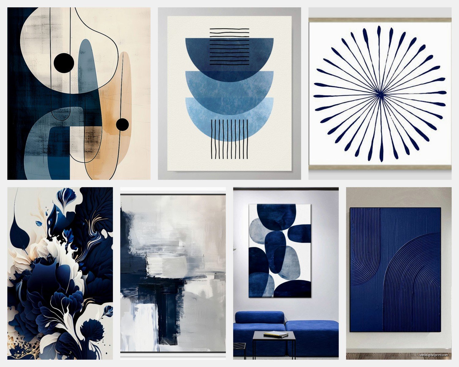
So I’ve been absolutely obsessed with navy blue abstract art lately and honestly it started because a client wanted to redo their living room but didn’t want the whole coastal vibe everyone associates with navy. Like, they wanted sophisticated, not nautical, you know?
The thing about navy abstract pieces is they’re weirdly versatile but also you can mess it up SO easily if you don’t think about your existing palette. I learned this the hard way when I bought this gorgeous deep blue piece with gold accents and it just died against my gray walls. Completely disappeared. Had to move it to a room with cream walls and suddenly it was like, oh THERE you are.
Understanding What Actually Works With Navy Abstract Art
Okay so first thing, navy reads differently depending on the time of day and your lighting situation. This sounds obvious but I cannot tell you how many times I’ve hung a piece that looked incredible in the gallery or online and then at 4pm in my actual space it just looked black. Not deep blue, not moody, just a black void on the wall.
Natural light is your best friend with navy abstracts. If you’ve got a room that gets decent daylight, even indirect, the blues will actually shift throughout the day and you’ll see all the undertones. But if you’re working with a room that’s more evening-use or relies heavily on artificial lighting, you gotta be strategic about your bulb temperature. Warm white bulbs (around 2700-3000K) make navy look richer but can pull out any purple undertones. Cool white (4000K+) keeps it crisp but can make it feel cold.
I usually go with 3000K for rooms with navy art because it’s that sweet spot where the blue stays blue but doesn’t feel sterile.
Size and Scale (aka Don’t Make My Mistakes)
Here’s where I see people mess up constantly. They go too small. Navy is a dark color, and dark colors recede visually, so if you get a tiny 16×20 navy abstract for a big wall, it’s gonna look like a postage stamp. You need to go bigger than you think.
My general rule is if you’re centering a piece above a sofa, you want it to be at least two-thirds the width of the sofa. For navy specifically, I actually push closer to three-quarters because of that visual recession thing. A 60-inch sofa needs at least a 40-inch wide piece, but honestly I’d go 48 inches with navy.
Oh and another thing, if you’re doing a gallery wall with navy abstracts mixed in, make sure the navy piece is one of the larger ones in the arrangement. Otherwise it just disappears among lighter pieces and becomes this weird dark spot that doesn’t anchor anything.
Single Statement Piece vs Gallery Wall
I’m personally team single statement piece for navy abstracts. There’s something about a large-scale navy abstract that just commands attention without trying too hard. But if you’re gonna do multiple pieces, keep them in the same color family with navy as the dominant shade.
Like I did this thing in my office where I got three pieces, all with navy as the base, but one had white and gold accents, another had navy and rust tones, and the third was almost entirely navy with just hints of silver. Hung them in a horizontal line and it actually worked because the navy thread connected them.
What Colors Actually Work With Navy Abstract Art
Okay this is where it gets fun. Navy plays well with way more colors than people think, but you gotta know the rules before you break them.
The classics that always work:
- Cream and ivory – this is like, foolproof, makes navy look expensive
- White walls – crisp and modern, very gallery-like
- Warm gray – sophisticated, less stark than white
- Blush pink – I know it sounds weird but trust me, navy and dusty pink is *chef’s kiss*
- Brass and gold metallics – adds warmth and prevents the space from feeling too cool
Wait I forgot to mention, if you’ve got navy art, your metal finishes matter more than you’d think. I default to brass or brushed gold for frames and nearby fixtures because it warms everything up. Silver and chrome can work but they make the space feel more contemporary and a bit colder, which is fine if that’s your vibe.
Colors that are trickier but can work:
- Emerald green – rich and jewel-toned together, but don’t let them compete for attention
- Mustard yellow – love this combo but it needs to be in small doses, like throw pillows
- Terracotta – surprisingly good, especially with navy abstracts that have warm undertones
My cat just knocked over my coffee while I’m writing this, so if this gets rambly that’s why…
Texture Matters More Than You Think
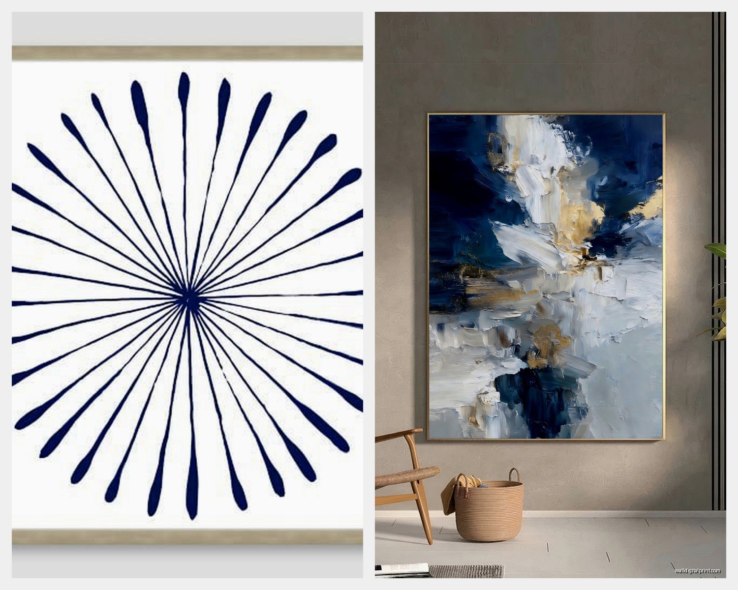
So here’s something I didn’t realize until I started really paying attention, the texture of the abstract piece changes how the navy reads. A flat matte navy abstract feels very different from one with thick impasto brushstrokes that catch the light.
If your room is pretty minimal with smooth surfaces, a textured navy abstract adds that tactile interest without introducing new colors. I’ve got this one piece in my bedroom that’s almost entirely navy but the artist used palette knife techniques so it’s got all these ridges and valleys, and the way light hits it throughout the day is just… it’s like having a different painting every few hours.
On the flip side, if you’ve already got a lot of texture happening, chunky knit throws, velvet pillows, nubby rugs, then a smoother abstract piece can actually balance that out.
Frame or No Frame
This is gonna sound weird but I think navy abstracts often look better without frames or with a floating frame. Traditional frames can make navy feel too formal or contained. The whole point of abstract art is that it’s fluid and expressive, and a heavy frame can kill that energy.
If you do frame it, go minimal. A thin black metal frame or a natural wood floating frame. I love how raw wood plays with navy, it adds warmth without competing.
Where to Actually Hang This Stuff
Living room is obvious, but here are spaces where navy abstract art really shines:
Bedroom: Navy is calming without being boring. I’ve got a large navy and white abstract above my bed and it’s moody but not dark, if that makes sense. Just make sure you’ve got good bedside lighting because navy can make a room feel cave-like if the lighting is weak.
Dining room: This is actually one of my favorite spots for navy abstract art. It’s sophisticated enough for a formal dining space but the abstract element keeps it from feeling stuffy. Plus navy doesn’t clash with food colors the way some bold colors can.
Home office: Navy is supposed to promote focus and productivity, and abstract art adds visual interest without being distracting like, say, a detailed landscape that you’d stare at instead of working. My office has a navy abstract with geometric elements and I love it.
Bathroom: Okay so funny story, I was skeptical about this but I put a small navy abstract in my powder room and it’s probably the most-complimented piece in my house. The moisture isn’t great for canvas though, so I went with a print behind glass.
Mixing Styles Without Looking Confused
You can totally mix your navy abstract with other art styles, you just need a connecting element. Could be the color navy appearing in multiple pieces, could be similar frame styles, could be a consistent size or orientation.
I’ve got my navy abstract hanging near some black and white photography and it works because the navy piece has strong graphic elements that echo the high contrast of the photos. The key is that there’s a visual conversation happening.
If your style is more traditional, look for navy abstracts that have some structure to them, like geometric abstracts or pieces with defined sections. The abstract element modernizes the space without feeling jarring next to your traditional furniture.
For modern spaces, you can go wild with fluid, gestural navy abstracts. The more expressive and loose, the better.
Lighting Your Navy Abstract Art
I mentioned this earlier but it deserves its own section because lighting can make or break navy art. Picture lights are great if you want to get technical about it. You want the light to hit the piece at about a 30-degree angle to minimize glare but still illuminate the surface.
But honestly, sometimes just repositioning a floor lamp or adding a table lamp nearby does the trick. I’ve got a brass arc lamp that curves over my sofa and illuminates my navy abstract from above and it looks intentional even though I mostly just needed more reading light.
Track lighting works too if you’ve got it, just make sure you’re using bulbs that don’t distort the color. Some LEDs can make navy look purple or black, so test before you commit.
What to Look For When Buying
If you’re shopping online (which, let’s be real, we all are), here’s what actually matters:
Check the undertones: Navy isn’t just navy. Some lean purple, some lean green, some are true blue. Read the description and look at multiple photos if possible. I always check reviews to see if anyone mentions the color being different in person.
Material matters: Canvas is classic and has that artist-studio vibe. Acrylic prints are more modern and the colors are usually more vibrant. Framed prints behind glass are good for high-moisture areas. Metal prints are having a moment and they make colors super saturated.
Original vs print: Originals are obviously pricier but there’s something about owning a one-of-a-kind piece. That said, I’ve got plenty of high-quality prints and honestly, most people can’t tell the difference from across the room. Prints are great if you wanna try the color scheme before investing in an original.
Artist style consistency: If you find an artist whose navy abstracts you love, check out their other work. Sometimes you can create a cohesive look by getting multiple pieces from the same artist even if they’re not technically a series.
Styling Around Your Navy Abstract
Once the art is up, you gotta style around it. This is where a lot of people stop but the art is just the starting point.
Pull colors from the abstract into your accessories. If your navy piece has touches of gold, add gold picture frames or a gold tray on the coffee table. If there’s white in the abstract, maybe a white vase or white candles.
Contrast is your friend though. If the abstract is very fluid and organic, balance it with structured furniture or geometric accessories. If the abstract is geometric, softer organic elements like plants or curved furniture pieces create balance.
Plants are actually amazing with navy art because the green pops against the deep blue. I’ve got a fiddle leaf fig near my navy abstract and the contrast is perfection.
Textiles and Patterns
You can echo the navy in your textiles but don’t match it exactly. If your art is a deep navy, maybe your throw pillows are a lighter blue or have navy as an accent color mixed with cream or gray.
Patterns are tricky. I usually go solid or very subtle patterns when I’ve got a bold abstract piece. The art is the statement, everything else should support it without competing.
Oh and rugs, if you’re gonna do a navy rug with navy art, make sure there’s enough contrast in the wall color. Navy on navy on navy can feel like a cave. I learned this when I tried to do an all-blue room and it was just… too much. Needed more breaks.
Anyway that’s pretty much everything I’ve figured out through trial and error with navy abstract art. It’s one of those things that seems straightforward but has all these little nuances that make the difference between “nice” and “wow that’s gorgeous.”