Wall Art Guide, Wall Art Tutoriels
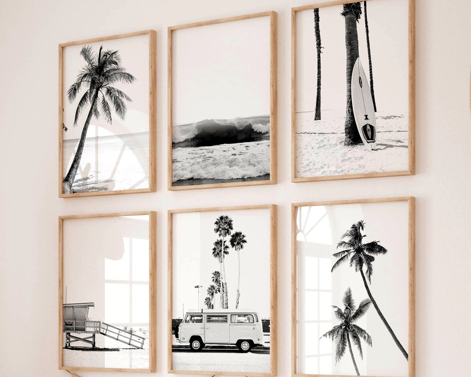
Black and White Beach Wall Art: Minimalist Coastal Photography
May
So I’ve been obsessing over black and white beach photography lately and honestly it’s become this whole thing where I can’t stop talking about it with clients. Like, I was literally watching The Crown last night and paused mid-episode to order three more prints because I had this sudden realization about negative space and coastal minimalism.
The thing with black and white beach art is it’s NOT all created equal. You’d think oh cool, waves and sand in monochrome, how different can it be? But then you start looking and there’s this massive range from like, genuinely stunning museum-quality stuff to those generic prints that scream “I bought a 5-pack from a big box store.”
Finding the Right Print Quality
Okay so first thing – and I learned this the hard way after hanging something in my own living room that looked amazing online but arrived looking like a bad photocopy – you gotta check what kind of printing process they’re using. Giclée prints are your friend here. It’s basically archival-quality inkjet printing on really good paper or canvas, and the blacks stay actually BLACK instead of fading to this weird grey-blue situation after six months.
I usually tell people to look for these specifics in the product description:
– Archival inks (sometimes called pigment-based or museum-quality)
– Acid-free paper or canvas
– At least 200gsm paper weight if it’s not canvas
– Actual photography, not digital art trying to look like photography
That last one is tricky because there’s nothing wrong with digital art but if you’re going for that authentic coastal photography vibe, you want actual captured moments. The light hits different, the grain structure is different, the whole feel changes.
Size Matters More Than You Think
Here’s where everyone messes up including me that one time in 2019 that we don’t talk about. Beach photography needs ROOM to breathe. Like, those tiny 8×10 prints of a vast ocean landscape? They lose all their impact. The whole point of minimalist coastal work is that sense of space and calm and horizon line going on forever.
For above a couch or bed, you’re looking at minimum 24×36 inches, honestly bigger if your wall can handle it. I just did a client’s bedroom with a 40×60 print of this gorgeous misty beach scene and it’s completely transformed the space. But in that same project I also used a 16×20 in their bathroom and that worked perfectly because smaller room, different purpose.
The general rule I follow:
– Large walls (like over a sofa): 30×40 or bigger, or do a diptych/triptych situation
– Medium walls (dining room, hallway): 24×36 works great
– Smaller spaces (bathroom, office nook): 16×20 to 20×30
The Diptych Thing Everyone Asks About
Oh and speaking of diptychs – this is where you use two or three panels instead of one big print – this actually works REALLY well with beach photography. I’m obsessed with splitting a long horizontal beach scene across two 20×30 canvases with like 2-3 inches between them. It creates this natural pause that somehow makes the scene feel even more expansive?
Just make sure if you’re doing this that the horizon line matches across both pieces. Sounds obvious but I’ve seen it done wrong and it’s… jarring.
What to Actually Look For in the Photography Itself
Okay so you’re browsing Etsy or whatever at 11pm (we’ve all been there) and you need to know what separates the good stuff from the meh stuff.
Composition basics:
The horizon line should be intentionally placed – either in the lower third giving you lots of sky, or upper third giving you beach/water. Dead center horizon is usually boring unless there’s something really compelling happening. Look for images with strong leading lines… like where the water meets sand, or a pier stretching out, or even footprints leading into the distance.
Contrast and tonal range:
This is huge with black and white work. You want a full range from pure white (maybe foam, maybe sky highlights) through all the greys to deep rich blacks. Images that are all mid-grey tones will look flat on your wall. I literally zoom in on product photos to check if there’s actual texture and depth.
The negative space thing:
Minimalist coastal photography lives and dies by negative space. That’s all the “empty” area – sky, smooth water, blank sand. It shouldn’t feel cluttered. If there’s a person in the shot, they should be small and purposeful, not dominating the frame. Same with birds or driftwood or whatever.
Framing Options That Don’t Suck
So framing is where people either nail it or completely undermine their beautiful print. For black and white beach photography specifically, I almost always go with:
Thin black frames: Like 1-inch or less width, matte black finish. This keeps the focus on the image and doesn’t compete with the simplicity of the composition. I get most of mine from this frame shop in Brooklyn but honestly IKEA’s RIBBA frames are surprisingly decent for this if you’re on a budget.
Natural wood frames: Light oak or ash, again thin profile. This works if your space has warm wood tones already and you don’t want the starkness of black. But avoid anything too ornate or dark walnut – it fights with the minimalist aesthetic.
Frameless/Float mounting: This is my secret weapon actually. You mount the print on a board that’s slightly larger, creating this shadow gap effect. It looks expensive and gallery-like but it’s not that hard to DIY if you’re even slightly handy. My cat knocked one off the wall last month and it survived fine so they’re sturdier than they look.
What to avoid: white frames (makes everything look washed out), ornate gold/silver frames (completely wrong vibe), those pre-made poster frames with the clip closure (too casual for this aesthetic).
Where Different Subjects Work Best
Not all beach photography works in all rooms and this took me forever to figure out.
Bedrooms: Go for calmer scenes. Gentle waves, morning mist, empty beaches at dawn. You want that restful energy. I have this print above my bed of a foggy shoreline where you can barely see where water ends and sky begins, and it’s perfect for that space.
Living rooms: You can do more dramatic stuff here. Big waves crashing, stormy skies, high contrast scenes with interesting rock formations. People gather in living rooms so the art can have more energy and conversation-starting quality.
Bathrooms: This is gonna sound weird but I love putting images with visible water texture in bathrooms. Like close-ups of foam patterns or ripples. There’s something that just works about water imagery near water.
Home offices: Horizon-heavy compositions work great because that long horizontal line is calming when you’re staring at a screen all day. I’ve got a client who has this minimal beach scene with like 70% sky and it apparently helps with her focus.
Mixing Black and White Beach Art with Other Stuff
You don’t have to do a whole gallery wall of just beach photos – actually that can feel a bit theme-park-ish. I usually mix in maybe one or two other elements:
– Abstract black and white art (geometric or organic shapes)
– Line drawings (faces, figures, botanical)
– Text-based art if it’s minimal enough
The key is keeping the color palette consistent. Once you introduce color photos or art into the mix with your black and white beach pieces, it gets tricky. Not impossible, but tricky. You’d need to be really intentional about it.
The Gallery Wall Approach
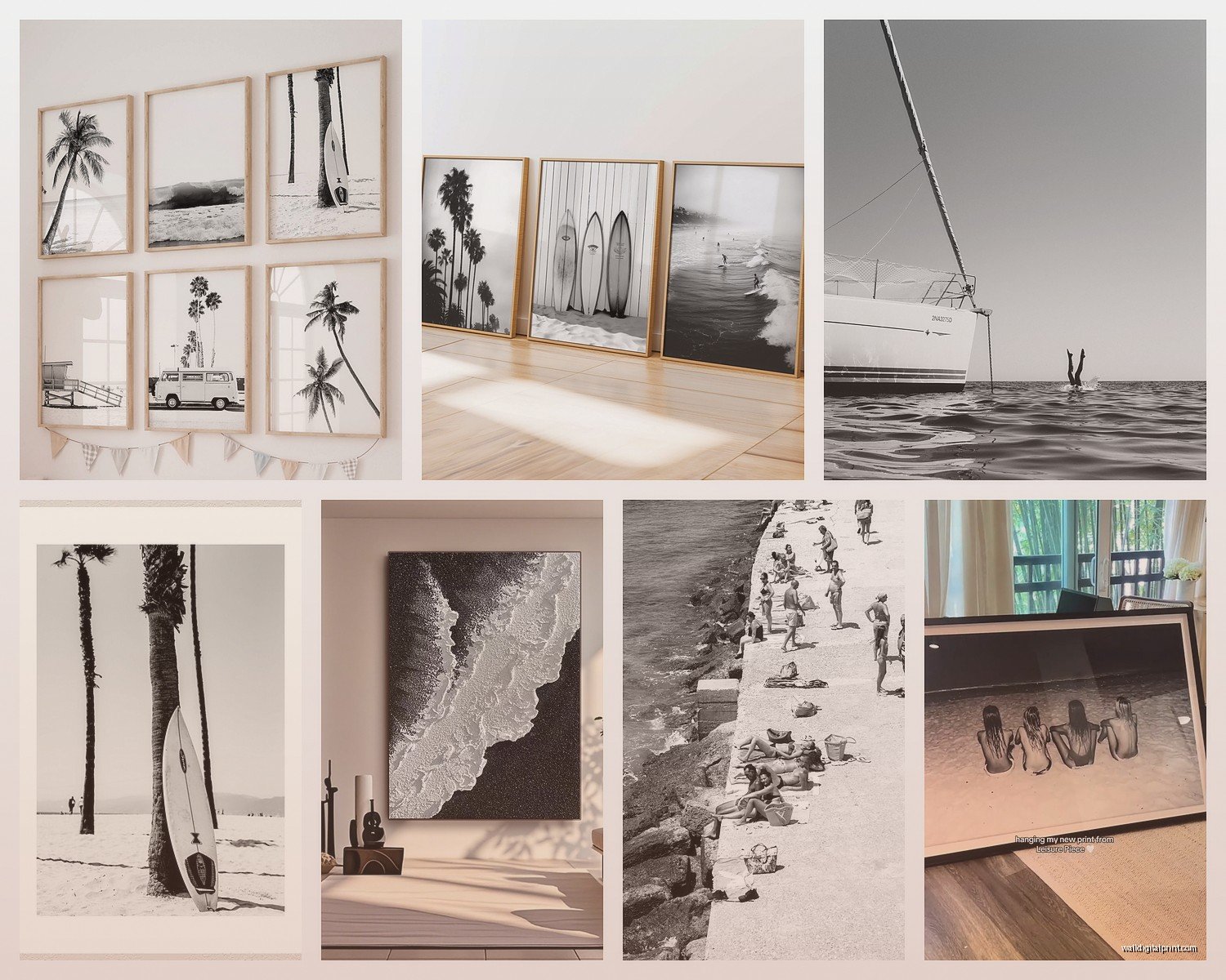
If you’re doing a gallery wall with multiple black and white beach prints, vary your sizes but keep your framing consistent. So like, all black frames but in 16×20, 11×14, and 8×10 sizes arranged asymmetrically.
I usually start with the largest piece and work outward, keeping roughly 2-3 inches between frames. And please please measure and map it out with paper templates first. I cannot tell you how many nail holes I’ve had to spackle because I just started hammering away without planning.
Lighting These Prints Properly
This is something nobody talks about enough but lighting makes or breaks black and white photography on your walls. You’ve got all this subtle tonal gradation and texture that gets completely lost in bad lighting.
Natural light is great during the day obviously, but position the print so you’re not getting glare. Slightly perpendicular to windows rather than directly across from them.
For artificial lighting, I’m obsessed with picture lights – those little lights that mount above the frame. They’re not just for galleries, they actually make a huge difference for nighttime viewing. The warm LED ones (around 3000K) work better than cool white which can make black and white prints look harsh.
Track lighting or adjustable can lights are good too if you can angle them to avoid glare on the glass or acrylic glazing.
Budget Breakdown Reality Check
Let’s talk actual numbers because this stuff adds up fast if you’re not careful:
Budget option ($50-150 total): Digital download from Etsy, print it yourself at a local print shop or online service like Printique, IKEA frame. This can actually look great if you choose quality files and printing.
Mid-range ($150-400): Print from the photographer directly or through a quality site like Minted or Artifact Uprising, custom framing from a local shop or nice pre-made frame, proper matting.
Investment piece ($400+): Limited edition print, professional custom framing with museum glass, maybe even a piece from a known coastal photographer. I have one client who spent $800 on a single piece and honestly it’s stunning and will last forever.
Specific Photographers and Sources Worth Checking
I’m not gonna list like 50 options but here’s where I actually shop and recommend:
Etsy has tons of options but search specifically for “fine art beach photography” not just “beach wall art” – you’ll get better results. Look at seller reviews and how long they’ve been in business.
Gray Malin does beautiful aerial beach photography though it’s pricier and more colorful usually, but he has some black and white work that’s incredible.
For more affordable options, Society6 and Minted both have good quality printing and lots of coastal photographers. The nice thing is they offer different size options and framing services.
Local art fairs and coastal town galleries if you’re near the ocean – you can find really unique pieces and actually meet the photographer which is cool.
The Practical Hanging Stuff
Quick practical notes because I’m realizing this is getting long:
Use proper wall anchors if you’re not hitting studs. Drywall anchors rated for 50+ pounds for anything over 20×30. I like the self-drilling ones.
Measure 57-60 inches from the floor to the CENTER of your artwork – that’s standard gallery height and it works in most spaces.
If you’re hanging above furniture, leave 6-8 inches between the furniture top and the bottom of the frame.
Use a level. Seriously. Your eye will tell you it’s straight when it’s not and then you’ll notice it every single day and it’ll drive you crazy.
When It’s Not Working
Sometimes you get the print hung and it’s just… not right. That’s okay. Maybe the scale is off, maybe the subject matter doesn’t match the room energy, maybe the contrast is too harsh for that particular wall color.
I’ve definitely bought prints that looked perfect in my head and then felt wrong in the actual space. Usually it’s a scale issue – going bigger almost always solves it. Or sometimes the room needs more warmth and the stark black and white is making it feel cold, in which case adding some textured neutrals in other decor helps balance it.
Don’t be afraid to return stuff or resell it and try something different. I’ve got a whole system with my “maybe” pile of art that rotates through different client projects until it finds its perfect home.
Anyway that’s basically my entire brain dump on black and white beach photography for walls. It’s almost midnight and I’m gonna stop here but hopefully this helps you figure out what you actually need instead of just buying random coastal prints and hoping for the best.