Wall Art Guide, Wall Art Tutoriels
Abstract Geometric Wall Art: Angular Modern Designs
May
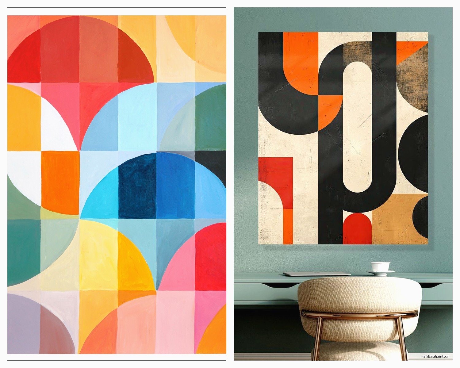
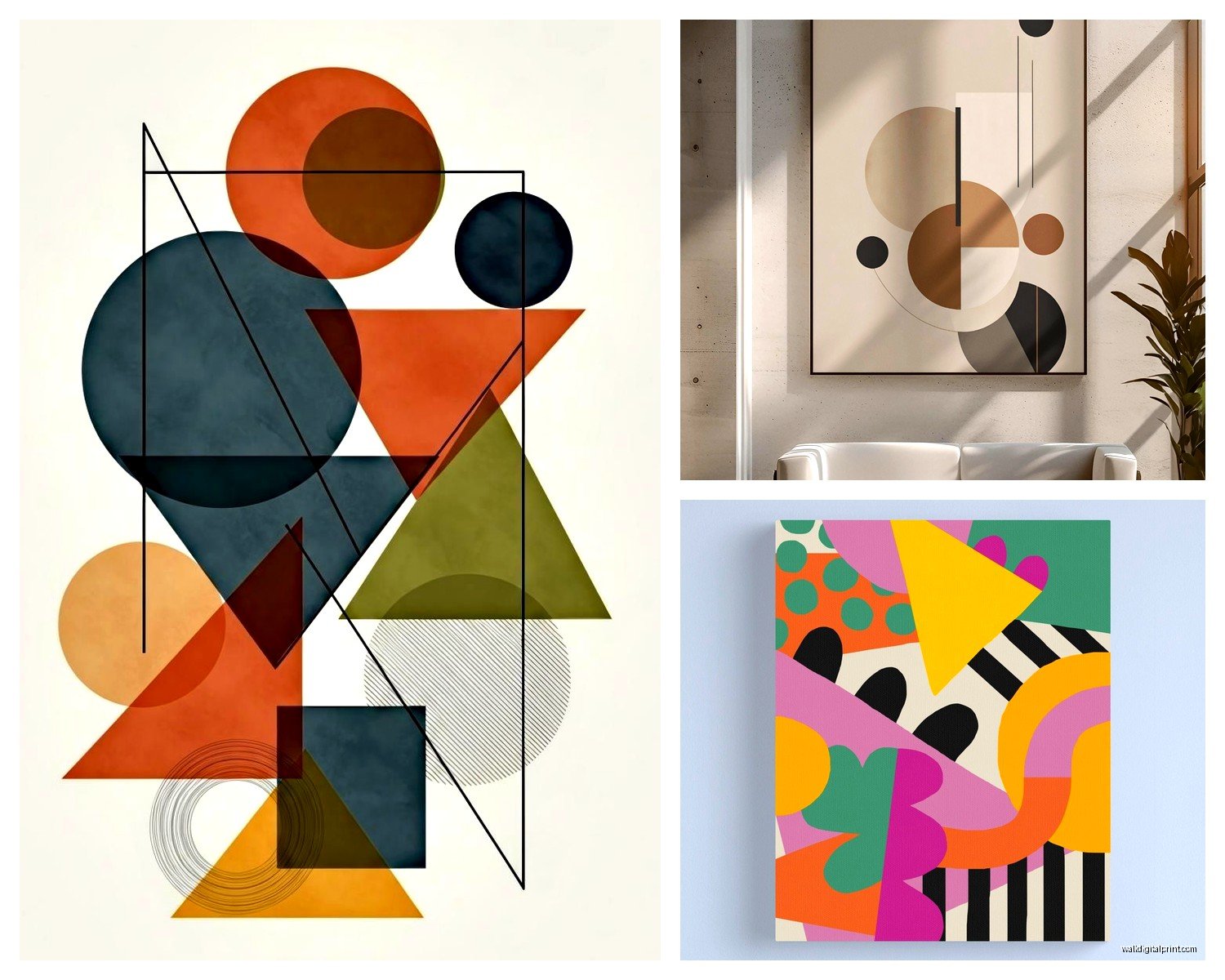
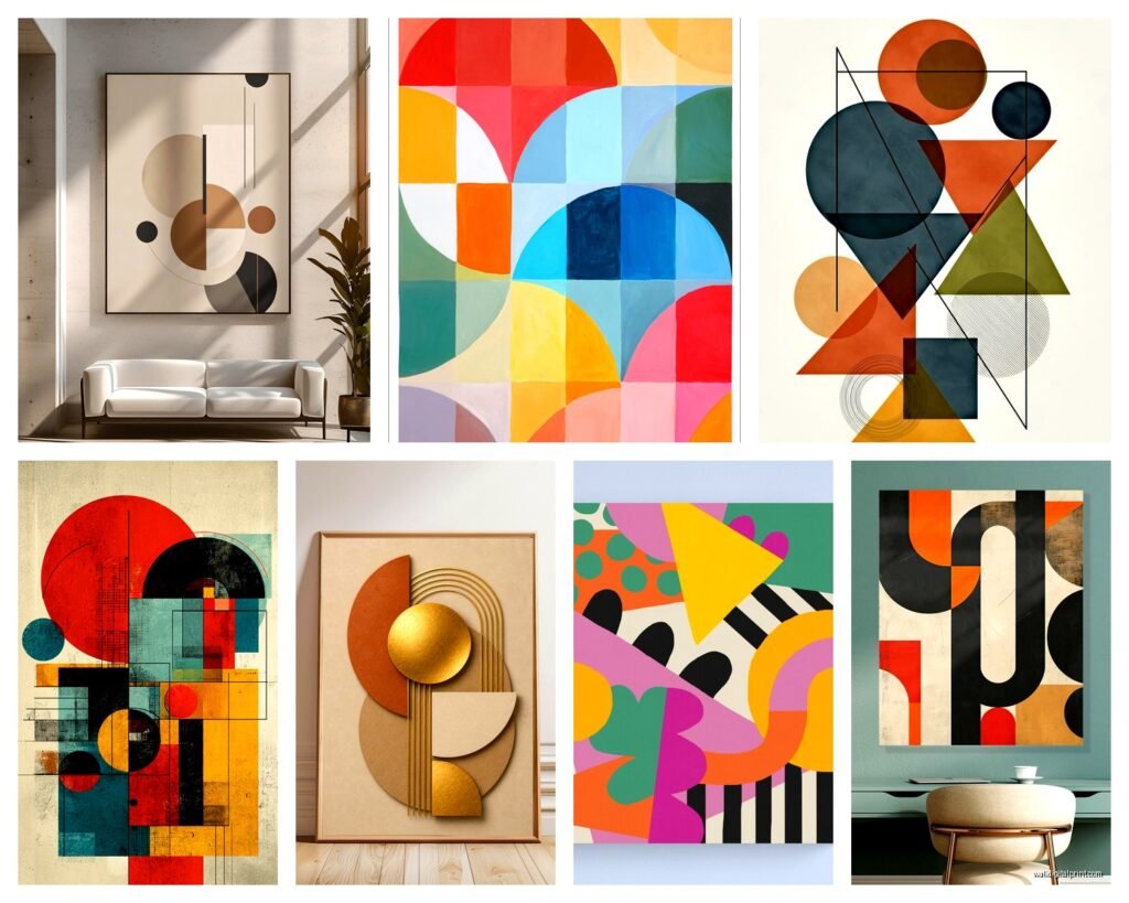
So I’ve been placing geometric wall art in like every project lately and honestly it’s the easiest way to make a room look intentional without doing much. My client last week had this beige nightmare of a living room and we threw up three angular pieces in navy and suddenly it looked like an actual design choice instead of… I don’t know, a waiting room.
Where This Actually Works Best
Okay so geometric stuff is weirdly versatile but there ARE rooms where it just hits different. Living rooms obviously, but I’ve had the most success in home offices and dining rooms. Something about those sharp angles makes a workspace feel more focused? I put this massive black and white angular piece behind my desk last year and I swear I procrastinate less. Could be placebo but whatever works.
Bedrooms are trickier because you don’t want it too aggressive. I learned this the hard way when I hung this intense red and orange geometric thing above a client’s bed and she called me saying she couldn’t sleep. We swapped it for something in softer grays and creams with geometric patterns and that worked way better. The shapes were still there but the colors weren’t screaming at her at 2am.
Entryways though… that’s where you can go BOLD. People see it for like thirty seconds max so you want impact. I did this whole triangular composition in metallics for someone’s foyer and every single person who visits comments on it.
Size is Gonna Make or Break This
This is where everyone messes up and I did too at first. You need bigger than you think. Like genuinely measure your wall and then get something that feels too big when you’re shopping online.
For above a sofa you want the art to be roughly two-thirds to three-quarters the width of the sofa. I know that sounds huge but trust me. I see SO many people hang these tiny pieces above their couch and it just looks like the art is floating away into nothingness.
Single large piece vs. gallery wall is the eternal question right? Here’s what I tell people: if your room already has a lot going on visually—patterned pillows, textured rug, lots of furniture—go with one large statement piece. If your room is pretty minimal, you can do a geometric gallery wall but keep it to 3-5 pieces max. I did seven once and it was chaos.
Oh and another thing, odd numbers look better for groupings. Three pieces in a row, five in a scattered arrangement. Even numbers feel too symmetrical which is weird because we’re literally talking about geometric art but somehow it matters.
The Height Thing Nobody Gets Right
Center of the artwork should be at 57-60 inches from the floor. This is like gallery standard and it actually works for most spaces. But if you’re hanging above furniture, the bottom of the frame should be 6-8 inches above the furniture piece.
I was watching this home reno show the other night while eating takeout and they hung everything SO HIGH and my partner was like why are you yelling at the TV, but seriously it drives me nuts.
Color Combos That Actually Work
Black and white is the safe choice and honestly it works in like 90% of spaces. You literally cannot mess this up. Adds contrast, looks modern, matches everything. But it can feel a little… corporate? So here’s what I do:
For warm-toned rooms (beiges, tans, warm woods):
- Terracotta, navy, and cream geometric patterns
- Rust orange with deep gray angles
- Warm metallics like gold and copper with black
For cool-toned rooms (grays, blues, white):
- Navy, white, and silver
- Teal and charcoal geometric shapes
- Gray with pops of mustard (sounds weird but works)
For neutral minimalist spaces:
- Different shades of gray in angular patterns
- Cream, taupe, and soft black
- All white with subtle texture variations
The trick with geometric art is you can bring in a bold color through it even if you’re scared of color elsewhere. Like my own living room is pretty much all gray and white but I have this geometric piece with these electric blue triangles and it’s the only color in the room. Makes it feel intentional instead of boring but I didn’t have to commit to blue furniture or whatever.
Materials and Textures to Look For
Canvas is fine but honestly kind of basic at this point. Everyone has canvas prints. Here’s what makes geometric art actually interesting:
Wood geometric art is having a moment and I’m here for it. Those pieces where different wood tones create the geometric pattern? They add dimension that printed canvas just can’t. I found this company that does reclaimed wood geometric pieces and the texture is insane. You can see the grain, there’s actual shadow and depth. My cat keeps trying to scratch it though so maybe not if you have pets who are jerks.
Metal geometric sculptures that hang on the wall are super cool for modern spaces. They cast shadows that change throughout the day which is a whole other layer of visual interest. But they’re pricey. Like really pricey. I usually suggest these for people who are gonna be in their space long-term.
Acrylic or resin pieces can be really striking. Some have metallic elements embedded in them or multiple layers that create this 3D effect. I used one in a client’s office and depending on where you stand the colors shift slightly. Very cool but you gotta have the right lighting or it just looks flat.
Mixed media is where artists combine materials—canvas with wood elements, metal accents on fabric, whatever. These tend to be pricier but if you want something that feels more like art-art and less like decor, this is the way.
Framing Decisions Because Apparently This Matters
Okay so do you frame geometric art or leave it unframed? Depends on the vibe you’re going for.
Unframed/gallery wrapped canvas (where the image continues around the edges) feels more casual and modern. Good for contemporary spaces. The art just floats on the wall which I like for geometric stuff because the clean edges of the canvas echo the clean lines in the design.
Floating frames where there’s space between the art and frame are really popular right now. They work great with geometric art because they add another layer of geometry? Frame within the shapes within the frame. Very meta. I use these a lot.
Traditional frames can work but keep them simple. Thin black or white frames, or natural wood. Nothing ornate or it clashes with the modern geometric vibe. I made this mistake with a client who had this beautiful angular artwork and she insisted on this thick gold baroque frame and it just… no. We eventually convinced her to switch it.
The Gallery Wall Formula I Use
If you’re doing multiple geometric pieces together, here’s my process that actually works:
Start with your largest piece as the anchor. Put it slightly off-center (not in the exact middle).
Add your second largest piece diagonal from it. This creates visual movement.
Fill in with smaller pieces but leave some breathing room. You don’t need to fill every inch of space.
Keep roughly 2-3 inches between frames. More than that and they look disconnected, less and it feels crowded.
I trace all the frames on kraft paper first and tape them to the wall to see the layout before I make any holes. Saved me SO many times from terrible spacing decisions.
Lighting Makes Such a Huge Difference
You can have the most amazing geometric art and if your lighting sucks it’s gonna look flat. This is gonna sound weird but I literally bring a small lamp to client consultations now to test lighting angles.
Picture lights mounted above the art are classic and work great. They create this gallery feel and add drama at night. But they need to be the right size—too small and it lights like a tiny circle, too big and it overwhelms the art.
Track lighting or directional recessed lights are better if you want flexibility. You can aim them exactly where you need them. I had this geometric piece in metallics that looked completely different depending on the light angle. We spent like twenty minutes adjusting the track light until the shadows hit right.
Natural light is tricky with geometric art. Direct sunlight can fade colors over time (learned this the hard way with a piece in my own house—the navy turned kind of purplish after two years by the window). But indirect natural light is perfect. Makes colors look true and if you have metallic elements they’ll catch the light throughout the day.
Mixing Geometric with Other Styles
Here’s where it gets fun. Geometric art doesn’t have to exist in a vacuum of modern minimalism.
I’ve mixed angular geometric pieces with vintage furniture and it creates this really cool tension between old and new. The geometric art keeps traditional furniture from feeling dated, and the traditional stuff keeps the geometric art from feeling cold.
With bohemian spaces you’d think geometric wouldn’t work but actually it grounds all those organic textures and patterns. I did this boho bedroom with macrame and rattan everything, then hung a simple black and white geometric piece and it pulled the whole thing together. Gave the eye somewhere to rest.
In industrial spaces geometric art is obvious but try to avoid making it too matchy-matchy with all the metal and concrete. I like using wood geometric pieces in industrial spaces for warmth, or geometric art in unexpected colors like blush pink or sage green to soften things.
Budget Options That Don’t Look Cheap
Real talk, original geometric art from artists is expensive. I’m talking hundreds to thousands. But there are ways to get the look without the massive price tag.
Print-on-demand sites have tons of geometric designs. You can get them printed on canvas, metal, acrylic, whatever. Quality varies though. I’ve had good luck with some and terrible results with others where the colors were totally off.
DIY geometric art is actually pretty doable if you’re remotely crafty. Painter’s tape, canvas, acrylic paint. Make your own angular design. I did this for my guest room and people always ask where I bought it. Cost me like thirty bucks in materials and a Sunday afternoon.
Thrift and vintage shops sometimes have geometric pieces from the 70s and 80s. That era was all about geometric patterns. Might need a new frame but the art itself can be really cool.
Local art schools often have student sales where you can get original pieces for way less. The quality is usually really good because these are students trained in composition and color theory, they just don’t have the name recognition yet.
wait I forgot to mention Society6 and similar sites where artists upload designs and you can buy them as prints. The nice thing is you’re still supporting artists (they get a commission) but the prices are way more reasonable than buying originals.
Common Mistakes I See Constantly
Hanging art too high. Already mentioned this but seriously it’s epidemic. Your art is not a crown molding decoration.
Choosing art that matches your throw pillows exactly. This isn’t 2010 anymore. You want coordination not matchy-matchy everything. The geometric pattern can echo colors in the room without being identical to your pillows.
Going too small. Bigger is almost always better with wall art.
Forgetting about the negative space around the art. The wall space around your geometric piece is part of the composition. Don’t cram it between a shelf and a window with two inches on each side.
Putting geometric art in rooms with already super busy geometric patterns everywhere else. Like if your rug is geometric, your curtains have angles, and your furniture has strong lines, maybe go with something softer for the wall art? Or simplify something else in the room.
My Actual Go-To Sources
Since you’re probably gonna ask where to actually buy this stuff:
Etsy has a huge range from prints to originals to wood pieces. You can search by exact size and color which is super helpful. Just read reviews carefully.
West Elm and CB2 have good modern geometric options. Pricier but quality is consistent. They have sales pretty often.
Desenio for affordable prints. Very Scandinavian minimal geometric stuff. Ships fast and I’ve never had quality issues with them.
Minted for supporting independent artists. Lots of geometric options and you can customize sizes.
Local galleries if you want original work. Build relationships with galleries in your area and you’ll learn about artists working in geometric styles.
Okay I think that covers most of it? The main thing is just don’t overthink it. Geometric art is forgiving because the strong lines and shapes create impact even if you’re not totally sure what you’re doing. Start with one piece, see how you feel, adjust from there. And measure twice before you put holes in your wall because patching and repainting is annoying.