Wall Art Guide, Wall Art Tutoriels
Black and White Horse Wall Art: Equestrian Monochrome
May
So I’ve been obsessing over black and white horse art lately because three different clients asked about it in the same week and now I can’t stop seeing it everywhere. Like once you notice how good monochrome equestrian prints look, you’re done for.
The thing with horse wall art is it can go really wrong really fast. You don’t want it looking like a teenage girl’s bedroom from 2005 (no shade, I had those posters too) but you also don’t want it so sterile that it feels like a vet’s office waiting room. The sweet spot is somewhere between artistic and grounded, which is where black and white comes in because it just… works?
Why Black and White Actually Makes Sense Here
Okay so the monochrome thing isn’t just aesthetic, though that’s obviously part of it. When you strip away color, you’re left with form, movement, texture. Horses are already incredibly sculptural animals, all that muscle definition and the way their manes catch light, so black and white photography or illustrations really emphasize that. I had this moment last month where I was comparing a color horse photo to a B&W version of basically the same shot, and the black and white one was just… more. More drama, more focus on the actual horse instead of the background competing for attention.
Plus it’s stupidly versatile for decorating. You’re not trying to match it to your throw pillows or worrying if it clashes with your rug. It goes with everything, which sounds boring but is actually incredibly freeing when you’re trying to pull a room together.
Different Styles and What They Actually Look Like in a Room
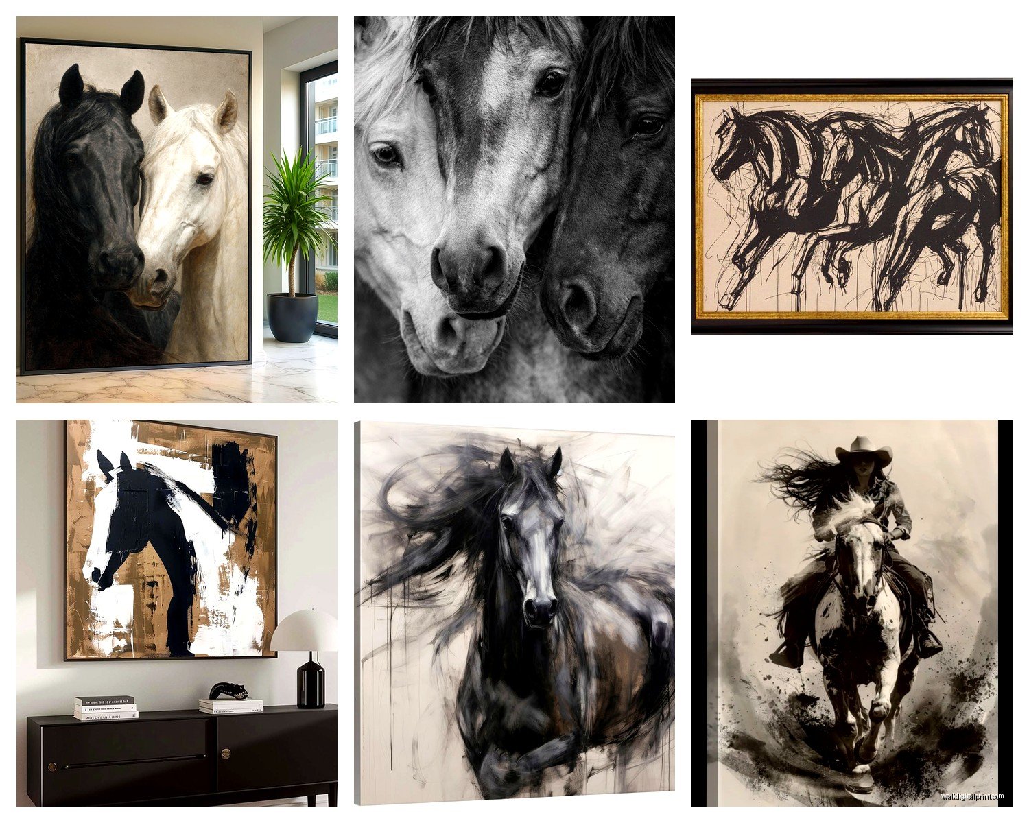
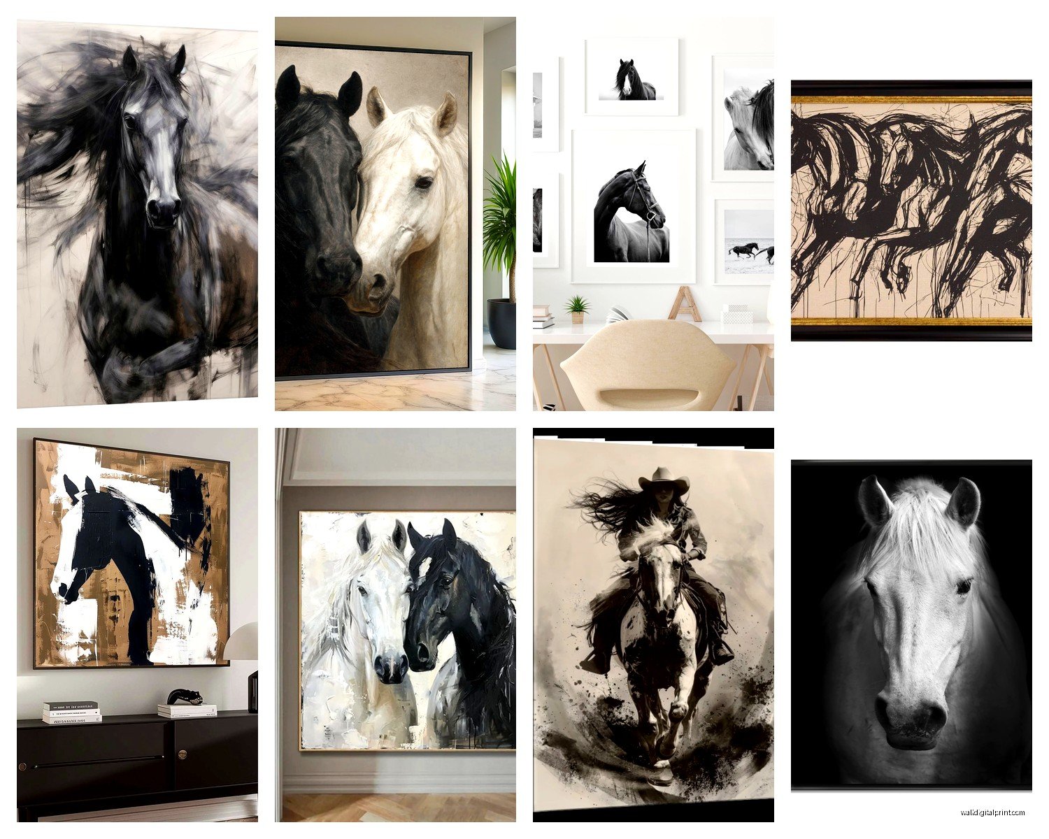
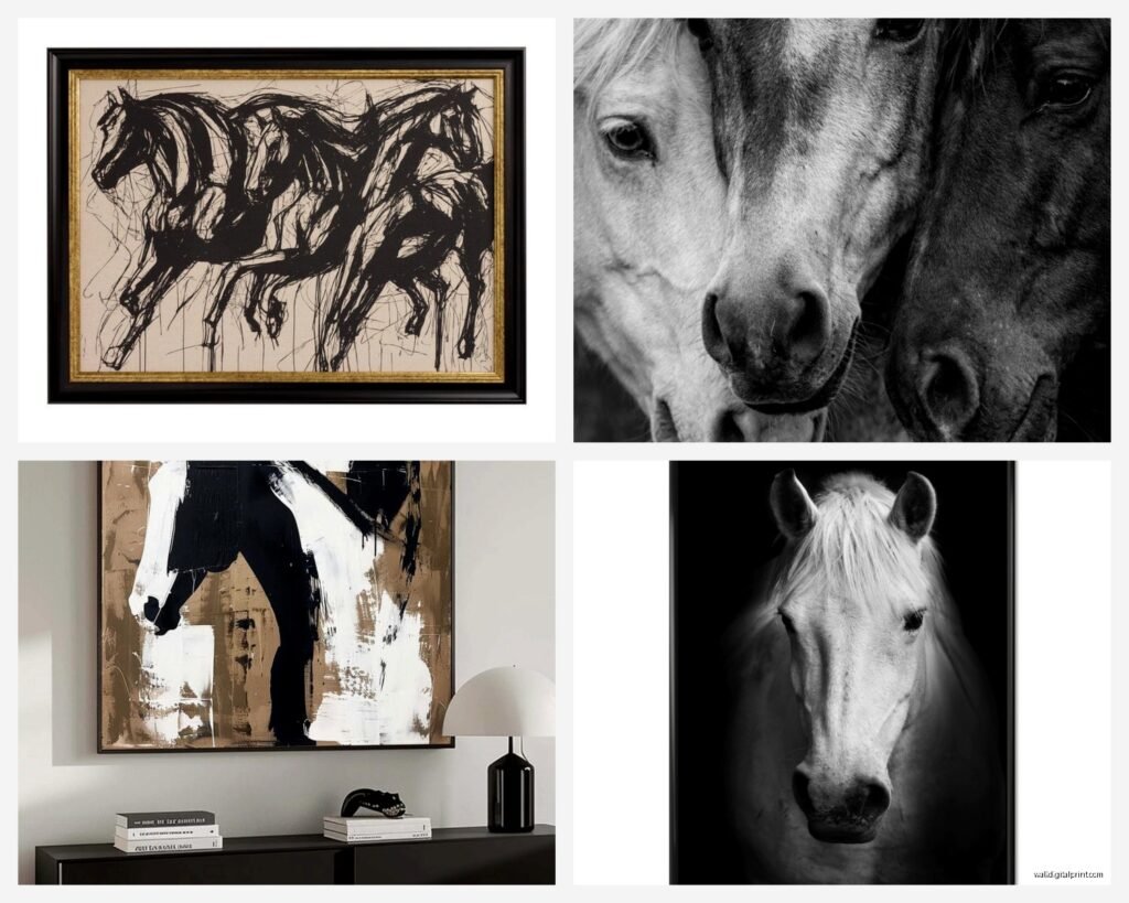
High Contrast Photography
This is the stuff that’s super dramatic, almost all shadows and highlights with not much middle ground. Think horses shot against dark backgrounds where just their profile or eye catches the light. I’ve used these in modern spaces, especially rooms with clean lines and minimal furniture. They need space to breathe though—like don’t hang one of these on a wall that’s already covered in other stuff.
Best rooms for this: Living rooms with neutral palettes, home offices where you want something striking but not distracting, modern bedrooms. My client Sarah put one above her bed and it’s genuinely the first thing you notice when you walk in, in a good way.
Soft and Ethereal Shots
These are the opposite, all misty and dreamlike. Horses in fog, backlit situations, lots of grey tones. They’re quieter, more contemplative. I actually like these better for bedrooms because they don’t demand attention the way high contrast ones do. There’s something calming about them.
The trick here is the frame matters more than you’d think. A thin black metal frame keeps them contemporary, but if you go with a thicker white or light wood frame, they can start feeling too country-rustic. Not bad necessarily, just depends on your vibe.
Line Drawings and Sketches
Oh and another thing—don’t sleep on simple line art. Like those minimalist single-line horse drawings that were everywhere on Instagram for a while? They’re still around and honestly they work great in smaller spaces or when you want something equestrian but subtle. I have one in my bathroom (weird flex but the room needed something) and it’s just this continuous line drawing of a horse head. Cost like $30 printed, looks way more expensive.
These are perfect for gallery walls where you’re mixing different art styles, or in transitional spaces like hallways where you want visual interest without overwhelming the space.
Abstract and Artistic Interpretations
This is where it gets fun—ink splatter horses, geometric interpretations, those prints where the horse kind of dissolves into brush strokes. These read as art first, horse second, so they work in spaces where you might not think equestrian art belongs. Like I used one in a dining room once and nobody even registered it as “horse art,” they just saw it as interesting abstract work that happened to have an equestrian form.
Size and Placement Because This Is Where Everyone Messes Up
Okay so funny story, I once hung a massive horse print for someone and we got the scale completely wrong on the first try. Had to rehang it. Here’s what I learned:
For above a sofa or bed, you want the art to take up about two-thirds to three-quarters the width of the furniture. So if your couch is 90 inches, you’re looking at 60-68 inches of art width. You can do this with one large piece or a diptych or triptych.
Height-wise, the center of the artwork should be at eye level, which is generally 57-60 inches from the floor. But if it’s going above furniture, leave 6-10 inches between the furniture top and the bottom of the frame. This is gonna sound weirdly specific but I measure this every single time because eyeballing it always ends badly.
Single Large Statement Piece
This works best in rooms with minimal wall decor otherwise. You want it to be THE thing, not competing with other stuff. I’m talking like 40×60 inches or larger for a living room, maybe 30×40 for a bedroom. Go big or go home honestly, because a too-small piece on a big wall just looks lost.
Gallery Wall Approach
If you’re doing multiple pieces, keep them all black and white but you can mix photography with line art with maybe one abstract piece. The key is consistent framing—all black frames or all natural wood or all white. Don’t mix frame colors here, it gets messy.
I usually do a template on the floor first, arrange everything until it looks right, then take a photo and recreate it on the wall. Painters tape to mark positions. It takes forever and my cat kept walking through the layouts but it’s worth it to not have a million nail holes to patch later.
Framing Options That Actually Matter
So framing seems like a minor detail but it really changes the whole feel. I’ve seen the same print look completely different with different frames.
Black metal frames: Modern, gallery-like, let the art be the focus. These are my default for contemporary spaces. Clean lines, usually thin profile, relatively inexpensive. You can get good ones from places like Framebridge or even Amazon if you’re careful about reviews.
Natural wood frames: Warmer, works with Scandinavian or modern farmhouse aesthetics. But be careful because the wrong wood tone can make it feel dated. Light oak or ash tones usually work better than darker walnut or espresso.
White frames: Tricky because they can wash out if your walls are also white, but great for creating a cohesive gallery wall or in rooms with color on the walls. They make the art feel more casual somehow.
No frame, just mounted: Okay this is my secret favorite for certain prints. You get it printed on thick paper or canvas, mount it to a backing board, and hang it frameless. Super modern, very gallery-like. Not for every space but when it works, it really works.
Where to Actually Buy This Stuff
Wait I forgot to mention where to source these because that’s probably important.
Original Photography
Etsy has a surprisingly good selection from actual equestrian photographers. You’re usually buying digital downloads or made-to-order prints. Price range is all over the place, anywhere from $30 for a digital file to $300+ for large format prints. I’ve had good luck with shops that specialize in horse photography—they understand the subject matter better than general photographers.
Art Prints and Reproductions
Society6, Redbubble, Minted—these print-on-demand sites have tons of options. Quality varies so check reviews. The nice thing is you can usually get the same image in different sizes and on different materials (canvas, framed print, metal print, whatever).
Vintage and Antique Prints
This is gonna sound weird but I’ve found some of my favorite horse prints at estate sales and antique shops. Old equestrian photographs and illustrations have this authentic quality that’s hard to replicate. You’ll need to get them professionally framed usually, but they’re one-of-a-kind which I love.
Commission Custom Work
If you have a specific vision or want a portrait of an actual horse, commissioning an artist is the way to go. More expensive obviously (usually starting around $200 and up depending on size and artist), but you get exactly what you want. I worked with a photographer once who did a custom shoot of someone’s horse specifically for their home office and it was absolutely worth the investment for them.
Styling Around the Art
Okay so you’ve got your horse art, now what? The room still needs to work as a whole.
Keep the supporting decor relatively simple. Black and white horse art is already a statement, so you don’t need a ton of other stuff competing. I usually stick with neutral textiles, maybe one accent color pulled from elsewhere in the home.
Texture becomes super important when you’re working with monochrome. Since you don’t have color doing the heavy lifting, you need varied textures to keep things interesting. Think chunky knit throws, smooth leather, rough linen, glossy ceramics. All that tactile variation makes the space feel layered even though your color palette is restricted.
Lighting matters more than you’d think. If you have the budget, picture lights or even just well-placed spotlights can make black and white photography look museum-quality. But honestly even just making sure there’s enough ambient light in the room helps, because these pieces can get lost in dim lighting.
Unexpected Places for Horse Art
I’ve put black and white horse prints in so many rooms beyond the obvious living room/bedroom situations. Bathrooms actually work great, especially powder rooms where you want something interesting but the space is small. Home offices, obviously. Mudrooms if you’ve got wall space. Even kitchens if the style is right—I did a modern farmhouse kitchen with a simple line drawing horse print and it was perfect.
The dining room thing I mentioned earlier—that was a risk but it worked because the art was abstract enough that it felt like art first, equestrian theme second.
Common Mistakes I See All the Time
Hanging it too high. Seriously, everyone does this. Measure properly, 57-60 inches center point from the floor.
Going too small. If you’re gonna do horse art, commit to it. A tiny print on a huge wall looks apologetic.
Mixing it with other animal art randomly. Like you’ve got a horse, then a random elephant print, then a bird… pick a theme or keep it varied enough that it reads as intentional.
Using cheap frames on nice prints. The frame is part of the presentation. You don’t need to spend a fortune but those flimsy plastic frames from the craft store aren’t doing your art any favors.
Not considering the room’s existing style. Black and white horse art is versatile but it’s not magic. If your room is super traditional with heavy florals and dark furniture, a minimalist horse line drawing might look out of place. Match the art style to the room style at least somewhat.
My Current Favorites
I’m really into the backlit mane shots right now, where the light catches all the individual hairs and creates this glowing effect. Super dramatic in person.
Also those abstract ink splash horses where the form is suggested but not completely defined—there’s an artist on Etsy whose name I’m blanking on but she does these and they’re stunning. Let me find it… okay I’ll send you the link later if I remember.
The minimalist single-line drawings are still holding strong for me too, especially for smaller spaces or when you want multiple pieces without visual overwhelm.
Oh and there’s this one photographer who does horses in Iceland, all black and white, lots of fog and dramatic landscapes. Those prints have this otherworldly quality that I keep coming back to. Definitely pricier but worth it if the budget’s there.
Anyway that’s basically everything I know about black and white horse art after way too many hours researching it for clients and also myself because I might have a problem. The key is really just picking pieces that speak to you and then being thoughtful about scale and placement. Everything else is fixable.