Wall Art Guide, Wall Art Tutoriels
Art Deco Wall Art: 1920s Vintage Geometric Designs
May
So I’ve been absolutely obsessed with Art Deco wall art lately and honestly it started because a client wanted their living room to look like a 1920s speakeasy but make it modern? And I went down this whole rabbit hole of geometric patterns and now my apartment looks like Gatsby might show up for cocktails.
The thing about Art Deco is it’s super specific but also weirdly forgiving. Like you can’t just throw any geometric print on the wall and call it Art Deco. It’s gotta have that symmetrical, stepped, fan-shaped vibe that screams jazz age luxury. I spent like three weeks testing different pieces in my own space and my clients’ homes and here’s what actually works.
The Basics You Actually Need to Know
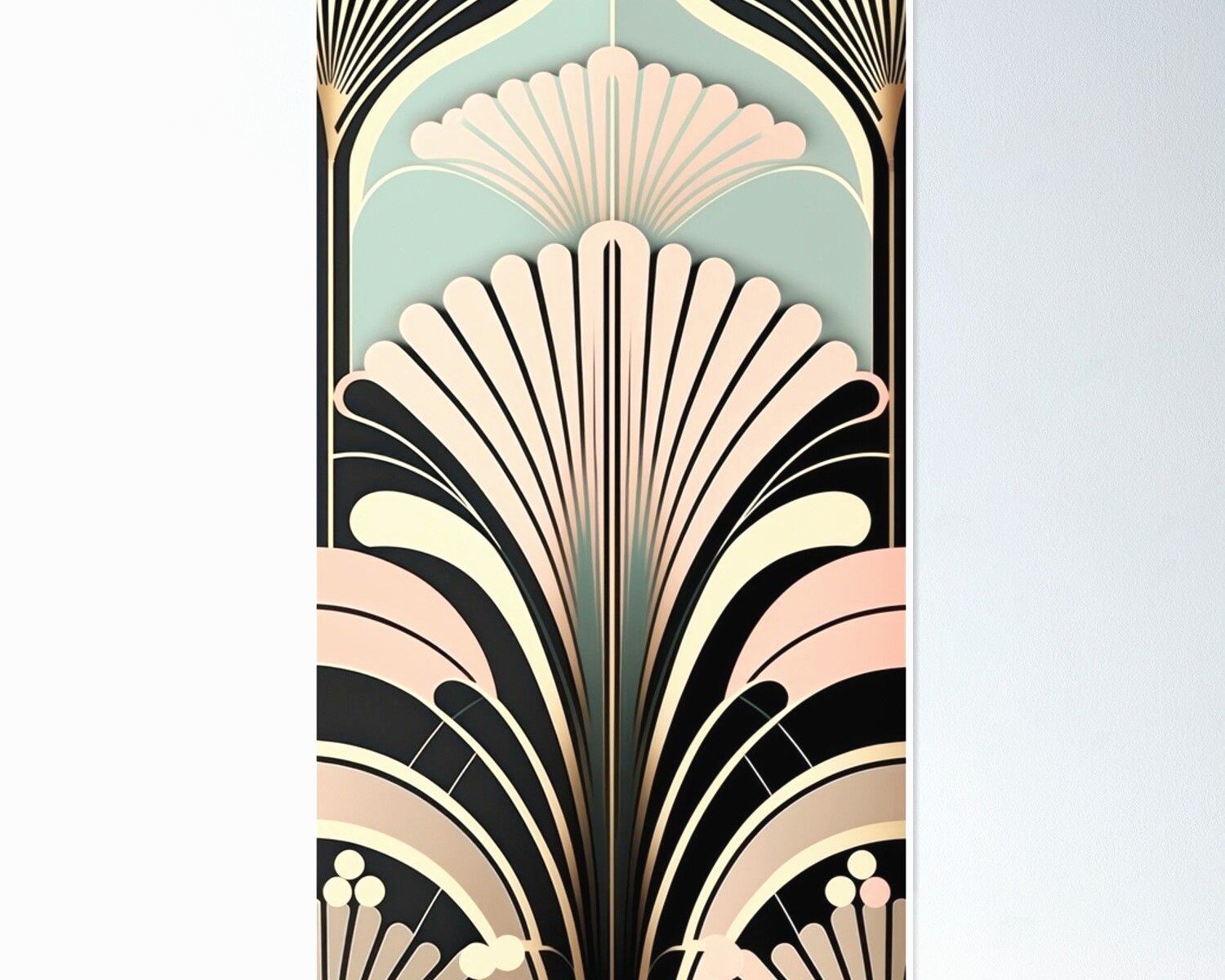
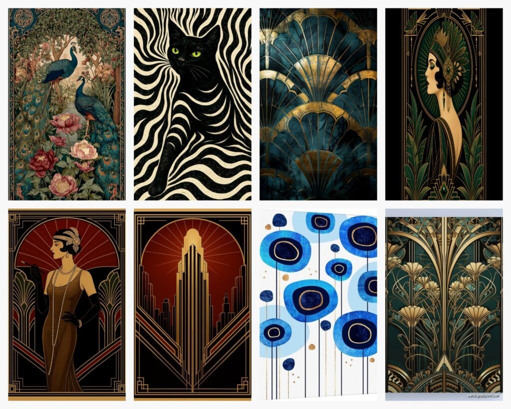
Okay so Art Deco wall art is all about those bold geometric shapes. We’re talking chevrons, zigzags, stepped forms, sunbursts, and fountain shapes. The color palette is super important too because you can’t just go pastel and expect it to work. Think gold, black, cream, deep emerald, navy, burgundy, and lots of metallic accents.
The scale matters way more than I thought it would. I bought this gorgeous print from an Etsy shop and it was like 8×10 and just completely disappeared on my dining room wall. Art Deco needs presence. You want pieces that are at least 16×20 for smaller walls, but honestly 24×36 or larger makes way more impact.
Where to Actually Find Good Pieces
I’ve tried everything from vintage shops to Amazon to custom commissions and here’s what’s worth your time. Etsy has amazing digital prints you can download and print yourself at Staples or wherever. Search for “Art Deco geometric print” or “1920s fan pattern” and filter by digital downloads. I found this seller called VintageWallArtPrints who has incredible stuff for like $8 and you can print it huge for way less than buying a finished piece.
For actual vintage posters, eBay is hit or miss but when you find something it’s usually authentic. Just be ready to spend $200+ for anything original from the era. I got a reproduction Cassandre poster for like $45 that looks completely authentic once it’s framed.
My Favorite Combinations That Actually Work
This is gonna sound weird but the best Art Deco wall arrangements I’ve done use odd numbers. Three pieces or five pieces arranged asymmetrically but with perfect symmetry within each piece. Does that make sense? Like the overall arrangement can be casual but each individual print needs that geometric precision.
I did my bedroom with three prints: a gold sunburst pattern in the center, a black and cream chevron on the left, and a teal geometric fan on the right. All different sizes but the same frame style. The frames are super important actually because cheap frames make even expensive art look bad. I use these simple black frames from Michael’s with a thin gold inner lip and they’re like $30 each but elevate everything.
Color Combos I Keep Coming Back To
- Gold and black with cream accents – this is classic and never looks dated
- Navy, emerald, and gold – feels rich without being overwhelming
- Black, white, and one jewel tone (I love burgundy) – modern but still authentic
- All metallics with geometric patterns in different finishes – this one’s risky but when it works it’s stunning
I tried doing an all-pastel Art Deco thing once and it just looked like… I dunno, a baby shower? Not the vibe. The era was about opulence and drama so you gotta commit to bold colors.
The Frame Situation Nobody Talks About
okay so funny story, I spent $200 on these custom gold frames thinking they’d be perfect and they were too shiny? Like they competed with the art instead of complementing it. Art Deco frames should be simple and geometric themselves. Think stepped profiles, black lacquer, or matte gold. Nothing ornate or curved.
My go-to is actually IKEA’s RIBBA frames in black. They’re cheap, they’re the right proportions, and you can spray paint the mat board gold if you want that authentic touch. I’ve done this like fifteen times now and it costs maybe $20 total per frame.
For larger pieces I use poster hangers – those magnetic wooden ones – in black or walnut. They give it a gallery feel that actually works better for geometric prints than traditional frames sometimes. Plus you can swap out prints easily when you get bored.
Matting Makes a Huge Difference
I never used to mat my prints because it seemed fussy but with Art Deco it’s actually essential. A wide mat in cream or black creates that breathing room the patterns need. I do 3-inch borders minimum, sometimes 4 inches for really busy geometric prints.
You can get custom mats cut at any frame shop but honestly I just buy pre-cut ones from Amazon in standard sizes and print my art to fit. Way cheaper and you can’t tell the difference once it’s on the wall.
Placement Tips That Aren’t Obvious
So everyone says hang art at eye level but with Art Deco I’ve found it works better slightly higher than you’d think. These designs were meant to be in grand spaces with high ceilings. In a regular apartment I hang the center of the piece at like 62-64 inches from the floor instead of the standard 57-60.
Living rooms are the obvious choice but I’ve had the most fun with unexpected placements. My bathroom has a small Art Deco fan print in gold and black and it makes getting ready feel fancy. Hallways are perfect for a series of matching geometric prints in a line – I did five 12×16 prints down a narrow hallway and it completely transformed the space.
Wait I forgot to mention – kitchens are tricky. The patterns can clash with cabinets and appliances unless you’re really intentional. I only do Art Deco in kitchens if they’re mostly white or black with minimal upper cabinets. Otherwise it’s too much visual noise.
DIY Options If You’re Into That
I’m not super crafty but I’ve made a few Art Deco pieces myself and they turned out better than expected. You can buy gold leaf sheets and apply them to canvas in geometric patterns using stencils. There are Art Deco stencils on Amazon for like $15 and gold leaf is surprisingly cheap if you get the imitation stuff.
My friend did this thing where she painted a canvas all black, let it dry, then used gold paint pens to draw geometric patterns freehand. It looked expensive and took her maybe two hours while watching TV. The key is using a ruler and planning your design first with pencil.
Digital Art and Printing
This is where I spend most of my money honestly. You can find amazing digital Art Deco prints on Creative Market, Etsy, and even free on sites like Rawpixel if you search their public domain collection. I download high-res files and print them at Costco or Nations Photo Lab.
For prints larger than 20×30 I use CanvasPop or Printique. Yeah it’s more expensive but the quality is noticeably better than drugstore printing. A 30×40 canvas print runs about $80-100 depending on sales.
The resolution matters more than you’d think. Always download the highest resolution available – you want at least 300 DPI at your final print size. I learned this the hard way when I printed a gorgeous geometric pattern at 24×36 and it came out pixelated because I grabbed the small file.
Mixing Art Deco With Other Styles
So you’d think Art Deco would be hard to mix but it’s actually super versatile if you’re strategic. I’ve paired it with mid-century modern furniture and it works because both styles love clean lines and geometric forms. The trick is keeping the color palette cohesive.
In my living room I have Art Deco prints on one wall and more organic abstract art on another and they work together because I stuck to black, gold, and cream throughout. If I’d introduced random colors it would’ve been chaos.
Contemporary minimalist spaces actually look amazing with one large Art Deco piece as a focal point. The contrast between the ornate pattern and the simple surroundings makes both stand out. I did this in a client’s all-white bedroom with a massive gold sunburst print and it completely made the room.
What Doesn’t Work
I’ve made plenty of mistakes so lemme save you some trouble. Don’t mix Art Deco with:
- Farmhouse/rustic stuff – the styles are too opposite and it just looks confused
- Too much pattern from other eras – one geometric style at a time please
- Overly feminine or shabby chic decor – Art Deco is sleek and sophisticated, not soft and romantic
- Super modern minimalism if you go too heavy on the Art Deco – one statement piece yes, an entire wall gallery no
Size and Scale Guidelines
This took me forever to figure out but there’s definitely a formula. For a standard 10-foot wall, you want your art or art grouping to take up about 2/3 to 3/4 of the wall width. So that’s like 6-7 feet of art horizontally.
Single large pieces: 30×40 or bigger for above a sofa, 24×36 for above a bed or console table, 16×20 minimum for any other wall
Gallery walls: I usually do 5-7 pieces in varying sizes but always include at least one large anchor piece that’s 24×36 or bigger. The others can be smaller but should all be Art Deco patterns that share at least two colors.
My cat knocked over a frame while I was arranging a gallery wall last week and honestly the random spacing where it fell looked better than my planned layout so sometimes just play around with it before committing.
Lighting Makes or Breaks It
Art Deco art needs good lighting to show off those geometric details and metallic accents. I use picture lights for important pieces – the LED ones from Amazon are like $35 and make such a difference. They’re battery operated so no wiring needed.
For gallery walls I prefer track lighting or adjustable spotlights that can highlight multiple pieces. Regular overhead lighting washes everything out and you lose the drama.
If you have gold or metallic elements in your art, warm white bulbs (2700-3000K) make them glow. Cool white light makes everything look flat and cheap. This seems minor but I’ve seen amazing art look terrible under the wrong lighting.
Budget Breakdown From My Experience
You can absolutely do this on a budget. Here’s what I spent for my dining room Art Deco wall:
Three digital prints from Etsy: $24 total
Printing at Costco (24×36 each): $45 total
IKBA frames and mats: $60 total
Picture hanging strips: $8
Total: $137 for a professional-looking gallery wall
Compare that to buying ready-made framed Art Deco prints which run like $150-300 EACH and you’re saving serious money. The only thing I splurge on is printing quality for my main focal pieces because pixelated geometric patterns are super obvious.
Maintaining and Updating
One thing I love about this style is you can easily swap pieces seasonally or when you get bored. I keep a rotation of prints and change them out every few months. The frames stay the same so it’s just swapping the art itself.
Clean glass regularly because dust shows up like crazy on black frames and behind glass. I use regular glass cleaner and microfiber cloths. Keep Art Deco prints out of direct sunlight because those bold colors will fade faster than you’d think – I learned this when a navy and gold print turned muddy purple after six months in a sunny window.
For canvas prints I use a soft dry cloth to dust them monthly. Don’t use any cleaners on canvas because it can damage the print surface.
Honestly the best part about Art Deco wall art is how much impact it has for relatively little effort. Once you nail the color palette and scale, everything else kinda falls into place. My apartment went from boring white walls to feeling like an actual designed space and people always comment on it when they visit.
Just start with one or two pieces and build from there. You don’t need a whole gallery wall right away and honestly it’s better to live with it for a bit before committing to a full arrangement anyway.