Wall Art Guide, Wall Art Tutoriels
Silver Abstract Wall Art: Metallic Modern Non-Representational
May
So I’ve been working with silver abstract pieces for like three years now and honestly the metallic trend isn’t going anywhere, which is great because I just convinced another client to invest in a massive piece for their dining room.
The thing about silver abstract art that nobody tells you is that it reads completely different depending on your lighting situation. I learned this the hard way when I hung this gorgeous brushed silver piece in a north-facing living room and it just looked… flat? Like all that beautiful dimension completely disappeared. You need either natural light from multiple angles or really good artificial lighting, and I mean REALLY good, not just your basic overhead fixture.
Getting the Scale Right Because Everyone Gets This Wrong
Okay so funny story, my dog knocked over my coffee while I was measuring wall space last week and I had this whole revelation about proportion. People always go too small with abstract art. Like they’ll have this massive blank wall and buy something that’s maybe 24×36 inches and wonder why it looks like a postage stamp floating in space.
For silver abstracts specifically you want to think bigger than you initially feel comfortable with. Over the sofa? You’re looking at minimum 60 inches wide, and honestly I usually push clients toward 72+ inches. The metallic finish needs surface area to do its thing, to catch light from different angles throughout the day. A small silver piece just looks like… a shiny blob from across the room.
I’ve got this formula I use: measure your wall width, multiply by 0.6, that’s roughly how wide your art should be. For a standard 10-foot wall that’s 72 inches of art. You can do one large piece or a diptych/triptych situation but don’t go smaller unless you’re creating a gallery wall and that’s a whole different conversation.
Finish Types and Why They Actually Matter
This is gonna sound weird but I keep samples of different metallic finishes in my car because I got tired of trying to explain the difference. You’ve got:
- Brushed silver – catches light softly, more subtle, works in bedrooms
- High-gloss metallic – super reflective, almost mirror-like, can be too much in small spaces
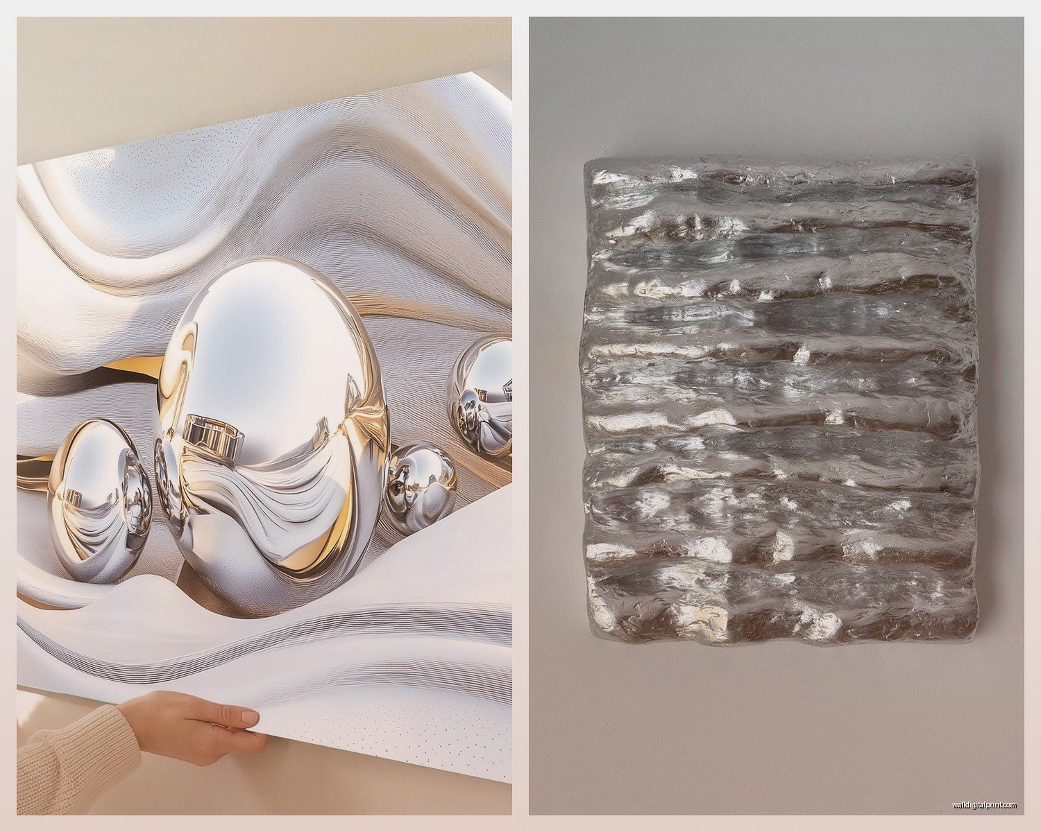
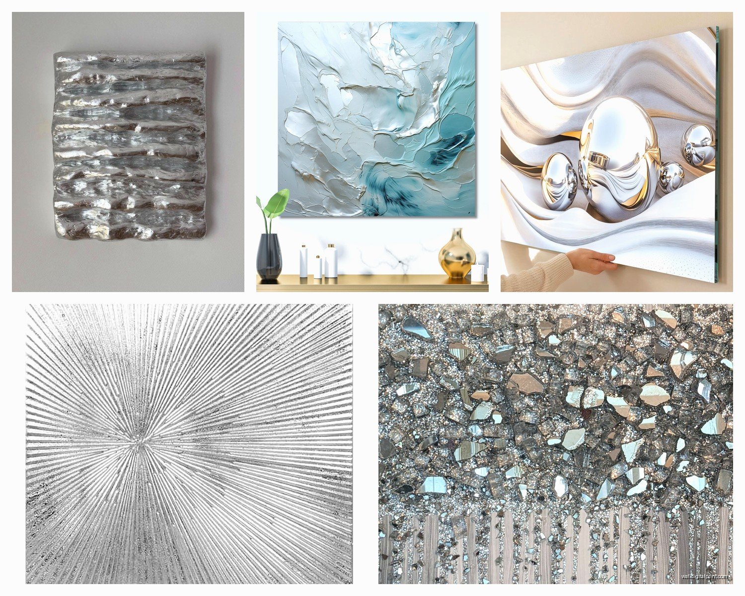
- Textured metallic – has actual dimension, my personal favorite for living rooms
- Patina/antiqued silver – has darker areas, more depth, feels less contemporary
- Mixed media with silver leaf – expensive but WOW the dimension
The brushed finish is the safest choice and I hate that I’m saying that because safe is boring, but it’s true. It works in like 90% of spaces. The high-gloss stuff is beautiful but you gotta be careful because it can create glare spots and if you have a TV in the room… just no. I made that mistake once and my client texted me a photo of their TV reflection bouncing off the art and it was bad.
Textured metallic is where I push most people because it gives you the best of both worlds. When light hits those ridges and valleys throughout the day it’s like the piece changes personality. Morning light, afternoon light, evening with lamps on – completely different vibes.
Color Combinations That Don’t Fight With Silver
Wait I forgot to mention this earlier – silver is NOT a neutral even though everyone treats it like one. It’s cool-toned and it has opinions about what colors it hangs out with.
Works beautifully with:
- Navy and charcoal gray – classic, sophisticated, very 2024
- Blush pink and soft coral – unexpected but the contrast is chef’s kiss
- Deep emerald or forest green – moody and elegant
- Black and white obviously but that’s almost too easy
- Warm cognac or caramel tones – the temperature contrast actually works
Fights with:
- Cool grays that are too similar in tone – everything just mushes together
- Bright primary colors unless you’re going for that specific ultra-modern look
- Yellow-based beiges – makes the silver look dirty somehow
- Too much other metallic in the same space – gold and silver together can work but it’s tricky
I had this client last month with these beautiful greige walls and they bought a silver abstract piece and it just… died on the wall. We ended up painting an accent wall in this deep charcoal blue and suddenly the silver came alive. Sometimes you gotta adjust the environment, not the art.
Room-by-Room Breakdown Because Context Is Everything
Living Room
This is where silver abstracts really shine, pun intended. You’ve got multiple light sources, people are viewing from different angles, it’s a space where you can go BOLD. I almost always recommend a large-scale piece above the sofa or on the main focal wall.
Pro tip that my mentor taught me – hang it so the center point is at eye level when you’re standing, not sitting. That’s usually around 57-60 inches from the floor to the center of the piece. Everyone hangs art too high and then wonders why their room feels off.
Layer your lighting – you want ambient overhead, task lighting for reading, and accent lighting on the art itself. I’m obsessed with picture lights right now, specifically the LED ones that don’t get hot. They create this gorgeous wash of light that really emphasizes the metallic elements.
Bedroom
Okay so bedrooms are tricky with silver because you don’t want anything too stimulating. I usually go for brushed or patina finishes here, nothing high-gloss. Above the bed is the obvious spot but I’ve been doing a lot of pieces on the wall opposite the bed lately – it’s what you see when you wake up and that first visual impression matters.
Keep the composition calm. Lots of movement and aggressive brushstrokes can feel too energetic for a sleep space. I look for pieces with flowing lines, softer abstraction, maybe some white or cream mixed in with the silver to keep it peaceful.
Dining Room
This is where you can get DRAMATIC. My client I mentioned earlier? We went with a 6-foot wide triptych in mixed silver and black, super textured, and it’s the first thing you see when you walk into their house. Dining rooms can handle bold because you’re not in there 24/7 staring at it.
Make sure it’s proportional to your table though. The art should be roughly the same width as your table or slightly wider. And consider what happens when people are seated – you don’t want something so visually busy that it competes with conversation.
Home Office
Silver abstracts in offices are having a moment because they feel professional but creative. Nothing too chaotic – you want something that suggests innovation without being distracting. I usually recommend pieces with geometric elements or clean lines rather than super expressive brushwork.
And please don’t hang it where it’ll create glare on your computer screen. I’ve had to move so many pieces because people don’t think about this until they’re squinting at their monitors all day.
The Actually Practical Stuff About Buying and Hanging
oh and another thing – framing matters way more than you think. Silver abstracts on canvas can work without frames if they’re gallery-wrapped (the image continues around the sides), but I almost always prefer a frame. It contains the piece, gives it weight, makes it feel more intentional.
Frame options:
- Thin black metal – contemporary, doesn’t compete with the silver
- Natural wood in walnut or oak – adds warmth, balances the cool metallic
- White or light wood – Scandinavian vibes, very clean
- Thick black or charcoal – gallery style, makes a statement
Skip silver or metallic frames. It’s too matchy and actually cheapens the look.
For hanging, if your piece is over 30 pounds you need two hanging points, not one. Use proper wall anchors if you’re not hitting studs. I’ve seen a $2000 piece crash down at 3am because someone used those cheap plastic anchors and it’s not a mistake you make twice.
The wire vs D-rings debate – I prefer D-rings with a level for anything large because wire can shift and then your piece is crooked and it’ll drive you insane. Gotta get a proper level though, not just eyeball it.
Where to Actually Find Good Pieces
This is where I probably sound like I’m scattered but there are so many sources now. I’ve been watching this show about art dealers while working and it’s made me think about value differently.
Online galleries – Saatchi Art, Artsy, Minted – good for browsing but the color accuracy on screens is terrible for metallics. Always request a return policy in writing.
Local galleries and art fairs – you can see the actual finish, the texture, how light hits it. Worth the time even if you end up buying online later.
Direct from artists – Instagram is actually amazing for this. Search hashtags like #silverabstractart #metallicpainting #contemporaryabstract. You can often commission custom sizes and negotiate prices.
Home decor stores – HomeGoods, West Elm, CB2 sometimes have decent pieces but they’re mass-produced. Fine for a starter piece but you’ll probably want to upgrade eventually.
I tell clients to budget at least $500 for something quality in a medium size (36×48 inches). Original art from emerging artists runs $800-2000 for that size. Established artists… sky’s the limit honestly.
Styling Around Your Silver Abstract
Don’t overthink this but also don’t underthink it? The art should be the star but it needs supporting actors.
Keep the wall mostly clear – maybe one small shelf or a console table below but don’t crowd it. Silver abstracts need breathing room.
Coordinate your accessories – pick up one or two colors from the piece and echo them in pillows, throws, vases. Not matchy-matchy but harmonious.
Add organic elements to balance the metallic – plants, wood, natural fiber textiles. Otherwise the room can feel cold and sterile.
Consider the sight lines from other rooms. If your silver piece is visible from the kitchen or hallway, make sure it makes sense in that context too.
The biggest mistake I see is people buying a gorgeous silver abstract and then surrounding it with a bunch of other art. Give it space. Let it be the moment on that wall. You can have other art in the room but not competing for attention on the same wall.
Also texture matters in the rest of the space – if your art is super smooth and glossy, add some rough linen or chunky knit textiles. If the art is heavily textured, keep your fabrics smoother. It’s about balance and I know that sounds vague but you’ll feel it when it’s right.