Wall Art Guide, Wall Art Tutoriels
Shadow Box Paper Wall Art: 3D Layered Frame Designs
Jun
So I’ve been obsessed with shadow box paper art lately and honestly it’s one of those things that looks way more complicated than it actually is. Like, I was scrolling Instagram at like midnight last week and saw this botanical one that I couldn’t stop thinking about, and now my studio has like three different projects going at once.
What You Actually Need to Get Started
Okay so first thing – you don’t need fancy equipment. I started with literally just:
- Cardstock in different weights (65lb and 110lb work great)
- An X-Acto knife or craft knife – get extra blades because dull ones will mess up your cuts
- Foam mounting tape or foam board pieces
- A cutting mat (don’t use your kitchen counter, learned that the hard way)
- Regular craft glue or a hot glue gun
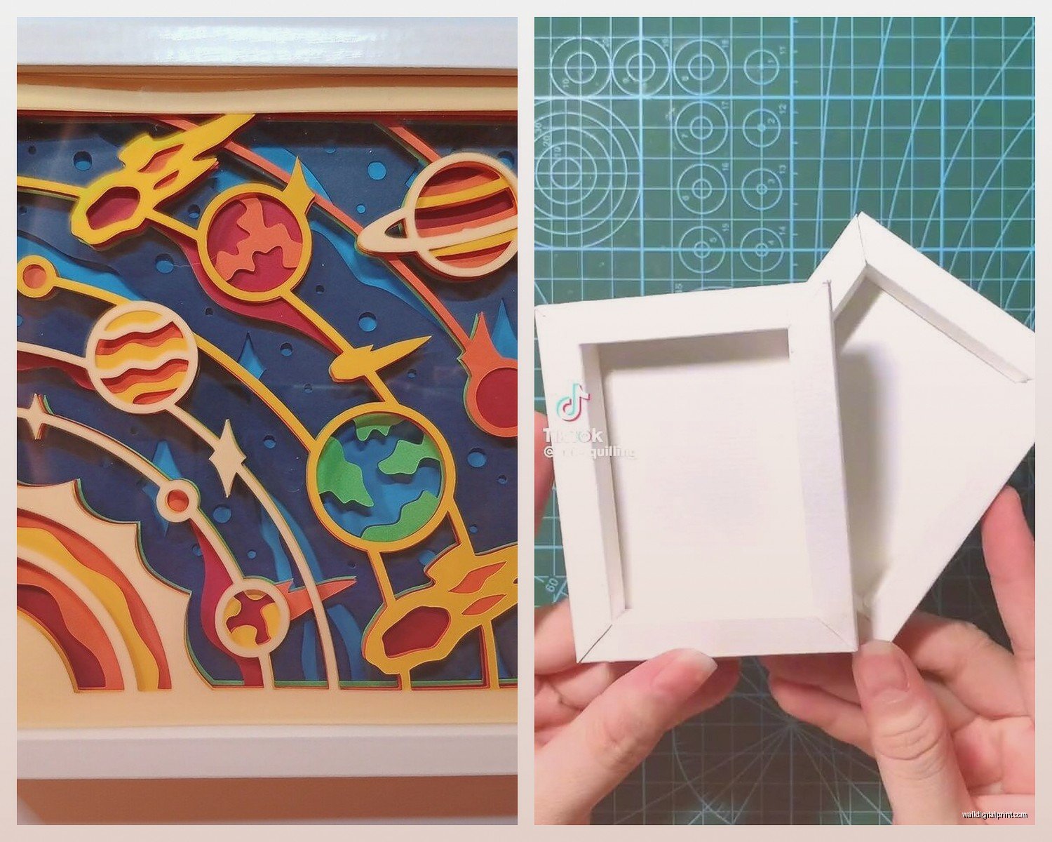
- Shadow box frame – IKEA has decent cheap ones or you can get deeper frames from Michael’s
The foam tape is really the secret sauce here. You want different thicknesses – like 1mm, 3mm, and 5mm so you can create actual depth between layers. I use the 3M stuff mostly but honestly the generic craft store brand works fine too.
Choosing Your Design
This is where people get stuck but like… just start simple. My first one was literally three leaf shapes in graduated sizes. Looked amazing and took maybe an hour total.
For paper colors, I tend to go monochromatic because it reads better from a distance. All blues, all greens, all neutrals. When you mix too many colors it can look kinda chaotic unless that’s specifically what you’re going for. There’s this etsy shop – wait I’m gonna find the name – okay I can’t remember but search “layered paper art templates” and you’ll find tons of SVG files you can use.
Oh and another thing, you can totally freehand draw your designs or trace them. I have a client who insists everything needs to be perfect and uses a Cricut to cut hers, but honestly hand-cut pieces have more character.
Scale Matters More Than You Think
Your shadow box depth determines how many layers you can realistically do. Most standard shadow boxes are like 1-2 inches deep. That means you’re looking at maybe 4-6 layers max before it gets too cramped. I made this mistake with a floral piece where I tried to do 8 layers in a shallow frame and it just looked… squished.
Deeper frames (3+ inches) give you way more freedom. You can create dramatic spacing between layers which is where the magic really happens.
The Actual Process
Alright so once you’ve got your design figured out – let’s say you’re doing a mountain landscape because that’s super beginner-friendly – here’s how I do it:
Layer Planning
Work backwards from what you want in front. So for mountains:
- Background layer – usually the sky, solid piece
- Distant mountains – lighter color
- Mid-range mountains – medium tone
- Foreground mountains – darkest
- Maybe some trees or details in the very front
Each layer needs to be slightly smaller than the one behind it, or at least designed so the back layers peek through in an intentional way. This is gonna sound weird but I actually photograph my layers on my phone before gluing anything down, just to make sure the composition works.
Cutting Tips
Use a fresh blade. Seriously, I change mine like every 30 minutes of cutting because once they get dull you start tearing the paper instead of slicing it cleanly.
Cut on a self-healing mat and always – always – cut away from your body. I have a scar on my thumb from being careless with this.
For curves, rotate the paper instead of the knife. Gives you way more control. And don’t try to cut through in one pass if you’re using thick cardstock. Multiple light passes are better than one heavy one where you might slip.
Creating the Depth
This is where foam tape comes in. I cut small squares or strips of the foam and place them on the BACK of each layer. You want the supports hidden when looking at the piece straight-on.
For the first layer (closest to the background), I use the thinnest foam – maybe 1mm. Then 3mm for the next layer, 5mm for the layer after that. Sometimes I stack foam pieces to get even more height.
The trick is to place the foam supports strategically. Put them where the layer above will hide them, or at least where they won’t cast weird shadows. My cat knocked over a piece I was working on last Tuesday and I had to redo all the foam placement because it shifted everything.
Assembly
I always work from back to front. Attach your background piece to the backing board of your shadow box first. Then add layer by layer, checking the positioning before you commit with glue.
Hot glue dries fast which is great if you’re impatient like me, but it can also string and look messy. White craft glue takes longer but dries clear. Pick your poison.
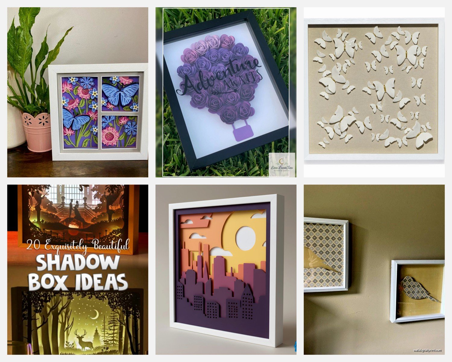
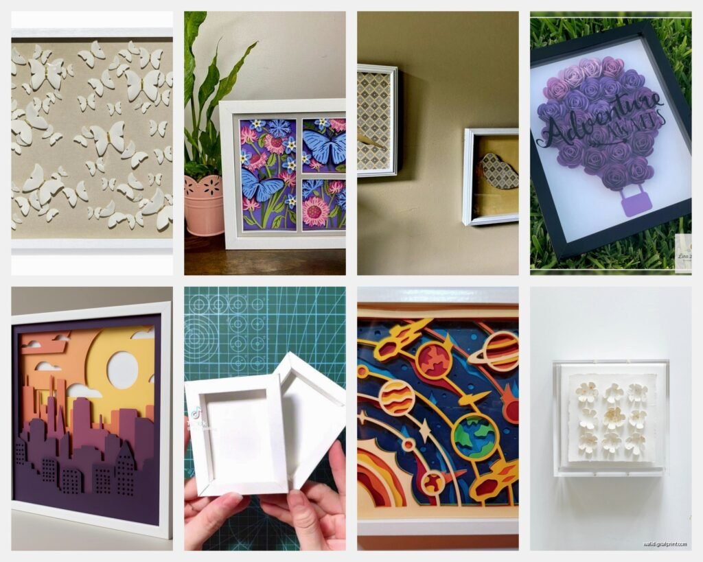
Design Ideas That Actually Work
Okay so beyond the basic mountains and florals, here’s what I’ve done that turned out really well:
Botanical studies – Single leaf or flower with like 5-6 layers showing the different parts. Looks scientific and modern. Use actual botanical prints as reference.
Geometric patterns – Overlapping circles or hexagons in graduated sizes. Super easy to measure and cut, looks expensive.
Cityscapes – Building silhouettes in layers. The skyline in back, mid-rise buildings in middle, details in front. Works great in all black or navy blue.
Abstract waves – Organic flowing shapes that overlap. This is actually the most forgiving because there’s no “right” way to do it.
Color Combinations I Keep Coming Back To
- Cream, tan, terracotta, rust – very warm and organic
- Navy, slate blue, pale blue, white – coastal vibes
- Forest green, sage, olive, cream – botanical look
- All white or cream with just texture differences – super minimalist
- Black on white or white on black – dramatic and graphic
The monochrome ones photograph the best if you’re planning to post them anywhere, btw.
Common Problems and Fixes
Shadows look weird: This happens when your foam supports are too close to the edges or unevenly distributed. Move them more toward the center of each piece.
Layers won’t stay put: You need more adhesive or heavier foam tape. Sometimes the paper weight is too heavy for thin foam.
Can see the foam from the side: Either use thinner foam or paint the edges of your foam the same color as your paper. I keep a set of cheap acrylic paints just for this.
Design looks flat even with layers: Increase the spacing between layers. Sometimes going from 2mm to 5mm makes all the difference.
Paper warping: Usually means moisture or humidity issues. Store your paper flat and in a dry place. Also some cheaper cardstock just warps no matter what – invest in better paper.
Framing and Display
The frame you choose matters almost as much as the art itself. I usually go for simple black or natural wood frames because they don’t compete with the dimensional aspect of the piece.
Make sure your frame has glass or acrylic front – this protects everything and prevents dust from settling between layers. Some people leave them open but then you’re gonna be dusting between layers forever which sounds like a nightmare.
For hanging, treat these like regular frames but be aware they’re deeper and sometimes heavier than expected. Use appropriate wall anchors if you’re not hitting a stud.
Lighting Considerations
This is something I didn’t think about until I installed one in my own place – the lighting totally changes how these look. Side lighting (like from a window) creates dramatic shadows between layers which can be gorgeous or distracting depending on the design.
Direct overhead lighting flattens everything out. I prefer a slight angle, like a picture light mounted above the frame or track lighting aimed at it from about 30 degrees.
Time Investment
A simple 4-layer design in an 8×10 frame takes me maybe 2-3 hours start to finish including planning. More complex pieces with intricate cuts or 6+ layers can take a full day. The cutting is what eats up time – assembly goes pretty quick once everything’s cut.
Wait I forgot to mention – if you mess up a layer, don’t throw it out immediately. Sometimes you can incorporate the mistake into a different design or use it as a template. I have a whole folder of “failed” cutouts that I reference.
Where to Find Inspiration
Pinterest obviously, but also look at actual paper cut artists on Instagram. People like Bovey Lee or Nahoko Kojima do insane intricate work that’ll make you rethink what’s possible with paper.
Museum gift shops have surprisingly good examples too – they sell a lot of botanical prints and nature studies that translate perfectly to layered paper art.
And honestly sometimes I just look at regular photographs and think about how I could simplify them into 4-5 distinct layers. That sunset photo from your vacation? Could be a layered piece. That close-up of a succulent? Definitely layerable.
The show I was watching last night – some nature documentary – had this shot of mountains with fog layers between them and I literally paused it to sketch out a design. So inspiration is kinda everywhere once you start looking at things through that lens.
Anyway, start with something simple, don’t overthink the first one, and remember that even if it’s not perfect it’ll still look pretty cool because the 3D aspect does a lot of heavy lifting. My first attempt had wonky cuts and uneven spacing and people still asked where I bought it.