Wall Art Guide, Wall Art Tutoriels
Krishna Wall Art: Hindu Deity Art & Spiritual Decor

Jun
So I’ve been working with Krishna art for years now and honestly it’s one of those things where people get super overwhelmed because there’s SO much symbolism and you don’t wanna mess it up, right? Like my client last week was literally frozen in the store because she didn’t know if putting Krishna in her bedroom was disrespectful or whatever.
First thing – location matters way more than most people think. I always tell people to avoid bathrooms and laundry rooms because that’s just basic respect for deity art, but also your entryway is actually amazing for Krishna pieces. The whole welcoming energy thing is real, and I’ve noticed guests literally pause and comment on the art when it’s the first thing they see. Living rooms are obviously the safe choice, and meditation spaces or home offices work really well too.
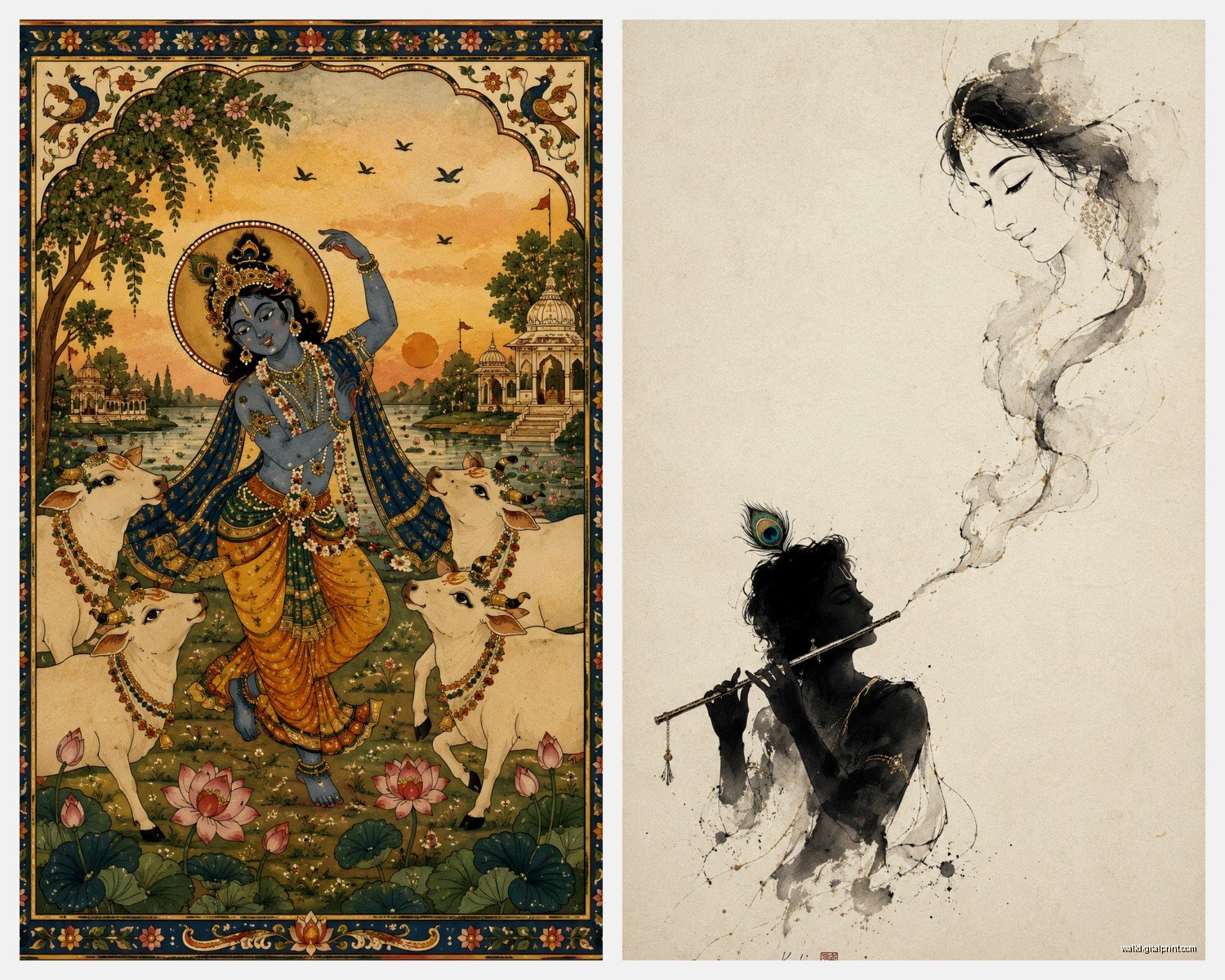
Now about the different depictions because this gets confusing fast. You’ve got baby Krishna (Bal Krishna) which is super popular and honestly less intimidating if you’re new to Hindu art. Then there’s Krishna with the flute which is probably what most people picture – that one works everywhere, super versatile. Krishna and Radha together is more romantic and I usually suggest that for bedrooms or couple’s spaces. And then you’ve got the whole Bhagavad Gita warrior Krishna on a chariot which is more intense and honestly works better in offices or study areas where you want that decisive energy.
The art styles are gonna make your head spin though. Traditional Tanjore paintings with actual gold leaf and gems – these are investment pieces and they’re HEAVY. Like you need proper wall anchors, don’t just use those command strips. I learned that the hard way when a client’s piece crashed at 3am and her cat absolutely lost it. Madhubani folk art is more affordable and has this gorgeous geometric vibe that works with modern spaces surprisingly well. Pichwai paintings are these elaborate temple hangings from Rajasthan and they’re detailed as hell, usually showing Krishna with cows in Vrindavan.
For modern spaces and this is gonna sound weird but hear me out – you can totally mix contemporary Krishna art with minimalist decor. I did this whole thing last month where we used a simple line drawing of Krishna in gold foil on white canvas and it looked insane next to mid-century modern furniture. The key is not overthinking the “it has to look traditionally Indian” thing. Blue and gold are Krishna’s colors so if your space already has those tones you’re golden.
Size matters more than people realize. Small pieces (like 12×16 inches) get lost on big walls unless you’re doing a gallery wall situation. Medium pieces around 24×36 inches are the sweet spot for most living rooms. And if you’re going big – like 4 feet or larger – you better have the wall space and the ceiling height or it’ll overwhelm everything. I saw someone put a massive Krishna painting in a room with 7-foot ceilings once and it just felt cramped and wrong.
Oh and another thing about frames – if you’re buying traditional art it probably already comes in an ornate frame which is great but those frames are LOUD. They need breathing room on the wall, so don’t crowd them with other art pieces too close. For contemporary Krishna art you can get away with simple black or gold frames. I’m obsessed with floating frames for canvas prints right now, gives it this gallery feel without being too precious about it.
Lighting is where people mess up constantly. You want soft warm lighting on Krishna art, not harsh white LEDs that wash out all the colors. Picture lights are worth the investment if you’re serious about displaying the piece properly. I use those little battery-operated ones sometimes for clients who don’t wanna deal with electricians. Natural light is tricky because you don’t want direct sunlight fading the colors over time, especially on prints or paintings that aren’t UV protected.
Color coordination… okay so Krishna is almost always depicted with blue skin which actually works with way more color schemes than you’d think. If your room is neutral (grays, whites, beiges) the blue becomes this gorgeous pop of color. If you’ve got warmer tones like terracotta or rust, the traditional orange and red elements in Krishna art tie everything together. I did a room last year with dusty pink walls and a Krishna painting and everyone thought I was crazy but the gold accents in the art pulled the whole thing together.
Wait I forgot to mention – if you’re buying online which let’s be real most people are now, you gotta zoom in on those product photos. Check the reviews for actual photos from buyers because the professional shots can be super misleading about color accuracy. I’ve returned probably a dozen pieces because the blue looked completely different in person. Also check if it’s a print, a canvas, or an actual painting because the descriptions can be sketchy. “Hand-embellished” usually means it’s a print with some paint dabbed on top which is fine but know what you’re paying for.
The whole spiritual aspect – some people are really strict about this and some aren’t. If you’re gonna be traditional about it, you might want to keep the art at eye level or higher (definitely not on the floor or low on the wall). Some people like to put a small shelf underneath for offerings like flowers or incense, which actually looks really beautiful design-wise even if you’re not religious. Creates this little vignette moment.
Mixing Krishna art with other pieces is totally doable but you gotta be thoughtful. I usually don’t mix different Hindu deities on the same wall unless it’s specifically a spiritual gallery wall. But mixing Krishna art with nature photography, abstract art, or even family photos can work if you’re careful with the arrangement. The trick is treating the Krishna piece as the anchor and building around it.
For renters or people who don’t wanna put holes in walls – there are options. Leaning a large framed piece on a console table or credenza looks intentional if you do it right. Those picture ledges from IKEA work for smaller pieces. And I’ve used easel stands for medium-sized framed prints which gives this casual studio vibe.
Budget stuff because not everyone can drop $500 on original art. Etsy has tons of affordable prints, just filter by seller location if you want to support artists in India specifically. Society6 and Redbubble have Krishna designs on everything from canvas to tapestries. Speaking of tapestries – they’re actually a great option for large wall coverage on a budget and they’re way easier to hang than framed art. I used a Krishna tapestry in a college student’s dorm room once and it completely transformed the space for like forty bucks.
The symbolism is something you might wanna know even if you’re just into it aesthetically. The flute represents the call of the divine, the peacock feather in his crown is about beauty and pride, the cows are sacred and represent abundance. The blue skin has all these interpretations but basically represents the infinite like the ocean or sky. If you’re having people over who know about this stuff it’s kinda nice to understand what you’re displaying.
This is gonna sound random but I was watching this documentary while installing a Krishna piece last week and it made me think – the art you choose really does set the mood of a room. Playful baby Krishna makes a space feel lighter and more joyful. Krishna and Radha together creates this romantic intimate energy. Warrior Krishna from the Bhagavad Gita feels more powerful and grounding. So think about what energy you actually want in that specific room.
Maintenance is super easy unless you’ve got one of those traditional pieces with actual gems and stones. Regular dusting with a soft cloth, keep it away from moisture and humidity. If you’ve got a canvas print you can use those gentle art cleaning wipes. For glass-covered frames just regular glass cleaner works but don’t spray directly on the frame, spray on your cloth first.
One thing I see all the time is people buying Krishna art that’s too ornate or detailed for their space and it ends up looking cluttered. If your room already has a lot going on – patterned rugs, busy furniture, lots of decor – go for simpler Krishna art with clean lines. Save the super detailed Pichwai or Tanjore paintings for rooms that are more minimal where the art can really be the star.
The color of your walls matters too. Krishna art on white walls can look too stark sometimes, I actually prefer off-white or cream backgrounds. Darker walls like navy or charcoal make the gold elements really pop but can make the blue skin tones harder to see. I did a dusty sage wall once with a Krishna painting and it was *chef’s kiss* – the whole nature connection thing with Vrindavan just worked.
Oh and if you’re gonna do a gallery wall with Krishna art as part of it, make sure it’s the largest piece or the most centrally positioned one. You don’t want it competing for attention or looking like an afterthought. I usually build the gallery wall around the Krishna piece, keeping everything else more neutral or complementary.
For kids’ rooms baby Krishna is obviously the way to go. It’s playful, the stories are fun (butter thief Krishna is super popular), and it’s less formal than other depictions. Plus kids actually respond to the colors and the whole chubby baby god thing is adorable without being overly precious.
Last thing I guess – don’t be afraid of this art if you’re not Hindu. I mean be respectful obviously, but appreciating the artistry and the symbolism is totally valid. Just maybe educate yourself a bit about what you’re displaying and treat it with respect. And if you’re hosting people who are Hindu, they’ll probably appreciate that you have it and that you bothered to place it thoughtfully rather than just slapping it up anywhere.