Wall Art Guide, Wall Art Tutoriels
James Bond Wall Art: 007 Movie Posters & Spy Decor
Jun
So I’ve been obsessed with James Bond decor lately and honestly it started because a client wanted to turn their basement into this whole spy den situation, and now I can’t stop finding cool pieces everywhere. Let me tell you what actually works versus what looks cheap and tacky.
The Poster Quality Thing Nobody Talks About
Okay so first thing – you gotta decide if you want original vintage posters or reproductions because this changes everything. Original posters from like Goldfinger or Dr. No can run you thousands, and honestly unless you’re a serious collector or have money to burn, reproductions are totally fine. But here’s the catch – the quality varies SO much.
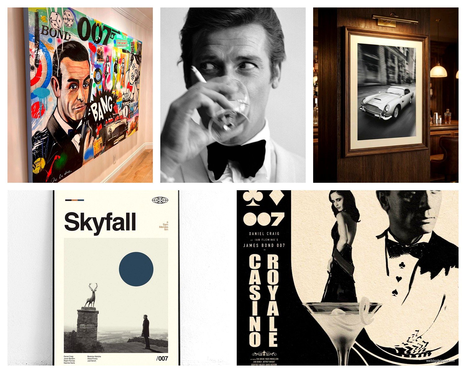
I tested a bunch from different sellers on Etsy and Amazon and the difference is wild. The cheap ones (under $15) always have this weird pixelated thing going on, especially on Sean Connery’s face which is just… no. The mid-range ones around $30-50 are usually printed on decent paper stock and the colors actually pop. I found this seller called VintageMovieShop on Etsy who does museum-quality giclée prints and they’re stunning. Worth the extra $20.
Framing Makes or Breaks It
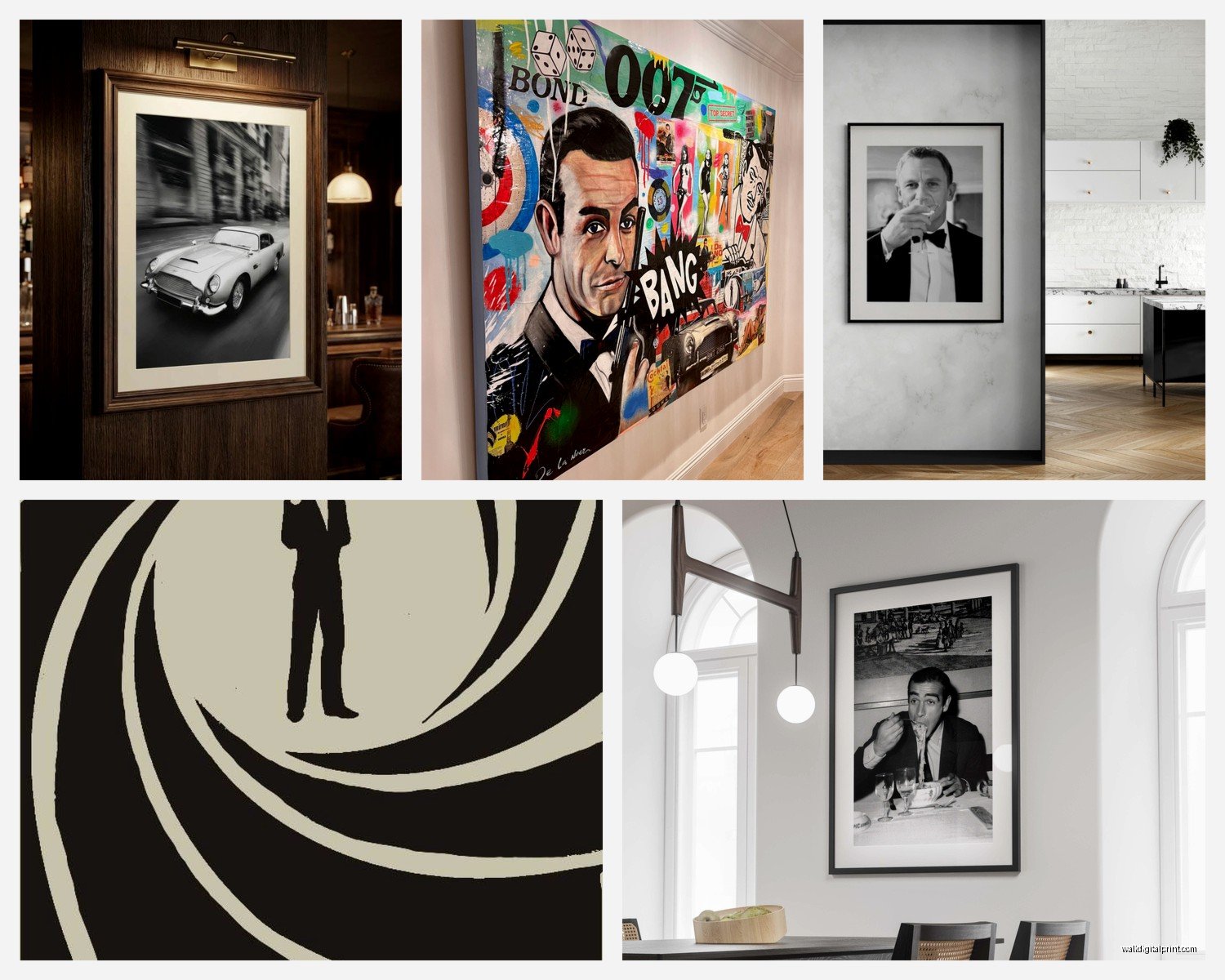
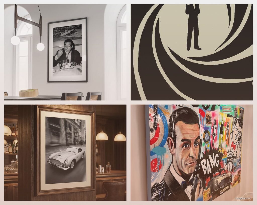
Don’t just stick a poster in a basic black frame from Target. I mean you can, but it’s gonna look like a college dorm. What actually works is getting thin metal frames in brass or matte black – the thin profile makes the poster feel more expensive and gallery-like. I got a set from Framebridge for my own apartment (the Casino Royale poster, Daniel Craig in the ocean, you know the one) and people always think it cost way more than it did.
If you’re doing multiple posters, which honestly is the move, keep the frames identical. I made the mistake once of mixing gold and silver frames thinking it would look eclectic and it just looked messy.
Which Movies Actually Look Good on Your Wall
Not all Bond posters are created equal for home decor. Some are iconic but the color schemes are just weird for actual living spaces. Here’s what I’ve found works:
- Casino Royale – the minimalist ones with Daniel Craig are super versatile, work in modern spaces
- Goldfinger – classic, the gold and black color scheme is chef’s kiss
- Skyfall – moody, works well in darker rooms or offices
- From Russia With Love – vintage charm without being too retro
- The Spy Who Loved Me – that ski jump image is actually really striking
The ones I’d skip for decor purposes: Octopussy (the name alone makes it awkward), Die Another Day (the poster design is just not great), and honestly most of the Roger Moore era except Spy Who Loved Me because the typography tends to be too busy.
Beyond Posters Because There’s So Much Cool Stuff
Wait I forgot to mention – you don’t have to do just movie posters. I’ve been collecting Bond-adjacent pieces and it’s way more interesting than just a gallery wall of poster reproductions.
There’s this artist on Society6 who does these minimalist prints of Bond gadgets – the Aston Martin, the Walther PPK, the watch – in like simple line drawings and they’re perfect for a home office. My cat knocked one off the wall last week and I was so mad because the frame cracked, but the print was fine at least.
The Aston Martin Situation
Okay so funny story, I spent three hours one night comparing different Aston Martin DB5 prints because my client wanted one for his garage. The photography-based ones are hit or miss – some look too much like car advertisements. What actually works better are the illustrated versions or the technical blueprint style drawings. There’s a seller called Rear View Prints who does these vintage-style technical drawings that look expensive and sophisticated.
You can also find actual vintage Aston Martin advertisements from the 60s and those have this cool Mad Men vibe that works if your space leans mid-century modern.
Creating a Gallery Wall Without Looking Like a Theater Lobby
This is where people usually mess up. They get too literal with it and suddenly their living room looks like the inside of a movie theater. Here’s what actually works:
Mix sizes intentionally. Don’t do all the same size posters in a grid – it’s boring and feels too corporate. I usually do one large statement piece (like 24×36) and then surround it with smaller 11×17 or 16×20 prints. The asymmetry makes it feel more curated.
The Rule I Always Follow
Keep it to one era or stick with one Bond actor if you’re doing a concentrated space. Mixing Sean Connery and Daniel Craig can work if you’re going for a timeline thing, but having Roger Moore next to Timothy Dalton just looks confused. Pick a vibe and commit.
Also – and this is gonna sound weird but – consider black and white prints even if the original posters were in color. I did this in my own place with a Skyfall poster and it looks so much more sophisticated than the blue-tinted original. Makes it feel more like art and less like movie merch.
The Spy Decor That’s Not Posters
Oh and another thing, there’s a whole world of Bond-themed decor that’s way more subtle than posters. If you want the vibe without being too on-the-nose:
- Vintage cocktail shaker sets – very Bond, very functional
- Globe bars (I found one at HomeGoods that’s perfect)
- Leather desk accessories in the British racing green color
- Those old-school rotary phones as decorative pieces
- Vintage suitcase stacks – very international spy vibes
I’ve been seeing a lot of neon signs lately that say stuff like “Shaken Not Stirred” or just “007” and honestly they can work in a bar area or game room but they lean more novelty. Gotta be careful with those.
The License Plate Thing
Okay so there are replica Aston Martin license plates everywhere online and some look incredibly cheap. The metal ones are better than plastic obviously, but even then, mounting it randomly on a wall looks kind of college apartment-ish. What I’ve seen work really well is incorporating it into a larger vignette – like on a bar cart with some vintage decanters, or in a garage workspace where it makes sense contextually.
Where to Actually Buy This Stuff
I’ve ordered from literally dozens of places at this point so here’s the breakdown:
Etsy – best for unique prints and vintage-style reproductions. Quality varies wildly so always check reviews and ask for print samples if you’re ordering multiples. Shipping takes forever sometimes but you find stuff you won’t see anywhere else.
AllPosters.com – huge selection, decent quality, sales constantly. The framing options are meh but the prints themselves are solid for the price.
Redbubble/Society6 – great for modern interpretations and minimalist designs. I love these for offices or more contemporary spaces. Print quality is consistently good.
eBay – if you want actual vintage posters, this is where you hunt. But you really gotta know what you’re looking for because there are SO many fakes. I almost bought a “vintage” Thunderball poster that was obviously printed last year.
Amazon – honestly skip it for posters. The quality is all over the place and you can’t really tell what you’re getting. I’ve been burned too many times.
The Layout Strategy That Actually Works
I always map it out on the floor first before putting holes in the wall. Sounds basic but I can’t tell you how many times I’ve seen people just start hammering nails and then everything’s crooked and unbalanced.
For a classic gallery wall, I do the largest piece first at eye level (which is like 57-60 inches from the floor to the center of the frame), then build around it. Keep spacing consistent – I use 2-3 inches between frames usually.
If you’re doing a horizontal arrangement above a couch or console table, leave about 6-8 inches between the furniture and the bottom of the lowest frame. Too high and it feels disconnected from the space.
The Lighting Nobody Remembers
This is gonna make such a difference and people always forget about it. Picture lights or even just some well-placed track lighting makes your posters look intentional instead of random. I installed these battery-operated LED picture lights from Amazon (the ones with the remote) and they completely transformed how the posters looked. Suddenly they felt like actual art.
If you have the budget, those thin gallery lights that mount above frames are worth it. They’re like $40-60 each but the effect is so good.
The Color Scheme Consideration
Bond posters tend to have strong color palettes – lots of blues, blacks, golds, reds. You gotta think about how that plays with your existing room colors. I did a consultation where someone wanted to put a bunch of bright orange and yellow Roger Moore posters in a room with sage green walls and it was… a lot.
If your space is neutral (grays, whites, beiges), you have more freedom. The posters become the color moment. But if you’ve got colored walls or bold furniture, stick with more monochromatic poster choices or black and white prints.
The Unexpected Spaces
Everyone thinks living room or home theater, but I’ve done Bond decor in some unexpected spots that really worked:
Bathrooms – hear me out, a small framed Bond poster in a powder room is actually kinda fun and unexpected. Keep it small and classy though.
Walk-in closets – if you have the space, this is very dressing room at MI6 vibes. One or two small frames near a mirror.
Hallways – perfect for a mini gallery wall since you’re just passing through anyway. Can go bolder here.
Home offices – obviously great for this, especially the more minimalist modern Bond imagery.
I’m literally watching Skyfall right now while writing this and just remembered – there are some really beautiful Shanghai skyline shots from that movie that work as standalone art prints even if someone doesn’t know they’re from Bond. That’s the sweet spot, when the decor works on its own merit.
What to Avoid Because I’ve Seen It Go Wrong
Okay real talk, some things just don’t work:
- Fathead-style wall decals – they look cheap and damage walls
- Foam board mounting – warps over time and looks amateur
- Too many text-heavy posters – visual overload
- Mixing Bond with other spy franchises – commit to one universe
- Anything with Roger Moore in that safari suit – just trust me on this one
The biggest mistake I see is people going too theme-park with it. Like every single thing screams JAMES BOND and it becomes too much. The best Bond-inspired spaces have subtlety. A few choice pieces mixed with complementary decor that supports the aesthetic without hitting you over the head with it.
Keep metallics in the room – brass, chrome, brushed nickel. These support the sophisticated spy vibe. Add in some leather, dark woods, maybe a bar cart situation. Crystal decanters are very Bond. The posters should feel like they belong in this larger aesthetic ecosystem rather than just being randomly slapped on a wall.
Also consider scale – one really large, museum-quality print often has more impact than five mediocre smaller ones. I’d rather save up for one incredible Goldfinger poster than buy a bunch of cheap prints all at once.