Wall Art Guide, Wall Art Tutoriels
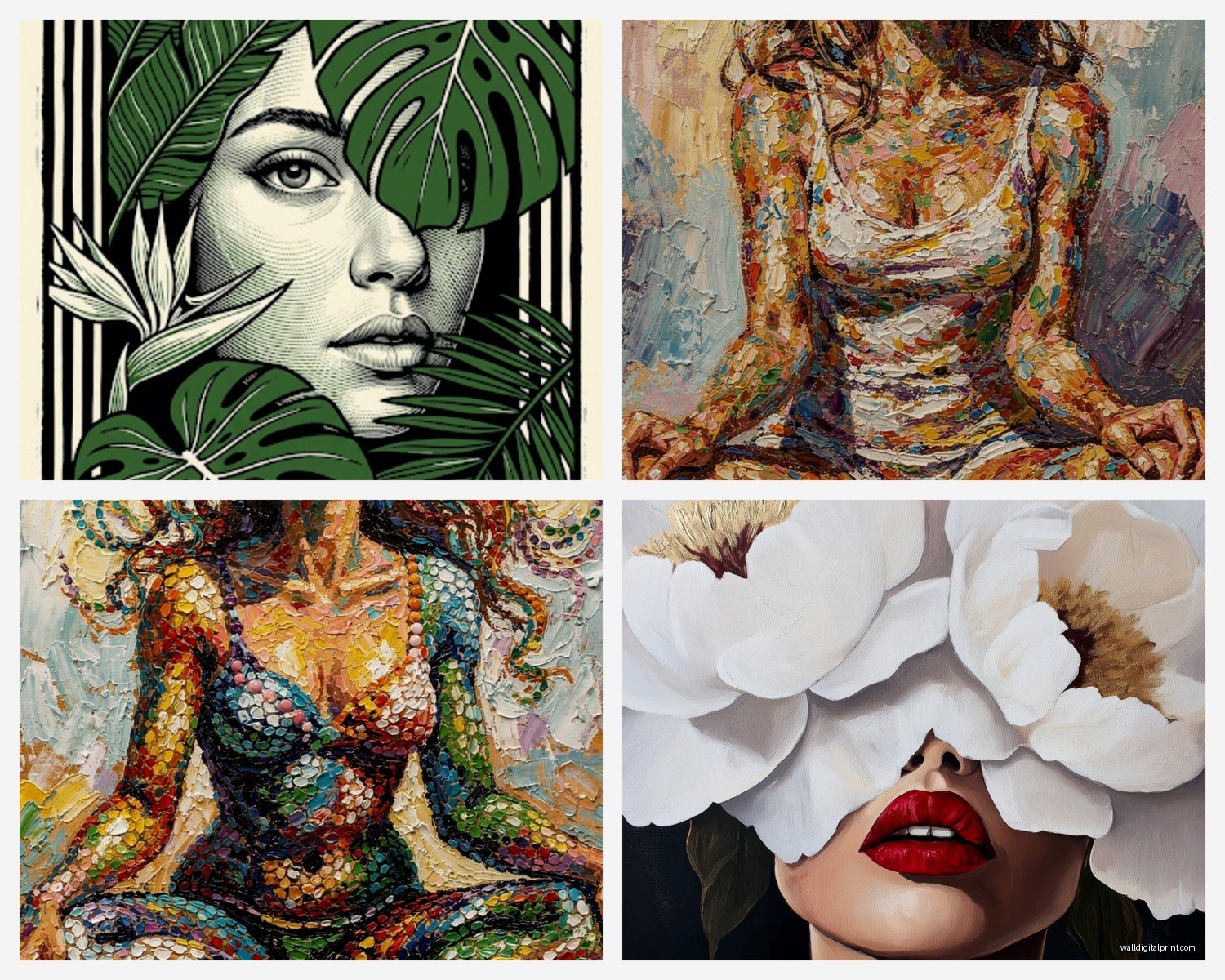
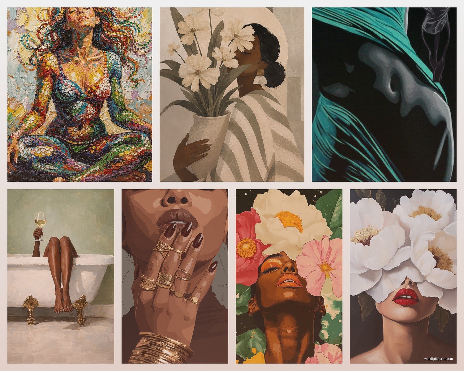
Female Wall Art: Feminine Figure Art & Women Portraits

Jun
So I’ve been styling women’s portrait art in client homes for like six years now and honestly it’s one of those things where everyone gets it wrong at first because they think just slapping up any feminine figure piece will work and… it really doesn’t.
Let me just dump everything I know because my friend texted me this exact question last week at like 11pm and I ended up sending her a voice memo that was basically 20 minutes long.
Size Actually Matters More Than You Think
Okay so the biggest mistake I see is people buying these tiny 16×20 prints and wondering why their bedroom feels blah. For female portrait art specifically, you want to go bigger than you think. I usually tell people to measure their wall space and then get something that fills about two-thirds to three-quarters of it.
Like in a bedroom above your bed, you’re looking at minimum 36×48 inches if you have a queen bed. King bed? Go 48×60 or even larger. I did this install last month where the client insisted on a small print and we had to redo it because it just looked like a postage stamp floating on this massive wall.
The exception is if you’re doing a gallery wall situation, which… we’ll get to that because it’s a whole thing.
Living Room vs Bedroom Placement
Living rooms can handle more abstract feminine figures or edgier portraits. I’m talking about the line art stuff, the faceless women, those moody black and white photography pieces. Your living room gets more foot traffic and different types of guests so you want something that feels confident but not too intimate.
Bedrooms though? This is where you can go softer, more vulnerable, more personal. I have this one client who has a watercolor nude portrait above her bed that would NOT work in her living room but in her bedroom it’s perfect because that’s her private space.
Color Coordination Without Being Matchy-Matchy
Here’s what I do and it’s gonna sound overly simple but it works every time. Take a photo of your room on your phone. Pull up the portrait art you’re considering. Put them side by side in your photos. Do you see at least TWO colors that overlap? Not exact matches, just in the same family?
If yes, you’re probably good. If no, you’re gonna need to add bridge elements.
Bridge elements are like… throw pillows, a vase, a blanket, whatever pulls the colors together. I did this room last fall where we had these gorgeous terracotta and cream tones in the space but the client loved this portrait with cool blue undertones. We added two blue velvet pillows and suddenly the whole thing worked.
Oh and another thing – black and white portraits are NOT easier. Everyone thinks they are because “oh it goes with everything” but actually they can look really stark and cold if your room has warm wood tones and soft textures. You gotta balance it out with the frame choice and surrounding decor.
Frame Selection Is Half The Battle
Natural wood frames work with almost any feminine portrait style. I default to oak or walnut depending on whether the room skews light or dark.
Black frames make things feel more gallery-like and modern but they can also make the art feel more serious? Like if you have a playful line drawing of a woman’s silhouette, a chunky black frame might kill the vibe.
White or cream frames are great for maximalist spaces or when you want the art to feel dreamy and soft. I use these a lot in bedrooms with romantic vibes.
Gold frames… okay so gold frames are tricky with female portraits because they can veer into boudoir territory really fast. Not that there’s anything wrong with that but you gotta commit to it. Half-assing a gold frame situation makes it look like you’re trying too hard.
Gallery Walls With Female Portraits
Wait I forgot to mention this earlier but if you’re doing a gallery wall, you need an odd number of pieces. Three, five, seven. Even numbers look too symmetrical and formal unless you’re going for a very specific grid situation.
I usually do one large focal portrait (like 24×36) and then surround it with smaller complementary pieces. Mix in some abstract shapes, maybe a plant print, something textural. All female portraits all the time can feel like… I dunno, too theme-y? Unless that’s specifically what you want.
My cat just knocked over my coffee so give me a sec
Okay back. So for gallery walls, keep all your frames the same color. This is the ONE time I’m gonna tell you to be matchy because otherwise it looks chaotic. And use the same mat thickness if you’re matting them – usually 2 inches works well.
Style Matching Your Actual Life
This is gonna sound weird but the portrait style should match how you actually live in the space. Like if you’re someone who leaves books everywhere and has plants on every surface and it’s cozy chaos, a super minimalist line drawing of a woman’s face might feel off. You’d want something with more texture, maybe a mixed media piece or an impressionist portrait.
If your space is clean lines and everything has a place, then yeah, go for those simple feminine silhouettes or abstract figure art.
I had this client who bought this really ornate classical female portrait because she loved it in the store but her apartment was all Scandinavian modern and it just… clashed so hard. We ended up moving it to her office where she had more traditional furniture and got her a simpler piece for the apartment.
Nude vs Non-Nude Considerations
Okay so funny story, I was installing a tasteful nude portrait in a client’s bedroom and her mom came to visit and there was this whole THING. So now I always ask people about their comfort level not just for themselves but for who might see it.
Tasteful nudes or implied nudity (like where you see a bare shoulder or back) work great in primary bedrooms. They add this intimate, personal feel. But if you have kids who come in your room regularly or you’re in a conservative area or whatever, maybe go with clothed portraits or figures that are more abstract.
For common areas I usually stick with clothed figures or abstract representations. Unless someone specifically wants to make a statement, which is totally valid too.
Where To Actually Buy This Stuff
Etsy is honestly my go-to for unique pieces. You can search “feminine figure art print” or “female portrait art” and filter by size. The quality varies wildly though so always check reviews and ask the seller about paper quality. You want at least 200gsm paper weight for prints.
Minted has good quality and lots of feminine portrait options. More expensive but the printing is consistently good.
Society6 and Redbubble work if you’re on a budget but I’ve had issues with color accuracy. What you see on screen isn’t always what arrives.
For original art or higher-end prints, Saatchi Art or Artfinder. I’ve bought several pieces through them for clients.
Local art fairs and Instagram artists – this is where you find really unique stuff. Search hashtags like #femaleportraitart or #feminineartwork and you can commission custom pieces sometimes.
Lighting Makes Or Breaks It
You can have the most beautiful feminine portrait and if the lighting sucks, nobody’s gonna see it properly. I always add picture lights or track lighting aimed at portrait pieces.
If you can’t do hardwired lighting, those battery-operated LED picture lights from Amazon actually work pretty well. I use them in rentals all the time.
Natural light is great but watch out for direct sunlight because it’ll fade your prints over time. UV-protective glass or acrylic is worth it if the piece is in a sunny spot.
Styling Around The Portrait
Don’t just hang it and walk away. You gotta style around it or it’ll look disconnected.
Under the portrait, add a console table or dresser with objects that echo the mood. Soft portrait? Add a vase with dried flowers, some books, maybe a candle. Edgy modern portrait? Go with sculptural objects, a single stem in a ceramic vase, keep it minimal.
If it’s above a bed, your bedding should relate to it somehow. Pull at least one color from the portrait into your pillows or throw blanket.
Side note – I’m watching this design show on Netflix right now and they just did a whole episode on this exact thing but they made it way more complicated than it needs to be.
Common Mistakes I See Literally All The Time
Hanging it too high. The center of the portrait should be at eye level, which is usually 57-60 inches from the floor. Above furniture, leave 6-8 inches between the furniture top and the bottom of the frame.
Choosing a portrait that doesn’t match the room’s energy. Peaceful bedroom? Don’t get a dramatic high-contrast portrait. Energetic living space? Skip the super soft watercolor.
Forgetting about proportion. A tiny portrait on a huge wall or a massive piece in a small room both look wrong.
Not considering the room’s existing art. If you already have landscapes and abstract pieces, adding one feminine portrait can actually work as an interesting contrast. But make sure there’s SOMETHING that ties it together – similar frames, complementary colors, whatever.
Mixing Different Female Portrait Styles
You can totally mix line art with photographic portraits with painted portraits but you need a unifying element. Usually that’s the frame color or the color palette within the pieces themselves.
I did this dining room where we had three different female portrait styles – a vintage photograph, a modern line drawing, and an abstract painted figure. All black frames, all with blush pink tones somewhere in the piece. Looked intentional instead of random.
Budget Breakdown That Actually Works
Under $50: Print from Etsy + IKEA frame. Honestly this can look great if you choose well.
$50-150: Minted print with their framing service or Society6 framed print. Good middle ground.
$150-500: Original work from emerging artists on Instagram or Saatchi Art prints with custom framing.
$500+: Original paintings, limited edition prints, or commissioned work.
I usually tell people to invest more in the pieces that are focal points (like above your bed or sofa) and go budget-friendly for secondary pieces.
Okay so that’s basically everything I know about styling feminine wall art and female portraits without making it look like either a doctor’s office waiting room or trying too hard to be artsy. The main thing is just that it should feel like it belongs in YOUR space with YOUR stuff, not like you copied a Pinterest board exactly.