Wall Art Guide, Wall Art Tutoriels
Winnie the Pooh Wall Art Nursery: Classic Baby Room Decor
Jun
So I’ve been working on like five different Winnie the Pooh nurseries this year and honestly didn’t expect to become the person everyone texts about this, but here we are. Let me tell you what actually works because I’ve seen some disasters.
The Wall Art Situation Nobody Tells You About
Okay so first thing – you’re gonna see a million options on Etsy and Amazon and they’re NOT all the same quality. I learned this the hard way when a client ordered these “vintage style” prints that showed up looking like someone printed them at a library in 2003. The colors were muddy, Pooh looked vaguely threatening, it was bad.
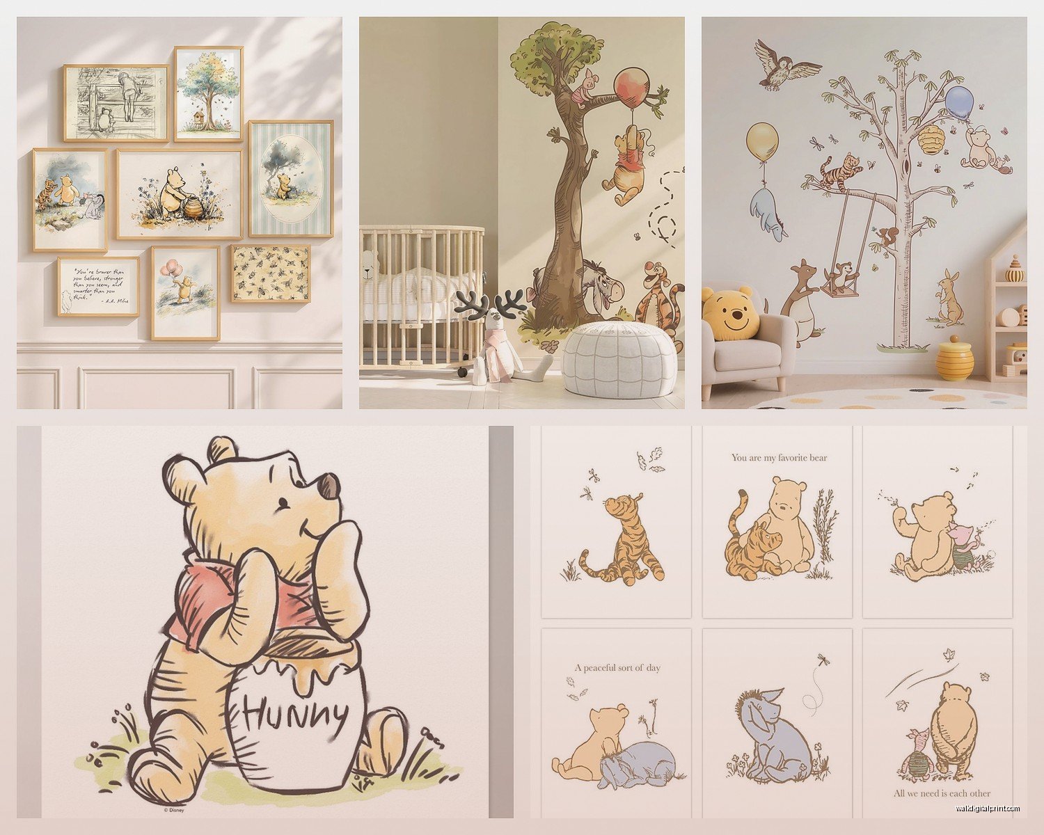
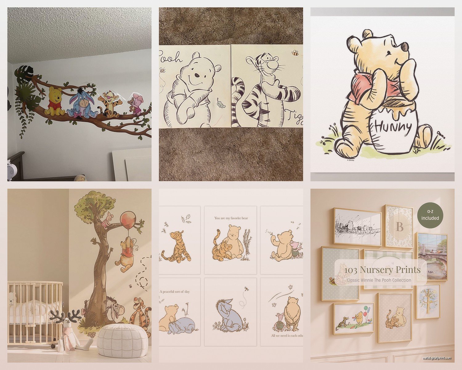
What you actually want depends on whether you’re going classic Pooh (the E.H. Shepard sketches, more sophisticated) or Disney Pooh (brighter, more recognizable to everyone). I’m team classic Pooh for nurseries because it ages better and doesn’t scream BABY ROOM quite as loud when your kid is like four and still attached to it.
Classic Pooh Prints That Don’t Look Cheap
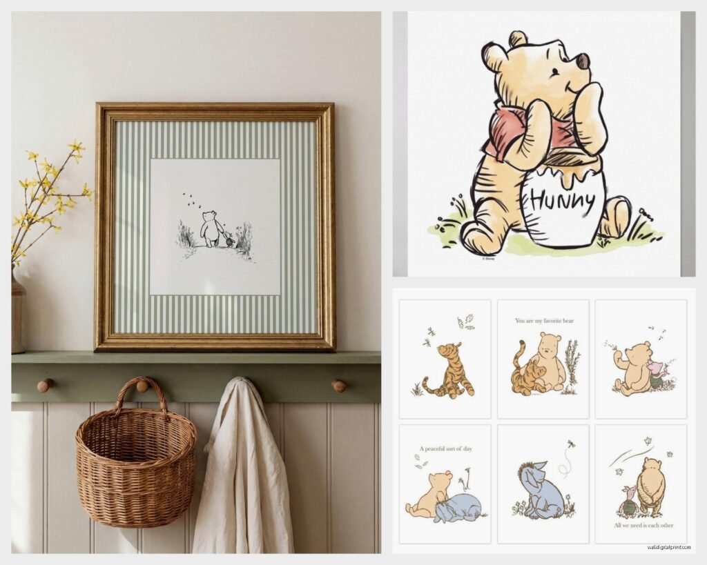
The vintage book illustration prints are where it’s at. You want the ones that look like they came straight from the original books – those soft pencil sketches with the watercolor washes. I usually frame a set of four to six prints, and here’s the thing nobody mentions: they need to be at least 8×10 inches. Anything smaller just disappears on the wall and looks like you weren’t confident about your choices.
My go-to setup is getting high-resolution digital downloads and printing them myself at a local print shop. Costs maybe $8-12 per print versus $40+ for pre-made ones. The quality is actually better because you can control the paper stock. I use a matte cardstock, nothing glossy – glossy looks too modern for classic Pooh.
Placement Because This Is Where People Mess Up
So you’d think just slap them on the wall above the crib right? Wrong. Well not wrong wrong but there’s better ways. I usually do a gallery wall on the longest wall in the room, not necessarily above the crib. Above the crib I keep it to one larger piece or a simple shelf with soft stuff that can’t fall and cause problems.
The gallery wall should be at adult eye level, which is like 57-60 inches to the center of your arrangement. I know everyone says this but then they still hang stuff too high because they’re thinking about how it looks from across the room instead of how it looks when you’re actually standing there at 2am trying to soothe a crying baby and you want something pleasant to look at.
My Actual Layout That I Use Over and Over
I do this arrangement constantly now:
- Three 8×10 prints across the top row
- Two 11×14 prints on the bottom row, centered under the top three
- Everything in matching frames with a thin profile, usually white or light wood
- About 2-3 inches between each frame
The top row is usually three different scenes – Pooh with honey pot, Pooh and Piglet together, and Pooh in the Hundred Acre Wood. Bottom row is bigger moments, like the whole gang together or that scene where Christopher Robin is saying goodbye. Gets me every time honestly.
Frames Matter More Than You Think
Oh and another thing – don’t cheap out on frames but also don’t spend $50 each at Pottery Barn. IKEA’s FISKBO frames are like $5 and they’re totally fine. The RIBBA frames are slightly nicer if you want something with a bit more depth. I’ve used both in nurseries that ended up in magazines so like, they work.
White frames for walls that are gray, beige, or white. Light wood frames if you’ve got more of a natural/Scandinavian thing going. Never black frames with Pooh art, it’s too harsh and the whole vibe is supposed to be soft.
Wait I forgot to mention – use proper picture hanging strips or anchors. A whole gallery wall coming down is not something you wanna deal with. I use the Command picture hanging strips for anything under 5 pounds and actual wall anchors for the heavier stuff.
Canvas Prints vs Framed Prints
People ask me this constantly. Canvas wraps are fine but they read more Disney-gift-shop to me. For classic Pooh, stick with framed prints under glass. It just looks more intentional and less temporary. Plus you can swap out the art later without replacing the whole thing.
The one exception is if you’re doing a really large statement piece, like 24×36 inches or bigger. Then a canvas wrap can work because the scale makes it feel more like actual art. I did this once with a gorgeous watercolor of the Hundred Acre Wood map and it was like the centerpiece of the whole room.
That Watercolor Map Though
Okay so funny story, that map print I mentioned? Client wanted it custom painted and hired someone on Instagram to do it. Cost $400. Looked amazing but like… you can get similar vintage map prints for $20-30 as digital downloads. Just saying. Sometimes the expensive version is worth it if it’s THE focal point, but don’t feel like you gotta go custom for everything.
Color Coordination Without Being Matchy Matchy
Your Pooh art should pull from your nursery colors but it doesn’t need to match exactly. Classic Pooh is mostly soft yellows, warm browns, sage greens, and that dusty blue-gray. If your nursery is in these tones, you’re golden.
I’ve done Pooh nurseries that were primarily white and gray with just touches of honey yellow. I’ve done ones that were more sage green and cream. One was even mostly navy and it worked because we used the sketchy black and white Pooh illustrations with just hints of color.
The mistake is trying to make everything match perfectly. Your bedding doesn’t need to have Pooh on it. Your curtains don’t need to coordinate exactly. The wall art should be the main character moment and everything else is just supporting cast.
Beyond Prints – Other Wall Art Options
So there’s also:
Wall decals – These can be cute but they’re hard to position correctly and they never come off as cleanly as they claim. I use them sparingly, usually just a small Pooh and Piglet holding hands near the door or something subtle. Not covering an entire wall unless you really commit to the Disney vibe.
Wooden signs – The quote ones like “How lucky I am to have something that makes saying goodbye so hard” or “You are braver than you believe.” These work if you do ONE, maybe two max. Otherwise it’s too much sentiment and starts feeling like a Pinterest board exploded. I usually put one over the glider chair where you’ll be doing bedtime reading.
Shelves with 3D stuff – Little shelf ledges with vintage Pooh stuffed animals or the classic books standing up. This adds dimension and you can style it. My cat knocked over a whole shelf arrangement once while I was staging a room so just… make sure they’re secure.
Name signs – Custom ones with your baby’s name in a Pooh theme. These are sweet but get quotes from multiple sellers because pricing is all over the place. I’ve seen the same quality for $35 or $120 depending on who’s selling.
The Actual Shopping List
Here’s what I tell people to buy when they just want me to make it simple:
- 4-6 classic Pooh print downloads from Etsy (look for shops with actual vintage book illustrations)
- Matching frames from IKEA or Target
- One larger piece for above the changing table or dresser
- Maybe one wooden quote sign if that’s your thing
- Picture hanging strips or a proper hanging kit
Total budget is like $150-200 if you’re careful, or you can blow $500+ easy if you go for all custom stuff and fancy frames.
Where to Actually Buy This Stuff
Etsy is where I get most digital prints. Search “classic Winnie the Pooh nursery art” and filter by digital downloads. Read reviews because some shops just steal low-res images from Google.
Amazon has pre-made sets that are honestly fine if you don’t wanna deal with printing. The quality varies wildly though so check recent reviews with photos.
Local print shops for printing your digital files. Fedex Office works in a pinch but local places usually have better paper options and can give advice.
HomeGoods/TJ Maxx sometimes have Pooh stuff randomly. It’s hit or miss but I’ve found some good pieces there for like $12.
Installation Day Reality Check
Give yourself way more time than you think. My first Pooh gallery wall took me three hours because I kept adjusting the spacing. Now I’m faster but it’s still not a quick project.
Use painters tape to map out your layout on the wall first. Trace your frames on paper, cut them out, tape them up. Looks insane but you can see the whole thing before putting holes in the wall. I learned this after creating seventeen unnecessary holes in a rental property wall… the client was not thrilled.
Get a level. Use it. Your eye will lie to you and say things are straight when they’re not. I’ve been doing this for years and I still use a level every single time.
What About When They Grow Up
This is gonna sound weird but I actually think about this a lot. Classic Pooh can genuinely work until age 6-7 if you style it right. It’s not babyish the way some nursery themes are.
As they get older, you can swap out a few prints for ones with Christopher Robin looking older, or focus more on the Hundred Acre Wood setting and less on baby Pooh specifically. Add in some of their own artwork in matching frames. It evolves instead of needing a complete redo.
I had one client keep the Pooh gallery wall until their kid was eight and just added superhero stuff on other walls. Worked fine because classic Pooh is subtle enough to coexist with other stuff.
Common Problems I Fix All The Time
Prints look washed out – This is a printing issue or you bought low-res files. Make sure you’re getting at least 300 DPI files and printing on quality paper.
Everything looks too busy – You probably have too many different styles mixing. Stick with all classic sketches OR all watercolor OR all Disney style. Don’t mix them.
The scale is off – Usually means your prints are too small for the wall space. Bigger is almost always better than you think you need.
It looks flat – Add some 3D elements like the shelf idea I mentioned, or use deeper frames that cast shadows.
Look, I’ve been watching this home renovation show while working on client mood boards and they keep talking about “creating moments” in rooms which sounds pretentious but it’s kinda true? Your Winnie the Pooh wall art should be a moment – something that makes you stop and smile when you walk in at 3am for the fourth feeding. Not just decoration but like, something that feels good to look at when you’re exhausted and covered in spit-up.
Just don’t overthink it to the point where you’re stuck staring at paint samples for six weeks. Pick your prints, frame them nicely, hang them straight, and call it done. The baby literally will not care if you chose the sage green mat board or the cream one, I promise.