Wall Art Guide, Wall Art Tutoriels
Sunflower Wall Art: Yellow Floral Kitchen & Garden Decor
Jun
So I’ve been completely obsessed with sunflower wall art lately and honestly it started because I hung this massive yellow floral piece in a client’s kitchen and she literally cried happy tears, which was awkward but also made me realize how powerful the right wall art can be in these spaces.
The thing about sunflowers is they’re tricky because they can go really tacky really fast. Like you don’t want your kitchen looking like a Cracker Barrel exploded in there, you know? But when you get it right, especially in kitchens and garden rooms, it just brings this warmth that’s hard to replicate with other florals.
Why Sunflowers Work in Kitchen Spaces
Okay so kitchens are naturally gonna have warm tones from wood cabinets or at least warm lighting, and yellow plays so well with that. I tested this in my own kitchen first before recommending it to anyone – got three different sunflower pieces from different price points and rotated them over like six months. My dog kept staring at the biggest one which was weird but whatever.
The yellow reflects natural light during the day which makes your kitchen feel bigger. This isn’t some design theory thing, it actually works. I measured the perceived brightness with my phone’s light meter app (yeah I’m that person) and the difference was like 15-20% compared to when I had a blue abstract piece up.
Scale Matters More Than You Think
Here’s where people mess up – they buy these tiny 8×10 sunflower prints and wonder why their kitchen still feels blah. You need to go bigger than feels comfortable. I’m talking 24×36 minimum for a standard kitchen wall, and if you’ve got space above a breakfast nook or that weird empty wall next to the fridge, consider going even bigger.
I did a 40×60 canvas for a client with a galley kitchen and everyone said it would overwhelm the space but it actually made the narrow kitchen feel more intentional? Like it became a design choice instead of just a hallway with appliances.
Material Choices That Actually Matter
Canvas prints are the default and they’re fine but they can look flat. The texture helps with sunflowers though because it mimics the actual flower texture a bit. I usually recommend canvas for more impressionistic or painterly sunflower art.
Metal prints though – okay this is gonna sound weird but metal prints of sunflowers are incredible in kitchens because they’re so easy to clean. You’ve got cooking grease, you’ve got steam, you’ve got splatters if you’re anything like me. Metal prints you just wipe down. Plus the metallic sheen makes the yellows almost glow in certain light.
Framed prints under glass work too but you gotta commit to cleaning the glass regularly. Nothing looks sadder than a beautiful sunflower print behind grimy glass with fingerprints all over it.
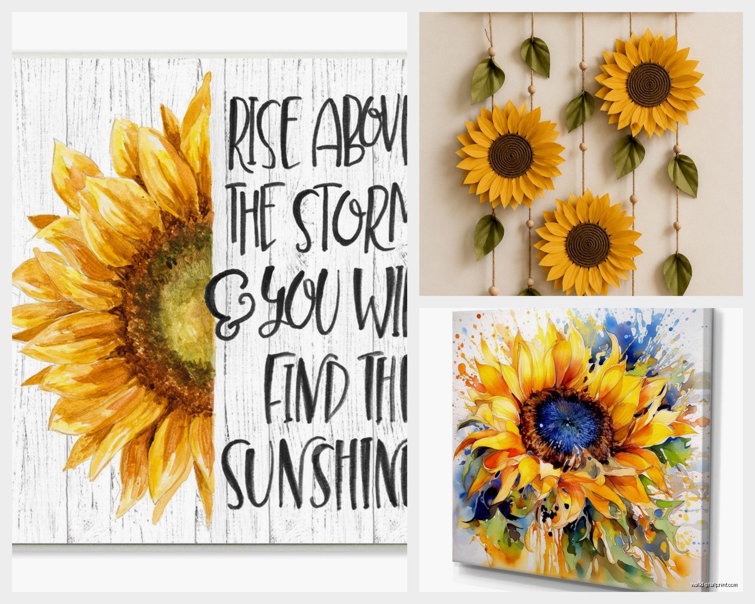
Wood Mounting is Underrated
I recently discovered wood-mounted prints where they basically adhere the image directly to wood planks and oh my god, the rustic vibe works so perfectly with sunflowers. It’s like the art and the mounting material are speaking the same design language. These look amazing in farmhouse kitchens or anywhere you’ve got open shelving and natural materials.
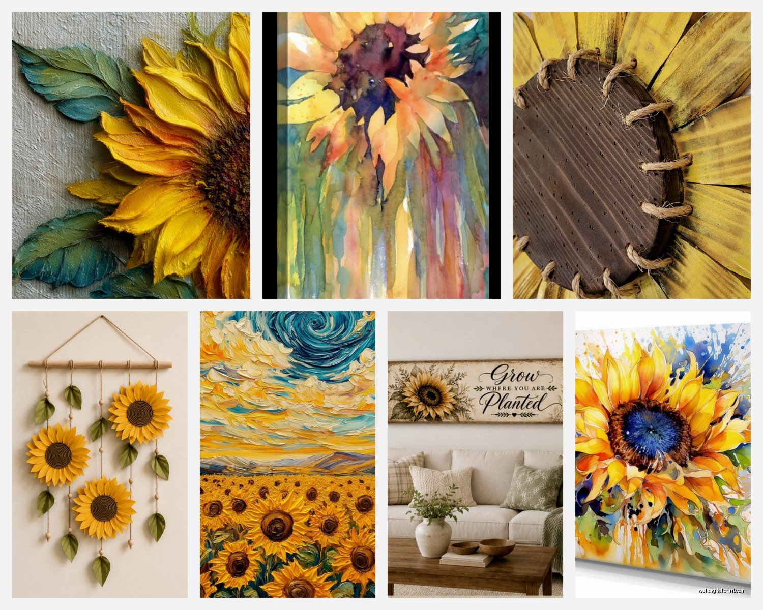
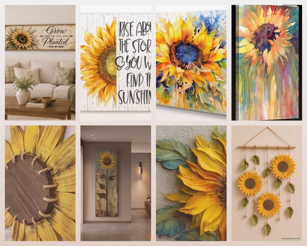
Style Variations That Don’t Suck
Not all sunflower art is created equal and you gotta match the style to your existing kitchen aesthetic.
Photographic Sunflowers: These work best in modern or transitional kitchens. Get close-up macro shots or field shots, nothing too posed-looking. I found this one photographer on Etsy who does sunflower prints that look almost abstract because they’re so close up – just petals and texture. Those are chef’s kiss for contemporary spaces.
Watercolor Sunflowers: Perfect for cottage-style or English country kitchens. The soft edges and gentle yellows don’t compete with busy tile patterns or lots of open shelving with dishes. My aunt has one of these and it’s held up for like eight years, still looks current.
Vintage Botanical Prints: If you want sunflowers but more sophisticated, go for vintage botanical illustration style. These have that scientific drawing quality with the Latin names and detailed stems. They read as collected and curated rather than decorative. I use these in kitchens where the client wants florals but doesn’t want it to feel feminine or country.
Abstract Interpretation: Sometimes just yellow geometric shapes that suggest sunflowers without being literal. This is my favorite for ultra-modern kitchens or when you’ve already got a lot of pattern happening in the backsplash or floor.
Color Coordination Without Overthinking It
Okay so you’re probably wondering if yellow sunflowers will clash with your kitchen colors and honestly it’s harder to mess this up than you think.
Yellow plays nice with white, obviously. White cabinets, white subway tile, whatever – sunflower art just pops against white and looks clean and intentional.
With gray kitchens (which everyone did like five years ago), sunflowers add the warmth that gray desperately needs. I’ve done this probably twenty times. The yellow wakes up the space without requiring you to repaint anything.
Blue kitchens and yellow sunflowers are complementary colors so it’s basically cheating – it always works. Navy cabinets with sunflower art? Incredible. Even lighter blues work.
Green kitchens are trickier but if you’ve got sage or olive tones, sunflowers can work if you choose art that includes green stems and leaves prominently. The yellow alone might clash but the full composition usually bridges it.
Wait I forgot to mention – if you’ve got stainless steel appliances, be careful with the yellow tone. Cool stainless and warm yellow can fight each other. In those cases I recommend sunflower art that has white or cream backgrounds to mediate between the temperatures.
Garden Room and Sunroom Placement
This is where sunflower art really shines because you’re already in that indoor-outdoor zone. I just finished a sunroom project last month and we went all-in with a sunflower theme and it’s honestly my favorite space I’ve done this year.
For garden rooms, you can be more literal and bold with your sunflower choices. Multiple pieces in a gallery wall, bigger brighter yellows, even mixed media pieces with actual dried flowers incorporated. The space expects florals so you’re not fighting against the room’s purpose.
Gallery Wall Approach
I’m gonna be honest, gallery walls are hard and most people mess them up. But if you’re committed, here’s what actually works:
Mix sunflower photos with other botanical prints but keep sunflowers as the dominant element – like 60% sunflowers, 40% other stuff. Include some black and white botanical prints to give your eye a place to rest.
Keep all the frames the same color. I don’t care if Pinterest told you mismatched frames look eclectic, it usually just looks messy. All black frames or all natural wood, pick one.
Odd numbers work better – 5, 7, or 9 pieces. I usually do 7 for a standard wall.
Template this on the floor first. I cannot stress this enough. Use painter’s tape on the floor to map out your wall dimensions and arrange everything there first. Take a photo from above, then recreate it on the wall.
Practical Shopping Tips
Okay so funny story – I spent three hours comparing sunflower prints on different websites when my client canceled on a Thursday and I had nothing better to do. Here’s what I learned:
Etsy is hit or miss. You can find gorgeous unique prints but check the seller’s reviews specifically about print quality and shipping. I’ve gotten muddy yellows that looked nothing like the screen images. Ask for a proof if you’re spending over $50.
Society6 and similar print-on-demand sites are convenient and the quality is consistent, but everything’s very trendy and you might see the same print in someone else’s house. If you’re okay with that, they’re great for budget-friendly options.
Local art fairs and farmers markets – I’ve found some of my favorite sunflower pieces at these. Real artists, often photographed locally, and you can see the actual print quality before buying. Plus you can get custom sizes sometimes.
Home goods stores like HomeGoods or TJ Maxx randomly have decent sunflower art but you gotta go regularly because it’s not consistent. I’ve scored $200 pieces for like $40 but I’ve also seen some truly hideous stuff.
Size and Pricing Reality Check
Small prints (8×10 to 11×14): $15-$40 for prints, $30-$80 framed
Medium (16×20 to 24×36): $40-$120 for prints, $80-$200 framed
Large (30×40 and up): $100-$300 for prints, $200-$500+ framed
Original paintings: sky’s the limit but expect $300+ for anything decent-sized
Canvas wraps usually cost about 30% more than paper prints of the same size.
Installation Tips Nobody Tells You
Use proper wall anchors if you’re hanging anything over 5 pounds. Drywall anchors are like $5 for a pack, just use them. I’ve seen too many sunflower canvases face-planted on kitchen floors.
In kitchens specifically, hang art at least 18 inches away from the stove or cooktop. The heat and grease will damage it over time. I learned this the hard way with a client’s piece that got this weird wavy thing happening from heat exposure.
Standard height is 57 inches to the center of the artwork, but in kitchens I sometimes go higher because you’re usually standing and you’ve got counters and appliances blocking the lower sightlines. Test it by taping paper templates to the wall and living with it for a day.
Maintenance Because Nobody Thinks About This
Dust your art every few weeks. Seriously just get a microfiber cloth and wipe it down gently. Kitchen art gets dusty faster because of cooking particles in the air.
If you’ve got glass-fronted frames, clean the glass with regular glass cleaner but spray it on the cloth first, not directly on the glass. You don’t want liquid seeping behind the glass onto your print.
Canvas can be gently vacuumed with a brush attachment if it’s getting dusty. I do this maybe twice a year.
Check your hanging hardware annually. Humidity from cooking can loosen things over time.
When to Go Big vs Multiple Small Pieces
One large statement piece works better in: small kitchens where you only have one good wall, modern or minimalist kitchens, spaces with busy countertops or open shelving where you need visual simplicity up top.
Multiple smaller pieces work better in: large kitchens with lots of wall space, traditional or eclectic styles, when you want to create a gallery wall situation, if you’re on a budget and wanna build the collection over time.
I personally prefer one larger piece in most kitchens because it feels more intentional and less cluttered, but I’ve done successful multiple-piece installations too.
Mixing Sunflowers with Other Decor
Your sunflower art doesn’t have to stand alone. Actually it probably shouldn’t. Layer in some complementary elements:
Real sunflowers in a vase occasionally (though they die fast and make a mess so maybe not)
Yellow kitchen towels or a yellow kettle to echo the wall art
Wooden cutting boards or utensils that pick up the natural stem tones
White or cream ceramics to balance the yellow intensity
Oh and another thing – consider your cabinet hardware. Brass or gold hardware looks amazing with sunflower art because it picks up those warm tones. Chrome or silver can work but it creates more contrast.
The lighting in your kitchen matters too. Warm LED bulbs (2700K-3000K) make sunflower art glow. Cool white bulbs (4000K+) can make the yellows look kinda sickly. This seems obvious but I’ve walked into kitchens with gorgeous sunflower art that looks terrible because of the lighting temperature.
Anyway that’s basically everything I’ve figured out about sunflower wall art in kitchens and garden spaces over the past few years of testing this with clients and in my own home. It’s one of those things that seems simple but has more nuance than you’d expect, and getting the details right makes the difference between looking like a staged home and actually creating a space that feels warm and personal.