Wall Art Guide, Wall Art Tutoriels
Nautical Wall Art: Sailing & Maritime Coastal Decor
Jun
So I’ve been doing a ton of nautical wall art lately and honestly it’s trickier than you’d think because there’s like three different vibes you can go with and they’re all kinda fighting each other if you’re not careful.
The Main Styles You’re Actually Choosing Between
Okay so first thing – nautical isn’t just one thing. You’ve got your classic New England yacht club look which is super crisp and preppy, then there’s the vintage maritime museum vibe with old maps and船 diagrams, and then there’s what I call “beachy nautical” which is lighter and more casual. Most people try to mix all three and it gets messy real fast.
I learned this the hard way with a client in Marina del Rey who kept sending me inspo pics that were like… completely different aesthetics. We ended up going full vintage maritime and it looked amazing but we had to return probably $400 worth of stuff first.
The Yacht Club Preppy Route
This is navy and white, maybe some red accents. Think brass frames, clean lines, stuff that looks expensive even if it’s not. For wall art you’re looking at:
- Sailing photography in thin gold or brass frames – black and white works best honestly
- Signal flag prints arranged in grids
- Boat class diagrams (like those technical drawings of sailboats from the side view)
- Regatta posters but only vintage ones, the new ones look cheap
The trick here is keeping it minimal. Like you want one statement piece per wall, not a gallery wall explosion. I usually do a large sailboat photo above a console table or sofa – something around 40×30 inches – and then maybe two smaller pieces flanking it if the wall is really long.
Oh and another thing – the frames matter SO much more in this style than the others. I usually hit up HomeGoods for the actual art (they get these great sailing photos sometimes) but then I reframe everything in matching thin brass frames from Amazon. There’s this brand… hold on lemme check… yeah, Americanflat makes decent ones that don’t cost a fortune.
Vintage Maritime Museum Vibes
This is my personal favorite probably because I’m a nerd about old maps. This look is warmer – lots of aged paper, tan and cream colors, those faded blues and greens. You’re gonna want:
- Antique nautical charts and maps
- Vintage ship blueprints
- Old compass designs
- Botanical prints of seaweed and shells
- Ship portraits from the 1800s
The real question everyone asks is whether to buy actual antiques or prints. Honestly? Prints are fine. I’ve found amazing stuff on Etsy where sellers have digitized old maps and you can get them printed huge for like $30. Then you frame them in these chunky wood frames – darker woods work better, walnut or espresso.
Wait I forgot to mention – if you go this route, you kinda have to commit to the aged look throughout. Like you can’t have one vintage map and then a crisp modern sailboat photo next to it. They’ll fight each other visually.
Where to Actually Find This Stuff
Estate sales are gold if you have time. I found an entire collection of 1940s harbor charts at one in San Pedro for $50 total. But that’s like… you gotta have free Saturdays and patience.
For normal people: Etsy is your best bet for prints, then get them printed at a local print shop. The quality is way better than those print-on-demand sites. I use a place near me but Staples actually does decent large format printing if you don’t have a local spot.
eBay has real vintage stuff but it’s gotten expensive. You’re looking at $80-200 for actual antique maps in decent condition.
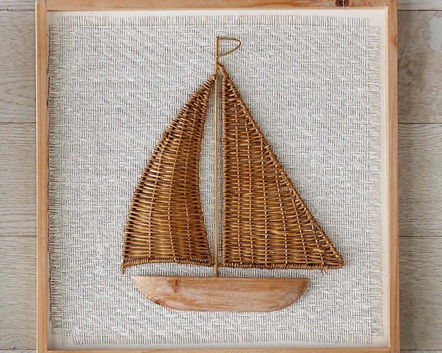
Beachy Casual Nautical
Okay so this is the most common one people end up with kinda by accident? It’s lighter, more weathered wood, whitewashed everything, rope details. The wall art is usually:
- Watercolor sea creatures
- Driftwood pieces with rope
- Light and airy beach photography
- Those painted wooden anchor or ship wheel things
- Sea glass art
This is gonna sound weird but this style is the easiest to mess up because it can go really cutesy really fast. Like if you see anything with the word “SEAS” as a pun (Seas the Day, etc.) just run. I’m serious.
The way to keep it sophisticated is focusing on texture and keeping the color palette super restricted. All whites, creams, soft blues, maybe a tiny bit of coral. And the art should feel collected over time, not matchy-matchy.
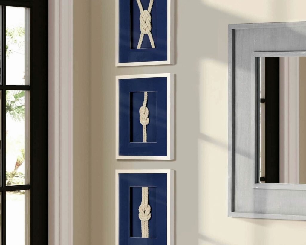
The Gallery Wall Problem
Everyone wants to do a nautical gallery wall and honestly… they’re hard. I’ve done maybe twenty of them and here’s what actually works:
Pick ONE style (see above – preppy, vintage, or beachy). Don’t mix them.
Stick to 2-3 colors max in the whole arrangement. For vintage maritime I do cream/tan, navy, and aged gold. That’s it.
Vary the sizes but use an odd number of pieces – 5, 7, or 9 works best. I know everyone says this but it’s actually true.
Frame consistency matters more than you think. Either all the same frames or all different frames that share one element like color or material.
My client last month wanted to mix black frames with natural wood frames and it looked chaotic until we switched everything to black. Sometimes you just gotta commit.
Size and Placement Real Talk
Okay so the biggest mistake I see is people buying art that’s too small. Like you need to go bigger than feels comfortable when you’re shopping online. A 16×20 print looks decent in the online photo and then you get it and it’s tiny on your wall.
For over a sofa you want at least 30 inches wide, ideally 40-50 inches. For over a console table or in a hallway, 24-36 inches works.
Height-wise, the center of your art should be at 57-60 inches from the floor. This is like, the museum standard and it actually works in homes too. I measure up 57 inches and make a tiny pencil mark, then hang so the center of the piece hits that mark.
The Hallway Opportunity
Oh and another thing – hallways are perfect for nautical stuff because you can do a whole story. I did a client’s hallway with a series of vintage harbor maps from different ports – Boston, Charleston, San Francisco. All same-size frames, hung in a line. It was like a journey down the coast and people actually stopped to look at them.
You could also do a series of ship diagrams or different types of sailing vessels. The key is it’s a series with a theme, not just random nautical stuff.
What Actually Looks Expensive vs Cheap
Let me be real about what reads as high-end versus what screams HomeGoods clearance section (no shade, I love HomeGoods, but you know what I mean):
Looks expensive:
- Large-scale photography – one big image versus lots of small stuff
- Actual framed items under glass versus canvas prints
- Matte finishes on prints
- Brass or gold details used sparingly
- Black and white photography
- Anything that looks like it came from a museum
Looks cheap:
- Canvas prints with the image wrapped around the edges
- Shiny/glossy finishes
- Text-heavy art with quotes
- Painted wooden signs with distressed paint (unless they’re actually vintage)
- Anything in primary colors – like bright red, bright blue
- Pre-made sets of 3 that come together
This is subjective obviously but I’ve noticed these patterns. The canvas wrap thing especially – I know they’re convenient because no framing needed, but they almost always look cheaper than a proper framed print.
DIY Options That Don’t Suck
Okay so funny story, my cat knocked over my coffee onto a vintage map I was gonna frame for my own place, and I ended up having to redo it… which made me realize the DIY process is actually pretty easy?
You can buy digital downloads of vintage nautical stuff on Etsy for like $5-10, then:
- Get them printed large format at a print shop
- Buy a frame from Target or Amazon
- Add a mat if you’re feeling fancy (this really does elevate it though)
Total cost is usually $40-60 for a large piece versus $200+ for something pre-made.
I’ve also done the thing where you buy an old frame at a thrift store, spray paint it if needed, and put your own print in it. Works great for the vintage maritime look especially.
The Mat Board Upgrade
Wait I forgot to mention mats earlier – these make SUCH a difference. A mat board is that border between the frame and the art. You can buy pre-cut mats on Amazon or get custom ones cut at a frame shop.
For nautical stuff I usually do cream or white mats. Navy can work for the preppy look but it’s riskier. The mat should be like 2-4 inches on each side depending on the size of your piece.
This single upgrade makes anything look more expensive and put-together.
Mixing Nautical with Other Stuff
So you probably don’t want your whole house to be nautical unless you live on a boat. Here’s how to mix it in:
In a living room, you can do nautical wall art but keep the furniture neutral. Like a great vintage ship portrait over a modern gray sofa works fine.
In a bedroom, maybe just one nautical piece as the focal point over the bed, and everything else is soft and neutral.
Home office is actually perfect for the vintage maritime look – all those maps and charts feel sophisticated and not too themey.
The bathroom is obvious but also can go wrong fast. One nice framed chart or some shell prints, sure. Six different anchor decorations? No.
The Color Palette Thing
Your nautical art should pull colors that are already in your space. If your room has warm woods and cream walls, go with vintage maritime in similar warm tones. If you’ve got cool grays and whites, the preppy or beachy styles work better.
I had a client try to force navy and white nautical art into a room with terracotta and warm oak and it just… didn’t work. We switched to sepia-toned vintage maps and suddenly everything clicked.
Lighting Makes or Breaks It
This is something people forget – you need good lighting on your wall art or it just disappears. Picture lights are great for the preppy look especially. Those little brass ones that mount above the frame.
For gallery walls I usually recommend adding a couple of wall sconces flanking the arrangement, or if you can’t do wired lighting, those battery-operated picture lights from Amazon actually work pretty well.
Natural light is tricky with vintage paper stuff because it’ll fade over time. If you have a sunny wall, either use prints (not originals) or add UV-protective glass to your frames. It’s more expensive but worth it.
What’s Actually Worth Spending Money On
Okay so here’s where I’d spend versus save:
Spend more: Frames for the preppy look, custom mats, one really large statement piece, anything that’s a focal point
Save: The actual prints (digital downloads are fine), smaller filler pieces, anything in a hallway or less-visible spot
I see people drop $300 on some mass-produced “nautical wall decor” set from a furniture store and it’s just… not worth it. You can create something way better and more personal for half that by mixing high and low.
My favorite combo is like, one splurge piece (maybe a real antique map for $150) surrounded by cheaper prints in nice frames. The expensive piece elevates everything around it.
Common Mistakes I Keep Seeing
Too much rope. I don’t know why everyone wants to add rope to everything but please, it’s usually not necessary.
Mixing metals – if your frames are brass, your other decor should be brass or at least warm metallics. Don’t throw chrome and brass together.
Going too literal – you don’t need anchors AND ship wheels AND life preservers. Pick one motif if you’re gonna go literal at all.
Ignoring the rest of the room – your wall art has to relate to what’s happening with furniture, rugs, etc. It’s not separate.
Oh and people always hang things too high. I mentioned the 57-60 inch rule earlier but seriously, measure it. Your instinct is probably too high.
The other thing is not committing to the style. Like having one vintage map and one modern abstract ocean print and a wooden anchor… it’s just confused. Pick a lane and stay in it, at least for one room.
Anyway that’s basically everything I’ve figured out about nautical wall art through way too many projects and some expensive mistakes. The main thing is just being intentional about which vibe you’re actually going for instead of grabbing random ocean-related stuff and hoping it works together.