Wall Art Guide, Wall Art Tutoriels
Friends Wall Art: TV Show Sitcom Fan Decor
Jun
So I’ve been decorating Friends-themed spaces for like three years now and honestly it started because my sister wanted her apartment to look like Monica’s but also wanted those iconic catchphrase posters, and it spiraled from there.
The Poster vs Canvas Question Everyone Gets Wrong
Okay first thing—you’re gonna see a million options on Etsy and Amazon and they’re either cheap posters or expensive canvas prints. Here’s what I actually tell people: get the poster version first if you’re testing a room layout. I wasted like $80 on a canvas print of the Central Perk logo that looked AMAZING online but totally clashed with my client’s burnt orange couch. Posters you can frame yourself for $15-20 at Target or IKEA, swap them out, see what works.
Canvas prints are better for that “finished” look but they’re harder to change. The colors also tend to be more saturated which sounds good but if you’ve got a lot going on in your room already it can feel like…too much? My cat knocked over one of those Central Perk canvas pieces last month and honestly I wasn’t even that mad because it was overwhelming the gallery wall anyway.
What Actually Works Size-Wise
Everyone wants those massive statement pieces but unless you have a really empty wall, go medium. Like 16×20 or 18×24 inches max. I see people buying 24×36 prints of the apartment door frame and it just eats the whole wall, makes everything else look cluttered.
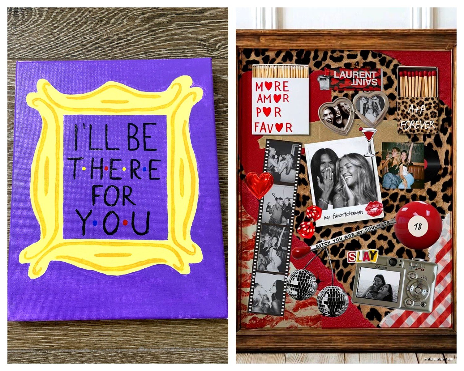
Best setup I’ve done was three 11×14 prints in matching frames—one with “How you doin’?”, one with the purple door, and one with a coffee cup illustration. Spaced them like 4 inches apart on the wall behind a couch. Clean, recognizable, not screaming I’M A SUPERFAN but definitely nodding to it.
Oh and another thing—vertical vs horizontal matters more than people think. Most Friends art comes in portrait orientation because of how the show was framed, but if you’ve got a horizontal space like above a console table or bed headboard, you gotta either get creative with groupings or specifically hunt for landscape options.
The Frame Situation Nobody Talks About
Black frames are safe but kinda boring unless that’s your whole aesthetic. I’ve been using natural wood frames lately and they make the whole Friends vibe feel less “dorm room” and more intentional. The warm wood tones actually complement those purple and yellow accent colors from the show really well.
White frames work if your space is super minimalist or Scandinavian-ish. But here’s the thing—if you’re doing multiple pieces, MATCH THE FRAMES. I cannot stress this enough. Three different frame styles with Friends art just looks like you raided a clearance bin, even if each frame is nice individually.
Where to Actually Buy This Stuff
Etsy is overwhelming but filter by “Star Seller” and read the reviews about shipping times. I’ve found sellers who do custom quotes from specific episodes which is actually cooler than the generic catchphrase stuff. There’s one seller—I think it’s called PrintableSage or something—who does minimalist line art of iconic scenes. Got one of the coffee shop couch for my client’s reading nook.
Amazon is faster but the quality is hit or miss. Read the reviews with photos, not just the text ones. People will post actual pics of what showed up and you can see if the colors are washed out or if the print is pixelated.
Society6 and Redbubble are good for artist-made stuff but pricier. The advantage is you’re supporting actual artists and the print quality is usually solid. They also offer different product options—like you can get the same design as a poster, canvas, or even a tapestry which is kinda cool for dorm rooms or casual spaces.
The DIY Route That’s Easier Than It Sounds
Wait I forgot to mention—you can literally make your own if you’re even slightly crafty. I did this for my own apartment because I’m cheap and also couldn’t find exactly what I wanted.
Found high-res images online (there are fan sites with screencaps), edited them in Canva to add text or crop them nicely, and uploaded to a print service. Shutterfly, Snapfish, even Walgreens photo center. Got three 8×10 prints for like $12 total. Put them in IKEA RIBBA frames and honestly people ask where I bought them.
The trick is making sure your image is high enough resolution. At least 300 DPI for print. If it looks even slightly blurry on your screen, it’ll look worse printed.
Specific Pieces That Actually Look Good
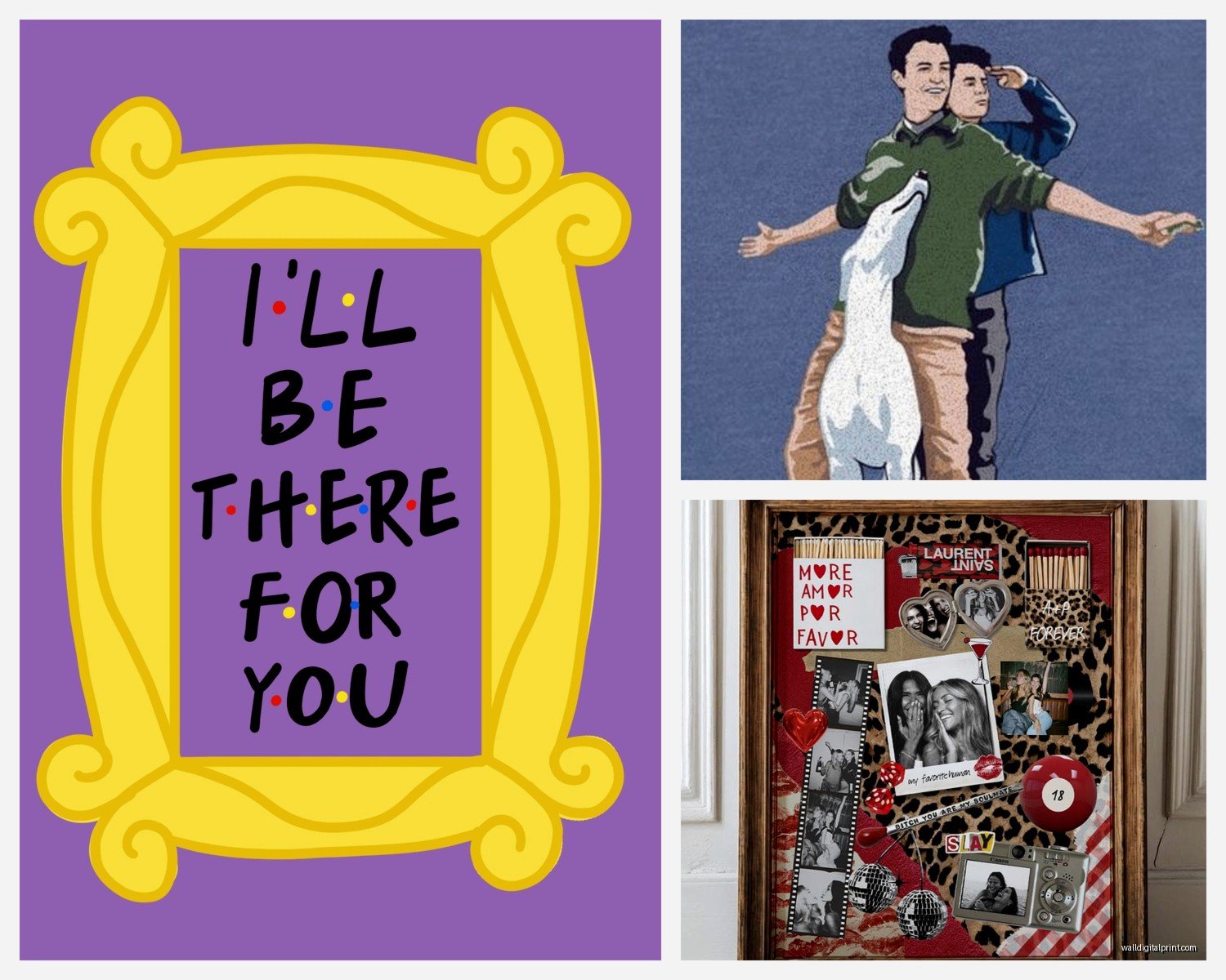
The apartment purple door is iconic but everyone has it, so if you want it, make it part of a gallery wall, not the only piece.
Central Perk logo or coffee cup designs are surprisingly versatile—they don’t scream TV SHOW if people don’t know Friends, they just look like coffee-themed decor.
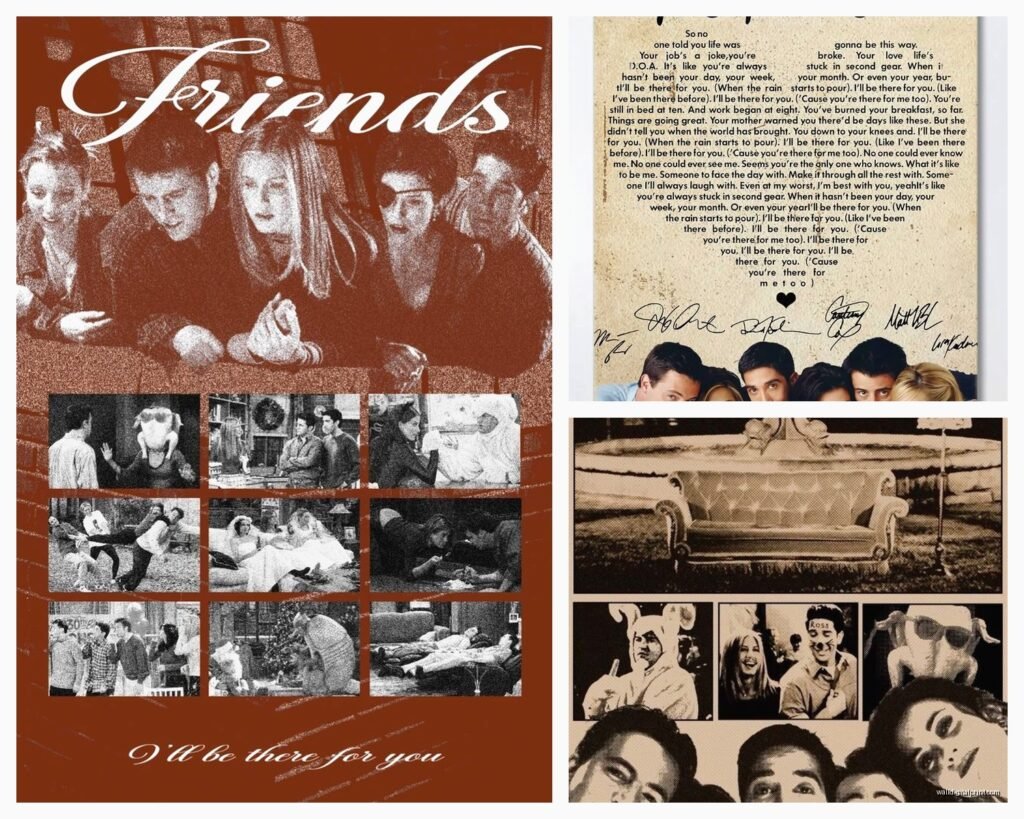
Quote prints are tricky because some are cheesy. “We were on a break” can feel played out. But something like “Welcome to the real world. It sucks. You’re gonna love it” has this funny cynical energy that works in a home office or entryway.
The gang silhouettes—you know, the six of them on the couch or by the fountain—those work best in monochrome. Color versions can look too busy.
Episode-specific stuff is for superfans but can be conversation starters. I saw one print of the “PIVOT” scene diagram and it made me laugh every time I walked past it. That’s the kind of thing that works if you really love the show, not if you’re just decorating on theme.
Color Coordination Is Gonna Make or Break This
Friends has a really specific color palette—lots of purple, orange, yellow, and that teal-ish blue. If your room is all grays and whites, throwing in a bright purple door print is gonna look jarring.
What I do is pull one or two accent colors from the art and echo them elsewhere. Got a print with purple tones? Add a purple throw pillow or purple spine books on your shelf. Makes it feel intentional instead of random.
Or go the opposite route—black and white prints only. Removes the color problem entirely and gives you that minimalist gallery wall look. There are tons of black and white stills from the show that look actually sophisticated.
Placement Ideas That Aren’t Just “Above the Couch”
Okay so funny story, I was watching The Office last week (I know, wrong show) and got distracted thinking about how people always default to above-the-couch placement. But there are better spots:
- Gallery wall in a hallway—makes a boring transition space more fun
- Kitchen or dining area—the Central Perk coffee theme works perfectly here
- Bathroom—sounds weird but a small “How you doin’?” print by the mirror is actually hilarious
- Home office or workspace—motivational quotes from the show, or just fun nostalgic energy
- Bedroom—keep it subtle though, maybe one piece on a dresser wall
Entryways are underrated. A print of the purple door by your actual door? Chef’s kiss. It’s punny without trying too hard.
Mixing Friends Art With Other Decor
This is where people mess up—they go all-in and it becomes a shrine instead of a decorated space. Mix your Friends pieces with non-TV art. Abstract prints, botanical illustrations, personal photos.
I did a gallery wall that was like 40% Friends, 60% other stuff and it felt collected and interesting instead of theme-y. The Friends pieces were conversation starters but not the whole conversation.
Also consider your furniture and existing decor. If you’ve already got a vintage/retro vibe going, Friends art slots right in because the show’s aesthetic is very 90s. But if your space is super modern and sleek, you might want more minimalist interpretations—line art, typography-only prints, monochrome photos.
Quality Markers to Look For
Print quality matters more than you think. Look for:
- Giclée printing if you’re going high-end—it’s archival and the colors stay true
- Thick paper stock, at least 200gsm for posters
- Canvas that’s actually wrapped around wood frame, not just printed fabric
- UV-resistant ink if it’s going in a sunny spot
Cheap prints fade. I’ve seen it happen in like six months with direct sunlight. If you’re investing in something you love, get the better quality version or at least keep it out of harsh light.
The Licensing Question
Most Friends art on Etsy and similar sites isn’t officially licensed. Which means it’s technically fan art in a legal gray area. Officially licensed stuff exists through retailers like Hot Topic, BoxLunch, or Warner Bros’ official store, but it’s usually more expensive and less unique.
I’m not gonna tell you what to buy, but know what you’re getting. Fan art supports small artists and gives you more variety. Licensed products are “legit” but often more generic.
Seasonal and Trend Considerations
Friends nostalgia peaked a few years ago but it’s still going strong, especially with younger people discovering it on streaming. That said, trends shift. If you’re worried about your decor feeling dated, stick with the more subtle pieces.
A minimalist coffee cup illustration will age better than a huge “PIVOT” meme poster. Though honestly if you love it, who cares? Your space should make you happy, not be trendy.
Budget Breakdown
Since you asked about actual buying—here’s what I’d recommend at different price points:
Under $30: Three small prints from Etsy plus IKEA frames. Simple, effective, easy to swap out.
$30-75: One or two nice canvas prints from Society6 or Redbubble, or a custom print from a quality Etsy seller with good reviews.
$75-150: Mix of canvas and framed prints, maybe one larger statement piece plus a few smaller ones for a gallery wall.
Over $150: You can get really custom stuff—commissioned art, high-end canvas prints, professional framing. Or just buy more pieces and do a whole wall.
Wait I forgot to mention frame costs add up fast. Budget for that separately if you’re buying unframed prints.
Common Mistakes I See All the Time
Going too literal with recreating Monica’s apartment or Central Perk. Unless you’re doing a themed space intentionally, it’s too much.
Buying only quote prints. Mix in imagery—the door, the couch, coffee cups, skyline shots.
Ignoring scale and proportion. Measure your wall space before buying. I use painter’s tape to mark out frame sizes on the wall first.
Not considering lighting. Dark prints in dark corners disappear. Light prints in sunny spots fade.
My Current Favorite Combo
Right now I’m really into mixing vintage-style Friends travel posters (like “Visit Central Perk” in old airline poster style) with actual NYC photography. Creates this cool New York nostalgia vibe that’s about the show but also about the city.
Also loving typography-only prints in interesting fonts. Just the words “Central Perk” in a cool vintage font can look really sharp and grown-up.
Okay I think that’s everything I’ve learned from trial and error and client work. The main thing is don’t overthink it—if a piece makes you smile when you look at it, it’s the right one. Start small, add gradually, and remember you can always rearrange or swap things out. Nothing’s permanent unless you want it to be.