Wall Art Guide, Wall Art Tutoriels
Geometric Prints Wall Art: Angular Shape Pattern Posters
Sep
So I’ve been obsessing over geometric prints lately and honestly it started because a client wanted to fill this massive blank wall in their living room and didn’t want “another boring landscape painting” and that sent me down this whole rabbit hole of angular patterns and now I’m gonna share everything because you’re asking at the perfect time.
Why Geometric Prints Actually Work When Other Stuff Doesn’t
Okay so the thing about geometric wall art is that it reads as both modern AND timeless which sounds impossible but hear me out. Like, a trendy boho print might look dated in two years, but a well-chosen geometric? It’s got this mathematical precision that feels intentional no matter what year it is. My own apartment has had the same set of triangle-pattern posters for like four years and they still feel current.
The angular shapes create this visual rhythm that your eye naturally follows. It’s weirdly calming even though you’d think all those sharp lines would feel chaotic. I tested this theory by putting different prints in my home office while I was curating a gallery show last spring and the geometric ones were the only ones that didn’t eventually annoy me.
Choosing the Right Style Without Overthinking It
There’s basically a few camps here and you gotta figure out which vibe matches your space.
Minimalist Line Art
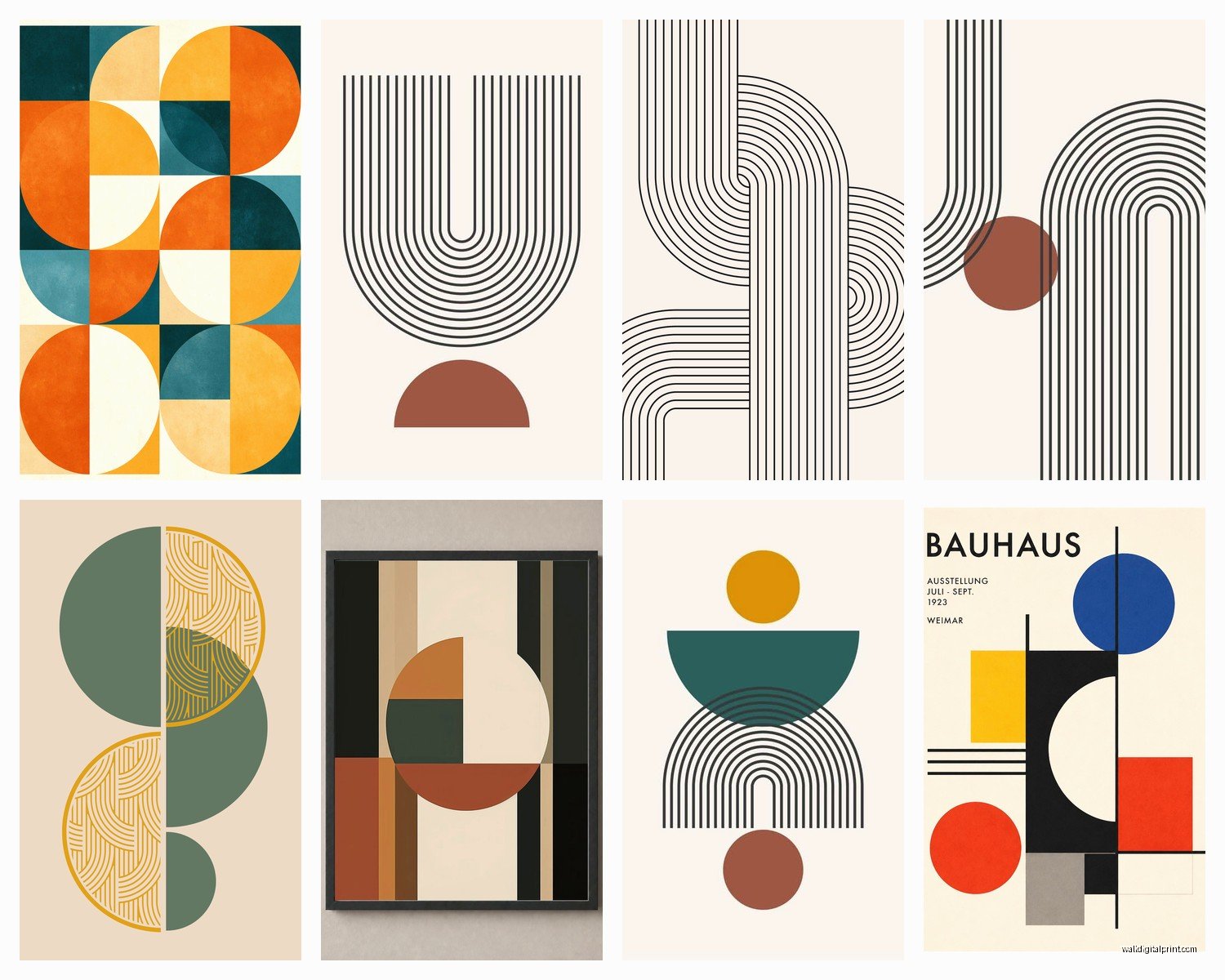
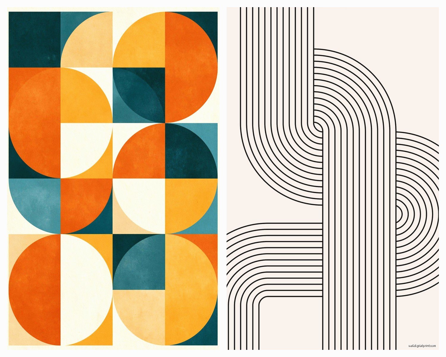
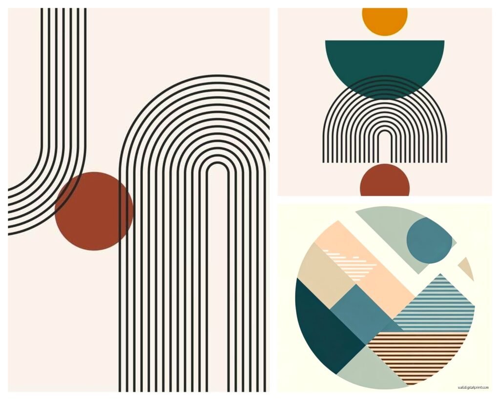
These are your simple black lines on white backgrounds. Super clean. They work literally everywhere but especially in Scandinavian-style spaces or anywhere you’ve already got a lot going on with furniture. I put a set of three in a client’s kitchen that had busy marble countertops and colorful appliances and the simple geometric lines actually tied everything together instead of adding more chaos.
The trick is scale though. Too small and they disappear. You want at least 16×20 inches if you’re doing a single print, or a set of three 11x14s arranged together.
Bold Color Blocking
This is where you get those posters with like… a yellow triangle overlapping a navy circle overlapping a coral rectangle. Very Bauhaus, very “I understand design theory.” These need more careful placement because they’re making a STATEMENT.
I learned this the hard way when I hung a bright geometric print in a bedroom with patterned curtains and it looked like a headache. These work best against neutral walls with minimal competing patterns. My living room has one massive color-blocked geometric above the sofa and literally nothing else on that wall and it’s perfect.
3D Illusion Patterns
Oh man these are fun. The ones where the shapes create optical illusions of depth or movement. I have this cube pattern in my hallway that looks different depending on the light and my cat sits and stares at it sometimes which is either very sophisticated of her or she thinks there’s a bug.
Warning though: don’t put these in bedrooms if you’re sensitive to visual stimulation before sleep. A client once texted me at midnight saying she couldn’t stop looking at the “spinning hexagons” and could we please move it to the dining room.
Size and Placement Because This Is Where People Mess Up
Real talk, I’ve seen so many people buy gorgeous prints and then hang them wrong and it kills me.
The Two-Thirds Rule: Your wall art should take up roughly two-thirds of the wall space above your furniture. So if your sofa is 90 inches wide, you want your art or art arrangement to be around 60 inches wide. This isn’t a hard rule but it’s a really good starting point.
For geometric prints specifically, they tend to look better when you go BIGGER than you think. The angular patterns can feel busy in small formats but when you scale up, suddenly they become these bold architectural elements.
Gallery Wall vs Single Statement Piece
I’m gonna be honest, geometric prints are one of the few art styles where I actually prefer single large pieces over gallery walls. The patterns already create visual interest, so a gallery wall can sometimes feel like too much math homework on your wall.
BUT if you’re doing a gallery wall, keep the color palette really tight. Like all black and white geometrics, or all warm tones. I did a client’s stairway with nine different geometric prints all in shades of blue and gray and it worked because the color unified them even though the patterns were totally different.
Wait I forgot to mention – odd numbers look better. Three prints, five prints, seven if you’ve got a huge wall. The asymmetry paradoxically makes geometric patterns feel more balanced.
Framing Decisions That Actually Matter
So framing is where you can either elevate a $20 print to look expensive or make a $200 print look cheap.
For geometric prints, I almost always recommend simple frames. Black, white, natural wood, or metallic. The art already has structural interest from the shapes, so ornate frames compete with that.
Black frames: Make colors pop, create strong contrast, very gallery-like. Use these when you want the art to feel serious and grounded.
White frames: Lighter feel, works better in bright spaces or with pastel geometrics. Can sometimes wash out if your walls are also white though – in that case go with off-white or cream frames.
Natural wood: Adds warmth, great for spaces that might otherwise feel too modern or cold with all the angular patterns. I use these in bedrooms a lot.
Metallic frames: Gold or brass with geometric prints is *chef’s kiss* if you’re going for that mid-century modern vibe. Silver or chrome if you want something more industrial.
Oh and another thing – mat or no mat? For geometric prints, I usually skip the mat unless the print itself is quite small. The clean edge-to-edge look reinforces the modern aesthetic. Mats can make them feel more traditional which might not be what you want.
Glass Considerations
Regular glass is fine for most situations but if you’re hanging geometric prints opposite windows, consider non-glare glass. The reflections can really mess with the pattern reading. I had this whole situation where a client’s beautiful hexagon print just looked like a mirror during daytime and we had to reframe it.
Where to Actually Buy Them
This is gonna sound weird but I’ve found my best geometric prints in the most random places.
Etsy: Tons of independent artists selling digital downloads you can print yourself. This is actually my favorite option because you control the size and can often get custom colors. Just make sure the file is high resolution – you want at least 300 DPI for printing.
Society6 and Redbubble: Good for finding unique designs, though quality can be hit or miss. Read reviews before ordering. I’ve gotten some amazing prints and some that looked weirdly pixelated.
IKEA: Don’t sleep on IKEA’s art section. They have surprisingly good geometric prints for like $15-30 and they’re already sized to fit their frames which makes life easier.
Local print shops: If you find a digital file you love, your local print shop can often do better quality than online printing services and you can see paper samples in person.
Actual artists: Instagram is full of geometric artists selling original prints. Yeah they’re pricier but the quality difference is real and you’re supporting actual humans making art.
Color Coordination Without Making It Boring
Okay so you don’t need to match your geometric print colors exactly to your room colors – in fact please don’t because that’s how you get a room that looks like a furniture showroom.
Instead, pull one or two accent colors from the print. Like if you have a geometric print with navy, coral, and mustard, maybe your throw pillows pick up the coral and you’ve got a mustard vase somewhere. The navy doesn’t need to appear anywhere else.
I watched this whole documentary about color theory while hanging prints last month and the main takeaway was that repetition creates cohesion but you don’t need exact matches. Your eye will connect a coral-ish pink pillow to the pure coral in the print.
Monochrome Spaces
If your room is very neutral – grays, whites, beiges – a geometric print is the perfect place to introduce color without committing to painting walls or buying a new sofa. I did this in my bedroom with a teal and copper geometric print and it completely transformed the space while everything else stayed gray.
Or go full monochrome with black and white geometric prints in a neutral space. It’s almost impossible to mess this up and it always looks intentional and sophisticated.
Mixing Geometric Prints With Other Art Styles
This is tricky but doable. The key is treating the geometric print as the “anchor” piece – the most visually structured element – and then you can add softer, more organic art around it.
I have a big angular geometric print flanked by two abstract watercolors in my dining room and it works because the geometric grounds everything while the watercolors keep it from feeling too rigid. But I wouldn’t do geometric plus geometric plus geometric unless they’re literally a matching set.
Photography can work next to geometric prints too, especially architectural photography or nature shots with strong compositional lines. There’s this visual conversation that happens between them.
Practical Hanging Tips
Use a level. I know this sounds obvious but I’ve gone into so many homes where prints are just slightly crooked and with geometric patterns it’s SO noticeable because the lines are literally showing you what straight should look like.
For lightweight prints and posters, Command strips are honestly fine and way easier than nails. The large picture hanging strips can hold up to 16 pounds which covers most framed prints.
If you’re hanging multiple geometric prints in a row, measure the space between them carefully. I use 2-3 inches of space between frames as my standard. Less than that feels cramped, more feels disconnected.
The center of your art should be at eye level, which is roughly 57-60 inches from the floor. But if you’re hanging above furniture, ignore this rule and go with the two-thirds thing I mentioned earlier.
Seasonal Switching
Okay this might be extra but I actually swap out some of my geometric prints seasonally and it’s such an easy way to refresh a space. Warm-toned geometrics (oranges, reds, browns) in fall and winter, cool-toned ones (blues, greens, grays) in spring and summer.
Since geometric prints are usually pretty affordable, especially if you’re printing digital files, you can build a little collection and rotate them. I keep mine in a flat file drawer but honestly a large portfolio case under the bed works fine.
Common Mistakes I See Literally All the Time
Hanging them too high. Seriously, people hang art way too high and then wonder why their room feels weird.
Choosing prints that are too small for the space. When in doubt, size up.
Mixing too many different geometric styles in one room. Pick a lane – minimalist line art OR bold color blocking OR 3D illusions, not all three.
Forgetting about lighting. Geometric prints look completely different in warm vs cool light. If you have the option, use adjustable lighting so you can see how the patterns read in different temperatures.
Not considering the wall color. A white geometric print on a white wall is gonna disappear. You need contrast for the shapes to register properly.
Anyway, my coffee’s cold now and I’ve probably told you way more than you needed but basically: go bigger than you think, frame simply, don’t overthink the color matching, and trust your gut on what patterns speak to you. Geometric prints are pretty forgiving once you nail the basics and they make any space look more intentional without trying too hard.