
Wall Art Guide, Wall Art Tutoriels
Wall Art for Men’s Living Room: Masculine Main Space Decor
Oct
So I’ve been helping my brother redo his living room and honestly the wall art thing is where most guys completely freeze up. Like they’ll spend hours researching the perfect TV mount but then just… leave the walls blank for months because they don’t know where to start with art.
Starting With What Actually Works in a Guy’s Space
Okay so first thing – forget what you see in those generic home decor magazines. The oversized motivational quotes and the live-laugh-love equivalent for men (which is like… vintage whiskey posters?) usually look pretty bad in real life. I learned this the hard way when my client bought three of those mass-produced “adventure awaits” maps and his living room looked like a TJ Maxx exploded.
What actually works is going bigger and bolder than you think. Guys tend to buy art that’s too small because they’re worried about it being “too much” but then you end up with these tiny frames that look lost on a big wall. The rule I use is measure your wall space and go for art that takes up about two-thirds to three-quarters of that width. So if you’ve got an 8-foot couch, you’re looking at art that’s roughly 5-6 feet wide total, whether that’s one large piece or a grouping.
The Types That Don’t Look Like You’re Trying Too Hard
Abstract pieces in blacks, grays, navy, or rust tones work really well. I know abstract sounds pretentious but hear me out – it reads as modern without being too specific about what you’re into. My brother went with this massive charcoal and white abstract piece above his couch and everyone who comes over thinks he knows what he’s doing with decor now.
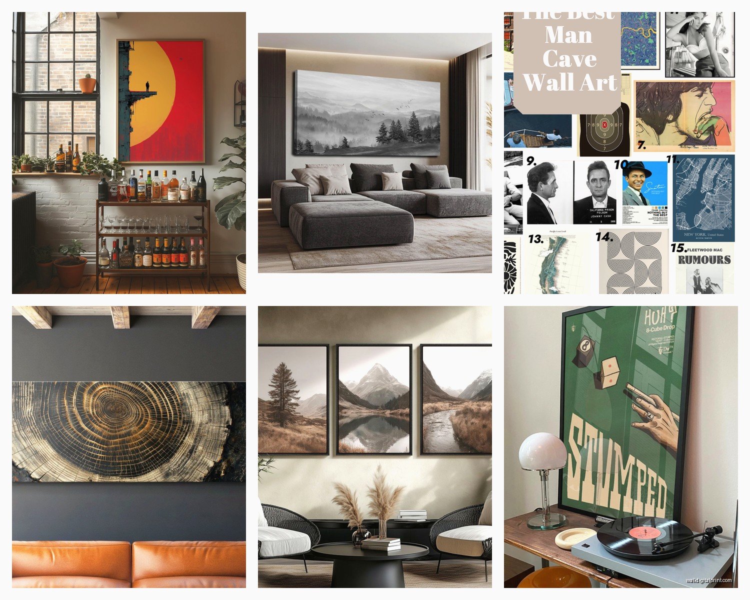
Maps are actually solid if you do them right. Not the cutesy watercolor ones, but vintage-style topographical maps or nautical charts. Especially good if you frame them properly – none of that poster-in-a-cheap-frame situation. I found this amazing set of old aerial survey maps at an estate sale last year and they look incredible matted in simple black frames.
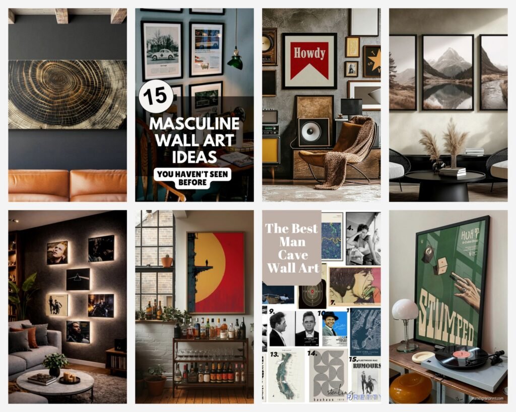
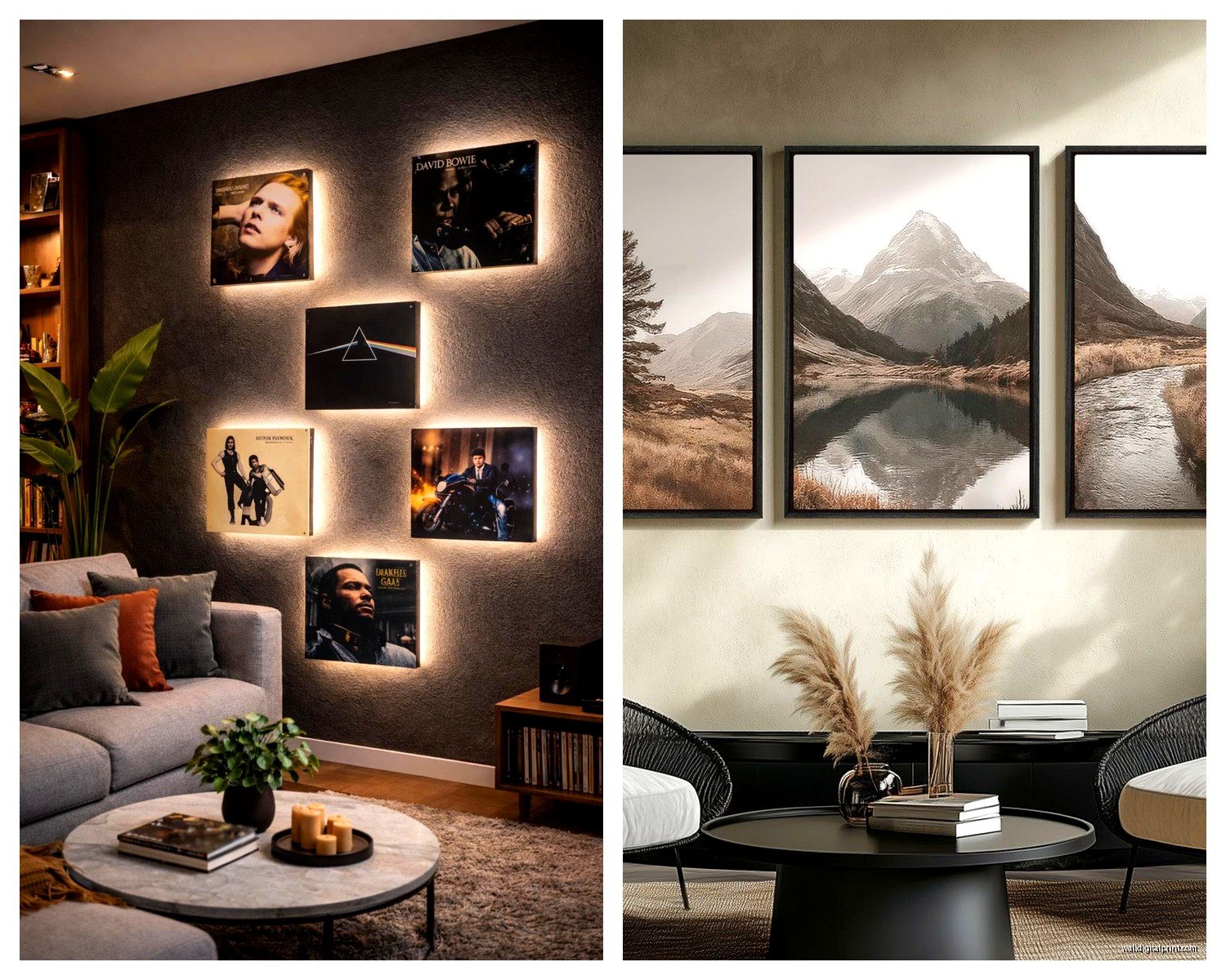
Black and white photography is your friend. Architectural shots, landscape photography, urban scenes – these all read as masculine without being overly themed. The key is going big and limiting your color palette. Three large black and white photos in a row beats a gallery wall of random colored images every time.
Music and Sports Stuff Done Right
If you’re really into music or sports, you gotta be strategic about it. Original concert posters from significant shows can look amazing, but those mass-produced “Beatles crossing Abbey Road” prints look like dorm room decor. Same with sports – an actual vintage pennant or a framed original ticket from a game you attended tells a story. A generic poster of your favorite team just screams “I don’t know what else to put here.”
Oh and another thing – if you collect vinyl, mounting a few significant album covers as art actually works. But pick ones with strong graphic design. My neighbor did this with old Blue Note jazz albums and it looks sophisticated as hell. Way better than the Bob Marley poster route.
Materials and Textures That Add Depth
This is gonna sound weird but mixing in some three-dimensional pieces changes everything. Not talking about those metal tree sculptures your aunt has, but like… a floating shelf with a couple of interesting objects can break up wall art in a good way.
Wood art pieces work really well in masculine spaces. There’s this reclaimed wood wall art trend that isn’t totally played out yet – geometric patterns made from different wood tones, or even just a simple wood panel with interesting grain. Adds warmth without being feminine.
Metal art can go either way. Industrial-style metal prints look modern and are super durable. But avoid anything too ornate or scrollwork-y. Keep it geometric, keep it simple. I saw this copper and steel mountain range silhouette last month that would be perfect for a guy’s space.
Where to Actually Find This Stuff
Okay so funny story, I was watching this documentary about urban planning while scrolling through art sites – don’t judge my Friday nights – and found some of the best sources. Etsy has tons of independent artists doing masculine prints, way better than the big box stores. Search terms like “minimalist art prints” or “industrial wall art” or “masculine abstract.”
Society6 and Minted let you buy art in different sizes which is super helpful. You can get the same design as a small print to test it out or go huge. Their framing options are decent too, saves you the trip to a frame shop.
Estate sales and antique shops are goldmines if you have the patience. Original art, vintage maps, old advertising prints – stuff with actual history behind it. Way more interesting than something 50,000 other people have hanging in their living rooms.
The Frame Situation Nobody Talks About
Real talk – bad framing ruins good art. Those flimsy poster frames from Target make everything look cheap. You don’t need to spend a fortune, but invest in decent frames. Black wood or metal frames work for almost everything masculine. Skip ornate frames unless you’re going for a specific vintage vibe.
I usually tell people to order frames from Framebridge or Frame It Easy if they’re buying prints online. Yes it’s more expensive than DIY but they look professionally done because… they are. My client tried to save money doing it himself and ended up with crooked mats and visible dust under the glass. Just pay the extra $50.
Layout and Arrangement Without Overthinking It
The gallery wall thing can work but it’s way harder to pull off than Instagram makes it look. I’ve spent literal hours arranging and rearranging frames on the floor before hanging them. If you’re gonna do a gallery wall, use matching frames. Seriously. The eclectic mixed-frame look requires a really good eye and most people don’t have it.
Easier option: go with a large statement piece or a simple two-piece arrangement. Two large horizontal pieces stacked vertically, or two square pieces side by side. Simple, impactful, way less math involved.
For height, the center of your art should be at eye level, which is usually around 57-60 inches from the floor. If you’re hanging above a couch, leave about 6-8 inches between the furniture and the bottom of the frame. I see people hang stuff way too high all the time and it just floats awkwardly up near the ceiling.
The Layout Trick I Use Every Time
Tape out your arrangement on the wall with painter’s tape before hammering anything. I know it seems obvious but I can’t tell you how many times I’ve seen someone eyeball it and end up with holes in the wrong places. Measure twice, hang once, whatever that saying is.
Wait I forgot to mention – if you’re hanging heavy pieces, actually use proper hardware. Those little picture hanging hooks aren’t gonna cut it for a large canvas. Get proper wall anchors or find the studs. Nothing kills a vibe like art crashing down in the middle of the night because you cheap-ed out on hardware.
Specific Pieces I Keep Recommending
There’s this artist on Etsy who does minimalist mountain prints that I’ve probably recommended to five different guys now. Clean lines, comes in different color combos, looks way more expensive than it is. Search for minimalist landscape prints and you’ll find tons of similar options.
For abstract, I’m really into the black and white brushstroke style right now. Bold, graphic, doesn’t require you to “get it” to appreciate it. Works in modern spaces, works in industrial lofts, even works in more traditional rooms if you frame it right.
Vintage patent prints are having a moment and they’re perfect for masculine spaces. Old car patents, airplane designs, tool patents – they’re technical but artistic. Usually pretty affordable too, especially if you’re just buying the print and framing it yourself.
Color Schemes That Won’t Feel Boring
You don’t have to stick to black and white exclusively, but keeping a limited color palette makes everything feel more cohesive. Navy blue is super underrated for masculine spaces. Deep forest green works too. Rust or burnt orange as an accent color adds warmth without going too bright.
My brother’s living room is mostly grays and blacks with these rust-colored abstract pieces and it looks really pulled together. The key is repetition – if you’ve got rust in your art, maybe your throw pillows pick up that same tone. Not matchy-matchy, just… connected.
Avoid bright primary colors unless that’s specifically your thing. They tend to read as either kids’ room or sports bar, not sophisticated living space. Muted, deeper tones feel more mature and are easier to live with long-term.
Lighting Actually Matters More Than You Think
This is where people mess up all the time – they hang perfect art and then light it terribly. If you’ve got overhead lighting only, your art is gonna fall flat. Picture lights or track lighting that actually highlights your pieces makes a huge difference.
I added simple LED picture lights above my brother’s main pieces and suddenly they looked like they belonged in a gallery. The warm light at night creates this whole mood. You can get battery-operated ones if you don’t wanna deal with wiring, though they’re not quite as bright.
What to Avoid Because It Never Looks Good
Okay real quick on the don’ts because I’m seeing my dog destroy a pillow in the other room and need to wrap this up soon. Skip the motivational quotes. Skip the generic “cigar and whiskey” themed prints unless you actually have a dedicated bar area. Skip tiny floating shelves with a bunch of small knick-knacks – that’s not art, that’s clutter.
Don’t hang your TV and surround it with art like it’s a gallery wall. The TV should be its own thing, art should be elsewhere. I see this attempted constantly and it never works. The TV is too visually dominant and everything around it just looks like an afterthought.
Avoid anything too literal or themed unless it’s genuinely personal. Like if you’re a pilot, cool, aviation art makes sense. But if you just think planes are neat, it’s gonna feel forced. Stick with more universal stuff that you’ll actually want to look at for years.
And please, no fake windows or those weird 3D ocean scene things. Just… no.
The main thing I’ve learned after doing this for years is that most guys overthink it and then do nothing, or they underthink it and buy the first thing they see at HomeGoods. Take your time, live with some options virtually first if you can, and remember that blank walls are worse than imperfect art choices. You can always switch things out later but you gotta start somewhere.
