Wall Art Guide, Wall Art Tutoriels
Farmhouse Bedroom Wall Art: Rustic Country Sleep Space
Oct
So I’ve been putting together farmhouse bedroom wall art for like three years now and honestly it’s one of those things where everyone thinks they know what they want until they see it up on the wall and then they’re like “wait this feels too country store” you know?
The biggest mistake I see is people going too literal with it. Like they’ll buy those metal farm signs that say “FARM FRESH EGGS” and stick them above their bed and I’m just… that’s not really what we’re going for here. You want the vibe without turning your bedroom into a Cracker Barrel.
Start With Your Wall Color Situation
Okay so first thing – what color are your walls. This matters SO much and nobody thinks about it first. If you’ve got white or cream walls you can basically do whatever. But if you painted them that trendy sage green or that greige color everyone was obsessed with in 2021, you gotta be more careful.
I did a bedroom last month with navy walls and we had to completely rethink the art because everything looked either too dark or too washed out. Ended up using a lot of cream and white pieces with black frames which sounds boring but actually looked incredible.
The Formula That Actually Works
Here’s what I tell everyone – you want three types of pieces in your farmhouse bedroom:
- Something with texture (think woven stuff, wood, metal)
- Something with words or a simple message
- Something natural or botanical
You don’t need all three on every wall but like, distributed around the room this creates that collected-over-time look instead of the “I bought a matching set at HomeGoods” look.
Textured Pieces
Woven wall hangings are having a moment and they actually work really well in farmhouse bedrooms. Not the super boho macrame ones but the simpler woven pieces. I found this amazing one on Etsy last year that’s just cream and tan stripes, super minimal, and it adds so much dimension above a nightstand.
Wood round signs are another good option but here’s the thing – they need to be big enough or they look like decorative plates. I’m talking at least 24 inches diameter. I made that mistake in my own bedroom with an 18 inch one and my sister came over and was like “why do you have a cutting board on your wall” and she wasn’t wrong.
Galvanized metal pieces can work but this is where it gets tricky. A small metal windmill or a vintage-looking metal number? Great. One of those huge metal “GATHER” signs? You’re gonna be sick of it in six months I promise.
Word Art Without Being Cheesy
Okay so funny story – I used to HATE word art. Thought it was all Live Laugh Love nonsense. But there’s actually a way to do it that doesn’t make your bedroom look like a Pinterest board from 2014.
Simple phrases in good fonts. That’s it. “Good Morning” in a nice serif font with a simple black frame looks classic. “Sweet Dreams” can work above the bed if it’s understated. What you want to avoid is anything too… instructional? Like if it’s telling you HOW to live or BE, it’s probably too much for a bedroom.
I’ve been seeing a lot of people use vintage book pages or sheet music in frames and honestly that’s a solid move for farmhouse style. You get the aged look, there’s text so it’s interesting, but it’s not screaming a message at you. Found a set of botanical dictionary pages at an estate sale last summer and framed them in these thin black frames – cost me maybe thirty bucks total and they look way more expensive.
The Above The Bed Situation
This is where everyone stresses out the most and I get it. It’s the focal point of the room and if you mess it up it’s just… staring at you while you’re trying to sleep.
Size Matters
Your art needs to be roughly two-thirds the width of your bed. So if you have a queen bed that’s 60 inches wide, you’re looking at around 40 inches of art width. This can be one large piece or a gallery wall or multiple pieces hung together.
I see people hang these tiny little 16×20 frames above a king bed and it just looks lost. Go bigger than you think you need. I promise it won’t overwhelm the space.
What Actually Works Above The Bed
Large rustic wood signs can be perfect here but they need to be the right style. I’m talking weathered wood with simple white lettering, not the heavily distressed farmhouse signs with seventeen different sayings crammed on them.
A big vintage window frame is super popular and can look amazing if you do it right. You can leave it empty for an architectural look or put something behind the panes. I did one where we put pressed cotton stems behind each pane and it was gorgeous. Just make sure it’s secured really well because those things are heavy and you don’t want it falling on you at 3am.
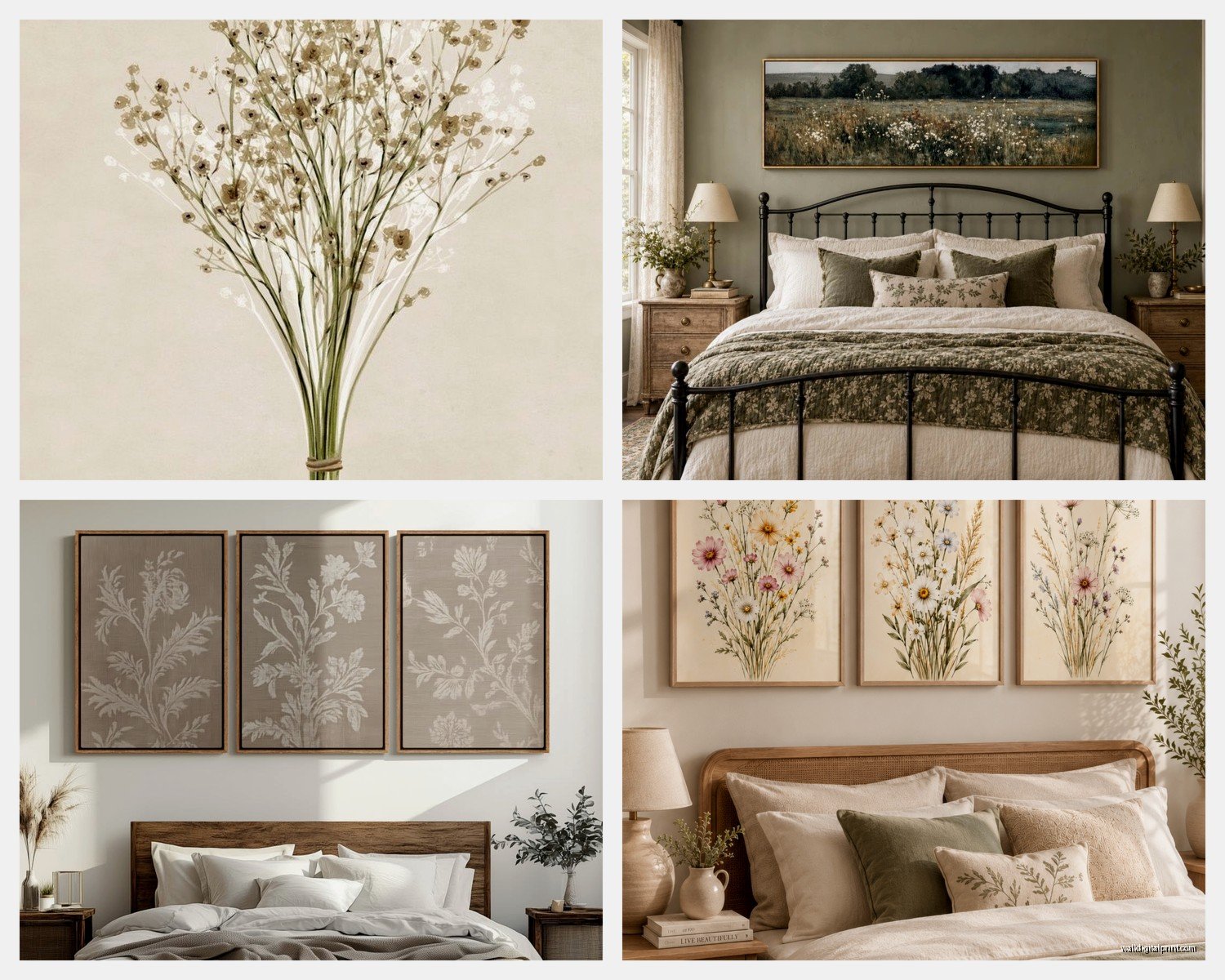
Oversized botanical prints work great for farmhouse bedrooms. Think simple line drawings of wheat, cotton, eucalyptus – stuff that actually grows on farms. You can find printables on Etsy for like five bucks and frame them yourself. I usually print mine at FedEx on their nice cardstock and it looks professional.
Oh and another thing – a large wreath above the bed is super underrated. Cotton wreath, grapevine wreath with some greenery, even a simple twig wreath. It adds dimension and texture without being too busy. My client was skeptical about this last month but we hung a 30 inch cotton wreath above her bed and she literally texted me a picture every day for a week because she loved it so much.
Gallery Walls For Farmhouse Bedrooms
Okay so gallery walls can either look amazing or like a chaotic mess. Here’s what I’ve learned after doing probably fifty of these.
Stick to a color palette. For farmhouse you’re usually working with black, white, cream, brown, and maybe one accent color like sage or rust. Don’t throw in a bright blue frame because you happened to have it.
Mix frame styles but keep them in the same color family. All black frames can look too formal. All wood frames can look too rustic. I like mixing black and natural wood frames together – it feels collected and intentional.
My Gallery Wall Layout Trick
This is gonna sound weird but I always lay everything out on the floor first in the exact arrangement. Then I take a picture of it with my phone from directly above. That way I can reference it while I’m hanging and I don’t forget where things go.
For spacing I use 2-3 inches between frames. Any closer and it looks crowded, any farther and it doesn’t feel cohesive.
Also pro tip – start with your center piece or largest piece and work outward. Don’t start in a corner and try to work your way across because you WILL run out of wall space in weird ways.
What To Put In The Frames
You don’t need expensive art prints for every frame. Here’s what actually works:
Vintage book pages like I mentioned. Architecture books, botanical guides, old dictionaries. Frame the pages individually or do a set.
Black and white farm photos. You can find these on Etsy or even in antique stores. Pictures of cows, barns, wheat fields – it gives you that authentic farmhouse feel without being too literal.
Pressed botanicals. I’ve started pressing my own and it’s honestly so easy. Cotton stems, wheat, eucalyptus – put them between heavy books for a couple weeks then frame them. Free art that looks expensive.
Simple line drawings. There are tons of free printables online of farm animals, plants, landscapes done in that minimal line art style. Print them on nice paper and they look legit.
Burlap or linen fabric. Sometimes I’ll just stretch a piece of vintage grain sack fabric over a canvas or in a frame and call it art. The texture reads as interesting even though it’s literally just fabric.
Wall Placement Strategy
Don’t just do the wall above your bed and call it done. A farmhouse bedroom should have art distributed around the room but in a way that feels natural.
Above the bed is obvious. But also consider above your dresser – this is a great spot for a smaller gallery wall or a single statement piece. I usually go smaller here than above the bed so it doesn’t compete.
Next to windows is tricky because you don’t want to block light but a tall narrow piece between two windows or on the wall perpendicular to windows can work really well. I did this with a vintage ladder leaning against the wall with a wreath hung on it – functioned as art but also added height.
In the corner – everyone forgets about corners. A larger piece in a corner can actually make the room feel more pulled together. Or do a corner shelf with some smaller art pieces and decor items mixed in.
Lighting Your Wall Art
This is something nobody thinks about until the art is up and they realize you can’t see it properly at night. My dog just knocked over my water bottle on my desk so give me a sec…
Okay back. So lighting. You don’t need fancy picture lights for every piece but the wall above your bed specifically should have some ambient lighting. I like using wall sconces on either side of the bed that cast light upward – they illuminate the art without being too direct.
If you have a gallery wall, make sure there’s a lamp nearby that lights it. A floor lamp in the corner or table lamp on a dresser can work.
Avoid Direct Sunlight
If your bed wall gets direct afternoon sun, be careful with certain prints because they’ll fade. I learned this the hard way with some botanical prints that went from deep green to basically yellow after one summer. Either use UV protective glass in the frames or pick that wall for pieces that won’t fade like wood signs or metal art.
Budget-Friendly Options That Don’t Look Cheap
You don’t need to spend hundreds of dollars on this. Here’s where I actually shop when I’m trying to keep costs down:
Thrift stores and estate sales for vintage frames. You can always paint them if you need to. I’ve found gorgeous old frames for like three dollars that would cost fifty new.
Etsy for printables. Five to ten bucks gets you a high quality digital file you can print yourself. Just make sure you’re printing at the right size and on good paper.
Hobby Lobby when they have their 50% off frame sale. Sign up for their emails because they do this constantly. Their farmhouse style frames are actually pretty decent quality.
Facebook Marketplace for larger pieces. I’ve found amazing vintage windows, old shutters, wood signs – people are always selling this stuff when they redecorate.
Make your own. I know that sounds intimidating but some of the best farmhouse wall art is DIY. Wood signs are super easy – get a piece of wood from Home Depot, sand it, stain or paint it, add lettering with vinyl stickers or paint. Done.
Common Mistakes To Actually Avoid
Hanging things too high. The center of your art should be at eye level which is around 57-60 inches from the floor. Above the bed can go slightly higher but not by much.
Too many fonts. If you’re doing multiple word art pieces, stick to one or two font styles max. Otherwise it looks scattered.
Everything matching too perfectly. Farmhouse style is supposed to feel collected. If every piece has the same frame and same matting, it looks too planned.
Ignoring scale. A bunch of small pieces on a big wall just looks sparse. You need some larger anchor pieces mixed with smaller ones.
Following trends too closely. The “Blessed” and “Gather” signs were everywhere for a while and now they feel dated. Stick with more timeless pieces or things that have actual meaning to you.
Seasonal Switching
One thing I do in my own bedroom and suggest to clients is having a few pieces you can swap out seasonally. Keep your main gallery wall permanent but maybe have a wreath above the bed that you change – cotton in fall, greenery in spring, whatever.
Or have a few smaller frames on your dresser that you rotate different prints through. Keeps the room feeling fresh without having to redo everything.
I keep a bin in my closet with seasonal art pieces and it takes like ten minutes twice a year to swap things out. My sister thinks I’m crazy but it makes such a difference.
The Pieces I Keep Coming Back To
After doing this for years there are certain pieces that work in almost every farmhouse bedroom. Large cotton wreath – can’t go wrong. Simple black and white farm photography in thin black frames – classic. Vintage window frame – adds so much character. Wood round sign with minimal text – works above a bed or dresser. Set of three botanical prints in matching frames – easy gallery wall that looks intentional.
You really don’t need to overthink this. Start with one or two pieces you really love, build from there, and don’t buy everything at once. The best farmhouse bedrooms feel like they were decorated over time because they actually were.
Just remember it’s your bedroom so it needs to feel relaxing to you specifically. If roosters stress you out don’t put rooster art on your wall just because it’s “farmhouse.” If you love a piece that’s maybe more modern but works with your color scheme, use it. The rules aren’t that strict.
Anyway I gotta go frame some prints before my client meeting tomorrow but hopefully this helps you figure out your wall situation!