Wall Art Guide, Wall Art Tutoriels
Media Room Wall Art: Home Theater Movie Watching Space
Oct
So I just finished setting up wall art in my friend’s media room last week and honestly, the biggest mistake people make is treating it like a regular living room. Like, you’re gonna be watching movies in the dark mostly, right? So half the stuff you’d normally put up just… disappears or creates weird glare issues.
The Lighting Thing Nobody Talks About
Okay so first thing – and I learned this the hard way in my own theater space – you need art that works in dim lighting. I had this gorgeous abstract piece with all these subtle color gradients, looked amazing in daylight, but the second we dimmed the lights for movie night it just became this black blob on the wall. Total waste.
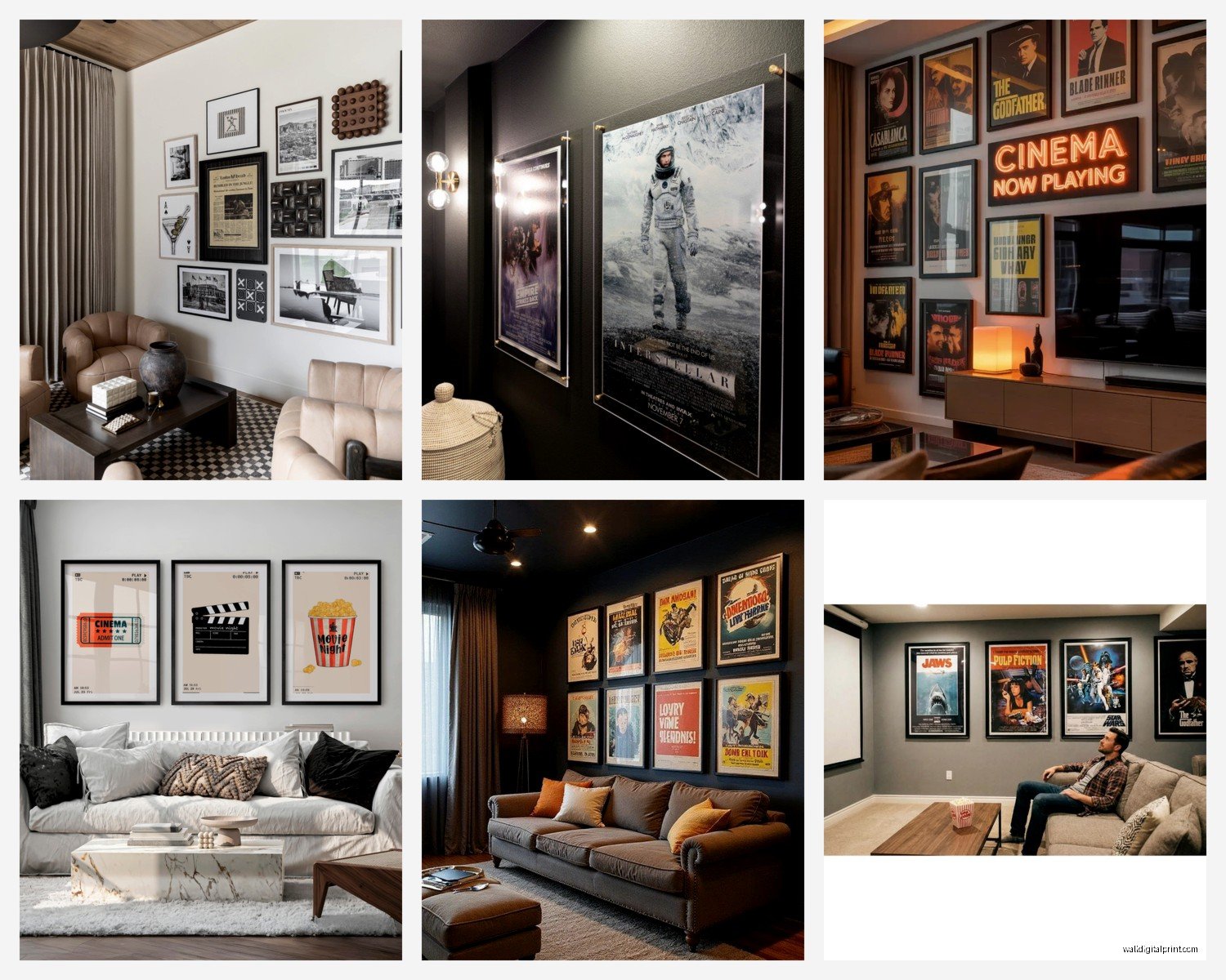
What actually works: high contrast pieces. Black and white photography, bold graphic prints, anything with defined shapes that don’t need perfect lighting to read properly. I’ve been obsessed with vintage movie posters lately because they’re designed to be eye-catching even in low light. My client last month did this whole wall of criterion collection-style posters and it looks incredible whether the lights are up or down.
Movie Posters But Make It Not Cheesy
Wait I gotta mention this because everyone defaults to the same tired Star Wars or Pulp Fiction posters. Nothing wrong with those but like… there are better options now. I’ve found these artists on Etsy who do minimalist redesigns of classic films. Just simple geometric shapes and limited color palettes. So much more sophisticated than the standard theatrical release posters.
Also – and this is gonna sound weird but – Polish movie posters from the 60s and 70s are absolutely stunning. They’re surreal and artistic and nobody else will have them. I found a Polish poster for “Rosemary’s Baby” that’s just this creepy illustrated face and it’s become my favorite piece in my own media room.
Size and Scale (aka Don’t Go Tiny)
Media rooms are usually pretty large spaces and people get intimidated by big art. But here’s the thing – you need substantial pieces. Those little 16×20 prints that look fine in a bedroom? They disappear completely on a big media room wall.
I generally tell people to go with either one massive statement piece (like 40×60 or bigger) or do a gallery wall situation with larger individual frames. Nothing smaller than 20×30 if you’re doing multiples.
My dog just knocked over my coffee and I’m realizing I haven’t mentioned the most important rule yet…
Absolutely No Glass or Glossy Finishes
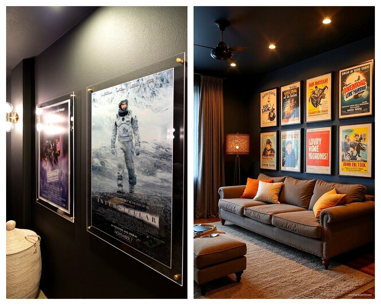
This is non-negotiable. The glare from your projector or TV will reflect right back at you and it’s SO distracting. I made this mistake in my first apartment – had three framed prints with glass and every time there was a bright scene in the movie, I’d see three rectangles of light on the wall. Drove me absolutely insane.
Use matte finishes only. Canvas prints work great. If you’re doing framed pieces, either go frameless or use frames without glass/acrylic. You can also do metal prints with a matte coating – those have been really popular with my clients lately and they hold up well in darker spaces.
The Fabric Panel Thing I’m Obsessed With
Oh and another thing – acoustic panels disguised as art. These are genius for media rooms because they actually serve a purpose beyond looking nice. They absorb sound and reduce echo, which makes your whole audio setup sound better.
You can get custom fabric panels printed with whatever image you want. I did four panels in my space with abstract geometric patterns in deep blues and grays. They look like modern art but they’re actually improving the acoustics. There’s this company… I think it’s called GIK Acoustics? They do really high-end ones but honestly you can DIY this pretty easily with acoustic foam and fabric from a craft store.
Color Schemes That Don’t Fight Your Screen
Your wall art shouldn’t compete with what’s on screen. I learned this watching Blade Runner 2049 with this bright orange abstract painting right next to the TV – every time there was a dark scene, my eyes kept drifting to the painting instead.
Stick with deeper, more muted tones. Navy, charcoal gray, deep burgundy, forest green. Black and white obviously works. Metallics can be okay if they’re not too shiny – I’ve used some brushed gold and copper pieces that add warmth without being distracting.
If you really want color, put it on the side walls, not the wall with your screen. I did a whole wall of colorful vintage travel posters on the side wall of my media room and it adds personality without interfering with movie watching.
Theme or No Theme?
This is totally personal preference but I’m gonna give you my honest take. Full-on themed media rooms – like everything is Star Wars or Marvel or whatever – can feel kinda juvenile unless you do it really carefully. I had a client who wanted a “cinema” theme and almost went with all this movie theater memorabilia and vintage popcorn machine imagery and it was just… a lot.
What we ended up doing instead was focusing on the golden age of Hollywood. Black and white portraits of classic actors, some art deco-inspired geometric prints, a few pieces that referenced old film equipment in an abstract way. It felt sophisticated and still connected to movies without being too literal about it.
But honestly if you love something, go for it. I’m not gonna judge someone for their Tarantino shrine if it makes them happy every time they walk in the room.
Gallery Walls in Media Rooms
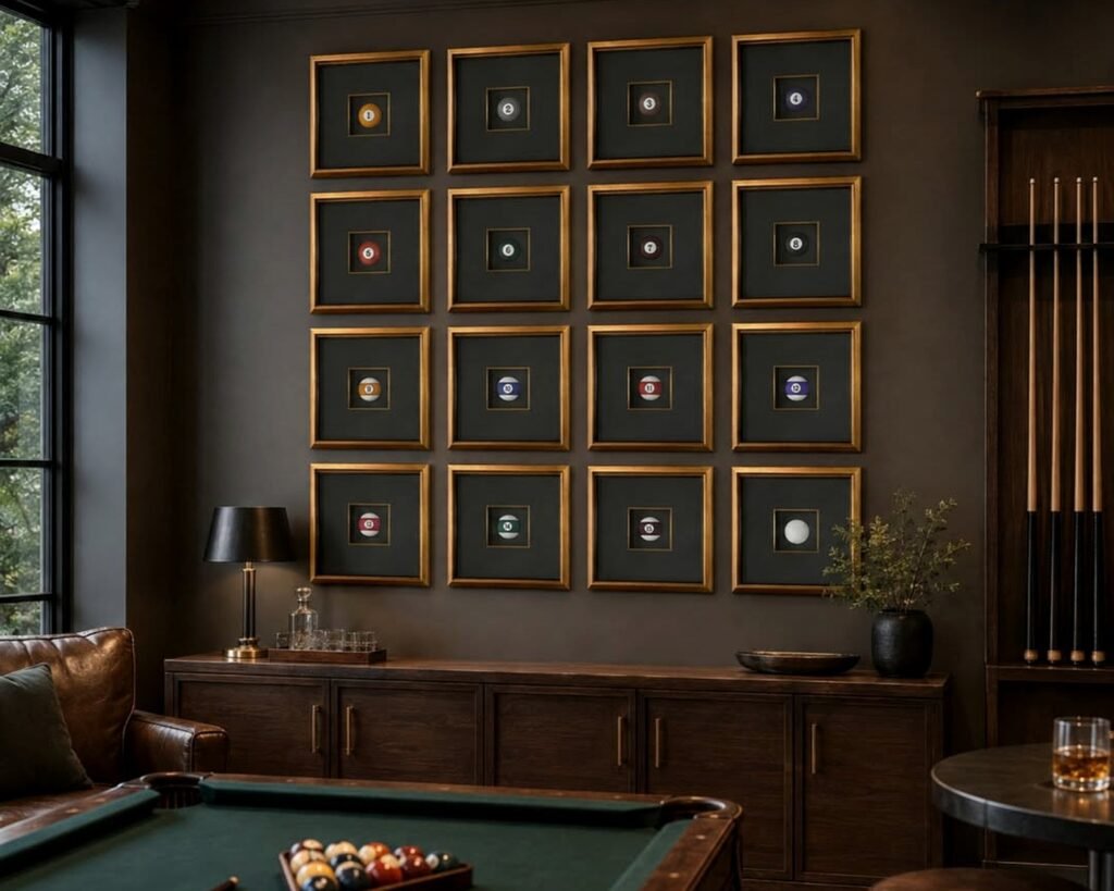
These can work really well but you gotta plan them differently than in other rooms. I always do symmetrical layouts in media rooms instead of the organic, scattered look that’s popular elsewhere. There’s already so much going on visually with the screen and equipment, so a clean grid of frames feels more intentional.
I did nine frames in a perfect grid – same size, same black matte frames, mix of black and white photography and graphic prints. It’s on the wall opposite the screen so you see it when you walk in but it’s not in your sightline during movies.
Spacing matters too. I go slightly wider between frames than I would in a living room, maybe 4-5 inches instead of 2-3. Gives each piece more breathing room.
LED Backlighting (I Resisted This For So Long)
Okay so funny story, I thought LED backlighting on art was super tacky for the longest time. Like something from a college dorm room. But then I saw it done well in a high-end home theater and completely changed my mind.
The trick is subtlety. You want a soft glow behind the piece, not bright colored lights. Warm white or very subtle amber tones work best. It creates this nice ambient lighting that’s perfect for when you want some light in the room but don’t want to turn on overhead fixtures.
I installed some behind a large canvas print of a minimalist landscape – just simple horizon lines in grays and blues – and it creates this really moody atmosphere. Plus it’s dimmable so you can adjust it based on what you’re watching.
Textural Elements That Add Depth
Flat prints are fine but adding some texture makes the space feel more intentional. I’m really into wood wall art right now – like those layered pieces that create topographic-style designs. They cast interesting shadows when lit and add dimension without being overly decorative.
Woven wall hangings can work too if they fit your style. I did a modern macrame piece in a client’s media room, all in natural fibers, very geometric and structured. It softened the space without feeling too boho.
Metal wall sculptures are another option, especially in darker finishes like oil-rubbed bronze or matte black. Just make sure they’re not too reflective – see the earlier rant about glare.
The Sides of Built-ins and Shelving
If you have built-in shelving or cabinets for equipment, don’t forget those surfaces. Small art pieces, sculptural objects, even just interesting books arranged spine-out can fill those spaces.
I’m currently binge-watching The Bear and just realized I haven’t eaten dinner but anyway…
I like using a mix of small framed pieces and 3D objects. Maybe a small vintage camera, some art books about cinematography, a sculptural piece that echoes your main wall art. It creates layers and makes the whole room feel curated.
Budget-Friendly Options That Don’t Look Cheap
Look, not everyone can drop thousands on original art. I get it. Here’s what actually works without breaking the bank:
Canvas prints from your own photos. If you’ve traveled anywhere with decent architecture or landscapes, blow those up. A really large canvas print is like $100-150 and looks way more expensive than it is. I did three huge prints from a trip to Iceland – just minimalist landscape shots – and everyone assumes they’re from a gallery.
Society6 and similar sites have tons of artists selling prints. You can get large format prints for reasonable prices. Just stick with the simpler, more sophisticated designs and avoid anything too trendy.
Thrift stores and estate sales for vintage frames. Buy cheap prints online, put them in quality vintage frames, suddenly they look legitimate. I’ve done this so many times.
What Doesn’t Work (Learned From Mistakes)
Anything too busy or detailed. You know those really intricate pieces with tons of small elements? They just create visual noise in a media room. You want clean lines and bold shapes.
Personal photos of like, your family and friends. This might be controversial but media rooms should feel like an escape, not a living room. Save the family gallery wall for the hallway.
Neon signs. I know they’re having a moment but the constant glow is annoying during movies. Unless you can turn it off easily, skip it.
Mirrors or anything reflective – already covered this but it bears repeating because people keep trying to make it work and it just doesn’t.
Installation Height and Placement
Standard rule is center the art at eye level when standing, but in a media room you’re mostly sitting. I hang things slightly lower than I would elsewhere, especially pieces flanking the screen.
For the wall opposite your seating, standard height works since you’ll see it when entering the room. But side walls and areas near the screen should account for your seated sightline.
And please, please measure before you commit to a layout. I use painters tape to map out where frames will go before putting any holes in the wall. Saved me so many times from asymmetrical disasters.
The one exception is ceiling art – I’ve done a few media rooms with artwork on the ceiling, especially in rooms with reclined seating. It’s unexpected and kinda fun when you’re lounging back. Just keep it simple, nothing too distracting.
Mixing Styles Without Looking Chaotic
You can absolutely mix vintage movie posters with modern abstract art with photography. The key is finding a common thread – usually color palette or framing style.
I did a media room last year that mixed 1950s sci-fi movie posters with contemporary geometric prints. Totally different styles but we kept everything in black, white, and one accent color (this retro teal). Same black frames throughout. It worked because there was visual cohesion even though the actual art styles were different.
Or go all matchy-matchy if that’s your thing. Nine identical frames, nine different black and white photos. Clean, simple, effective.
Alright I think that covers most of it. The main things are really just avoiding glare, going bigger than you think you need, and choosing pieces that work in low light. Everything else is personal preference and what makes you happy when you’re settling in for a movie marathon.