Wall Art Guide, Wall Art Tutoriels
Green Bathroom Wall Art: Nature Emerald Bath Space Decor
Oct
So I’ve been obsessing over green bathroom art lately and honestly it’s completely transformed how I think about that weird little room everyone forgets to decorate properly. Like, you spend money on fancy towels but the walls are just…blank? Makes no sense.
Why Green Actually Works in Bathrooms
Okay so here’s the thing about green in bathrooms that I didn’t get until I tested it in my own space. It’s not just about matching your eucalyptus shower curtain or whatever. Green actually makes bathrooms feel less clinical, you know? I had this client last month who had one of those stark white subway tile situations and she was like “I hate being in here, it feels like a doctor’s office” and we added three botanical prints in sage green frames and suddenly the whole vibe shifted.
The emerald tones especially work because they read as luxurious without being too precious. And bathrooms get humid and weird, so you want colors that feel fresh but also kind of…I dunno, intentional? Green does that.
What Actually Holds Up in Bathroom Conditions
This is gonna sound obvious but I learned this the hard way – not all art can handle bathroom moisture. I put a regular paper print in my powder room like three years ago and it got all warped and gross within six months. So here’s what actually works:
- Framed prints behind glass (the glass protects the paper from humidity)
- Canvas prints with a protective coating
- Metal prints (these are surprisingly affordable now)
- Acrylic prints (they look super modern and sleek)
- Ceramic tile art pieces
Whatever you pick, make sure there’s some kind of barrier between the actual art and the steam from your shower. I use this rule: if it’s within like 4 feet of the shower, it needs to be properly sealed or behind glass.
The Types of Green Art That Don’t Look Cheesy
Oh and another thing – not all botanical prints are created equal. There’s this whole category of green bathroom art that’s just…bad. Like those generic fern prints you see at HomeGoods that somehow look both boring and trying too hard at the same time?
Here’s what I’ve found actually looks good:
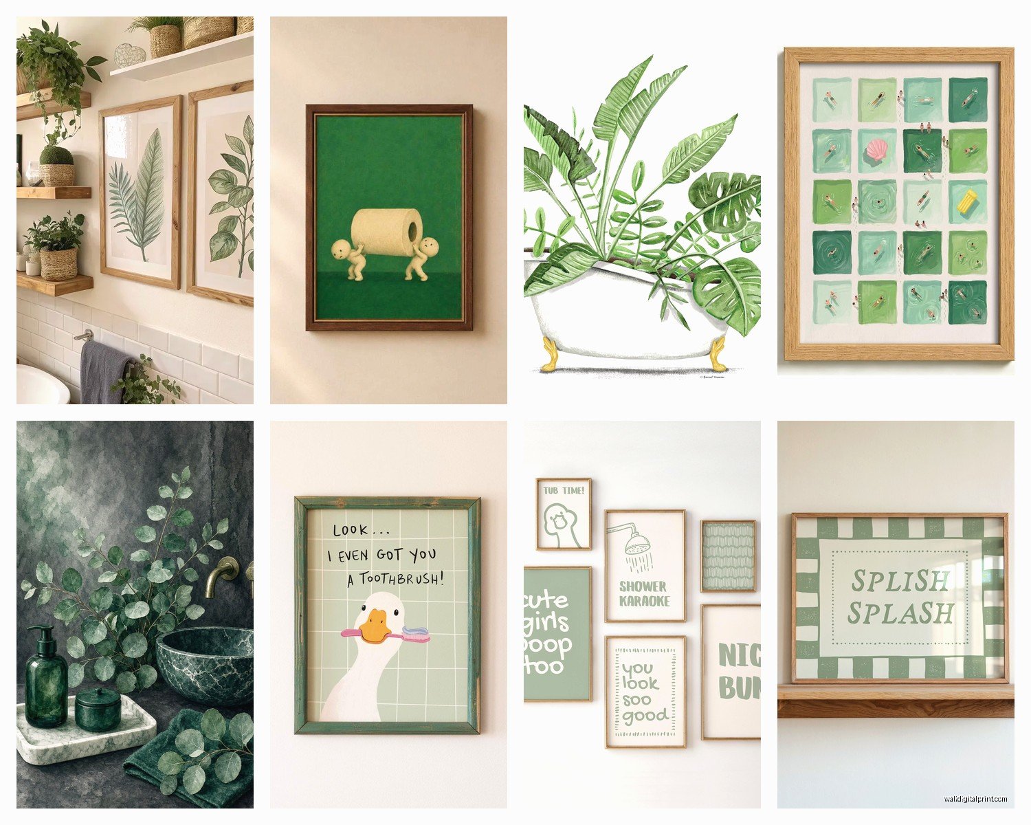
Abstract green watercolors – These work because they’re not trying to be literal. Just washes of emerald and sage with maybe some gold accents. I got one from this Etsy seller last year and people always ask about it.
Vintage botanical illustrations – The old-school scientific drawing style. They’re detailed but not cutesy. You can find high-res scans of public domain ones and print them yourself if you’re on a budget.
Palm leaf photography – But only if it’s well-shot. Like actual artistic photography, not the stuff that looks like a stock photo.
Monstera or tropical plant line drawings – Simple black line drawings on white or cream backgrounds with green mats. Very clean.
Abstract emerald gemstone or agate art – This sounds weird but the geode/agate slice trend actually works in bathrooms because the colors are naturally in that green-blue range.
Size and Placement Things Nobody Tells You
So my dog knocked over my coffee this morning while I was measuring frames and it made me realize I should mention this – bathrooms are SMALL. Like you think you know this but then you go to hang art and suddenly you’re like “wait where does this actually go?”
Above the toilet is obvious but here’s the thing – don’t go too small. I see people put these tiny 5×7 prints above the toilet and it looks like an afterthought. You want at least 16×20 or a gallery wall of smaller pieces. The rule I use is the art should take up about 2/3 the width of whatever’s below it (toilet, vanity, etc).
Opposite the mirror is actually my favorite spot that people forget about. When you’re at the sink, you can see the wall behind you in the reflection. Put something good there.
Next to the shower works if you have the wall space, but keep it at least 18 inches away from the shower edge.
For sizing, I did this whole thing where I cut out newspaper in different sizes and taped them to my bathroom wall before buying anything. Looked insane but it helped me figure out that I needed three 11×14 pieces instead of one big statement piece.
The Gallery Wall Approach
Okay so funny story – I was watching The Great British Baking Show and stress-eating crackers when I planned out my bathroom gallery wall, and honestly being distracted helped because I wasn’t overthinking it.
For a green-themed gallery wall:
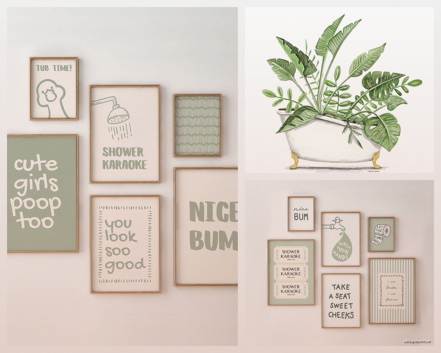
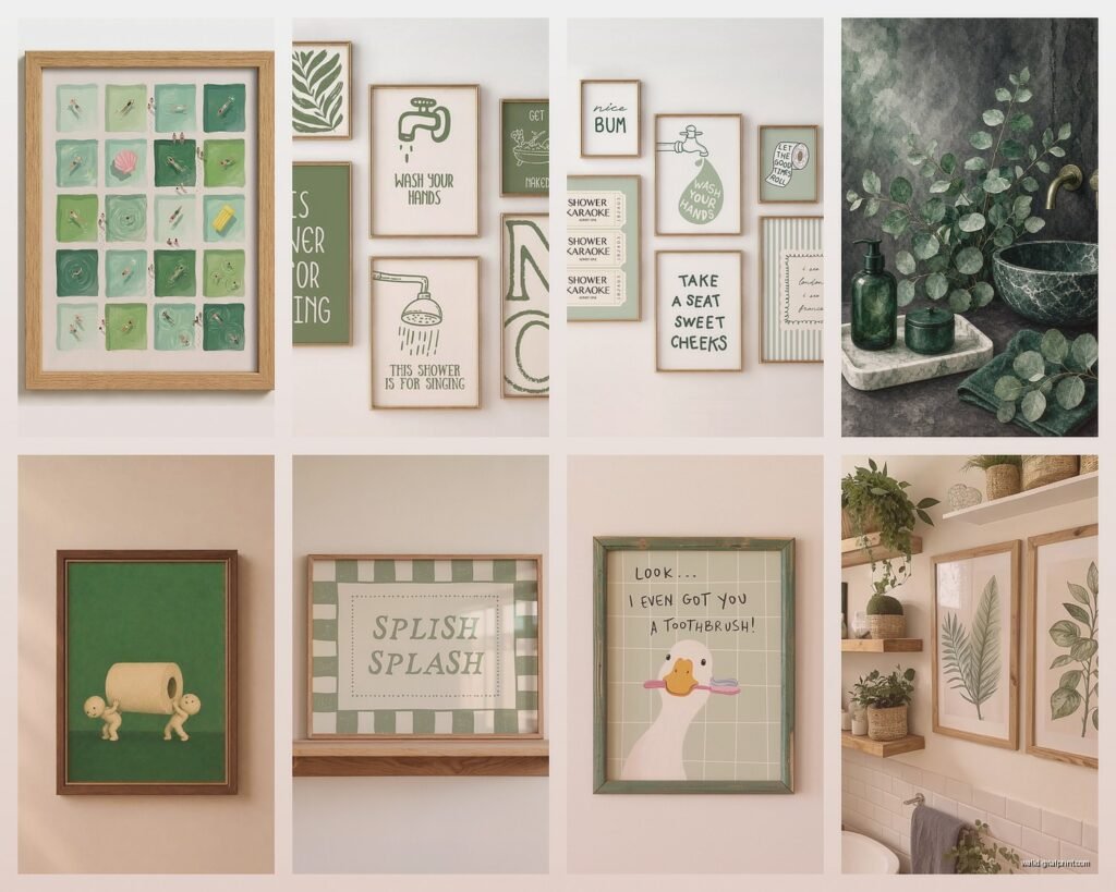
- Mix 3-5 pieces in different shades of green (emerald, sage, olive, mint)
- Vary the subjects (one abstract, one botanical, one geometric)
- Keep frames consistent – all gold, all black, or all natural wood
- Leave 2-3 inches between frames
- Arrange them on the floor first, I’m serious, this saves so much wall damage
I use those 3M picture hanging strips for bathroom art because drilling into tile is a nightmare and if you change your mind later you’re not stuck with holes.
Actual Product Recommendations I’ve Tested
Wait I forgot to mention – when people DM me asking “which one should I actually buy,” here’s what I send them:
Budget option: Print your own from sites like Desenio or Etsy. Get them printed at a local print shop on cardstock, then frame them in IKEA Ribba frames with the glass. Total cost like $45 for three pieces. I’ve done this for clients who are renting and don’t wanna invest a ton.
Mid-range: Minted has really good botanical art prints and you can get them framed. Their frames are actually decent quality. Or check out Society6 for canvas prints with that protective coating I mentioned. Around $80-150 per piece.
Splurge: Etsy shops that do original watercolors or mixed media pieces. I’m obsessed with this one artist who does eucalyptus branches in emerald and gold leaf. Like $200-400 but they’re actual art.
The DIY route: If you’re crafty (I’m not really but I tried this), you can press real ferns and leaves between glass in a floating frame. Spray them with acrylic sealer first so they don’t get moldy from bathroom humidity. Learned that one the hard way.
Color Combinations That Don’t Clash
This is where people get tripped up. You’ve got green art picked out but then what?
Emerald + white + brass – Classic, can’t go wrong. White subway tile, brass fixtures, emerald art. Done.
Sage green + cream + black – More modern farmhouse if that’s your thing. Black frames, cream walls, sage green prints.
Forest green + marble + gold – Fancy. Like hotel bathroom fancy. Dark green art, marble counters, gold frame accents.
Mint + gray + chrome – Contemporary and fresh. Light and airy.
The trick is picking 2-3 shades of green max. I made the mistake once of mixing emerald, lime, sage, and forest green in one small bathroom and it looked like a confused jungle. Stick to tones in the same family.
Making It Feel Cohesive
Oh and another thing that matters more than you’d think – repeat the green somewhere else in the room. Just the art alone can look random. I add:
- Green hand towels (even just one accent towel)
- A small plant (pothos are unkillable and trail nicely)
- Green soap dispenser or toothbrush holder
- Bath mat with green accents
You don’t need all of these, just like one or two other green elements so the art doesn’t look like it parachuted in from another room.
The Lighting Thing Nobody Talks About
Your bathroom lighting is probably terrible, right? Most bathrooms have that harsh overhead light that makes everything look weird. Here’s what I’ve learned: green art actually needs decent lighting to not look muddy.
If you can add a picture light above your main piece, do it. Those little battery-operated LED picture lights from Amazon are like $25 and they make such a difference. Or if your bathroom has no natural light, consider art with lighter greens (sage, mint, seafoam) instead of deep emerald because dark greens can look almost black in bad lighting.
I tested this by moving the same emerald print between my powder room (no windows) and my master bath (big window) and it looked like two different pieces of art. In the windowless room I had to switch to a lighter sage print.
Dealing With Existing Tile Colors
So you’ve probably got existing tile that’s beige or blue or whatever, right? Here’s how to make green art work:
Beige/tan tile: Go with olive or sage greens, they share warm undertones
White tile: Literally any shade of green works, you lucky person
Gray tile: Emerald or hunter green looks amazing, very jewel-tone
Blue tile: Stick to blue-greens like teal or seafoam so it doesn’t clash
I had this client with pink tile (yes, pink, original 1960s) and we actually made emerald green art work by adding brass frames and cream mats. Sometimes you gotta lean into the weird.
Maintenance Stuff
Real talk – bathroom art needs occasional cleaning. Steam leaves this thin film on everything. I wipe down my frames every couple months with just a damp microfiber cloth. If you’ve got glass-covered prints, glass cleaner works fine.
Canvas prints are trickier. You can’t really clean them without damaging them, so honestly just keep them away from direct shower spray and hope for the best. Mine have been fine for two years but I have good ventilation.
Also run your bathroom fan during and after showers. This helps everything last longer, not just art but like…everything in your bathroom.
The Matting Decision
White mats make green art pop but show water spots if they’re near the sink. Cream or off-white mats are more forgiving. I’ve also done green-on-green with a sage mat around emerald art and it looked really sophisticated, but that’s harder to pull off.
Double matting (two mats layered) adds depth and looks expensive for not much extra cost. I do cream outer mat with a thin gold or dark green inner mat sometimes.
When to Skip Frames Entirely
Canvas gallery wraps (where the image wraps around the edges) can go frameless and look modern. Metal prints too. I actually prefer frameless in really small bathrooms because frames can make the space feel cluttered.
Just make sure if you’re going frameless that the edges are finished nicely. Nothing worse than a canvas wrap where you can see staples on the sides.
Okay I think that covers most of what I’ve learned through trial and error and one minor flood situation we don’t need to discuss. The main thing is just start somewhere – even one good green print above your toilet is better than blank walls. You can always add more later once you figure out what you actually like living with.