Wall Art Guide, Wall Art Tutoriels
Best Wall Art for Dining Room: Top Rated Eating Space Decor
Oct
So I’ve been obsessing over dining room wall art lately because honestly my own space looked so sad for like two years and I finally figured out what actually works versus what just looks good on Pinterest but fails in real life.
Size Matters Way More Than Anyone Tells You
Okay first thing – everyone goes too small. I did this in my first apartment and the art just disappeared on the wall. For dining rooms you want something that takes up about two-thirds to three-quarters of your sideboard or buffet width if you’re hanging above furniture. If it’s a blank wall, think bigger than feels comfortable. I’m talking like 40-60 inches wide minimum for a standard dining room.
I tested this theory with my sister’s place last month and we went from a sad 16×20 print to a 48-inch wide triptych and it completely transformed the space. She thought I was crazy when I suggested it but now she sends me photos of it like every week.
What Actually Works in Eating Spaces
Here’s the thing about dining rooms – you’re staring at the walls while you eat. For like an hour sometimes. So the art needs to be interesting enough to look at but not so intense that it kills conversation or makes your food look weird.
Abstract Art in Warm Tones
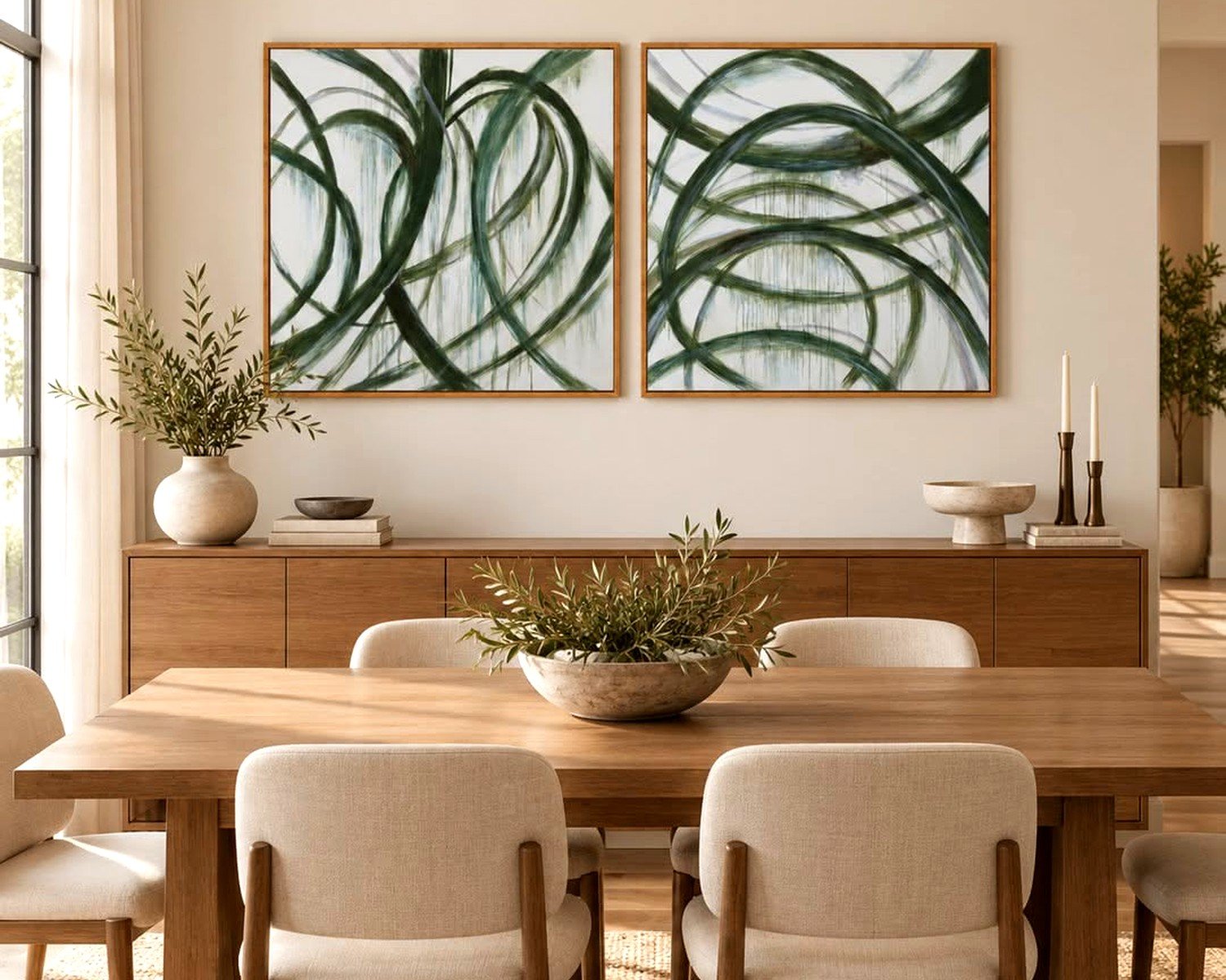
This is my go-to recommendation and I know it sounds boring but hear me out. Abstract pieces in warm colors – think terracotta, deep reds, golden yellows, burnt orange – they actually make food look more appealing. There’s some psychology thing about it. I used a large abstract canvas with rust and cream tones in a client’s dining room and she said her family started eating together more often because the room felt “warmer.” Could be coincidence but I’ll take it.
The best ones I’ve found are from Minted and Artfully Walls. Minted has this artist named Caryn Owen who does these gorgeous abstracts that read sophisticated but aren’t pretentious. Prices range from like $150-$600 depending on size.
Botanical Prints and Food Art
Okay so this is gonna sound obvious but vintage botanical prints are chef’s kiss for dining rooms. Not the basic Ikea ones everyone has – I mean actual vintage-style illustrations of fruits, vegetables, herbs. There’s this Etsy seller… wait let me find the name… okay I can’t remember but search for “antique botanical prints dining room” and you’ll find a ton.
What works really well is getting a set of 4-6 smaller prints (like 11×14) and doing a gallery wall. Frame them in matching black or natural wood frames. Cost effective too – you can do the whole thing for under $300 if you print them yourself at a local print shop.
I did this in my own dining room with vintage vegetable illustrations and it’s such a conversation starter. My nephew asked me why I had “pictures of food on the wall” which yeah fair point kid.
Black and White Photography
This works especially well in modern or minimalist dining rooms. Large-scale black and white photos of architecture, landscapes, or even abstract subjects. The key is high contrast – you want deep blacks and bright whites, not muddy grays.
I’m obsessed with this one photographer on Society6 who does aerial shots of coastlines in black and white. Hung a 40×60 print in a client’s dining room last fall and it’s still one of my favorite installations. Something about the organic shapes works with the social aspect of dining.
Word of warning though – avoid black and white food photography in dining rooms. I know it seems like it would work but it makes actual food look less appealing by comparison. Learned that the hard way.
Framing Basics Nobody Explains Properly
Okay so framing is where people blow their budget or cheap out too much. Here’s what I’ve learned after way too many framing disasters:
For large pieces you’re gonna want to use a frame with a mat. The mat creates breathing room between the art and frame and makes everything look more expensive. Standard rule is 2-3 inch mat borders.
If you’re on a budget, Framebridge is actually really good. Yeah it’s pricier than doing it yourself but the quality is solid and they have frequent sales. I wait for their 25% off sales and stock up.
For gallery walls, keep the frame style consistent but you can vary sizes. All black frames or all natural wood – don’t mix metals and woods together unless you really know what you’re doing. I tried to get creative once with mixed frames and it looked like I’d decorated using only thrift store finds. Which I had, but still.
The Hanging Height Thing
Center of the artwork should be at 57-60 inches from the floor. This is like museum standard and it actually works. I use painters tape to map out where the art will go before I commit to holes in the wall because I’ve definitely hung things too high or too low and had to redo it.
If you’re hanging above a buffet or console, leave 6-8 inches between the furniture and the bottom of the frame. More than that and the art looks like it’s floating away, less and it looks cramped.
Unexpected Options That Actually Work
Textile Wall Hangings
Okay this is gonna sound weird but woven wall hangings or tapestries can be amazing in dining rooms. Not the macrame stuff from the 70s – I mean modern textile art. There’s something about the texture that adds warmth and the fabric actually helps with acoustics if your dining room is echoey.
I found this gorgeous handwoven piece at a local art fair last year and it’s in my own dining room now. Cost me $400 but it’s a conversation piece every single time we have people over.
Mirrors as Art
Not technically art but decorative mirrors work really well in dining rooms because they reflect light and make the space feel bigger. I especially love vintage sunburst mirrors or modern geometric ones.
Pro tip – hang a mirror on the wall opposite a window and it’ll bounce natural light around the room. Makes evening dinners feel brighter without harsh overhead lighting.
Sculptural Pieces
Three-dimensional wall art is having a moment and I’m here for it. Metal wall sculptures, ceramic installations, even shadow boxes with interesting objects. These add depth that flat art can’t achieve.
I installed a brass geometric wall sculpture in a client’s dining room last month – it was from West Elm and it catches the light in this really beautiful way throughout the day. Cost was around $250.
Color Coordination Without Being Matchy-Matchy
Your wall art doesn’t need to match your dining room colors exactly but it should complement them. I usually pull one or two accent colors from the room and make sure they appear somewhere in the artwork.
Like if you have navy dining chairs, look for art that has some navy in it along with other colors. Or if your room is mostly neutrals, the art can be where you introduce color.
What doesn’t work – and I see this all the time – is choosing art that fights with your wall color. Red art on red walls = muddy and flat. You want some contrast.
Budget Breakdowns That Actually Make Sense
Under $200
Society6 or Desenio for prints. Frame them yourself with frames from Target or Michaels during a sale. You can do a whole gallery wall for under $200 if you’re strategic.
Print your own art from digital downloads on Etsy – costs like $5-15 per print then you just need frames. My cat knocked over my coffee while I was doing this once and ruined three prints but that’s a different story.
$200-$500
This is the sweet spot honestly. You can get original art from emerging artists on Saatchi Art or Artfinder. Or go with higher-end prints from Minted or Framebridge with professional framing included.
I’ve bought several pieces in this range and the quality jump from cheaper options is noticeable.
$500+
Original paintings, commissioned work, or investment pieces from established artists. If you’re spending this much, buy what you genuinely love not what’s trendy. I have clients who’ve spent thousands on dining room art and zero regrets because they chose pieces with staying power.
Also local art galleries often have payment plans which makes original art more accessible than you’d think.
Installation Tips From Someone Who’s Made Every Mistake
Use proper hanging hardware – those little sawtooth hangers that come with cheap frames are garbage. Get D-rings and picture hanging wire for anything over 5 pounds.
For heavy pieces use wall anchors or hit a stud. I’ve had art fall off walls and it’s terrifying and expensive. A $5 pack of wall anchors is worth it.
Command strips work for lightweight art if you’re renting but read the weight limits carefully. I’ve had mixed success with these honestly.
Level everything. Your eye will catch even slight tilts and it’ll bug you forever. I use a laser level now because regular levels are annoying for large pieces.
Styles That Keep Working Year After Year
Trends come and go but some styles have staying power in dining rooms:
Landscape paintings – especially moody seascapes or mountain scenes. They’re calming and timeless.
Still life art – classic for a reason in dining spaces. Look for modern interpretations not stuffy traditional ones.
Abstract expressionism – the big gestural pieces with lots of movement. These work in both traditional and modern dining rooms.
Line drawings – simple, sophisticated, versatile. Single-line face portraits are everywhere right now but simple line landscapes or objects have more staying power.
What I avoid in dining rooms – anything too personal like family photos (save those for other rooms), anything violent or disturbing obviously, and overly trendy stuff like those “gather” signs or word art. Just my opinion but they feel dated already.
Lighting Your Art Properly
This is something people forget but it matters so much. If your art is in a dark corner it might as well not exist.
Picture lights are the fancy option – those brass or black lights that mount above frames. They’re pricey though, like $100-300 per light.
More affordable option is to angle a track light or recessed light toward the art. Or use the lighting you already have and just make sure the art isn’t in shadow.
I added a dimmer switch to my dining room lights and it made such a difference. You can adjust the mood for different occasions and the art looks different at various light levels.
Natural Light Considerations
If your dining room gets tons of sunlight, be careful with prints and photographs – they’ll fade over time. Use UV-protective glass in frames or acrylic glazing. Museum glass is expensive but worth it for pieces you really love.
I learned this lesson when a print I’d hung in a sunny spot faded to basically nothing after two years. Frustrating and avoidable.
When to Break the Rules
Everything I’ve said has exceptions. Sometimes going super small with art works if it’s intentionally minimalist. Sometimes mixing frame styles creates an eclectic vibe that’s perfect for your space. Sometimes the “wrong” color combination is exactly right.
Trust your gut over design rules. If you love something and it makes you happy when you look at it during dinner, that’s what matters. I have a client who hung a neon sign in her formal dining room and it shouldn’t work but it totally does because it fits her personality.
The only real rule is that you should love looking at it because you’re gonna see it every day, probably multiple times, and if it annoys you or bores you that’s a problem.
My dining room art has evolved over the years and I’m sure it’ll keep changing. Right now I have that textile piece I mentioned and I’m obsessed with it but who knows, maybe next year I’ll want something completely different. And that’s fine too.