Wall Art Guide, Wall Art Tutoriels
Above TV Wall Art: Media Console Focal Point Placement
Jun
So I’ve been dealing with this exact thing for like three clients this month and honestly, the TV-plus-art situation is way trickier than people think. Everyone assumes you just slap something above the screen and call it a day but there’s actually a whole thing about proportions and sight lines that’ll make or break the whole setup.
First thing – and I cannot stress this enough – measure the actual viewing distance from your couch to the TV. I had this couple in Brooklyn who mounted their art way too high because they were going off some random Pinterest rule, and every time they watched anything they’d get neck strain from the TV being mounted too low in comparison. The art was gorgeous (this abstract piece from an artist in Portland) but it basically ruined their whole media wall situation.
The Height Thing Nobody Gets Right
Okay so here’s what actually works. Your TV center should be at eye level when you’re seated – that’s usually around 42-48 inches from the floor depending on your couch height. Then you need AT LEAST 6-8 inches between the top of your TV and the bottom of whatever art you’re hanging. Less than that and it looks cramped, like you just stuck it there because you had empty wall space.
I personally prefer 8-12 inches of breathing room because it creates this visual separation that makes both pieces feel intentional instead of cluttered. My cat knocked over a vase last week while I was trying to measure this exact spacing for a client and honestly the interruption made me realize I was overthinking it – sometimes you just gotta eyeball it and adjust.
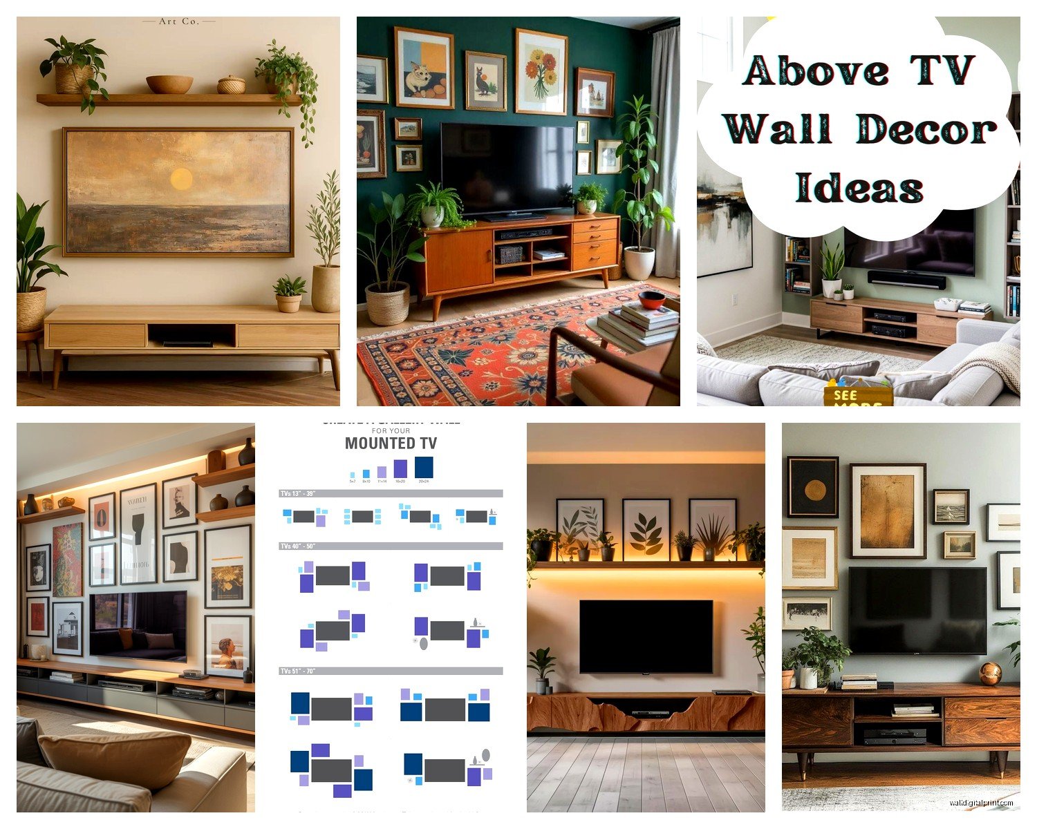
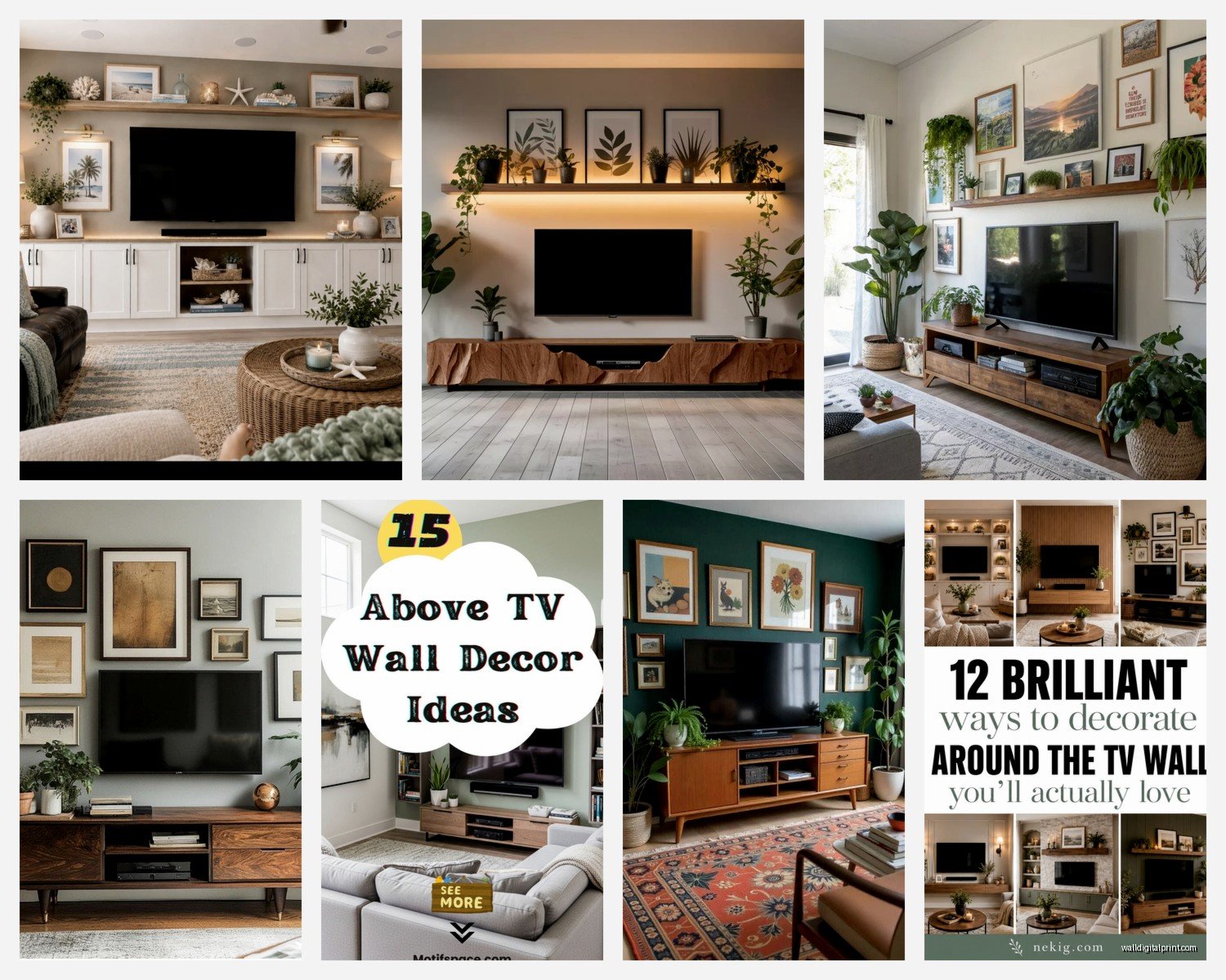
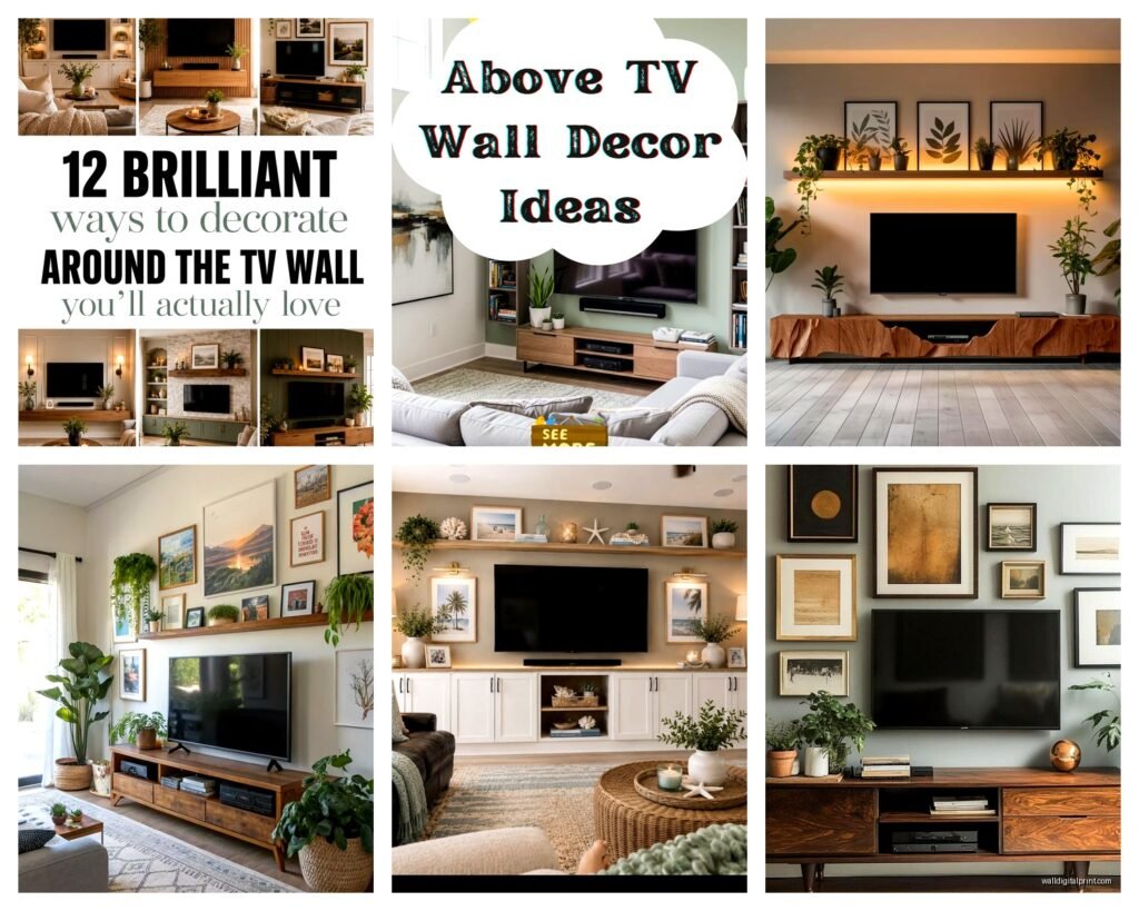
The rule I use: if your TV is 55 inches or smaller, you can go with a single horizontal piece that’s roughly the same width as the TV or slightly wider. If you’ve got one of those massive 65+ inch screens, you might actually want to go narrower with the art or do a gallery wall situation, otherwise the whole thing starts feeling like a giant black hole of visual weight.
What Actually Looks Good Up There
Abstract pieces work really well because they don’t compete with the content on your screen. I’ve used everything from minimal line drawings to bold geometric prints. This is gonna sound weird but I actually avoid anything too realistic or detailed because when the TV’s off, you want people to look at the art, but when it’s on, you don’t want the art screaming for attention.
Oh and another thing – avoid glass frames if you can. The glare situation is real, especially if you have windows opposite your TV wall. I learned this the hard way in my own apartment where I had this beautiful framed print that basically turned into a mirror every afternoon. Switched to a canvas print and problem solved.
Color-wise, you’ve got options:
- Go monochromatic or neutral if your room already has a lot going on
- Pull an accent color from your throw pillows or rug to tie everything together
- Use the art as your main color moment if the rest of the room is pretty basic
- Metallic accents (gold, brass, copper) add warmth without being too bold
I did this one media console setup where we used a black and white photograph above a black TV and black console, then brought in warmth through the wood shelving on either side. The client was worried it would be too dark but the contrast actually made the whole wall feel more intentional.
The Actual Installation Part
Wait I forgot to mention – you gotta consider whether your TV is mounted or on a stand. If it’s mounted flush to the wall, you have more flexibility with art placement because everything sits on the same plane. But if your TV is on a console (which I actually prefer for most spaces), the art needs to relate to BOTH the TV and the furniture piece below it.
Here’s my process when the TV is on a console:
Stand back like 8-10 feet and take a photo of the wall. I know it sounds basic but your phone camera will show you the proportions way better than just staring at it. Then use painter’s tape to map out where the art would go. Live with it for a day or two, watch some TV, see if it bugs you.
The center point of your art should align with the center point of your TV – not the console, not the wall, the TV itself. This creates visual harmony even though technically the art is higher. Does that make sense? Like if you drew an invisible vertical line down the middle of your TV, that same line should bisect your artwork.
Gallery Wall Alternative
Okay so funny story, I had a client who insisted they wanted a single large piece, but their wall was like 12 feet wide and nothing looked right. We ended up doing a gallery wall instead with 5 smaller pieces arranged horizontally above the TV, and it completely transformed the space.
For gallery walls above TVs, keep these things in mind:
- Arrange them in a single horizontal line rather than scattered – less chaotic
- Use identical frames for a cleaner look (I like thin black frames from Frame Bridge or even Ikea)
- Keep consistent spacing between pieces, usually 2-3 inches works
- The overall gallery width should be close to your TV width, maybe slightly wider
The mistake people make is treating it like a regular gallery wall with different sized frames going up and down. Above a TV, you want horizontal movement to complement the screen’s shape, not compete with it.
Lighting Considerations Nobody Talks About
This is where things get interesting. If you’re gonna light your artwork (and you should, especially for evening viewing), you need adjustable picture lights or small LED strips. I’ve used those battery-operated puck lights from Amazon in a pinch and they work fine, but the rechargeable ones die at the worst times.
The lighting shouldn’t be so bright that it creates glare on your TV screen. I usually aim for soft, warm accent lighting that highlights the art when the TV is off but doesn’t interfere when you’re watching something. Dimmable is key here.
My client last month installed these smart LED strips behind both the TV AND the artwork, and you can control them separately through an app. When they’re watching TV, the art lighting goes off completely. When the TV’s off, the art gets illuminated. Pretty genius actually.
Size Guidelines That Actually Work
I’m gonna give you some real numbers because the vague advice online drives me crazy:
For a 55-inch TV, your art should be roughly 40-55 inches wide. You can go slightly wider but not narrower unless you’re doing a vertical piece (which honestly I don’t love above TVs).
For a 65-inch TV, aim for 50-65 inches of art width. This is where a gallery wall or a diptych works really well.
For those massive 75+ inch screens, you might actually want to go narrower – like 50-60 inches – because otherwise you’re just creating a huge vertical stack of visual information that feels overwhelming.
Height of the art matters too. I typically don’t go taller than 24-30 inches for the actual artwork because remember, you’ve already got the TV taking up vertical space, plus the console below it. The whole composition from console top to ceiling needs to feel balanced.
What About Shelving Instead
Oh and another thing – floating shelves instead of hung art can be amazing above a TV. I did this in my own place actually, two thin black floating shelves staggered above the TV with small plants, a couple art books, and one small framed print. The dimensional aspect adds interest without the commitment of drilling holes for a large frame.
The trick with shelves is keeping them minimal. Like, three objects per shelf MAX, otherwise it starts looking cluttered and your eye doesn’t know where to focus when the TV’s on.
Common Mistakes I Keep Seeing
People hang the art too high because they’re thinking about it like regular wall art. But this isn’t a blank wall – there’s already a focal point (the TV), so the art needs to relate to it closely.
Using art that’s too small. A tiny 16×20 print above a 65-inch TV looks like an afterthought. Go bigger or do a gallery grouping.
Forgetting about the console styling. Your art, TV, and console should all work together. If you’ve got a bunch of stuff on the console, simpler art works better. If the console is minimal, you can go bolder with the art.
Not considering the room’s function. A media room where you’re watching movies in the dark needs different art than a living room where the TV is on as background noise half the time.
My Actual Recommendations
If you’re starting from scratch, here’s what I’d do:
Get a large horizontal canvas print – something abstract or minimalist. Minted and Artfully Walls both have good options at reasonable prices. Size it so it’s roughly the same width as your TV or slightly wider.
Hang it 8-10 inches above your TV with the center aligned to the TV’s center.
Add a small picture light or LED strip if your room has the wiring for it.
Style your console simply – maybe a plant on one side, a couple books, that’s it. Let the art and TV be the stars.
If budget’s tight, honestly even a large-scale printable from Etsy in a simple frame from Target can look expensive if you get the sizing and placement right. I’ve done this for clients who were renovating and needed something temporary, and it worked perfectly.
The whole thing should feel intentional but not precious. You’re gonna be watching TV there, living your life, maybe eating dinner on the couch (no judgment, I do it all the time while watching whatever’s on Netflix). The art should enhance that experience, not make you feel like you’re in a museum.
Wait one more thing – consider the sight line from your main seating. Sit on your couch and look at the wall. Can you see the art in your peripheral vision when watching TV? Does it feel balanced? Take another photo from seated position. This perspective is what you’ll actually experience daily, so it matters way more than how it looks when you’re standing up arranging everything.