Wall Art Guide, Wall Art Tutoriels
Gallery Wall Art: Curated Museum-Style Collections
Jun
So I’ve been putting together gallery walls for like eight years now and honestly it’s one of those things that looks way more complicated than it actually is, but also you can absolutely mess it up if you don’t think it through first.
The biggest mistake everyone makes is buying frames first. Don’t do that. I learned this the hard way in my own dining room where I ended up with like seventeen frames that didn’t work together and had to return half of them. Start with the art itself because that’s gonna dictate everything else.
Finding Your Actual Art Pieces
Okay so here’s what I do now. I hit up museum gift shops online first because their prints are usually really well curated already. The Met Store has insane options and you can filter by period which helps when you’re trying to create that cohesive museum vibe. I’m obsessed with their Japanese woodblock prints right now, my cat knocked one off my desk yesterday and I nearly had a heart attack but the frame saved it thank god.
But also don’t sleep on these sources:
- Art.com for affordable prints that don’t look cheap
- Saatchi Art if you want originals mixed in (this really elevates the whole thing)
- Minted for contemporary stuff that still feels curated
- Your local art fairs because honestly nothing beats actual original pieces
- Estate sales where I’ve found some of my best vintage prints
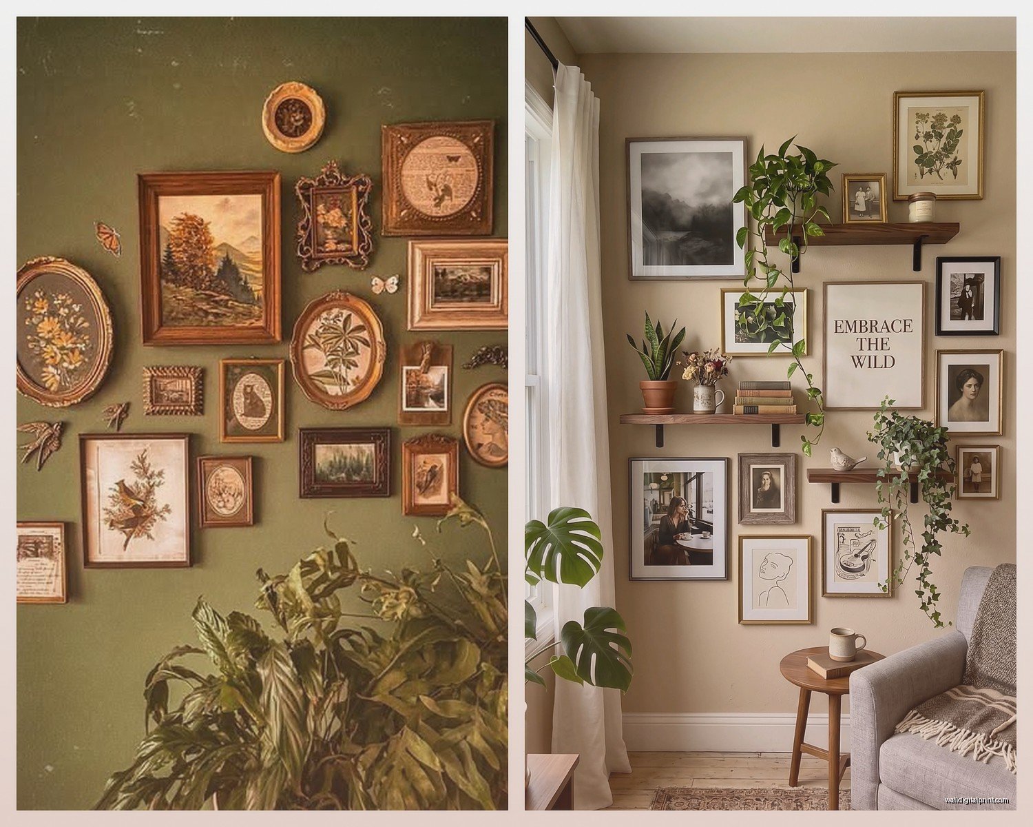
The thing about museum-style collections is they usually have a theme but it’s subtle. Like all landscapes but different periods. Or all portraits but various mediums. Or my personal favorite which I just finished for a client in Brooklyn, all architectural drawings and etchings from different eras.
The Frame Situation That Everyone Overthinks
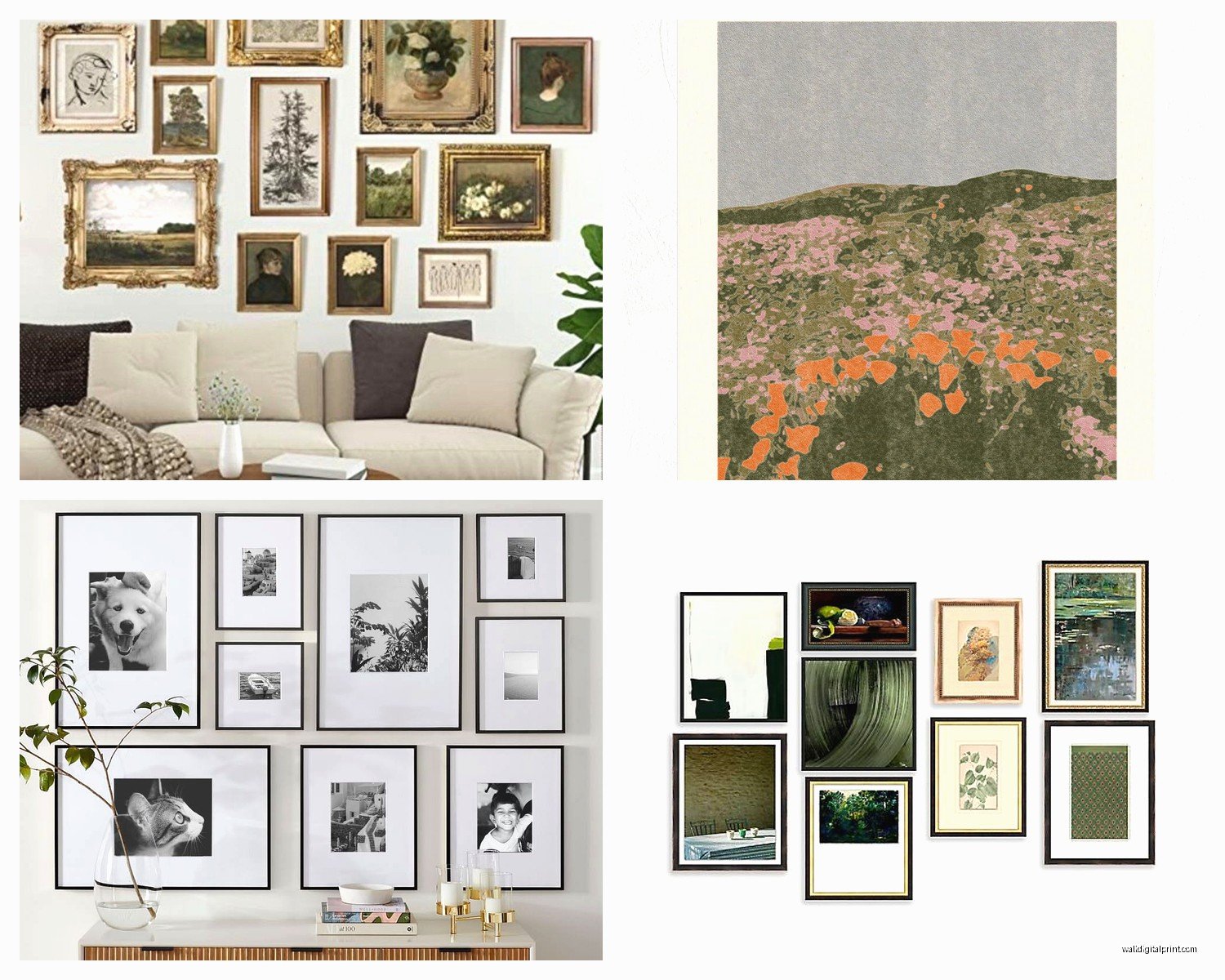
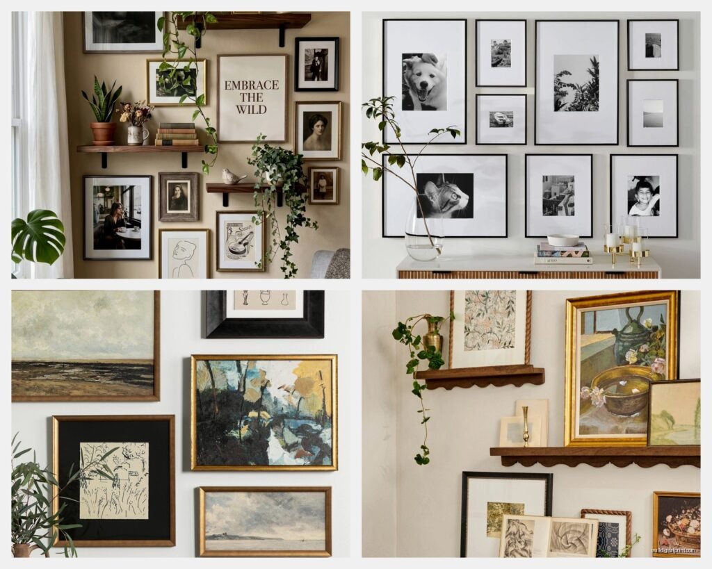
People always ask me if everything needs to match and the answer is no but also kinda yes? Museum galleries typically use similar frames throughout but not identical. What I do is pick 2-3 frame styles max and stick with those.
My go-to combo right now:
- Thin black metal frames for modern prints
- Natural wood frames (same finish) for warmer pieces
- Sometimes white mats, sometimes no mats depending on the piece
Framebridge is honestly worth the money for important pieces because their quality is consistent and you can reorder the same style years later. I’ve used them for probably 60% of my gallery walls. For less critical pieces, IKEA’s RIBBA frames are actually pretty decent and they’re like a fraction of the cost.
Oh and another thing, mat size matters SO much. A tiny print in a huge mat with a big frame looks intentional and museum-like. A tiny print in a tiny frame just looks… tiny. I usually do at least 3-4 inches of mat on all sides for smaller pieces.
Planning the Layout Without Losing Your Mind
This is gonna sound weird but I use painter’s tape on the floor first. Cut pieces the exact size of your frames and arrange them on the floor until it looks right. Take a photo from above. That’s your template.
The classic museum approach is either:
- Salon style (organized chaos with pieces close together)
- Grid layout (very formal, everything aligned)
- Linear arrangement (single row, all pieces same height)
I’m personally obsessed with the salon style right now because it feels more collected over time, but it’s definitely the hardest to execute. You need varying sizes and you gotta pay attention to visual weight.
Wait I forgot to mention the most important rule: pick a center line. In salon style, imagine a horizontal line running through the middle of your arrangement. The frames don’t all have to align to it perfectly but you want roughly equal visual weight above and below. Most people hang everything too high. The center of your gallery wall should be at eye level, which is usually around 57-60 inches from the floor.
The Actual Hanging Process
Okay so funny story, I used to use those command strips for everything and then had a frame crash down during a dinner party once. Never again. For a proper gallery wall you need:
- A laser level (the $25 one from Home Depot is fine)
- Picture hanging wire for anything over 10 pounds
- Actual wall anchors if you’re not hitting studs
- A pencil and painter’s tape
- Patience because this takes longer than you think
Here’s my process: I make paper templates of each frame, tape them to the wall in my planned arrangement, step back like fifty times to check it, then mark the wall through the paper where the hook needs to go. Poke a hole through the paper with your pencil so you know exactly where to drill.
The salon style trick is to start with your largest or most important piece first. That’s your anchor. Build out from there, keeping spacing relatively consistent. I usually do 2-3 inches between frames but sometimes less for a really dense museum wall look.
Creating Actual Cohesion
This is where people usually fail. They get random prints they like and throw them together and wonder why it looks like a college dorm. Museum collections work because there’s a curatorial thread.
Some themes that actually work:
- All black and white photography from different decades
- Botanical prints and drawings (very popular right now)
- Abstract art in a specific color palette
- Vintage maps and diagrams
- Portrait studies across different mediums
- Architectural sketches and blueprints
I just finished one for my own hallway that’s all vintage bird illustrations from different field guides and honestly it’s maybe my favorite thing I’ve ever done. Found most of them on eBay over like six months.
The color palette thing is real though. Even if your subjects are different, keeping the overall colors cohesive makes everything feel intentional. My client last month wanted bright colorful art but it still works because we stuck to jewel tones only, no pastels.
Mixing Original and Prints
If you can swing even one or two original pieces, do it. Doesn’t have to be expensive, local art students sell stuff for reasonable prices and it adds so much authenticity. I mix them in with museum prints all the time and nobody can tell which is which unless they get really close.
Thrift stores and estate sales are gold mines for original art. I found this amazing oil painting of a dog for $40 last year and it’s literally the centerpiece of a gallery wall I did in a client’s study. Just gotta look past the ugly frames sometimes.
Lighting Makes or Breaks This
You can have the most perfectly curated collection and if the lighting sucks, nobody’s gonna appreciate it. Museums use picture lights for a reason.
I usually install:
- Small LED picture lights above key pieces (battery operated ones are surprisingly good now)
- Track lighting if the room doesn’t have it already
- Sometimes just really good ambient lighting is enough if you position it right
The Cocoweb LED picture lights are pricey but they’re what I use for high-end clients and they look super professional. For my own house I honestly just use well-placed floor lamps with daylight bulbs aimed at the wall.
What Actually Goes Wrong
Let me tell you the mistakes I see constantly:
Everything’s too small. If you’re doing a big wall, you need some substantial pieces. I usually include at least one or two frames that are 16×20 or larger.
Frames are too matchy-matchy. All identical frames in a perfect grid can work but it looks more office building than museum. Vary the sizes at least.
Hanging things too far apart. Unless you’re doing a very minimal linear arrangement, museum walls have pieces closer together than you think. That 2-3 inch spacing I mentioned earlier is key.
Not considering the furniture below. Your gallery wall should relate to what’s underneath it. If you have a sofa, the wall should extend beyond the sofa edges a bit, not sit exactly above it like a weird rectangle.
Ignoring the room’s architecture. I did a gallery wall in a room with beautiful crown molding and made sure to leave space at the top so it didn’t feel cramped. Work with what you’ve got.
The Pieces I Keep Coming Back To
After doing this for years, there are certain types of art that just work in gallery walls. Botanical prints are having a moment but they’re also kind of timeless. Black and white photography never goes out of style. Vintage maps add instant interest.
I’m really into mixing mediums right now though. Like a charcoal drawing next to a watercolor next to a photograph. All within your theme obviously, but the variety in technique creates visual interest that all-prints or all-paintings doesn’t quite achieve.
Oh and don’t forget about sculptural elements. A small floating shelf with a tiny sculpture or object can break up all those rectangles in a really nice way. Museums do this all the time.
Budget Real Talk
You don’t need to spend thousands. Honestly my best gallery walls have been mix of:
- A few nice framed prints from museum shops ($50-150 each)
- Some DIY framed vintage finds ($20-40 each)
- Maybe one original piece ($100-300)
- Frames from a mix of sources
A really good 9-piece gallery wall can be done for like $600-800 total if you’re smart about it. I’ve also done them for $3000+ when clients want all originals and custom framing.
The investment pieces are the ones at eye level in the center. Those are what people actually look at closely. The stuff at the edges can be less precious.
Maintaining the Collection
Nobody talks about this but gallery walls get dusty and you gotta dust them. I use a microfiber duster every couple weeks. Also check that nothing’s gotten crooked because it happens gradually and suddenly your whole wall looks off.
Direct sunlight will fade prints over time so if your wall gets a lot of sun, use UV-protective glass or acrylic. It’s more expensive but worth it for pieces you care about.
And honestly? Your gallery wall doesn’t have to be permanent. I swap pieces out sometimes when I find something better or my taste changes. That’s the beauty of it, it can evolve. Museums rotate their collections and so can you.
The biggest thing is just committing to a vision and executing it thoughtfully. Take your time collecting pieces, don’t rush it just to fill the wall. The best gallery walls look like they were assembled over years even if they weren’t.