Wall Art Guide, Wall Art Tutoriels
Amazing Grace Wall Art: Hymn Religious Christian Song
Jul
So I’ve been obsessing over Amazing Grace wall art lately because a client asked me to help redesign their prayer room and honestly, once you start looking at all the options out there it’s kinda overwhelming? Like there’s SO many different styles and I ended up going down this rabbit hole comparing everything.
The Main Styles You’ll Actually Find
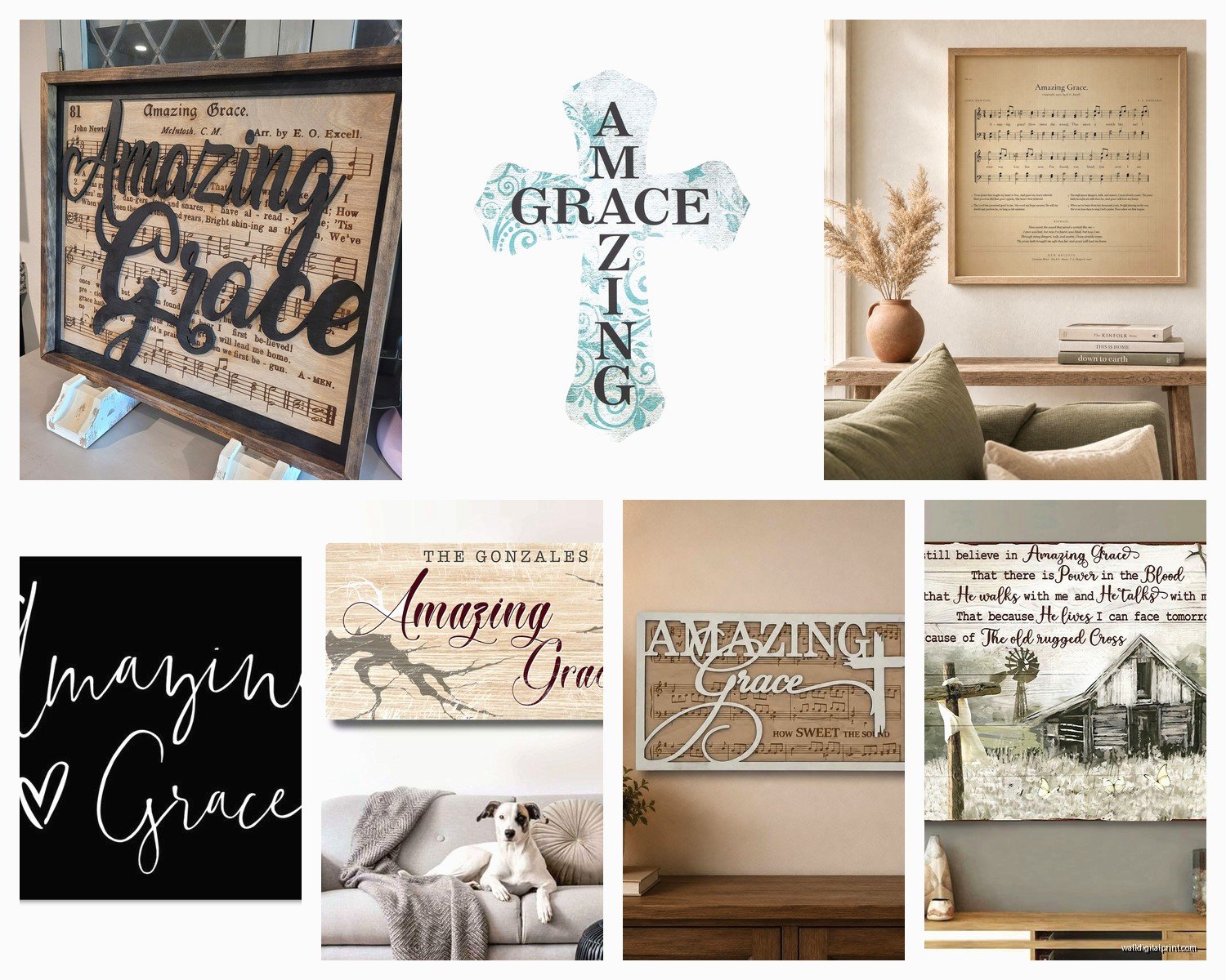
Okay so first thing – Amazing Grace wall art basically comes in like 5 main categories and knowing which one fits your space is gonna save you so much time scrolling through Etsy at midnight (don’t ask me how I know this).
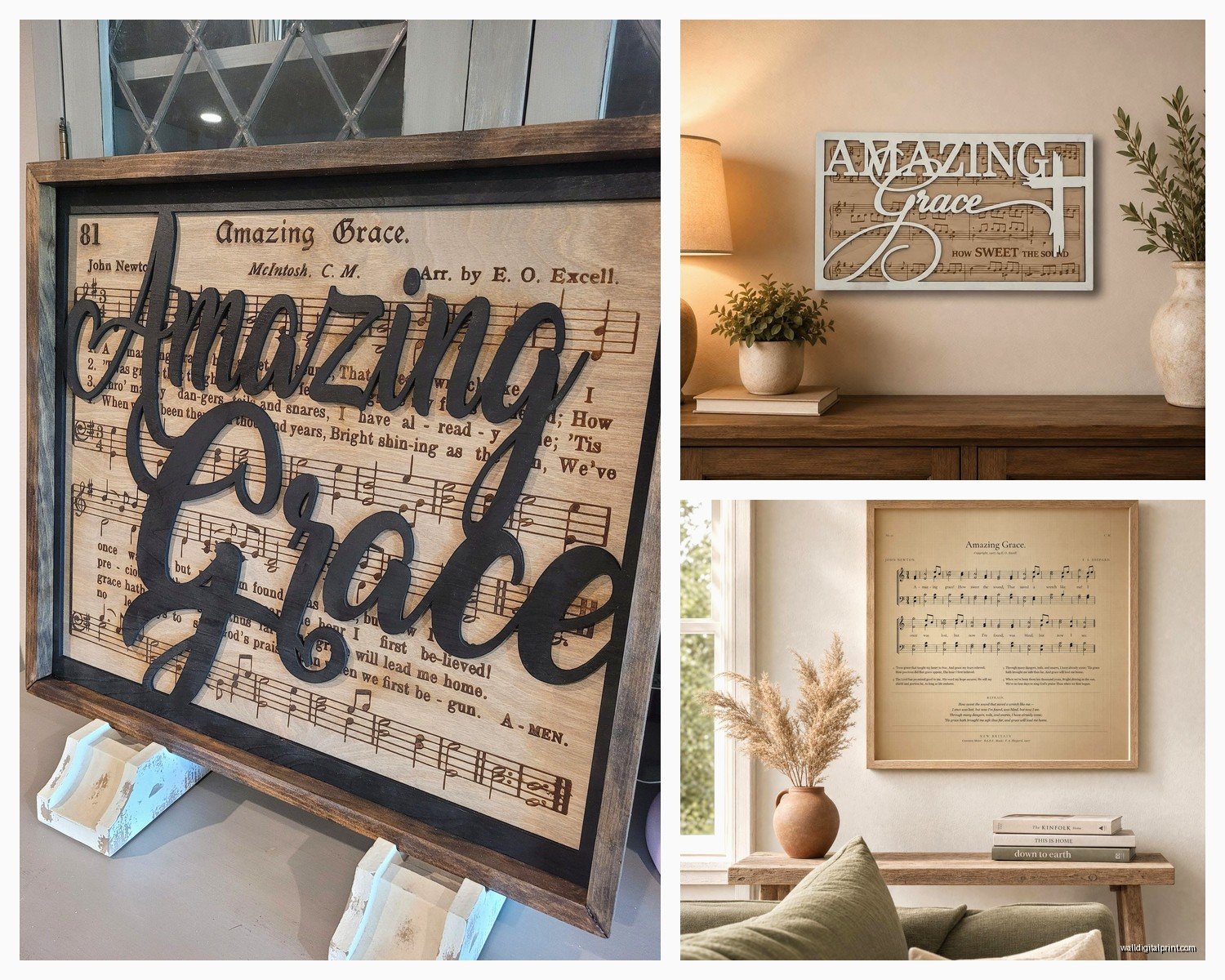
Farmhouse rustic wood signs are everywhere right now. These are usually the distressed white or natural wood with black lettering. Sometimes they have the full hymn lyrics, sometimes just the chorus. I tested one in my own hallway – the 24×36 inch size – and it’s perfect for that modern farmhouse vibe but heads up, if your walls are already busy with texture or shiplap, it can look like too much of the same thing happening.
Canvas prints give you more artistic freedom. I’ve seen watercolor versions, vintage sheet music backgrounds, florals mixed with the text. My favorite so far was this one with a sunset background and the lyrics in a script font – hung it in a client’s bedroom and she literally cried when she saw it installed. The thing about canvas though is you gotta make sure it’s actually canvas and not just a poster print, because the cheap ones show glare from windows like crazy.
Framed prints are your classic option. More formal, works great in traditional spaces. I usually go for these in offices or formal living rooms where you want something that feels more… established? Less trendy? You can find vintage actual sheet music framed which is super cool if you’re into authenticity.
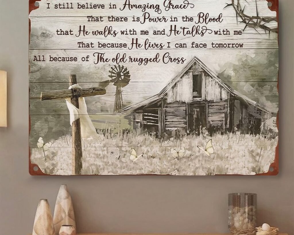
Metal signs are having a moment too. Industrial vibe, really durable. Good for covered porches or entryways. I hung one outside a client’s sunroom and it’s held up through two winters no problem.
Vinyl decals if you’re renting or don’t want to commit. Personally I’m not huge on these for hymn lyrics because they can look a bit elementary school classroom? But if you get a really elegant script font and apply it carefully they can work.
Size Actually Matters More Than You’d Think
This is where people mess up the most honestly. I see it all the time – someone buys this gorgeous piece and then it’s either way too small for the wall or overwhelming the space.
For above a couch or bed, you want something that’s at least 2/3 the width of the furniture. So if your couch is 90 inches, you’re looking at 60 inches minimum. I learned this the hard way in my first apartment where I hung this tiny 16×20 print above my sofa and it looked like a postage stamp floating in space.
Entry halls or narrow walls – go vertical. A 12×36 or 18×48 inch piece works better than trying to fit something wide. The vertical format actually makes your ceiling look higher too which is a nice bonus.
Gallery walls are different though – you can mix smaller pieces. I did one recently with a 20×20 Amazing Grace print as the anchor, surrounded by smaller 8×10 scripture verses and some family photos. Took me three attempts to get the spacing right but it turned out really good.
The Lyrics Situation
Okay so here’s something nobody tells you – there’s like a million verses to Amazing Grace and most wall art only shows 1-3 verses. You gotta decide which verses matter to you.
The classic first verse everyone knows – “Amazing Grace how sweet the sound that saved a wretch like me” – that’s on basically every piece. But some people don’t love the word “wretch” so I’ve seen versions that say “saved a soul like me” instead. Just depends on if you want traditional or modified.
Some pieces include all six verses which looks really impressive but can be hard to read if the font is too small. I had a client who wanted all the verses and we ended up going with a 36×48 canvas just so the text would be legible. It dominated the whole wall but that’s what she wanted for her music room.
The chorus-only versions are cleaner looking and work better in modern spaces. Less text, more impact. I’ve got one in my bathroom actually – just “Amazing Grace how sweet the sound” in simple black letters on white. My cat knocked it off the wall twice but it’s fine, just needed to use better hanging strips.
Font Choices That Don’t Look Cheesy
Oh man the font thing. So many options look great in the thumbnail and then you get them in person and they’re just… not it.
Script fonts are popular but they can be really hard to read from a distance. I only recommend them if you’re hanging the piece somewhere people will be close to it – like a bedroom or personal office. For living rooms or spaces where you’re viewing it from across the room, go with something simpler.
Block letters or serif fonts are more readable. They also feel more timeless – you’re not gonna look at it in 5 years and think “wow that’s so 2024.”
All caps can feel shouty? I dunno, that’s just my opinion but I usually prefer title case or sentence case for hymn lyrics. It feels more like you’re reading poetry instead of being yelled at.
Color Schemes That Actually Work
Black and white is classic for a reason. Works with literally any decor style, won’t clash with your throw pillows, always looks clean. But it can feel a bit stark if your whole room is already monochrome.
Navy blue text on white or cream is softer, still reads well. I used this in a nursery recently and it was perfect – felt calming but still had enough contrast.
Gold or copper lettering looks amazing but ONLY if you have other gold/copper accents in the room. Otherwise it just floats there looking random. Learned this when I tried to add a gold Amazing Grace print to my living room and it clashed with all my silver picture frames. Had to return it.
Colorful watercolor backgrounds are tricky. They’re beautiful but they have to coordinate with your existing color palette. I saw this gorgeous one with purple and pink flowers but the client’s room was all greens and blues so it would’ve looked weird.
wait I forgot to mention – if you’re going with a wood sign, natural wood tone is the most versatile. The really dark walnut stains can make a space feel heavy, and the whitewashed look only works if you’ve got that farmhouse coastal thing going on.
Where to Actually Hang It
Living room above the sofa is the obvious choice but consider what you’re looking at when you sit down. If you’re gonna be staring at it during your morning coffee, make sure it’s something you want to meditate on daily.
Bedrooms are really popular for hymn art. I personally have a small Amazing Grace print on my nightstand wall – it’s the last thing I see before sleep which is nice I guess? Though sometimes I’m just scrolling Instagram and don’t even notice it.
Prayer rooms or home offices obviously. One client turned a closet into a tiny prayer space and we hung a 16×20 framed print – it was the only art in there and it made the space feel really intentional.
Entryways or hallways work great because people actually stop and read them when they’re coming and going. Plus hallway walls are usually awkward to decorate anyway.
Bathrooms might sound weird but I’ve done it and it works. Keep it smaller though – like 11×14 max. And make sure it’s in a frame or sealed canvas because humidity.
Hanging Tips From Someone Who’s Messed This Up
Eye level is 57-60 inches from the floor to the center of the artwork. This is the museum standard and it actually does look best. I used to just eyeball it and wonder why things looked off.
If you’re hanging above furniture, leave 6-8 inches between the furniture top and the bottom of the frame. More than that and it looks disconnected, less and it feels cramped.
Use the right hardware for your wall type. Drywall anchors for drywall, masonry bits for brick or concrete. I stripped so many screw holes in my first apartment because I didn’t know this and now I’m paranoid about it.
Level it properly. Use an actual level app on your phone at minimum. Nothing makes a space look cheaper than crooked wall art – I saw this in a model home once and couldn’t focus on anything else during the tour.
For heavy pieces (over 20 pounds), use two hanging points instead of one. Distributes the weight better and keeps it from tilting forward over time.
Custom vs Ready-Made
Ready-made from places like Hobby Lobby or Amazon is obviously cheaper and faster. You can literally have it on your wall this weekend. The quality varies a lot though – I’ve gotten pieces that looked amazing and pieces where the print was pixelated or the colors were way off from the photos.
Etsy custom pieces take longer (usually 2-4 weeks) but you can get exactly what you want. Custom colors, specific verses, your preferred font, whatever size you need. I just ordered one for a client with her grandmother’s handwriting of the lyrics – they digitized it from an old letter. Took 3 weeks but it’s absolutely beautiful and meaningful.
The price difference isn’t as big as you’d think honestly. A ready-made canvas at HomeGoods might be $40-60, while a custom Etsy one could be $60-100 depending on size. For something you’re gonna look at every day, the extra $20-40 might be worth it to get exactly what you want.
Quality Markers to Look For
For canvas prints, check if they’re gallery wrapped (printed image wraps around the edges) or if they have white/black edges. Gallery wrapped looks more finished without a frame.
Wood signs should be sealed properly – ask if they’re coated. Unsealed wood in humid climates is gonna warp eventually, trust me on this.
Print quality matters. Look for at least 300 DPI if they list it. Lower resolution looks fine in photos but fuzzy in person, especially on larger sizes.
Frame quality if you’re buying framed – cheap frames have thin glass that warps and backing that bends. Spend a bit more for proper matting and plexiglass at minimum.
Mixing It With Other Decor
This is gonna sound weird but don’t make your whole wall a church bulletin board? I’ve seen people go overboard with religious art and it starts feeling less like home decor and more like… I dunno, a religious gift shop?
Mix your Amazing Grace piece with family photos, landscapes, or abstract art. The contrast actually makes the hymn lyrics stand out more because they’re not competing with 15 other scripture verses.
If you want multiple faith-based pieces, vary the styles. Like combine your Amazing Grace canvas with a simple wooden cross and maybe a vintage photo of a church. Different textures and formats keep it interesting.
Okay so funny story – I was watching The Great British Baking Show while arranging a gallery wall last week and ended up spacing everything to the timing of the show segments. Worked perfectly though so maybe that’s my new method?
The other thing is don’t feel like Amazing Grace art has to go in a super traditional space. I’ve seen it look amazing in modern minimalist rooms, industrial lofts, even bohemian bedrooms. The key is choosing a style that matches your overall aesthetic rather than defaulting to the most churchy-looking version.
What to Avoid
Those really thin canvas prints that are basically poster paper stretched over a frame – they look cheap and don’t last. You can tell by the weight usually.
Overly distressed wood that looks artificially aged. Real vintage is cool, fake vintage often looks tacky.
Tiny fonts that require you to squint. If you can’t read it from 6 feet away, it’s too small.
Clipart style designs. You want something that looks like actual art, not a church bulletin insert from 1987.
Anything that’s TOO matchy with your decor. If your whole room is gray and white farmhouse, maybe don’t add another gray and white farmhouse sign? Add some contrast.
And yeah that’s pretty much everything I’ve figured out about Amazing Grace wall art through way too many hours of research and installation. The main thing is just pick something that actually means something to you and fits your space rather than buying whatever’s trending on Pinterest right now.