Wall Art Guide, Wall Art Tutoriels
Last Supper Wall Art: Leonardo da Vinci Religious Scene
Jul
So I’ve been obsessing over Last Supper wall art lately because three different clients asked about it in the same month and I’m like, okay universe, I get it. Let me tell you what I’ve actually learned from hanging these things in real spaces because there’s a huge difference between what looks good on a website and what actually works on your wall.
The Size Thing Nobody Talks About
First off, everyone underestimates how big these pieces need to be. The Last Supper is this long horizontal composition, right? So if you go too small, you literally can’t see the apostles’ faces and it just looks like a brown blur from across the room. I made this mistake in my own dining room initially – got a 24×16 inch print thinking it would be “elegant and understated” and it just looked… sad? Like a postcard taped to the wall.
Here’s what actually works: for a standard dining room (we’re talking maybe 12×14 feet), you want something at least 40 inches wide, preferably closer to 60 inches. I know that sounds massive but trust me. The original fresco is like 15 feet tall and almost 30 feet wide, so the whole point is this expansive scene. When you shrink it down too much, you lose the drama of all thirteen figures at the table.
Canvas vs Metal vs Wood Prints
Okay so I’ve tested all of these and they each have their weird quirks. Canvas is obviously the most popular because it feels “artsy” but here’s the thing – cheap canvas prints of the Last Supper look terrible because there’s so much detail in the original. The shadows, the expressions, the folds in the clothing… if the printing quality isn’t there, it all mushes together.
I actually prefer metal prints for this particular image and I know that sounds weird for a Renaissance painting. But the metal gives you this crisp detail and the colors pop differently. There’s something about the contrast that works. I hung one in a contemporary apartment last year – totally modern space, all white walls and minimalist furniture – and the metal Last Supper print actually bridged this gap between classical and modern that I wasn’t expecting.
Wood prints are hit or miss. They can look amazing in a rustic or farmhouse setting, but the wood grain shows through and sometimes it interferes with the faces. I did one for a client who specifically wanted that distressed look and we went with a lighter wood that didn’t compete as much with the image itself.
Framing Decisions That Matter
If you’re going the canvas route, do NOT get those cheap wrapped canvas prints without a frame. I’m gonna be honest, they warp. Especially if you’re hanging them anywhere with humidity changes. Get a floating frame at minimum – those are the ones where the canvas sits in a frame but there’s a small gap, so you still get that gallery-wrapped look but with actual support.
For framed prints under glass, go darker with the frame. I’ve tried ornate gold frames thinking it would match the Renaissance vibe and it’s just… too much? Like costume-y. A simple dark walnut or even black frame lets the image speak for itself. The painting has enough going on without competing with a fancy frame.
Where to Actually Hang This Thing
Everyone assumes dining room and yeah, that’s the obvious choice since it’s literally a dinner scene. But I’ve put these in some unexpected places that worked really well.
Had a client with a long narrow hallway that connected their kitchen to their home office – perfect spot because you get that processional feeling walking past it. The horizontal format fits awkward wall spaces that are too wide for regular portraits.
Oh and another thing, I hung one in a reading room/library situation and it actually created this contemplative atmosphere that wasn’t too heavy-handed religious. The client wasn’t even particularly religious, they just loved Renaissance art and history. It sparked conversations when people came over, which is what good art should do anyway.
Skip the bedroom though. I don’t care how much you love it, there’s something about thirteen dudes staring at you while you sleep that’s just… no. My cat would probably agree if she could talk, she hates when I rearrange furniture in there as it is.
The Restoration Debate
This is gonna sound weird but you actually have to choose which version of the Last Supper you want. The original has been restored multiple times and there are prints based on different restoration periods. Some show more vibrant colors, others are darker and more weathered-looking.
I personally think the pre-1999 restoration images have more character. They’re moodier, more mysterious. The post-restoration versions are technically more accurate to what Leonardo originally painted, brighter colors, clearer details, but they can look almost too clean? Like digital art instead of a 500-year-old masterpiece.
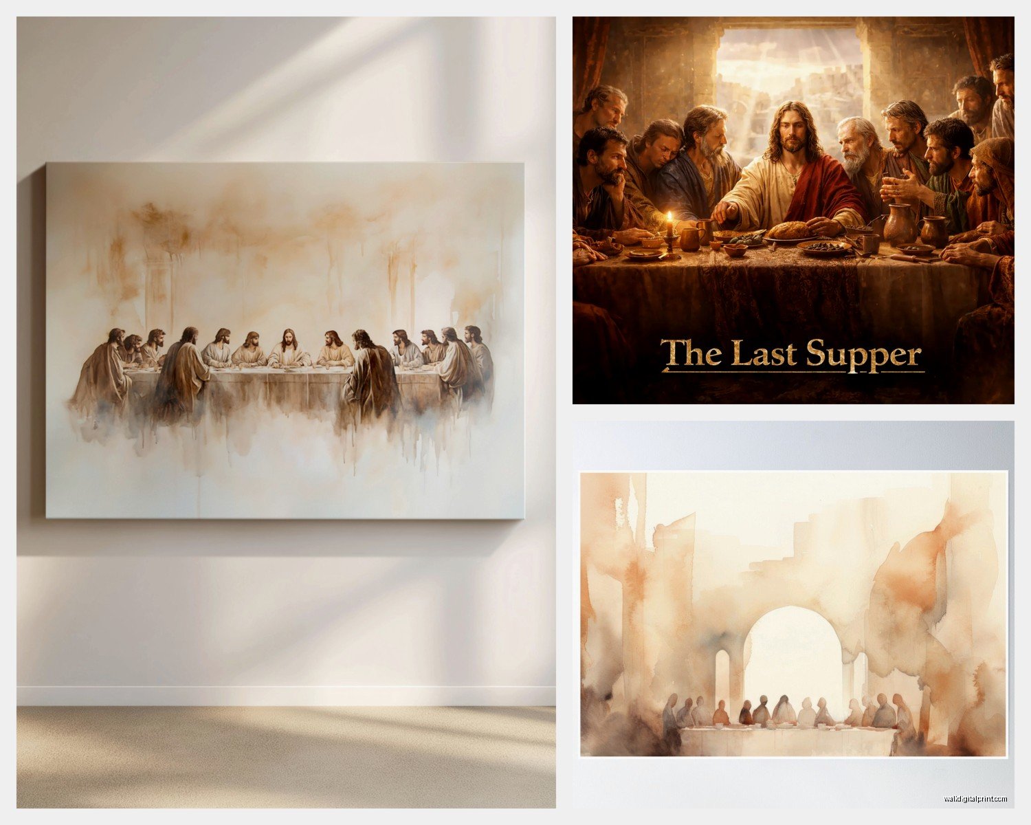
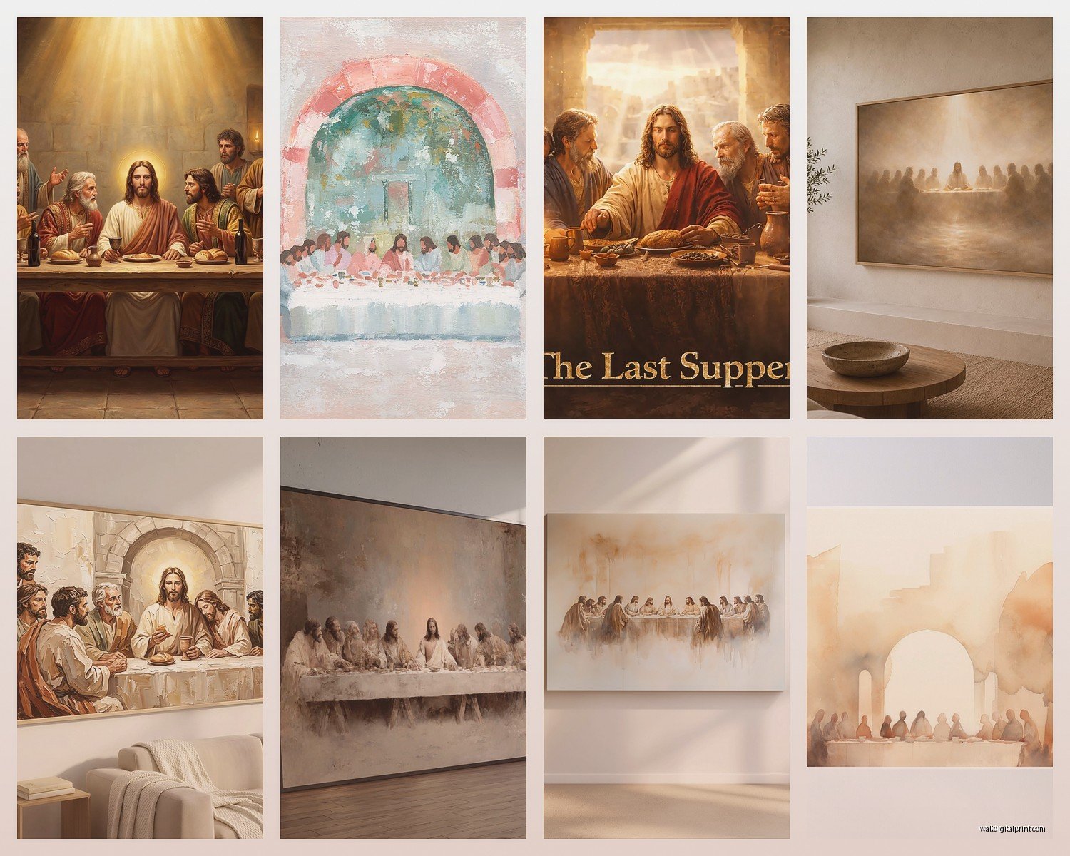
There’s also this whole category of “interpretive” Last Supper art where artists reimagine the scene in different styles. I worked with someone who got a modern abstract version in blues and grays – you could still recognize the composition but it was completely reinterpreted. That’s honestly a cool route if you want the iconography without the traditional religious art look.
Lighting Makes or Breaks This
Wait I forgot to mention lighting earlier and it’s actually crucial. The Last Supper has a lot of dark areas and subtle shading. If you don’t light it properly, it just looks muddy from certain angles.
Picture lights are your friend here – those little lights that mount above the frame. I use them on basically every Last Supper installation now. They’re not expensive (you can get decent LED ones for like $40-60) and they make such a difference in bringing out the detail.
If picture lights feel too museum-y for your space, adjustable track lighting or even a nearby floor lamp that you can angle toward the wall works. Just avoid overhead lighting only because it creates glare if you’ve got glass over the print.
Natural light is tricky. Don’t hang this opposite a bright window where it’ll get direct sun – the UV will fade it over time and you’ll get glare during certain times of day. Perpendicular to windows is better so you get ambient light without direct exposure.
The Conversation About Religious Art in Secular Spaces
So this comes up a lot because the Last Supper is obviously religious but it’s also just objectively one of the most famous paintings ever created. I’ve installed these for people across the whole spectrum of religious to not-religious-at-all.
What I tell people is that it reads differently based on your other decor. If you’ve got crucifixes and other religious items, it reinforces that theme. If your space is otherwise secular with eclectic art, it becomes more about art history and cultural significance. Context matters a lot.
That said, I do think you need to be thoughtful about it. Having it in a space where you regularly host people with different belief systems… just be aware it might spark reactions. I had a client who loved the piece but ended up moving it from their main living area to their private office because dinner party conversations kept centering on religion when they’d rather talk about literally anything else.
Quality Markers to Look For
When you’re shopping online (because let’s be real, that’s where most people buy wall art now), here’s what separates good from garbage:
Check the DPI or print resolution. You want at least 300 DPI for something this detailed. If they don’t list it, that’s a red flag.
Read reviews specifically about color accuracy. Some prints skew too yellow or too red. The Last Supper should have relatively neutral tones with warmth – not neon, not sepia.
Look at the return policy. If they make returns difficult, they know their quality is questionable.
See if they show closeup shots of the actual print, not just mockups. A lot of sellers use the same digital mockup and the real product looks completely different.
Price Ranges That Make Sense
I’m gonna save you some time – anything under $50 for a large print is probably gonna disappoint you. The printing quality just isn’t there at that price point for something with this much detail.
Sweet spot is like $80-200 for a quality canvas or print in the 40-60 inch range. You can spend way more if you want museum-quality giclée prints but honestly for most homes, the mid-range stuff looks great.
I’ve also worked with people who commissioned local artists to create their own interpretations, which obviously costs more ($500+) but you get something unique. That’s a whole different category though.
Styling Around It
The Last Supper is a statement piece so you gotta be careful about what else goes on that wall. I usually keep it solo or maybe add simple sconces on either side. Don’t do a gallery wall with this – it needs space to breathe.
Color palette in the room matters too. The painting has a lot of earth tones, reds, blues, and that golden Leonardo lighting. It looks best against neutral walls – white, cream, soft gray, even a muted sage green works surprisingly well. I wouldn’t put it against a bold colored wall unless you really know what you’re doing.
Furniture-wise, it actually pairs well with both traditional and modern pieces. I’ve seen it work over a rustic farmhouse table and also over a sleek modern console. The key is not trying too hard to match the Renaissance era in your furniture – that usually ends up looking like a theme restaurant.
Practical Installation Stuff
These horizontal pieces need proper hanging hardware. Don’t cheap out with those little sawtooth hangers that come pre-attached to frames. Get proper D-rings and picture wire or use a French cleat system for anything heavy.
Find the studs in your wall if possible. For the larger pieces (like 48+ inches), you really want at least one anchor point in a stud. I’ve seen too many of these crash down because people just used drywall anchors.
Hang it at eye level, which means the center of the image should be about 57-60 inches from the floor. People hang art way too high all the time – you should be able to comfortably look at the apostles’ faces without tilting your head up.
Oh and measure twice, hang once. Seriously. I’ve been doing this for years and I still sometimes get excited and rush it and then have to patch holes.
Okay so funny story, I was installing one of these last month and my drill battery died right in the middle and I had to hold this massive frame against the wall for like ten minutes while my assistant ran to get the backup battery. My arms were shaking. Now I always charge both batteries the night before.
Alternatives If You’re Not Sure
If you love the concept but aren’t sold on the traditional image, there are some cool alternatives. I’ve used detail crops of just a few apostles – focusing on Jesus and John, or the Judas figure, or Peter. These can be really striking and less overwhelming in smaller spaces.
There’s also modern photographic recreations where photographers stage the scene with contemporary models. Some are really well done and give you that iconic composition without the classical painting vibe.
Tapestries are another option I’ve used – they add texture and warmth and can actually soften the formality of the image a bit.
The main thing is figuring out what you actually want from this piece. Is it religious significance? Art historical importance? Just aesthetic appeal? Your answer changes which version and style you should go with. And honestly you gotta just trust your gut sometimes – if you love it, you’ll make it work in your space.