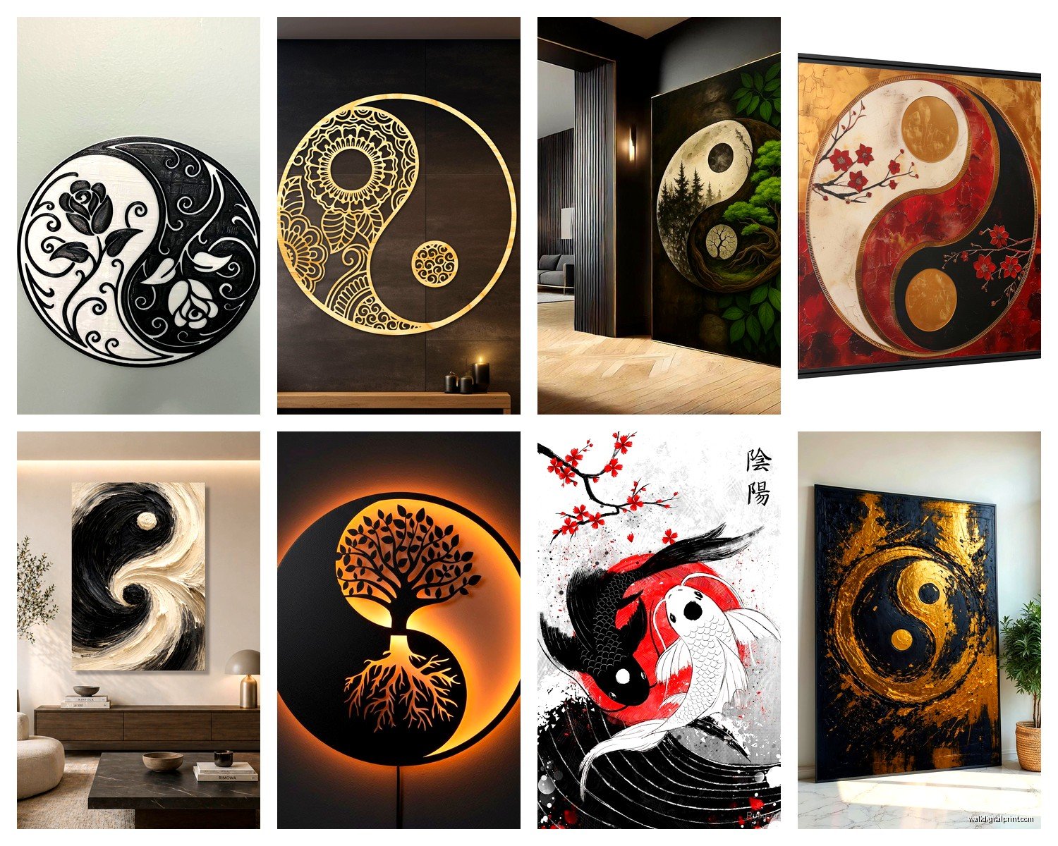
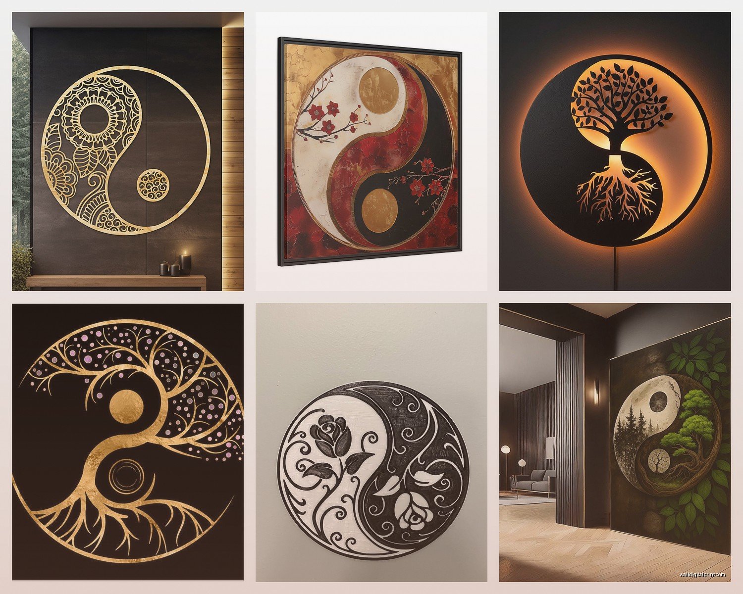
Wall Art Guide, Wall Art Tutoriels
Yin Yang Wall Art: Balance Duality Eastern Philosophy
Jul
So I’ve been absolutely obsessed with yin yang wall art lately and honestly it started because a client wanted to redo their meditation room but didn’t want it to look like every basic yoga studio ever. And let me tell you, finding the RIGHT yin yang piece that doesn’t scream “I bought this at a college dorm poster sale” took way more research than I expected.
The Actually Good Materials That Matter
Okay so first thing – material makes a HUGE difference and I learned this the hard way. I ordered this gorgeous black and white yin yang print on canvas from this Etsy shop, looked amazing in photos, got it and the canvas was so thin you could literally see the wall color through it. Returned that immediately.
What actually works: if you’re going canvas, you want at least 400gsm weight. Anything less and it looks cheap up close. I’ve had really good luck with metal prints though for yin yang designs – there’s something about the way the contrast hits on brushed aluminum that just… works? The blacks stay deep, the whites don’t yellow over time like canvas sometimes does.
Wood prints are having a moment too. I found this carved wooden yin yang piece at a market in Portland (I was there visiting my sister, totally unplanned purchase) and the texture adds this whole other dimension. The shadows shift throughout the day as light changes which feels very on-brand for the whole balance concept.
Sizing Without Making Your Wall Look Ridiculous
Here’s where people mess up constantly – they either go way too small or comically large. For a yin yang symbol specifically, you want it large enough that the details are visible from across the room. Those tiny 8×10 prints? They get lost and honestly just look like you were too scared to commit.
My rule of thumb: for a focal wall, go at least 36 inches diameter if it’s a circular piece. For rectangular compositions with yin yang elements, I usually do 40×30 minimum. Over a bed or sofa, you want the art to take up about two-thirds to three-quarters of the furniture width.
But also like, I have a massive 6-foot yin yang metal sculpture in my own living room so maybe I’m not the person to ask about restraint. My cat uses it as a climbing structure which wasn’t the intended purpose but here we are.
Color Schemes That Don’t Bore You To Death
Everyone thinks yin yang = black and white only and yeah that’s traditional but you’re gonna get so bored looking at stark black and white every single day. I’ve experimented with this a ton.
Navy blue and cream instead of black and white – this softens the whole vibe, makes it feel more residential and less… I dunno, martial arts studio? Works amazing in bedrooms where you don’t want harsh contrast.
Metallics are where it gets interesting. Gold and silver yin yang pieces have this luxe thing happening. I did a client’s home office with a rose gold and charcoal gray yin yang and it felt modern and sophisticated. She’s a lawyer though so we were going for that polished vibe.
Color inversions on the background – so like, traditional black and white yin yang symbol but on a deep emerald green background or burnt orange. This is gonna sound weird but I saw this in a restaurant bathroom once and became obsessed with the concept. The contrast makes the symbol pop without being aggressive about it.
Textural Elements You’re Probably Not Considering
Wait I forgot to mention – texture changes everything with these pieces. Flat prints are fine but they’re kinda one-note. I’ve been layering textures lately and clients are really responding to it.
Mixed media pieces where part is smooth and part is rough – like half of the yin yang is polished resin and the other half is natural stone or cork. There’s this artist on Instagram (I cannot remember her handle right now, it’s driving me crazy) who does yin yang pieces with actual river stones embedded in one half. The physical weight difference between the two sides reinforces the duality concept.
3D elements make a huge difference too. Raised relief, carved wood, layered acrylic sheets with spacing between them so there’s actual depth and shadow. I installed one of these layered pieces in a hallway with spotlight positioning and the shadows it creates are honestly cooler than the actual art piece.
Placement Strategy That Actually Makes Sense
Okay so everyone wants to put yin yang art in meditation spaces or yoga rooms which, fine, makes sense. But you’re limiting yourself.
Bedrooms are actually perfect – the whole rest and activity balance thing, night and day, it’s literally what bedrooms are for. I hung a subtle yin yang piece above my bed (wood with barely visible carving, you almost have to look for it) and something about it makes the space feel more intentional.
Home offices need this energy more than anywhere else. Work-life balance, focus versus creativity, all that stuff. I’ve been putting yin yang art behind desks or on the wall you face when sitting. One client said it helps remind her to switch between analytical tasks and creative ones which… okay that might be placebo effect but if it works it works.
Living rooms – and this is controversial but hear me out – yin yang pieces can be conversation starters if you style them right. Not as the only art, but as part of a gallery wall with other Eastern philosophy elements or nature photography. I did this whole thing with a yin yang print surrounded by close-up photos of tree bark, water ripples, and cloud formations. The natural duality stuff ties together really well.
The Gallery Wall Approach
Oh and another thing – if a single large yin yang feels too heavy-handed, try breaking it up. I’ve done gallery walls where the yin yang concept is IMPLIED rather than explicit:
- Pair of circular frames, one with predominantly dark imagery, one light
- Two long vertical pieces flanking a central element
- Series of small prints showing day-to-night progression of the same landscape
- Abstract pieces in complementary colors arranged in circular pattern
This way you get the philosophical concept without the literal symbol. Some people find the actual yin yang too direct or they’re worried about cultural appropriation (which, valid concern, we’ll get to that).
Style Mixing Without Creating Visual Chaos
So yin yang art is inherently Eastern philosophy but you can absolutely mix it with other design styles if you’re thoughtful about it. I’ve done this successfully with:
Modern minimalist – clean lines, monochromatic palette, the yin yang becomes a focal point against white walls and simple furniture. Keep everything else stripped back and let the symbol be the detail moment.
Industrial spaces – metal yin yang pieces work SO well with exposed brick, concrete, metal fixtures. There’s something about the smooth circular symbol against rough industrial textures that creates its own kind of balance.
Bohemian – this is actually the easiest mix. Yin yang art fits naturally with plants, textiles, global decor elements. Just don’t go overboard with the Eastern elements or it starts looking like you’re trying too hard.
Scandinavian – hear me out on this one. The hygge concept and yin yang philosophy both emphasize balance and harmony. A subtle, minimalist yin yang in natural wood tones or soft grays works perfectly in Scandi spaces.
What Doesn’t Work
I’ve made mistakes so you don’t have to. Yin yang art in super traditional, ornate spaces looks confused. Like if you’ve got heavy Victorian furniture and baroque frames everywhere, a yin yang symbol is gonna feel like it wandered in from a different house.
Also multiple yin yang pieces in the same room usually feels repetitive unless they’re part of an intentional series. I tried doing three different yin yang interpretations in a client’s living room and it just felt… cluttered? Like we get it, you understand duality.
The Cultural Respect Thing We Need To Address
Okay so this matters and I’ve had to educate myself on this a lot. The yin yang symbol comes from Taoist philosophy and has genuine spiritual and philosophical significance. It’s not just a cool design.
My approach: if you’re gonna display yin yang art, maybe spend like twenty minutes understanding what it actually represents. The interplay of opposites, how they’re interdependent, the idea that nothing is purely one thing. It makes the art more meaningful when you actually know the concept behind it.
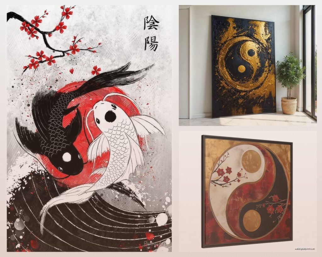
Avoid pieces that mix yin yang with random “Asian-looking” elements just for aesthetic. I’ve seen some really cringey wall art that throws yin yang symbols together with random kanji, cherry blossoms, and bamboo like it’s all the same thing. It’s not.
Support artists from Chinese or broader Asian backgrounds when possible, especially for more traditional interpretations. There are contemporary Asian artists doing incredible modern takes on yin yang concepts that feel both culturally rooted and fresh.
DIY Options If You’re Into That
I’m not usually a DIY person (I tried watching that home reno show last week, fell asleep twice) but yin yang pieces are actually pretty doable if you’re crafty.
Painted wood rounds – get a large circular wood slice, sand it down, paint half black and half white with the teardrop shapes and dots. Seal it. Done. I’ve seen people do beautiful versions of this with stain instead of paint for a more natural look.
String art – okay this takes patience but the results are stunning. Circular board, nails arranged in the yin yang pattern, wrap string around the nails to fill in the shapes. You can do gradients with different colored strings which looks really cool.
Resin art – if you’re into resin pouring, yin yang designs work great. Black and white resin in circular molds, you can add metallic powders, embed objects, whatever. Fair warning, resin is messy and kinda toxic so good ventilation and follow safety stuff.
Lighting Considerations Nobody Talks About
This is gonna sound overly detailed but lighting makes or breaks these pieces. I’ve installed the same yin yang artwork in different homes with different lighting and it reads completely differently.
Natural light: if your yin yang art is on a wall that gets direct sunlight, make sure it’s UV protected otherwise the blacks will fade to brown over time. I learned this the expensive way with a client’s piece that cost like $800 and faded in six months.
Spotlighting: works amazing for three-dimensional or textured pieces. A simple picture light or track lighting aimed at the piece creates drama and emphasizes the contrast.
Ambient lighting: softer, more diffused light makes yin yang art feel calmer and more meditative. Good for bedrooms and relaxation spaces.
Backlighting: this is advanced but if you have an acrylic or translucent yin yang piece, backlighting it creates this glowing effect that’s honestly stunning. I did this in a client’s hallway and people always comment on it.
Budget Breakdown From Someone Who’s Bought Too Many
Real talk about costs because this stuff varies wildly:
Under $50: prints, posters, small canvas pieces. These are fine for temporary situations or if you’re just testing out the look. Quality is hit or miss. Etsy and Society6 have decent options here.
$50-200: better quality canvas, small to medium metal prints, decent wood pieces. This is the sweet spot for most people. You’re getting something that looks intentional without dropping serious money.
$200-500: large format pieces, custom work, quality materials. This is where I usually shop for client projects. The craftsmanship jump from the previous tier is noticeable.
$500+: original art, large metal or wood sculptures, commissioned pieces. Worth it if it’s a focal point in your space and you’re gonna be there long-term. I have a few pieces in this range that I’ll keep forever.
I spent way too much on a carved stone yin yang piece once (like $700) and honestly it’s one of my favorite things I own so sometimes the splurge is worth it.
Combining With Other Decor Elements
Yin yang art doesn’t have to exist in isolation. Actually it works better when it’s part of a bigger design story.
Plants – natural elements reinforce the philosophy. I always add plants near yin yang art. Snake plants, pothos, anything with strong architectural leaves works well. Or go softer with ferns and trailing plants for contrast.
Natural materials – wood furniture, stone accents, linen textiles, these all support the organic balance concept without being too literal about it.
Water features – if you’re really committed to the vibe, a small fountain or water element near yin yang art reinforces the flow and balance concepts. This works better in larger spaces though, don’t cram a fountain into a tiny room.
Mirrors – strategically placed mirrors can reflect your yin yang art and create interesting visual echoes. I did this in a narrow hallway once and it made the space feel wider while doubling the impact of the art.
Honestly the key is not overthinking it. Yin yang philosophy is about natural balance so if your space feels balanced and intentional, you’re probably doing it right. I’ve seen people get so caught up in making everything “perfect” and “meaningful” that the space ends up feeling forced and uncomfortable.
Just pick a piece that speaks to you, put it somewhere you’ll actually see it, and let it do its thing. The whole point is balance and harmony, not stress and perfectionism.