Wall Art Guide, Wall Art Tutoriels
Eiffel Tower Wall Art: Paris France Landmark Photography
Jul
So I’ve been basically obsessed with Eiffel Tower photography for wall art lately and honestly it started because a client wanted something “Parisian but not cliché” which is like…the hardest brief ever? But I’ve learned SO much about what actually works versus what looks cheap.
The Black and White vs Color Debate
Okay so here’s the thing about black and white Eiffel Tower prints – they’re safer but also they can read really dated if you’re not careful. I spent like three hours last Tuesday (my dog kept interrupting because apparently 2pm is playtime) comparing different B&W shots and the ones that work best have serious contrast. Not that washed out grey nonsense that was everywhere in 2015.
The color versions though? They’re trickier. You gotta consider what time of day the photo was taken. Golden hour shots with that warm peachy light can be stunning but they lock you into a specific color palette for the whole room. I learned this the hard way when I bought this gorgeous sunset Eiffel Tower print and then realized it clashed with literally everything in my living room because of the orange tones.
Blue hour photography is actually my favorite – that deep blue sky right after sunset when the tower is lit up. It’s moody without being dark and works with both warm and cool color schemes. Plus it doesn’t scream “I bought this at HomeGoods” which is always a win.
Size Actually Matters More Than You Think
This is gonna sound weird but most people buy Eiffel Tower art that’s way too small. Like you want impact right? The tower itself is this massive vertical structure so a tiny 16×20 print just looks…sad. I usually tell people to go at least 24×36 if you’re doing a single piece.
But here’s where it gets interesting – orientation matters too. Vertical prints make more sense architecturally because hello the tower is tall, but horizontal shots that show the tower with the Trocadéro or the Seine can actually fill wall space better. I’ve got this one horizontal print in my office that shows the tower from across the river and it works perfectly above my desk where a vertical would’ve felt cramped.
Oh and another thing – if you’re doing a gallery wall situation, mix it up. Don’t do like five different Eiffel Tower shots unless you’re going for a very specific collector vibe. One statement Eiffel Tower piece with complementary Paris images (café scenes, architecture details, street photography) reads way more sophisticated.
Print Quality Is Where People Mess Up
Okay so funny story – I ordered what I thought was gonna be this amazing museum-quality print from an Etsy seller and it arrived looking like someone printed it at Kinko’s. The pixels were visible from like six feet away. Never again.
You want to look for actual photography prints, not just digital downloads that you print yourself unless you have access to a legitimate photo printer. Giclée prints are the gold standard – they use archival inks and the color accuracy is insane. Yeah they cost more but a good 30×40 giclée will run you maybe $150-300 depending on the photographer and it’ll actually look professional.
Canvas prints are super popular but honestly I’m kinda over them? They can look cheap really fast especially if the image quality isn’t perfect. The texture of the canvas can actually detract from sharp architectural photography. Metal prints though – those are having a moment and for good reason. The Eiffel Tower on a metal print has this crisp modern look that works amazing in contemporary spaces.
Framing Choices That Don’t Suck
Simple frames. I cannot stress this enough. The Eiffel Tower is already ornate and iconic – you don’t need a baroque gold frame situation happening. Thin black frames, natural wood, or even floating frames work best.
I did see this one installation where someone used a really thick white mat with a thin gold frame and it was actually stunning but that’s because the photo itself was super minimal – just the tower tip against a clear sky. If your photo has a lot going on compositionally, keep the frame simple.
Oh wait I forgot to mention – if you’re going frameless with a canvas or metal print, make sure the image extends to the edges properly. Some photographers sell prints where the full tower is visible but then when you wrap it around canvas edges you lose the top or bottom. Super annoying. Always check the preview.
Where to Actually Buy This Stuff
Etsy is like a minefield honestly. You’ll find gorgeous original photography but also a million people selling the same stock image. Look for sellers who actually took the photos themselves – their shops usually have consistent style and they can answer technical questions about the prints.
I’ve had good luck with Society6 and Redbubble for more affordable options. The quality is decent and they have lots of size/format choices. But for investment pieces I go directly to photographers. There are several who specialize in Paris photography and sell limited edition prints. Yeah you’re paying more but you’re getting actual art.
Museums shops are underrated too – the Musée d’Orsay online shop has some incredible vintage-style Eiffel Tower prints and posters. Same with the Bibliothèque Nationale de France if you want historical photographs.
Vintage vs Contemporary Photography
So vintage Eiffel Tower photos have this whole romantic thing going on but you gotta be careful because some of them are SO overused. That one black and white shot from the 1920s with the old car in front? Everyone has seen it a thousand times.
If you go vintage, try to find something actually unique – construction photos from when they built the tower, lesser-known angles, or vintage color photography from like the 1960s which has this amazing saturated film quality.
Contemporary photography gives you way more variety. Drone shots looking straight down, long exposure at night with light trails, close-ups of the iron lattice structure, reflections in puddles – there’s so much creative stuff happening. My current favorite is this series where a photographer shot the tower during different weather conditions and they’re all moody and atmospheric.
Placement Strategy Because Location Is Everything
Living room is the obvious choice but it can feel touristy if you’re not careful. I think Eiffel Tower art actually works better in bedrooms, home offices, or even dining rooms where it creates ambiance without being the whole personality of your house.
Height matters – the center of your print should be at eye level which is usually around 57-60 inches from the floor. But if you’re hanging it above furniture, leave like 6-8 inches between the furniture and the bottom of the frame. I’ve seen people hang art way too high and it just floats there awkwardly.
Lighting is crucial too. If you’re gonna invest in a nice print, light it properly. Picture lights or adjustable wall sconces make such a difference. I installed this one LED picture light above my client’s Eiffel Tower print and it completely transformed it – suddenly you could see all the details in the iron structure.
What Doesn’t Work Trust Me
Multi-panel splits where the Eiffel Tower is broken across like three canvases – it’s been done to death and usually looks cheap. Unless you find a really artistic version where the split actually adds something compositionally, skip it.
Overly filtered Instagram-style prints with heavy vignetting and crushed blacks. They might look cool on your phone but blown up to wall size they just look amateur.
Anything with cheesy text overlay like “Paris is always a good idea” or “meet me in Paris” – just no. Let the image speak for itself.
Super zoomed in shots where you can only see like a section of the tower and it’s not immediately recognizable. The whole point is the iconic silhouette.
Mixing Eiffel Tower Art With Other Decor
This works best when you don’t make it a whole “Paris theme” situation. One great Eiffel Tower piece mixed with abstract art, botanicals, or other travel photography looks collected and intentional. Five different Paris landmarks starts feeling like a themed restaurant.
Color coordination is key – pull colors from the print into your throw pillows, curtains, or other accessories. If you’ve got a blue hour Eiffel Tower shot, navy or slate blue accents throughout the room tie everything together.
I’m actually watching this design show right now where they did a whole Parisian apartment vibe and it works because they kept it subtle – the Eiffel Tower print was there but so was modern furniture and contemporary art. Balance.
The Photography Style That Matches Your Space
Minimalist modern spaces need clean architectural shots – maybe the tower against a white sky or a super sharp geometric composition. Traditional spaces can handle more romantic interpretations with softer light and classic framing. Industrial or loft spaces look amazing with gritty black and white or even street photography that includes the tower in the background.
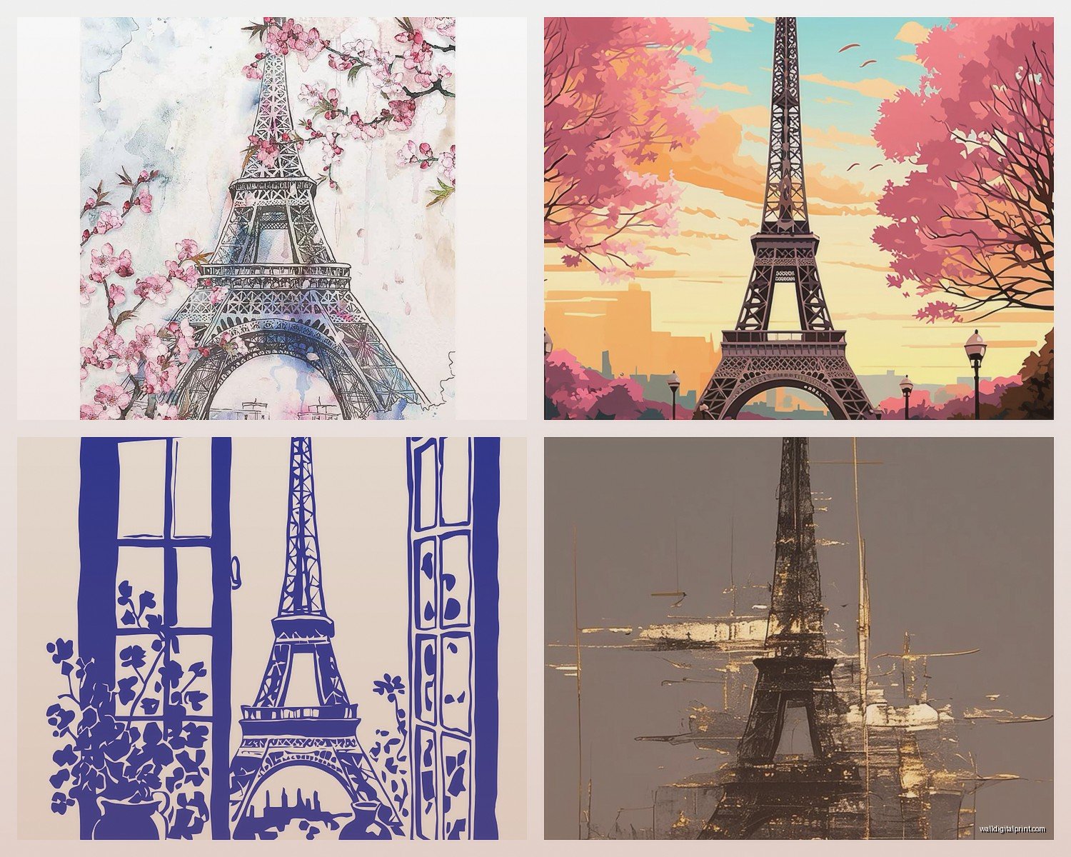
I helped style this one ultra-modern condo and we used a massive metal print of the Eiffel Tower shot from directly below looking up. Super graphic and architectural. Totally different vibe than the soft watercolor-style print I put in someone’s French country bedroom.
Just make sure whatever style you choose actually reflects how you live and what you like, not what you think looks “Parisian” because Pinterest told you so. Your home should feel like you, not like a hotel lobby in the 8th arrondissement.
The best Eiffel Tower art is the piece that makes you happy when you look at it and doesn’t make your friends roll their eyes when they come over. That’s honestly the only rule that really matters.