Wall Art Guide, Wall Art Tutoriels
Arch Wall Art: Architectural Doorway Portal Design
Aug
So I’ve been totally obsessed with arch wall art lately and honestly it started because a client asked me to make their boring hallway less… boring, and I went down this whole rabbit hole about architectural doorways and portals and now half my Pinterest boards are just arches.
Why Arches Actually Work (And It’s Not Just Trendy)
Okay so the thing about arch designs is they trick your eye into thinking there’s more space. Like, your brain sees that curved doorway shape and goes “oh there must be another room there” even though it’s literally just your wall. I tested this in my own apartment – put a large arch print above my console table and suddenly that corner didn’t feel like a dead end anymore.
The key is understanding that you’re basically creating architectural interest where none exists. My neighbor has those gorgeous original doorways from the 1920s and I’m over here with builder-grade everything, but the right arch art? Makes it look intentional.
Types of Arch Art You’ll Actually Find
There’s basically a few categories and they all do different things:
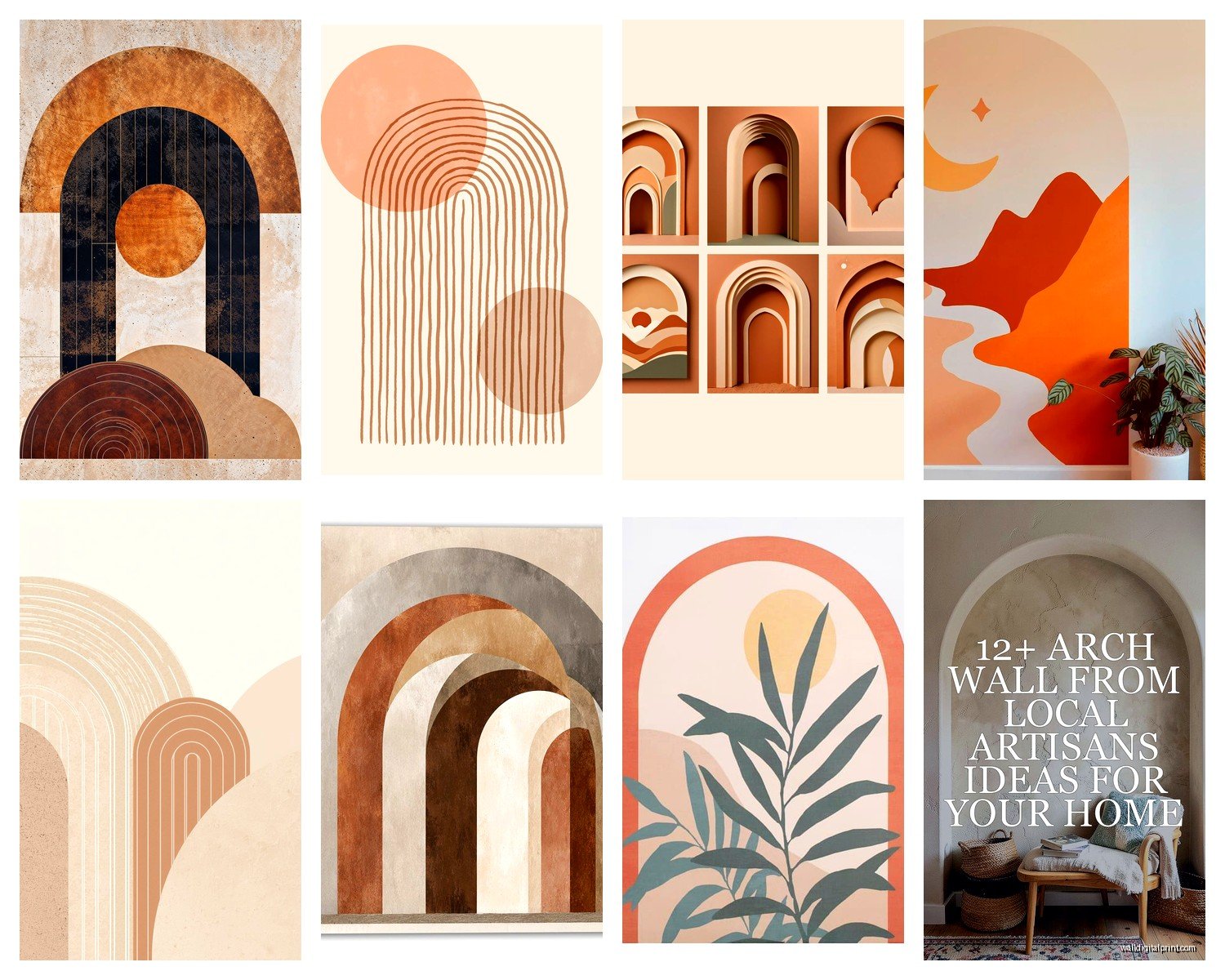
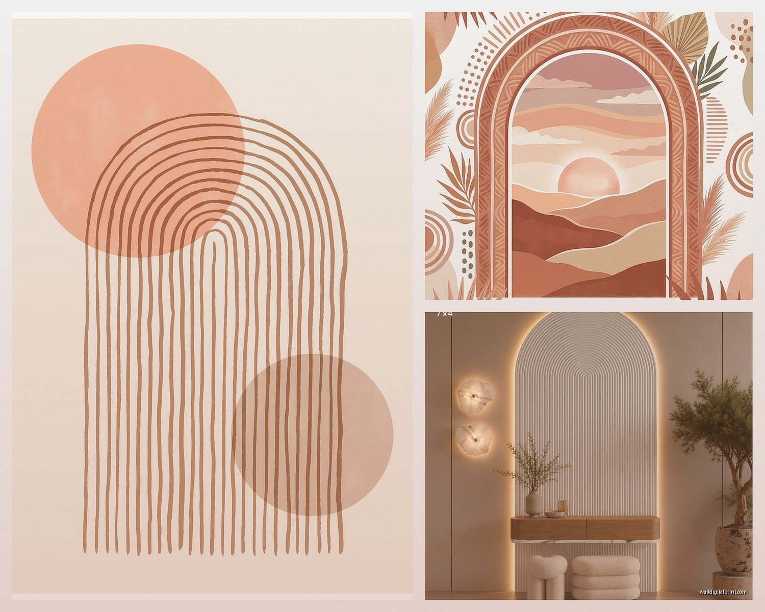
- Line drawing arches – super minimal, usually black on white or that trendy terracotta color
- Photographic arches – actual doorways from like Moroccan riads or Italian villas
- Abstract arches – more painterly, textured, the ones that look expensive even when they’re not
- 3D or trompe l’oeil – these are wild, they literally look like cutouts in your wall
I’ve worked with all of them and honestly the line drawings are easiest to place but the photographic ones have more… I dunno, soul? If that doesn’t sound too pretentious.
Sizing This Thing Right
This is where everyone messes up and I did too at first. You need to think about the arch proportions relative to your wall space. A tiny 16×20 arch print on a huge empty wall looks like you gave up halfway through decorating.
Here’s what actually works – measure your wall width and go for art that’s roughly 2/3 to 3/4 of that width. So if you have a 6-foot wide wall section, you want your arch art to be around 48-54 inches wide. This is gonna sound weird but I literally use painter’s tape to outline the size on the wall before I buy anything now because I’ve made expensive mistakes.
For vertical spaces – like that awkward spot between two doorways or next to a bookshelf – a tall arched doorway design works better than a wide one. Think about actual architectural proportions. Doorways are taller than they are wide, usually.
The Height Thing Nobody Talks About
Hang it at eye level, which is roughly 57-60 inches from the floor to the center of the artwork. But – and this matters – if you’re putting it above furniture, you want 6-8 inches of space between the furniture top and the bottom of the frame.
I watched my cat knock over a vase last week while I was trying to hang something too low over my credenza and honestly that whole situation reminded me that you need clearance for actual living, not just what looks good in theory.
Color Schemes That Don’t Fight Your Space
Okay so funny story, I bought this gorgeous terracotta arch print for my living room and it clashed horribly with my rug and I didn’t realize until I got it home because I was looking at it on my phone in terrible lighting. Learn from my mistakes.
Neutral spaces – you can go bold with your arch art. Deep blues, terracotta, ochre, even black arches on warm white backgrounds. This is your chance to introduce color without committing to painting walls.
Colorful rooms – honestly just stick with black and white or sepia-toned photographic arches. You don’t need more happening.
Monochrome everything – this is where textured or 3D arch art shines. Same color family but different materials or finishes.
I’ve also noticed that aged or weathered-looking archways (like photos of old stone doorways) work in almost any space because the colors are naturally muted and earthy.
Where to Actually Put These Things
Not just “on a wall” but like, specifically:
Hallways – this is the obvious one but it works so well. Long narrow hallways benefit from a series of smaller arch prints or one large statement piece at the end. Creates a destination.
Behind beds – instead of a traditional headboard or with a minimal headboard. The arch shape mimics that headboard curve and adds height. I did this in a client’s bedroom and they said it made the ceiling feel taller which… I mean, optically it kind of does?
Dining rooms – above a sideboard or console. Especially if you have a modern dining setup that feels a bit stark, an arch adds that Old World element without going full Tuscan villa.
Living rooms – over the sofa is standard but also consider flanking a fireplace with two matching arch prints or creating a gallery wall where the arch is the anchor piece.
Bathrooms – wait I forgot to mention this earlier but small arch prints in bathrooms are incredibly chic. Like a framed vintage doorway photo above the toilet or a line drawing arch above the towel rack. Just make sure it’s properly sealed if it’s near the shower.
The Gallery Wall Approach
If one arch feels too minimalist for you, you can do multiples but there’s a trick to it. I usually go with:
- Three arches in a row – same size, same style, maybe different colors within the same palette
- One large arch with smaller complementary pieces around it – but keep the arch as the focal point
- Arches mixed with abstract art – this works if the other pieces have curves or circular elements that echo the arch shape
Don’t mix arch styles though. Like, don’t put a minimalist line drawing arch next to a heavily textured Moroccan doorway photo. It looks confused.
DIY vs. Buying (I’ve Done Both)
So you can totally DIY this if you’re into that. I made some using:
Canvas and paint – literally just paint an arch shape. Use painter’s tape for clean lines. The minimal aesthetic is forgiving for non-artists. Terracotta, ochre, or sage green on cream canvas looks expensive.
Printed photos – if you travel or have photos of cool doorways, print them large format. I used an online printing service and got a 24×36 print of a doorway I photographed in Barcelona for like $30. Framed it myself from a craft store frame.
Fabric or wallpaper – cut an arch shape from interesting fabric or wallpaper remnants, stretch it over a canvas frame. This adds texture and you can find materials for cheap.
But honestly? For the time investment, sometimes buying is smarter. Etsy has tons of downloadable arch art – you pay $5-15, download it, and print it yourself at whatever size you need. Or places like Society6 and Minted have really good quality prints.
Framing Matters More Than You Think
A great print in a cheap frame looks cheap. A mediocre print in a great frame looks intentional.
For arch art specifically:
- Thin black frames – modern, gallery-like, works with line drawings
- Natural wood frames – warmer, pairs well with terracotta or earth-toned arches
- No frame (canvas print) – good for larger pieces, more casual
- White frames – if your walls are white and you want the art to feel integrated rather than contrasted
I usually go frameless for really large pieces (40+ inches) because the frame cost gets ridiculous at that size and a good quality canvas print stands on its own.
Lighting This Properly
This is something I see people skip and it makes such a difference. Arch art, especially the ones with depth or texture, needs proper lighting to not look flat.
Picture lights – those little lights that mount above the frame. Very traditional but they work.
Track lighting – if you have it, angle a spotlight toward the art. Creates drama.
Wall sconces – flanking the art on either side. This is my favorite for larger arch pieces because it emphasizes that doorway/portal illusion.
Natural light – obviously you can’t always control this but if you can position arch art where it gets indirect natural light during the day, it’ll have this whole different quality compared to artificial light.
Oh and another thing – avoid direct sunlight on prints because they’ll fade over time. I learned this the hard way with a beautiful sepia arch print that’s now basically beige.
Mixing Arch Art with Actual Architecture
If you already have architectural details – like crown molding or wainscoting or actual arched doorways – you gotta be careful. Too much can feel theme-y.
What works: echoing existing shapes. If you have arched doorways, arch art reinforces that design language. But keep it subtle – maybe just one piece rather than multiples.
What doesn’t work: fighting your architecture. If your space is super modern with clean lines and zero curves, a heavily ornate Romanesque arch photo might feel out of place. Go minimal instead.
I had a client with this beautiful mid-century modern home and we used really simple line drawing arches in black – just the suggestion of an arch, very geometric. It referenced the doorway shape without contradicting the home’s aesthetic.
The 3D/Trompe L’oeil Situation
These are having a moment and they’re cool but tricky. Basically they’re designed to look like actual cutouts or recessed doorways in your wall. Some are wallpaper, some are decals, some are actual sculptural pieces.
The effect only works if:
- Your lighting is right – shadows need to fall naturally
- The scale is correct – too small and it looks like a sticker, too large and it’s overwhelming
- Your wall is the right color – most of these are designed for white or light walls
I used a trompe l’oeil arch decal in a client’s entryway and people literally walk up and try to look through it. It’s that convincing. But it took three tries to get the placement right because even being off by a few inches broke the illusion.
Budget Breakdown
Since you’re probably wondering what this actually costs:
DIY route – $20-50 depending on materials
Downloadable prints + printing – $10-60 total
Ready-made prints (unframed) – $30-150
Framed prints – $100-400
Original art or high-end photography – $300-2000+
3D/sculptural pieces – $150-600
I usually tell people to start with one really good piece rather than multiple okay pieces. Better to have one $200 framed arch print that you love than three $50 pieces that feel like placeholders.
My personal collection is a mix – I have expensive ones in main living areas and DIY/budget ones in hallways and bedrooms where they’re not the focal point.
Common Mistakes I Keep Seeing
Hanging it too high – I see this constantly. People think wall art should be near the ceiling? It shouldn’t. Eye level, always.
Wrong proportions – tiny art on huge walls or vice versa. Do the tape outline thing, seriously.
Ignoring the rest of the room – your arch art should relate to something else in the space. Pick up a color from your rug or echo the shape of your furniture.
Too many arches – unless you’re committing to a full gallery wall, one statement arch piece per room is usually enough.
Cheap printing – if you’re doing downloadable prints, pay for good quality printing. Pixelated arches look sad.
Look, I just realized I’ve been talking about this for way longer than I meant to but I’m watching this terrible reality show and just gonna keep typing during commercials… anyway, the main thing is just to think about arches as architectural elements you’re adding to your space, not just decoration. They should feel like they belong there, like maybe they were always there and you just noticed them.