
Wall Art Guide, Wall Art Tutoriels
Architectural Prints Wall Art: Building Blueprint Design Posters
Sep
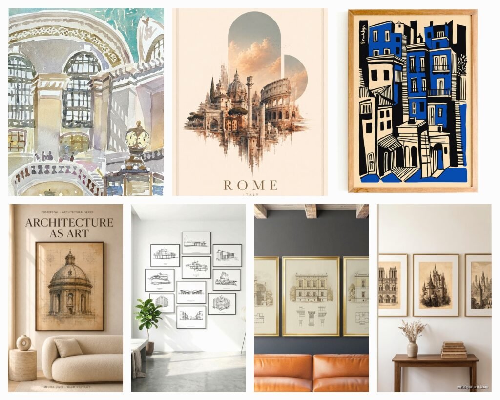
So I’ve been obsessing over architectural prints lately and honestly it started because a client wanted something “sophisticated but not boring” for their home office and I fell down this whole rabbit hole. Let me tell you what I’ve actually learned from hanging like 20 different blueprint posters in various spaces over the past year.
Finding the Right Prints Without Losing Your Mind
Okay so first thing – not all architectural prints are created equal. You’ve got your actual vintage blueprints which are gorgeous but pricey, then reproduction prints, and then modern designs that just look like blueprints. I’ve worked with all three and here’s the deal.
Vintage originals are amazing but they’re gonna run you anywhere from $80 to like $400 depending on the building and condition. I found this incredible 1920s Chicago apartment building blueprint on Etsy and it’s still one of my favorite pieces. But you gotta be careful because some sellers are literally just printing old blueprints they found online and calling them vintage.
Where I Actually Shop
- Etsy for vintage stuff but read those reviews carefully
- Society6 and Redbubble for modern architectural line drawings
- Local architectural salvage shops sometimes have actual blueprints
- Museum shops – the MoMA store has some really cool ones
- This random site called Slow Architecture Prints that I found at 2am one night
The reproduction prints are honestly where I tell most people to start. You can get a really high-quality print of like the Eiffel Tower construction plans or Frank Lloyd Wright designs for $30-60. They look just as good from three feet away and you’re not stressed about preservation.
Size Actually Matters More Than You Think
This is where everyone messes up including me the first time. I ordered what I thought was a huge statement piece and it arrived and was like… the size of a notebook. Always check the actual dimensions not just the listing photos.
For a home office or study I usually go with 24×36 inches minimum. That’s your standard architectural print size and it actually makes an impact. If you’re doing a gallery wall situation you can mix 11×14 and 16×20 but don’t go smaller than that or it just looks like you printed something at Kinko’s.
Oh and another thing – horizontal vs vertical orientation matters for the space. Blueprints are usually horizontal which is perfect above a desk or console table but kinda awkward on a narrow wall. I learned this the hard way in my own apartment when I tried to force a horizontal bridge blueprint onto this vertical space and it just… no.
My Go-To Size Combos
- Solo statement piece: 24×36 or 30×40
- Above furniture: 24×36 horizontal works perfect
- Gallery wall: mix of 16×20 and 11×14, keep it to 4-6 prints max
- Bedroom: two 18×24 prints side by side looks really clean
Framing Is Where You’ll Spend More Than Expected
Okay so funny story – I thought I was being smart buying affordable prints and then spent $200 framing one of them. Custom framing is insane. But here’s what I’ve figured out.
IKEA frames actually work great for architectural prints. The RIBBA and SILVERHÖJDEN lines come in standard sizes and they’re like $20-40. The black frames especially make blueprint designs pop. I’ve used them in probably half my projects and clients never know they’re IKEA unless I tell them.
For vintage blueprints though you might wanna invest in proper framing with UV-protective glass. The blue fades like crazy in direct sunlight and I watched a client’s $300 print turn basically white over six months because we cheaped out on the glass. Not worth it.
Matting Yes or No
This is gonna sound weird but I’m pretty anti-mat for architectural prints most of the time. The blueprints themselves have so much white space usually and adding a white mat just creates this sea of nothing. I like the print to go edge to edge in the frame.
Exception is if you’re doing museum-quality vintage preservation then yeah you need that acid-free mat and spacers and the whole thing. But for regular decorative prints just skip it and save the money.
Color Coordination Without Making It Boring
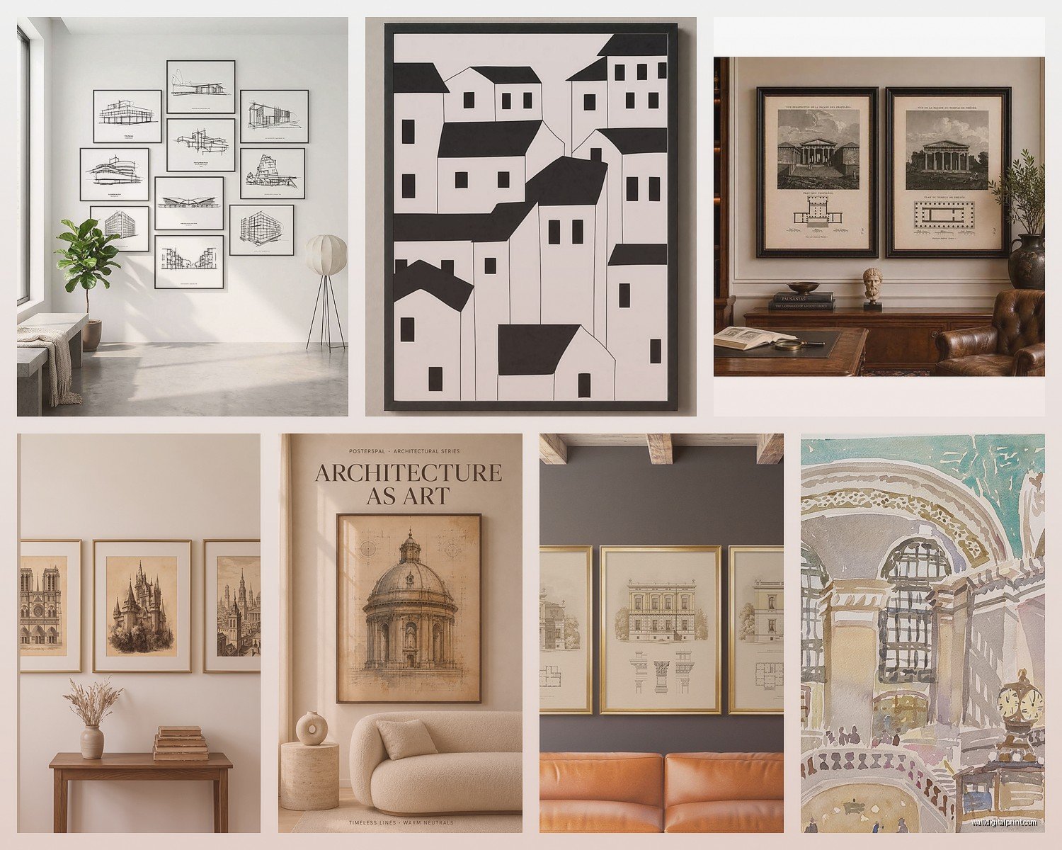
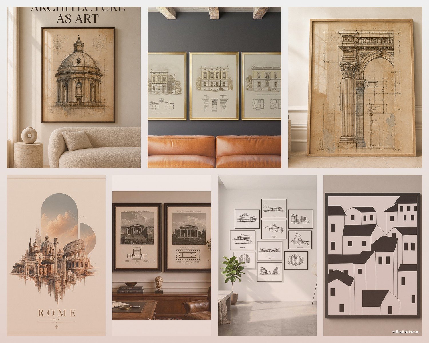
Traditional blueprints are blue and white obviously but you can find prints in different color schemes now. I’ve got sepia-toned architectural drawings, black line drawings on cream paper, even some cool inverted prints that are white lines on black.
For a cohesive look I usually stick to one color family across all the prints in a room. Like all blue blueprints or all black line drawings. Mixing them looks messy unless you really know what you’re doing… which I thought I did in my living room and then had to rehang everything because it looked like a chaotic college dorm.
Wait I forgot to mention – if your room is already pretty neutral, the traditional blue and white blueprints add just enough color without being overwhelming. I use them a lot in gray and white spaces or rooms with a lot of natural wood.
What Buildings to Actually Choose
This matters more than people think. You want something that means something to you or fits the vibe you’re going for. I see a lot of people just buying whatever looks cool and then it feels random.
Personal connection options:
- Your actual city’s buildings or bridges
- Places you’ve traveled that meant something
- Your profession if you’re an architect or engineer obviously
- Historical buildings from your area
- Your own house blueprints if you can get them which is actually really cool
I helped a client frame the actual blueprints from their 1890s Victorian house and it’s still one of my favorite projects. They got copies from the city archives for like $15 and we framed three different floor plans. So much better than generic Eiffel Tower prints everyone has.
For offices I tend to go with famous bridges or engineering marvels. There’s something about the Golden Gate Bridge construction plans or Brooklyn Bridge elevations that just works in a professional space.
Hanging Tips From Someone Who’s Put Holes in Too Many Walls
Measure twice hang once is real. I use painter’s tape to map out exactly where frames will go before putting any nails in the wall. Sounds basic but you’d be surprised how many times I’ve eyeballed it and been off by like three inches.
For a gallery wall of architectural prints I lay everything out on the floor first. Take a picture of it. Then recreate that exact layout on the wall. The center of the gallery should be at eye level which is usually around 57-60 inches from the floor.
My cat knocked over my coffee while I was doing this last week and I had to restart the whole layout process so… maybe don’t have beverages nearby.
The Command Strip Debate
Look I know people love Command strips but for anything over 16×20 I don’t trust them with expensive prints. I’ve had exactly one fall off the wall at 3am and nearly gave me a heart attack. Use proper picture hanging hardware.
For rental situations where you can’t put holes in walls, consider leaning larger frames on a shelf or mantle instead. It actually looks really intentional with architectural prints and you can layer a couple different sizes.
Lighting Makes or Breaks the Whole Thing
You need either natural light or good artificial light hitting these prints. The detail in architectural drawings gets lost in dark corners. I always suggest picture lights for really special pieces but even just positioning them on a wall that gets decent daylight works.
Avoid direct sunlight though especially on vintage blueprints. That blue color is basically dye on paper and it fades so fast. I learned this in my own apartment where I had a beautiful 1930s print that’s now basically a pale ghost of itself because I ignored my own advice.
Mixing Architectural Prints with Other Art
This is tricky but doable. Architectural prints are pretty technical and detailed so they don’t always play nice with abstract art or photographs. What works:
- Black and white photography with blueprint designs
- Other technical drawings like botanical illustrations or anatomical prints
- Vintage maps which have a similar vibe
- Simple line art or minimalist pieces
What doesn’t work in my experience is mixing them with colorful abstract paintings or busy patterns. It just competes for attention and nothing looks good.
Caring for These Things Long-Term
Dust them regularly with a dry microfiber cloth. Don’t use any cleaners on the glass because it can seep under and damage the print. If you’ve got vintage blueprints keep them out of humid spaces like bathrooms – learned that one when a client’s powder room print got all warped.
For really valuable pieces consider rotating them out seasonally if they’re in sunny spots. I know that sounds extra but preservation matters if you spent serious money.
Budget Breakdown From My Recent Projects
Since you’re probably wondering what this actually costs here’s what I spent on my last three installations:
Home office setup: Three 24×36 prints at $45 each, IKEA frames at $30 each, hanging hardware $15 total. Grand total around $240.
Living room statement piece: One vintage 1940s print at $180, custom framing with UV glass at $220, picture light at $65. Total $465 but it’s the focal point of the whole room.
Bedroom gallery wall: Four reproduction prints averaging $35 each, frames from Amazon at $25 each, Command strips I didn’t end up using $20. About $260 total.
You can definitely do this on a budget if you skip custom framing and stick to standard sizes. Or you can invest in one really special piece. Both approaches work depending on what you’re going for.
Okay so I think that covers most of what I’ve learned through trial and error with architectural prints. The main thing is just pick something you actually like looking at every day not what you think is supposed to be sophisticated or whatever. I’ve got a print of a water treatment plant in my studio because I think the mechanical drawings are beautiful and everyone thinks I’m weird but I love it so.
Don’t overthink the whole thing too much – these prints are forgiving and work in so many different spaces. Start with one, see how you like it, then build from there if you want more.
