Wall Art Guide, Wall Art Tutoriels
Line Art Wall Art: Minimalist Single-Line Drawing Designs
Sep
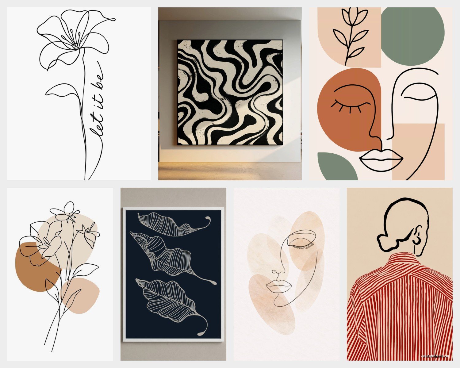
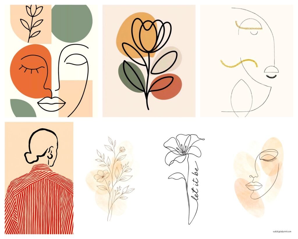
So I’ve been obsessing over line art lately and honestly it started because I hung this single-line face drawing in my bathroom and suddenly everyone who visits asks where I got it. Like, my neighbor literally texted me a photo of my wall at 11pm asking for the link.
The thing with line art is it looks deceptively simple but there’s actually a bunch of stuff you gotta know before you start buying or making pieces. I learned this the hard way when I ordered three “minimalist” prints that arrived looking like… kindergarten scribbles? Not the vibe.
What Actually Makes Good Line Art
Okay so the basic concept is one continuous line (or sometimes a few lines) that creates a recognizable image. Faces are huge right now, also bodies, hands, botanical stuff. The key thing I’ve noticed after curating like dozens of these for clients is that the WEIGHT of the line matters so much more than you’d think.
Thin lines (like 0.5mm to 1mm) look super delicate and modern but they completely disappear if you hang them more than 6 feet away. I made this mistake in a client’s living room and we had to reorder everything in a thicker line weight. Now I always tell people – if it’s going above a sofa or across a room, you want at least 2mm line weight, maybe even 3mm.
Thick lines (3mm+) read better from a distance but can look clunky up close. There’s this sweet spot around 1.5-2mm that works for most spaces.
Where to Actually Buy Them
I’ve tried basically every source at this point because my living room became a testing ground when I was writing a blog post last month.
Etsy is honestly still the best for variety. Search “single line drawing print” or “one line art” and you’ll get thousands of options. The trick is filtering by reviews – anything under 4.8 stars usually has weird printing issues or the proportions are off. I’ve ordered from at least 15 different Etsy shops and my favorites are the ones that show you the ACTUAL line weight in the listing. Most don’t, which is annoying.
Price range is usually $8-$30 for digital downloads, $25-$80 for physical prints. The digital downloads are great if you have a good printer or you’re gonna take the file to a print shop.
Desenio and Poster Store are those Scandinavian print sites that everyone uses. Their line art section is pretty good, very minimalist obviously. Quality is consistent which I appreciate. Frames are decent too if you bundle. I will say their designs can look a bit… same-y? Like you’ve seen them before because half of Pinterest is using their images.
Minted has some really beautiful options but pricier. $40-$150 range usually. The paper quality is noticeably better though – it’s that thick cotton rag paper that feels expensive when you touch it.
The Print Quality Thing Nobody Talks About
This is gonna sound weirdly specific but the type of printing matters. Giclée prints look crisp and the lines stay sharp. Regular inkjet printing can make lines look fuzzy, especially on the curves. I learned this when I printed a line drawing of a woman’s profile on my home printer and the nose looked… blurry? It was bad.
If you’re buying physical prints, look for:
- Giclée or archival printing
- Acid-free paper (so it doesn’t yellow)
- At least 200gsm paper weight
- Matte finish for line art – glossy looks weird with simple lines
DIY Line Art If You’re Feeling Ambitious
Okay so I tried making my own line drawings last year during a particularly slow week and it’s actually not that hard if you have a steady hand OR if you cheat with technology like I did.
The Analog Method
Get yourself:
- Smooth bristol paper or marker paper
- Fine liner pens – Micron or Staedtler, sizes 02 to 05 depending on how thick you want your lines
- A reference photo
- Pencil for very light sketching first
The technique is to literally not lift your pen. Start at one point and just… keep going until you’ve drawn the whole thing. It’s actually kinda meditative? I did this while watching The Crown and ended up with like 6 face drawings, only 2 were usable but still.
Pro tip my artist friend told me: start with profiles (side views of faces) because they’re more forgiving than front-facing portraits. The proportions can be slightly off and it still looks intentional.
The Digital Method (Way Easier)
If you have an iPad with Procreate ($13 one-time purchase, totally worth it), you can trace over photos and then clean up the lines. I know “tracing” sounds like cheating but literally every artist I know does this for line art. The skill is in knowing which lines to keep and which to leave out.
My process:
- Import a high-contrast photo
- Lower the opacity to like 30%
- Create a new layer and use the monoline brush
- Trace the essential lines – and this is the hard part, deciding what’s essential
- Delete the photo layer
- Export as PNG with transparent background
There’s also apps like Adobe Capture that can auto-convert photos to line art but honestly the results are usually too detailed or too simplified. Better to have control.
Oh and another thing – you can also hire someone on Fiverr to create custom line art from your photos. I did this for a client who wanted a line drawing of her grandmother from an old wedding photo. Cost like $25 and turned out beautiful. Took three days.
Framing Makes or Breaks the Whole Thing
I cannot stress this enough – a $15 line art print in the right frame looks like a $200 piece. In a cheap frame it looks like dorm room decor.
Frame colors that work best:
- Black frames – classic, makes the line art pop, works everywhere
- Natural wood (oak or walnut) – warmer feel, great for bedrooms
- White frames – very Scandinavian, but only if your walls aren’t also white or it disappears
- Brass or gold thin frames – elevated look but can read as trying too hard if everything else is super minimal
Mat or no mat? I go back and forth on this. Mats add breathing room and make small prints feel more substantial. But for line art specifically, sometimes the extra white space dilutes the impact. I usually skip the mat if the print itself has good margins (at least 1-2 inches of white space around the drawing).
Size and Placement Strategy
This is where people mess up constantly. They buy art that’s too small for the space.
General rules I follow:
- Above a sofa: minimum 24×36 inches or a gallery wall of smaller pieces
- Bedroom above bed: go big, like 30×40 or even 40×50 if you have the wall space
- Small walls or hallways: 11×14 or 16×20 works
- Gallery walls: mix of sizes but keep at least 2-3 inches between frames
Wait I forgot to mention – hanging height matters too. Center of the art should be at 57-60 inches from the floor, which is basically eye level. I see so many people hang stuff way too high and it looks like it’s floating off into space.
Creating a Gallery Wall with Line Art
This is actually my favorite way to display these because you can mix different subjects and it still looks cohesive since the style is consistent.
I usually do:
- 3-7 pieces total (odd numbers look better for some reason)
- Mix of faces, bodies, hands, maybe one botanical piece
- All the same frame color
- Varying sizes but not TOO varying – like don’t put an 8×10 next to a 30×40, the scale difference is jarring
Layout the arrangement on the floor first. Take a photo. Move stuff around. Take another photo. I usually end up with like 20 photos before I commit to hanging anything. My cat kept walking through my arrangements which was annoying but also kinda helped because it forced me to restart and I ended up with a better layout.
The easiest gallery wall formula: one large central piece with 4-6 smaller pieces around it. Or do a grid – all same size frames in a perfect grid pattern. Very graphic, very clean.
Mixing Line Art with Other Art Styles
You don’t have to do ONLY line art on your walls, that can actually look too matchy. I like mixing in:
Photography: Black and white photos especially work well. The high contrast complements the starkness of line drawings.
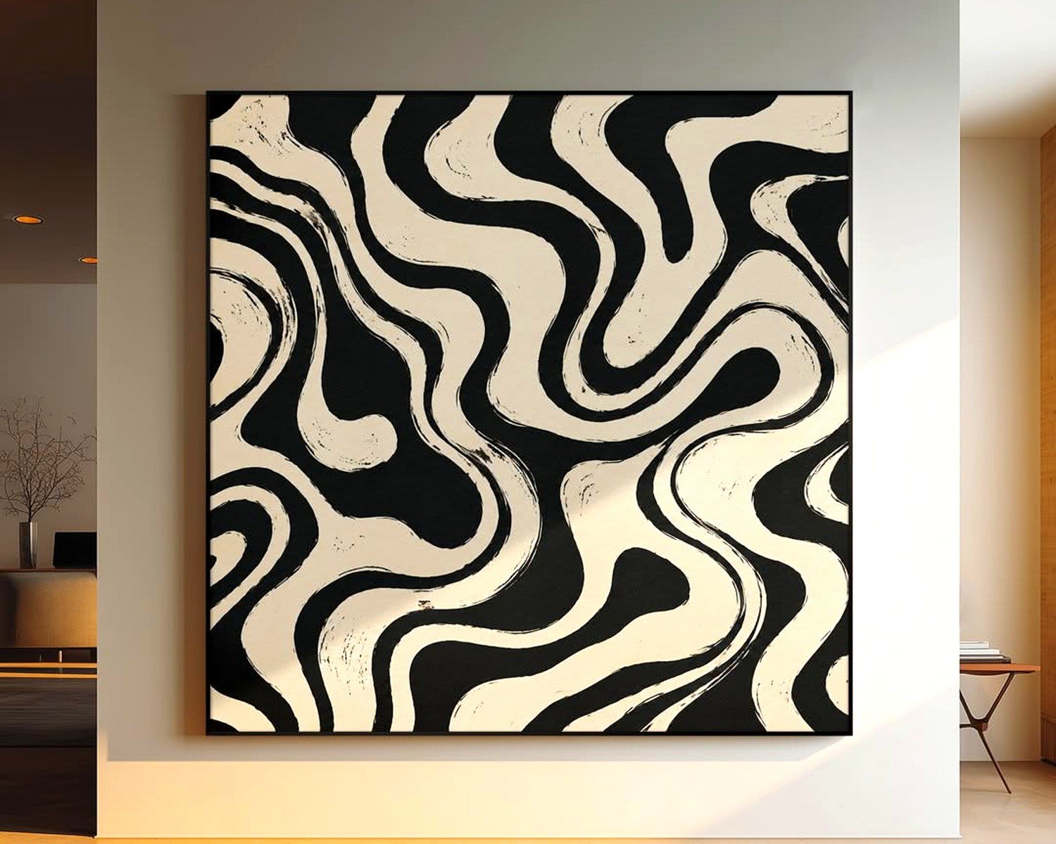
Abstract pieces: Something with a bit of color or texture creates nice contrast. I have a single-line face drawing next to an abstract piece with rust and cream colors and they balance each other.
Typography/quotes: Keep it minimal though. Like one word or a short phrase in simple font.
What doesn’t really work: busy patterns, traditional paintings, anything too colorful or detailed. The line art gets lost.
Trends I’m Seeing Right Now
Faces are still dominant but I’m seeing more:
- Hands in various positions
- Full body line drawings (reclining figures are everywhere)
- Couples – two faces or intertwined figures
- Architectural line drawings – buildings, arches, stairs
- Plant stems and leaves
- Animals but in that really simplified one-line style
The colored line art trend is picking up too – like a single rust-colored line or terracotta instead of black. I’m experimenting with this in my own space, got a burgundy line drawing that looks really sophisticated.
Common Mistakes to Avoid
Because I’ve made all of these:
Hanging too many: Line art works because of negative space. If you cover every wall, it loses impact. Leave breathing room.
Wrong backing: If you’re framing yourself, use white or off-white backing. I once used gray backing behind black line art and it made the lines look muddy.
Ignoring proportions: Some line art has weirdly elongated or distorted proportions that look “off” even though you can’t immediately pinpoint why. Trust your gut – if something looks wrong, it probably is.
Buying prints that are too small: I already mentioned this but seriously, people constantly buy art that’s too small and then wonder why their space feels unfinished.
Mixing too many line weights: If you’re doing a gallery wall, try to keep the line thickness somewhat consistent across pieces. Otherwise it looks chaotic.
Maintenance and Longevity
This stuff is pretty low maintenance but keep line art out of direct sunlight. The black ink can fade over time, and if it’s printed on cheaper paper it’ll yellow. UV-protective glass helps if you’re worried about this, but it’s pricier.
Dust frames regularly because dust is more visible on minimal art – there’s nowhere for it to hide. I just use a microfiber cloth.
If you’re in a humid environment, make sure your prints are sealed properly in the frame. Moisture can warp paper and make it buckle which looks terrible behind glass.
Budget Breakdown
Since you’re probably wondering about actual costs:
Budget-friendly route:
- Digital download from Etsy: $10
- Print at local shop or Staples: $8-15
- IKEA frame: $10-20
- Total per piece: $30-45
Mid-range:
- Physical print from Desenio or similar: $30-50
- Decent frame from Target or CB2: $40-70
- Total per piece: $70-120
Splurge version:
- Original artwork or limited edition print: $150-500
- Custom framing: $100-300
- Total per piece: $250-800
I usually recommend the mid-range option because the quality difference is noticeable but you’re not spending a fortune. Save the splurge prices for one statement piece if you want.
Anyway, that’s basically everything I’ve figured out through trial and error and also one particularly expensive mistake where I bought 5 prints that all arrived pixelated because I didn’t check the DPI. Always check that it’s at least 300 DPI if you’re printing yourself.
The whole line art thing really does make a space feel more curated and intentional without being fussy, which is probably why I keep coming back to it even when I tell myself I’m gonna try other styles.