Wall Art Guide, Wall Art Tutoriels
Ballet Wall Art: Dance Tutu Pointe Performance Art
Aug
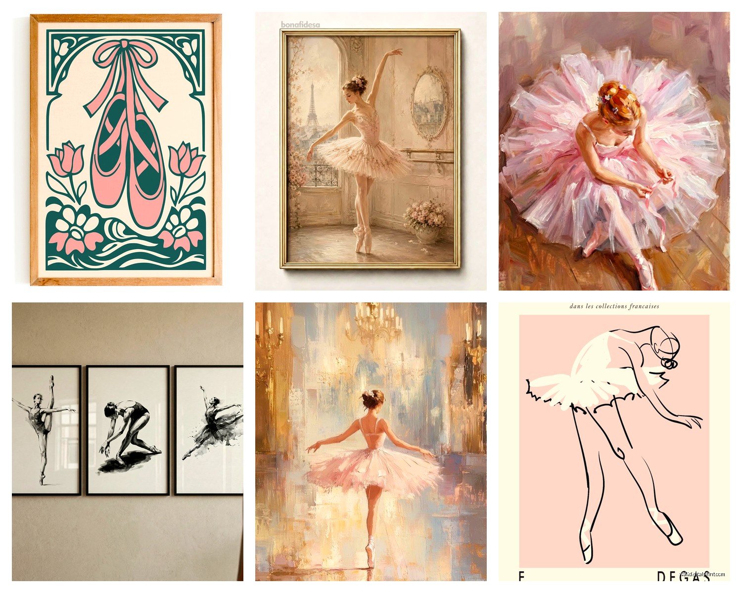
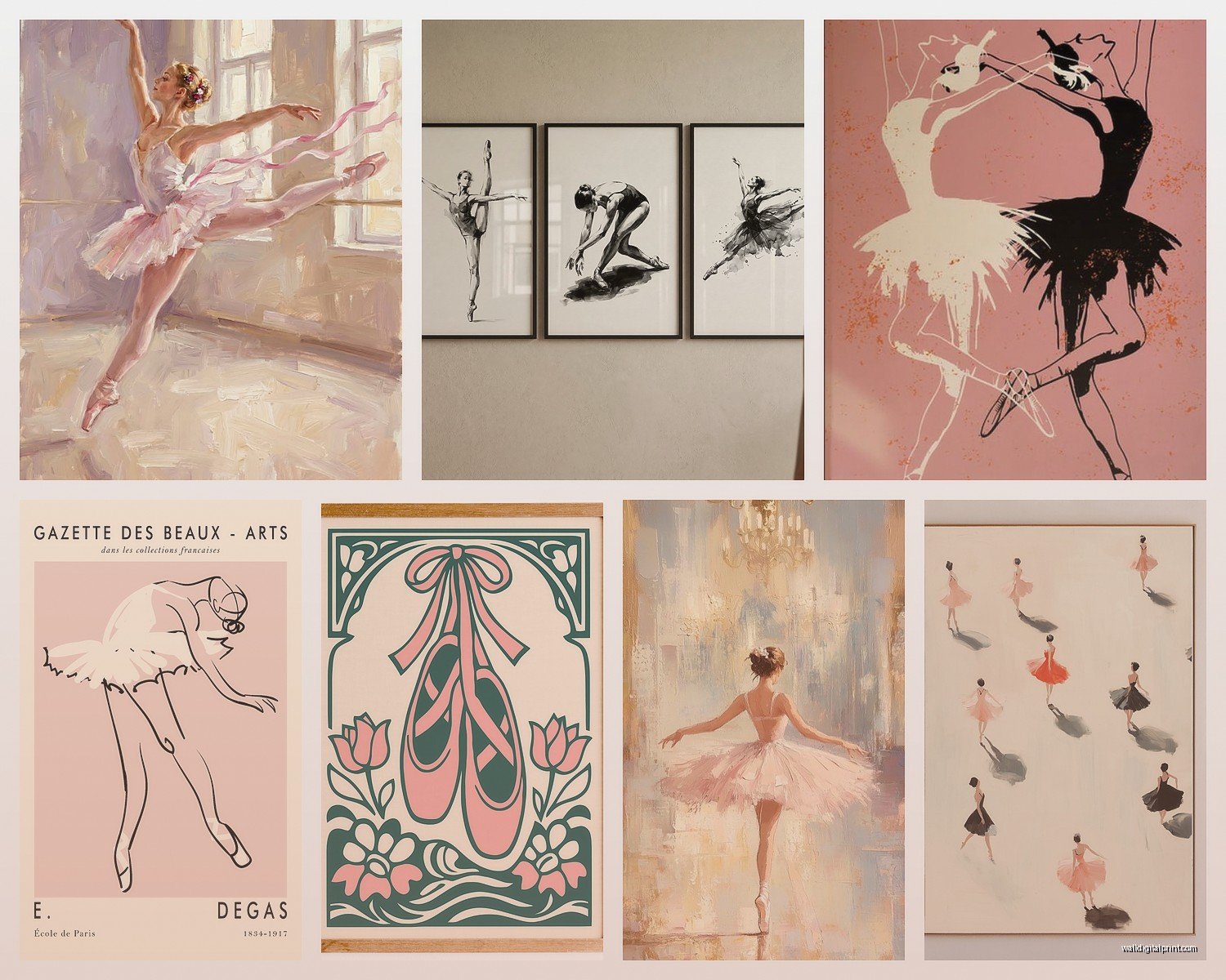
So I’ve been completely obsessed with ballet wall art lately because this client wanted to turn her daughter’s room into this elegant dance space and honestly it sent me down such a rabbit hole. Let me tell you what actually works because I’ve tested way too many pieces at this point.
Finding Ballet Art That Doesn’t Look Cheap
Okay so the biggest problem with ballet art is that SO much of it looks like those mass-produced prints you find at HomeGoods, you know the ones. Nothing wrong with HomeGoods but when you’re spending money on wall art you want it to feel special. What I learned is you gotta look at the details in the artwork itself.
For photographs especially, check if you can see actual texture in the tutu. Like the netting should have dimension, not just be a blur of pink. I found this amazing black and white photo series where you could literally see every thread in the pointe shoes and it made ALL the difference. The artist was some photographer in New York who shoots actual ballet companies and those images just hit different than the stock photo stuff.
Paintings are trickier though. I’ve bought three different painted ballet pieces this year and only one made it onto an actual client wall. The other two are in my storage unit because the proportions were off on the dancers. Their legs looked weird. My sister who did ballet for like 12 years came over and immediately pointed it out, said the turnout was all wrong and now I can’t unsee it.
Print Quality Actually Matters More Than You Think
This is gonna sound boring but I spent an entire Saturday comparing print methods. Canvas prints vs fine art paper vs metal prints. My cat knocked over my coffee during this whole process so there’s definitely a stain on one of my sample prints now but whatever.
Canvas works great for impressionist style ballet art, those dreamy Degas-inspired pieces. But here’s the thing nobody tells you about canvas prints – they need to be thick canvas, at least 400 GSM. The thin stuff looks cheap the second you hang it. I made that mistake with a beautiful watercolor ballet piece and you could see the wooden frame through the canvas when the light hit it wrong. Had to return it.
Fine art paper is my favorite for photography though. There’s this cotton rag paper that makes black and white ballet photos look absolutely incredible. The blacks are actually black, not that grayish color you get with cheap printing. I use a local print shop now instead of ordering online because I can actually see samples first.
Metal prints are interesting for modern ballet art. I did this whole series of contemporary dance poses on brushed aluminum for a client’s home gym and the effect was perfect – edgy but still elegant. Wouldn’t work for traditional tutus and pointe shoes though, feels too cold.
Where to Actually Buy This Stuff
Etsy is honestly my first stop always. But you gotta know how to search because if you just type “ballet art” you’ll get buried in results. I search for things like “ballet photography print” or “original ballet painting” or even specific things like “en pointe shoes art” to narrow it down.
The trick with Etsy is reading the shop reviews obsessively. I look for reviews with photos showing the art actually hung on walls. And I message sellers with questions – the good ones respond fast and know their stuff. I asked one seller about the exact Pantone color of the pink in their tutu print because I was matching it to a room and they got back to me within an hour with specifics. That’s when you know they’re legit.
Saatchi Art is pricier but worth it for original pieces. I’ve bought two original ballet paintings from there and both artists were so helpful about sizing and framing options. One artist even did a custom piece adjusting the background color to match the client’s room. Took like 6 weeks but it was perfect.
Oh and another thing – local art fairs and galleries. I know it sounds obvious but I found my favorite ballet photographer at a random art fair in my neighborhood. He had this series of dancers captured mid-leap and the motion blur was intentional and gorgeous. Bought three prints on the spot. Sometimes you gotta actually leave your house instead of just scrolling online at midnight which is usually when I’m shopping let’s be honest.
Framing Changes Everything
I cannot stress this enough – the frame matters almost as much as the art itself. I’ve seen beautiful ballet prints completely ruined by the wrong frame choice.
For classic ballet art with tutus and traditional poses, I usually go with simple black or white frames. Nothing ornate. Let the art be the fancy part. I like frames that are about 1.5 to 2 inches thick, substantial but not overwhelming.
For more modern or abstract ballet pieces, natural wood frames work really well. There’s this light oak frame I use constantly that somehow makes contemporary dance art feel warmer and more approachable.
Matting is where people mess up though. White mat with ballet art is safe but sometimes it’s TOO safe, makes everything look like a school photo. I’ve been using off-white or cream colored mats lately and it adds this subtle sophistication. For black and white photos, a black mat with white core (where you see white on the beveled edge) looks insanely good.
Wait I forgot to mention – if you’re doing a gallery wall of ballet pieces, your frames don’t all have to match exactly but they should coordinate. I usually pick two frame styles max and alternate them. Did a whole dance-themed gallery wall last month with black and gold frames mixed together and it looked way more interesting than all matching.
Sizing and Placement Tips
This is where I see people make the biggest mistakes honestly. They buy art that’s too small for the wall space.
For above a bed or sofa, your art should be about 2/3 to 3/4 the width of the furniture. So if you have a queen bed that’s 60 inches wide, you want your art or gallery wall to span about 40-45 inches. I did a single large ballet canvas that was only 24 inches wide above a queen bed once and it looked like it was floating awkwardly in space.
Height matters too. The center of your art should be at eye level, which is usually around 57-60 inches from the floor. But in a kid’s room I go a bit lower so they can actually see it properly. Had a client hang ballet art way too high in her daughter’s room and the kid literally couldn’t see the details without craning her neck.
For gallery walls with multiple ballet pieces, I lay everything out on the floor first. Take a photo, live with it for a day, rearrange, repeat. I know it’s tedious but it’s better than putting 47 nail holes in your wall. My process is usually to start with the largest piece and build around it.
Mixing Different Ballet Art Styles
Okay so funny story – I tried to mix vintage ballet poster reproductions with modern ballet photography for a client and it looked TERRIBLE at first. Like they were fighting each other for attention. What finally worked was using all black frames and making sure the color palette was consistent even though the styles were different.
You can totally mix paintings, photos, and prints together but they need a common thread. Either the color scheme matches, or they’re all the same tone (all warm or all cool), or they share a similar level of detail. I did this amazing mix of detailed pointe shoe closeups with minimalist dancer silhouettes and it worked because they were all in black, white, and gray.
Don’t mix too many different orientations though. If you’re doing mostly horizontal pieces, stick with that. Maybe one vertical piece as an accent but not half and half. It looks chaotic.
Color Choices That Actually Work in Real Rooms
Pink ballet art is beautiful but it doesn’t work in every room and this took me forever to figure out. Soft blush pink pieces work great in neutral rooms with white, gray, cream, or even navy. But if your room has warm beige or tan tones, that cool pink looks off.
Black and white ballet photography is the most versatile honestly. Works in literally any room. I’ve used it in modern spaces, traditional bedrooms, even a home office. The key is making sure the blacks are true black not muddy gray.
For rooms with bold colors, I actually love using ballet art with unexpected color backgrounds. There’s this series I found with dancers against teal backgrounds and I used it in a room with coral accents and it was stunning. The teal and coral played off each other perfectly.
Watercolor ballet art in soft pastels works amazing in little girls rooms obviously but also in bathrooms? I did a powder room with three small watercolor ballet prints and it added this unexpected elegance. My friend thought I was crazy but it totally worked.
What to Avoid
Okay real talk – those canvas prints with the inspirational quotes over ballet images. “Dance like nobody’s watching” or whatever. They’re so overdone and they make any space look like a teenager’s bedroom from 2012. If you want text, find vintage ballet posters with the original typography, that’s actually interesting.
Also avoid super literal art if you’re decorating a dancer’s room. Like you don’t need art that says BALLET in huge letters. They know they like ballet, you know? More subtle is better. Focus on beautiful images rather than being so on the nose about it.
Those weird 3D canvas prints where the image is split across multiple panels can work for modern art but I’ve never seen it work well with ballet. It chops up the dancer’s body in awkward places. Just get one good large canvas instead.
My Current Favorite Combos
Right now I’m obsessed with mixing vintage ballet photography (like actual old photos from the 1960s-70s) with one contemporary piece. The contrast between old and new is really beautiful.
Also loving ballet art mixed with abstract art in the same color family. Did a room recently with blush pink abstract pieces flanking a central ballet photo and it felt sophisticated instead of too theme-y.
For kids rooms specifically, I like doing two larger statement pieces rather than a bunch of small ones. Kids accumulate so much stuff that their walls get cluttered fast, so keeping the art simple and impactful works better.
The thing is you gotta trust your gut with this stuff. I’ve had pieces that checked all my boxes on paper but when I hung them they just didn’t feel right. And I’ve impulse bought art that broke all my rules but looked perfect on the wall. Sometimes you just know when something works.
Oh and maintenance – if you’re using real paintings or anything valuable, keep them out of direct sunlight. I learned this the hard way when a beautiful watercolor ballet piece faded after like 8 months in a sunny room. Now I always mention this to clients, use UV protective glass or keep valuable art away from windows.