Wall Art Guide, Wall Art Tutoriels
Wall Art for Guys Apartment: Masculine Bachelor Pad Decor
Aug
So I just helped my brother redo his entire apartment last month and honestly, wall art for guys is way easier than people make it out to be, you just gotta stop overthinking it.
Start With Scale Because That’s Where Everyone Messes Up
First thing – measure your wall space before you buy anything. I’m serious. My friend Jake bought this tiny 16×20 print for his massive living room wall and it looked like a postage stamp. You want something that takes up at least 2/3 of the width of your furniture below it. So if you’ve got an 8-foot couch, you’re looking at art that’s roughly 5-6 feet wide total. Could be one big piece or a grouping, doesn’t matter.
Large scale stuff (like 40×60 inches or bigger) immediately makes a space look more expensive and intentional. I’ve been pushing my male clients toward oversized prints because they fill space without looking like you tried too hard, which seems to be the vibe most guys are going for.
What Actually Works in Bachelor Pads
Okay so here’s what I’ve seen work really well:
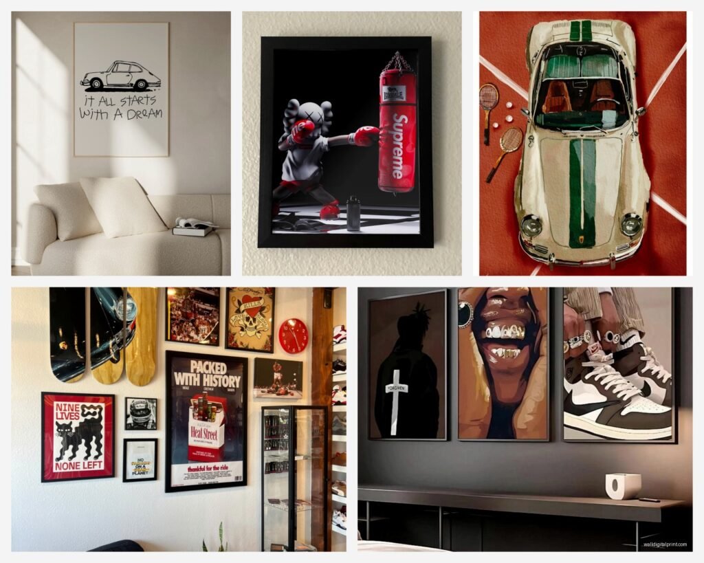
- Black and white photography – cities, architecture, vintage cars, that sort of thing
- Abstract geometric prints in black, white, gray, maybe one accent color
- Vintage maps or blueprints (these look sick in a home office area)
- Music-related stuff if you’re into that – concert posters, album covers, vintage instruments
- Sports photography that’s actually artistic, not just team logos
- Industrial or urban photography
The key is avoiding anything that screams “I bought this at Target in the dorm section.” Not that there’s anything wrong with Target, I literally buy half my stuff there, but you know what I mean.
Where to Actually Buy This Stuff
I’m gonna be honest, I spent like three hours comparing frame prices last Tuesday while my cat kept walking across my keyboard, and here’s what I figured out.
Society6 is solid for prints and they have tons of masculine options. Their framing is decent quality and they run sales constantly. Wait for a sale, seriously. I got my brother a huge abstract geometric print for like $80 framed during a 30% off thing.
Etsy has some really cool vintage stuff and digital downloads. The digital downloads are clutch because you can print them at whatever size you need at a local print shop. Way cheaper. Just make sure you’re getting high resolution files – you want at least 300 dpi.
Desenio if you want that minimalist Scandinavian vibe. Their frames are really affordable and they have good masculine prints. Ships from Europe though so factor in time.
Framebridge is pricier but if you have a poster or something you actually care about, their custom framing is worth it. I used them for a client’s vintage motorcycle blueprint and it looked incredible.
Oh and another thing – check out local thrift stores and antique shops. I found an amazing vintage National Geographic map for $12 last month. Spent another $60 getting it properly framed but still way cheaper than buying new, plus it’s actually unique.
The Gallery Wall Thing
Gallery walls can look really good in guy apartments but they require more planning than one big piece. Here’s how to not screw it up:
Pick a consistent element. Could be all black frames, all the same subject matter, all black and white photos, whatever. You need something tying them together or it just looks random and messy.
Lay it out on the floor first. Take a picture with your phone. Move stuff around. I cannot stress this enough because once you start putting holes in the wall you’re committed.
The spacing rule: keep 2-3 inches between frames. Consistent spacing makes it look intentional instead of chaotic.
Start with the biggest piece in the center or slightly off-center, then build around it. Don’t try to make it symmetrical unless you’re going for a super formal grid layout.
Grid Layouts Are Your Friend
Actually wait, if you’re not confident with the whole asymmetrical gallery wall thing, just do a grid. Four or six prints in identical frames, hung in a perfect rectangle. It’s foolproof and looks clean and masculine. I did this in my brother’s bedroom with four 16×20 black and white city photos and it took maybe 20 minutes to hang.
Frames Matter More Than You Think
Black frames are the safest bet for masculine spaces. They work with everything and don’t compete with the art. I use black metal frames for like 90% of my male clients.
Wood frames can work too but go darker – walnut, espresso, black stain. Light wood can look good in the right space but it’s trickier to pull off in a bachelor pad aesthetic.
Skip the ornate stuff entirely unless you’re going for some specific vintage vibe. Simple, clean lines.
And this is gonna sound weird but, don’t mix frame colors on the same wall unless you really know what you’re doing. Stick with one frame style per wall or room.
Subject Matter That Doesn’t Look Juvenile
Movie posters are fine but get them properly framed. A Pulp Fiction poster in a cheap plastic frame looks college dorm. Same poster in a nice black frame with a mat looks intentional and cool.
Avoid anything with motivational quotes unless it’s vintage or ironic. “Work Hard Play Hard” type stuff just… no.
Sports stuff – if you’re gonna do jerseys or memorabilia, limit it to one statement piece and get it professionally framed. Don’t turn your living room into a sports bar unless that’s genuinely the aesthetic you want.
Photography prints that work:
- Architectural details
- Urban landscapes
- Vintage cars or motorcycles
- Nature but make it dramatic – mountains, storms, deserts
- Abstract close-ups of industrial stuff
- Black and white portraits that are artsy not cheesy
Color Schemes for Masculine Spaces
Most bachelor pads I work with stick to neutral walls, so the art can either blend in or provide the only color pop. Both approaches work.
If your walls are white or gray, you could go:
- All black and white art for a monochrome sophisticated look
- Black and white with one accent color repeated (like navy or rust or forest green)
- Colorful abstract art as the focal point
I’m personally a fan of the mostly neutral with one colorful statement piece approach. Like everything is black and white photography except one large abstract painting with some color. It gives you flexibility to change up your decor without replacing all your art.
The Accent Color Thing
If you do want color, pick ONE accent color and stick with it. Could be a deep blue, burnt orange, olive green, whatever. Then that color shows up in your art, maybe a throw pillow, maybe a plant pot. This is basic stuff but it actually makes your space look pulled together instead of random.
Installation Tips Because Hanging Art Sucks
Get a level. Just buy one. They’re like $8 and the difference between art that looks professional and art that looks crooked is literally just using a level.
The standard rule is center the art at 57-60 inches from the floor, which is average eye level. But honestly, I adjust based on the space and furniture. If you’ve got a low couch, you might go a bit lower.
For heavy pieces, use proper anchors. Drywall anchors for anything over like 10 pounds. Don’t just rely on nails unless you’re hitting a stud.
Command strips work for lightweight frames and they’re great for renters, but check the weight limits. I’ve had frames fall at 2am and it’s not fun.
Oh and measure from the center point of where you want the art, not from the top of the frame. This messed me up for years until another designer showed me the proper way to do it.
Specific Room Recommendations
Living Room: Go big or go home. One large statement piece above the couch or a gallery wall on the main focal wall. This is where you can do the dramatic oversized photography or abstract art.
Bedroom: Above the bed is the obvious spot but don’t ignore the other walls. I like doing a large horizontal piece above the bed and maybe a smaller piece or two on adjacent walls. Keep bedroom art slightly more subdued than living room stuff.
Home Office: This is where maps, blueprints, vintage diagrams, and architectural prints really shine. You can go more specific to your interests here since it’s not the main entertaining space.
Entryway: Make a statement immediately. One impactful piece right when you walk in sets the tone for the whole place.
Budget Breakdown
You can totally do this on a budget, just gotta be smart about it.
Cheap option: Digital downloads from Etsy ($5-15) + printing at Staples or a local print shop ($20-40 depending on size) + IKEA frames ($15-40) = $40-95 per piece
Mid-range: Society6 or Desenio framed prints during sales = $80-150 per piece
Splurge: Original art from local artists or custom framing = $200-500+ per piece
I usually tell people to mix it up. Splurge on one or two statement pieces and fill in with budget-friendly options.
The IKEA Frame Hack
IKEA’s RIBBA frames are actually really good quality for the price. The black ones especially. I use them all the time. Get your prints done at a good quality printer, pop them in RIBBA frames, and nobody can tell you didn’t spend $200 per piece.
Their LOMVIKEN frame is also solid if you want a thinner profile.
Common Mistakes to Avoid
Hanging everything too high. Seriously this is the number one thing I see. Lower than you think.
Buying art that’s too small for the space. When in doubt, size up.
Not considering the room’s lighting. A print that looks great in natural light might look totally different under warm artificial light at night.
Mixing too many styles. Pick a vibe and stick with it, at least per room.
Forgetting about the space above furniture. Leaving walls completely bare above your desk or dresser is a missed opportunity.
Using those sawtooth hangers that come with cheap frames. They’re terrible. Replace them with proper D-rings and wire.
Alternative Wall Art Ideas
Okay so beyond prints and paintings, here are some other options that work great in masculine spaces:
Floating shelves with a curated selection of objects – books, small sculptures, plants, vintage cameras, whatever you’re into. This is technically decor not art but it fills wall space effectively.
Tapestries or textile wall hangings – but make them masculine. Think woven geometric patterns or vintage rugs hung on the wall, not that hippie stuff (no offense to hippie stuff, just different vibe).
Metal wall sculptures – industrial looking pieces can add dimension and texture.
Vinyl records – if you actually collect vinyl, displaying some on the wall looks cool and personal. Use proper record frames or mounting systems.
Vintage signs or advertisements – but only if they’re actually vintage or really high quality reproductions.
I’m watching this show about interior design competitions right now and it’s funny how they overcomplicate things, like just put something on the wall that you actually like and that’s the right size for the space, it’s not that deep.
Making It Personal Without Making It Weird
Your apartment should reflect your actual interests, just in a curated way. If you’re into surfing, some ocean photography makes sense. Into cars, vintage automotive prints work. The key is keeping it subtle and sophisticated rather than theme-park obvious.
Travel photography from places you’ve actually been can be really cool. Get them properly printed and framed though, not just snapshots in drugstore frames.
If you have a hobby that produces visual results – photography, woodworking, whatever – displaying your own work is actually awesome and gives you conversation starters.
Just avoid the trap of making your place look like a shrine to one thing unless you’re really committed to that aesthetic.
Anyway, start with measuring your walls, figure out your budget, pick a style direction, and just commit to it. You can always swap stuff out later but an empty wall looks worse than art that’s not quite perfect, so just start somewhere.