Wall Art Guide, Wall Art Tutoriels
Modern Wall Art for Dining Room: Contemporary Eating Space
Aug
So I’ve been obsessing over dining room wall art lately because honestly, it’s the one space where people get it SO wrong. Like my sister just bought this tiny 8×10 print for her massive dining wall and I was like… no. We need to talk.
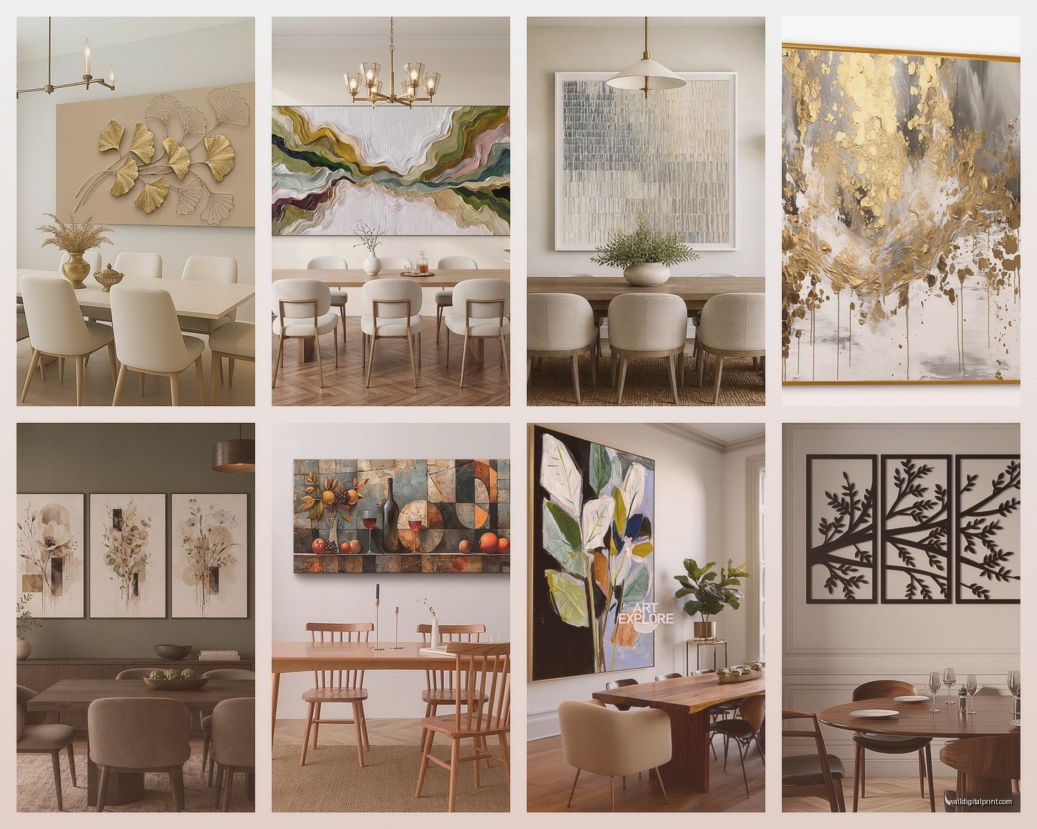
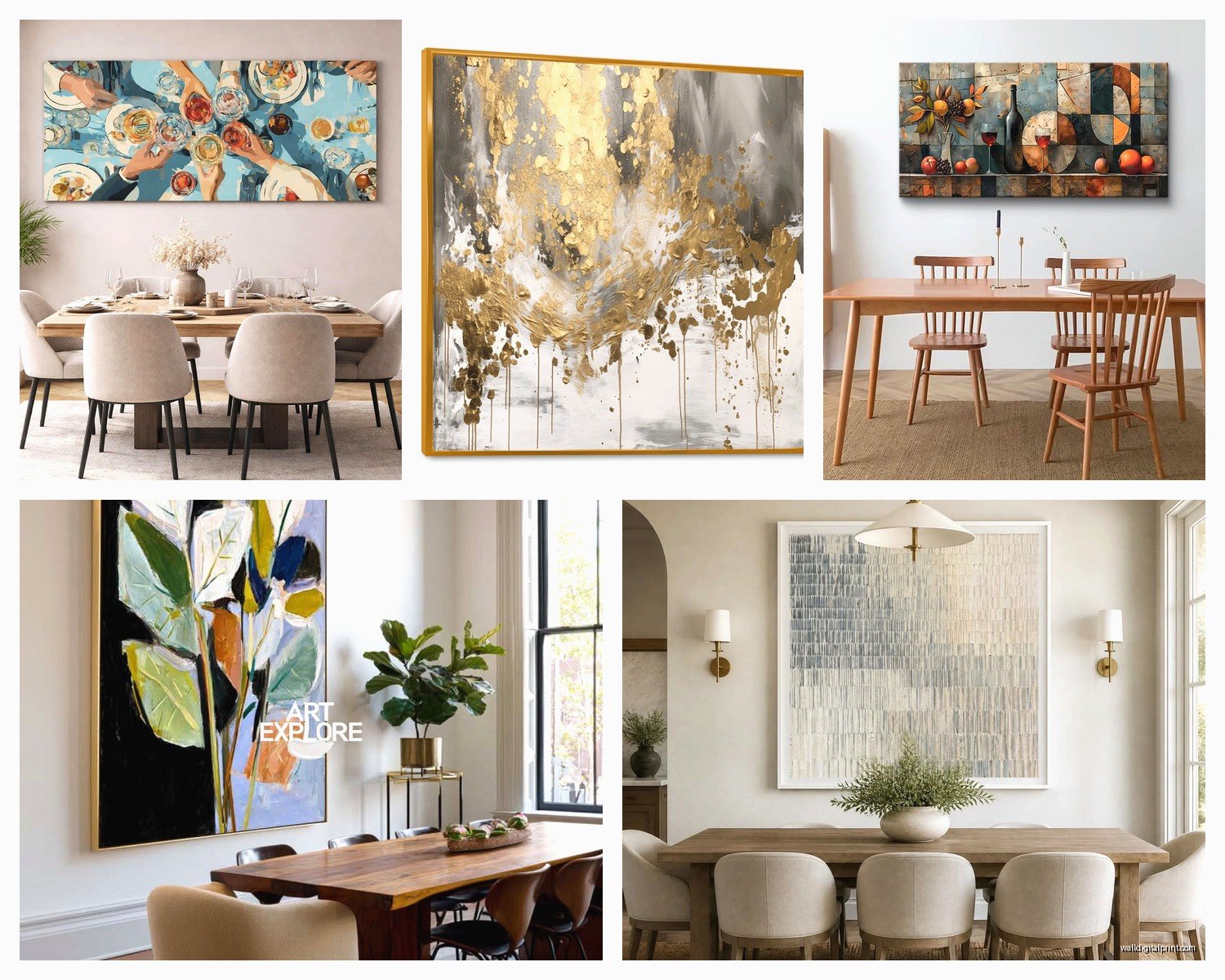
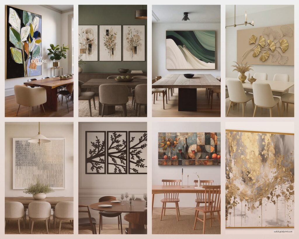
The biggest mistake everyone makes is going too small. Your dining room wall can handle way more than you think. I always tell people to measure their wall space and then go bigger than feels comfortable. If you’ve got a standard dining table that seats 6-8 people, you’re looking at needing artwork that’s at least 40-50 inches wide. I learned this the hard way in my own place – hung what I thought was a decent-sized piece and it just looked like a postage stamp floating in space.
Scale Is Everything and Also Kinda Confusing
Okay so here’s my weird rule that actually works. Take the width of your dining table (let’s say it’s 72 inches) and your wall art should be roughly 2/3 to 3/4 of that width. So you’d want something around 48-54 inches wide. This isn’t like a design law or whatever, but it creates this visual balance that just… works.
You can also do a gallery wall situation but honestly those are trickier than people think. I spent like three hours last month helping a client plan one and we used painters tape on the wall to map everything out first. Total pain but necessary because once you start putting holes in the wall, you’re committed.
Abstract vs Figurative and Why I Changed My Mind
I used to be all about abstract art for dining rooms because it’s “safe” and works with everything. And yeah, it does work. But lately I’ve been pushing people toward more interesting contemporary pieces that actually have some personality. Like there’s this trend of line drawings – really minimal faces or figures – that look incredible in dining spaces. They’re modern but still have this human element that makes conversation spaces feel less cold.
My cat knocked over my coffee while I was browsing art sites yesterday and I found this whole category of botanical line art that’s not your grandmother’s floral prints. Think single leaf studies in black and white, or these really graphic plant forms. They photograph well too which matters if you’re someone who posts dinner party pics.
Color Coordination Without Making It Boring
Everyone asks about matching colors and look… you don’t want it to match perfectly. That’s gonna look like a hotel conference room. What you want is either:
- One or two colors from your art that echo something in the room (chair fabric, rug, whatever)
- OR go completely neutral with the art and let it be a visual break
- OR – and this is my favorite – choose art with one unexpected pop of color that doesn’t exist anywhere else in the room
I did this teal and coral abstract piece in a client’s beige and wood dining room last year and everyone thought I was crazy until we hung it. Now it’s the whole personality of the space.
The Practical Stuff Nobody Tells You
Hang your art so the center point is at eye level when you’re standing. That’s usually around 57-60 inches from the floor to the center of the artwork. But here’s the thing – in a dining room, people are mostly sitting, so you can actually go slightly lower than you would in a hallway. I usually aim for 54-56 inches in dining spaces.
If you’re hanging above a buffet or sideboard, leave 6-8 inches between the furniture and the bottom of the frame. Less than that looks cramped, more looks disconnected. I have a whole phone full of photos of bad spacing because I document these things like a weirdo.
What Actually Looks Good Right Now
Okay so current trends that aren’t gonna look dated in two years:
Oversized Photography – Black and white architectural shots, or really any monochrome photography at a large scale. There’s something about a 40×60 inch photograph that just commands attention without being loud about it.
Mixed Media Pieces – Stuff that has texture. Maybe it’s a print with hand-painted elements, or something with metallic accents. The texture thing matters more than people realize because dining rooms have all this other texture happening (wood table, fabric chairs, maybe a woven rug) and flat art can feel too one-dimensional.
Diptychs and Triptychs – Two or three panel pieces that span a larger space. These work really well if you have a long wall behind your table. The separation between panels creates visual interest without the complexity of a full gallery wall. I just installed a three-panel abstract landscape thing that’s technically one piece split into three 20×40 panels and it looks so much more expensive than it was.
Where to Actually Buy This Stuff
Real talk – you don’t need to spend thousands of dollars. I mix high and low all the time and nobody can tell the difference once it’s on the wall with good lighting.
Minted has really stepped up their contemporary game. Their photography collection is solid and you can get stuff framed which saves you the hassle. I probably use them for like 40% of my projects now.
Etsy for original pieces or prints from actual artists. Search for “modern dining room art” or “contemporary abstract” and filter by size first. I found this amazing artist who does custom colorway prints – you send her your room colors and she adjusts the digital file before printing. Game changer.
West Elm and CB2 for when you need something quickly and you know it’ll look decent. Not groundbreaking but reliable. Their framing quality is actually pretty good.
Local art fairs and studio tours – okay this sounds pretentious but hear me out. You can negotiate prices with artists directly, and you get something nobody else has. Plus there’s something cool about telling dinner guests you bought it directly from the artist. I got this incredible piece from a student art show for like $200 that would’ve been $2000 in a gallery.
The Framing Debate That I Have Strong Opinions About
Frame or no frame depends entirely on your room’s vibe. Super modern minimalist space? Canvas prints or pieces mounted on wood panels look cleaner. More traditional or mixed-style dining room? You probably want frames.
Frame color matters more than people think:
- Black frames – modern, graphic, make colors pop
- Natural wood – warm, works with literally everything, safe choice
- White or light wood – contemporary, airy, good for smaller rooms
- Metal frames (brass, gold, silver) – add that bit of glam without going full fancy
I’m currently obsessed with these thin brass frames that are like barely there but just add enough polish. Got them from Framebridge and they’re pricey but worth it if you have a piece you really love.
Lighting Changes Everything
Wait I forgot to mention lighting which is actually crucial. You can have the most amazing art in the world and if you light it badly, it looks meh.
Picture lights are having a moment and I’m here for it. Those little brass or black lights that mount above the frame add this gallery feel. They’re like $50-150 depending on how fancy you go. Make sure you get LED ones so they don’t get hot.
Or if you have a track lighting system or recessed lights, angle them toward the wall. You want to avoid glare on the glass though, so the light should hit at about a 30-degree angle. This is gonna sound weird but I actually bring a flashlight to clients’ houses to test lighting angles before we commit to placement.
The Multi-Piece Strategy That Saved My Blank Wall Problem
If you have a really large wall and can’t find one piece that works, don’t force it. Do a curated collection of 3-5 pieces that relate to each other somehow. Maybe they’re all the same color palette, or all the same frame style with different art, or all the same subject in different styles.
I did this in my own dining room – three different botanical prints, all different sizes, all in matching black frames with white mats. Arranged them asymmetrically and it looks way more interesting than one big piece would’ve. The key is keeping some element consistent (the frames, the mat color, the subject matter, whatever).
Spacing between pieces should be 2-4 inches. Less than 2 looks cramped, more than 4 starts to look like separate random pieces instead of a collection.
Seasonal Swapping Which Sounds Extra But Isn’t Really
Some people switch out their dining room art seasonally and at first I thought this was ridiculous but actually… it’s kinda fun? You don’t need expensive pieces if you’re rotating them. Get a few inexpensive prints in different moods – something light and bright for spring/summer, something moodier for fall/winter.
Command picture hanging strips are your friend for this. They hold way more weight than you’d think and you can swap things out without putting new holes in your wall every time. I’ve had the same strips holding a 20-pound framed piece for two years now.
What to Avoid Because I’ve Seen It Go Wrong
Anything too literal about food or dining. Like those “EAT” signs or forks and spoons artwork. It’s too on-the-nose and honestly kinda dated at this point. Your dining room doesn’t need to announce that it’s a dining room.
Overly inspirational quotes. Unless you’re really into that vibe, most contemporary spaces look better without “Gather” or “Blessed” spelled out on the wall. Just my opinion but I stand by it.
Matching everything too perfectly. If your art matches your curtains matches your chair cushions matches your rug, it’s gonna look like a catalog page instead of a real room. Some intentional clash is good.
Ignoring the rest of your wall stuff. If you have a chandelier or pendant light, your art needs to work with it spatially. I’ve seen people hang art right where it visually competes with the light fixture and it’s just chaos.
Oh and another thing – consider what’s happening on the opposite wall or in sightlines from the dining room. If you can see your living room gallery wall from the dining table, those spaces need to have some kind of visual conversation happening. Doesn’t mean they match, just means they shouldn’t fight each other.
My Current Favorite Combinations
Large-scale black and white photography + warm wood table + mixed metal chairs = chef’s kiss
Colorful abstract art + all-white or neutral room + one other colorful element (like colored glassware) = looks way more expensive than it is
Botanical line drawings + natural wood tones + lots of plants = modern organic vibe that everyone loves
Textured neutral art + bold dining chairs + simple table = lets your furniture be the star
Honestly the best thing you can do is live with your dining room for a bit before buying art. Notice where your eye goes when you sit at the table. Think about what mood you want – energizing for dinner parties, calm for family meals, whatever. I know everyone wants instant results but the pieces that work best are usually the ones you thought about for a minute first.
My brother just texted me asking about this exact thing and I sent him like 15 photos of different options. Sometimes you just gotta see it to know what you want, you know?