Wall Art Guide, Wall Art Tutoriels
Black Bathroom Wall Art: Dark Bold Bath Space Decor
Aug
So I’ve been obsessing over black bathroom wall art lately and honestly it’s become this whole thing where I can’t stop thinking about how much it transforms a space. Like my neighbor came over last week and saw what I did with my powder room and now she won’t stop texting me photos of random prints asking “is this too much?”
The thing with black art in bathrooms is it’s actually way more forgiving than people think. Everyone gets nervous about going dark in a small space but here’s what I’ve learned through like, way too many client bathrooms and my own failed experiments—black grounds everything. It makes the white fixtures pop, it hides those weird paint smudges that always happen near the sink, and it just feels intentional instead of that generic spa vibe everyone defaults to.
The Moisture Problem Nobody Warns You About
Okay so first thing, and I learned this the hard way with a gorgeous charcoal print that literally warped within two months—you gotta think about what your bathroom is actually like. My main bathroom has terrible ventilation because the previous owner did some weird renovation, and regular paper prints just don’t survive. The edges curl, you get this weird rippling effect, it’s a whole disaster.
What actually works: framed prints behind glass, metal prints, or canvas with a really good sealant. I’ve been using this UV-protective spray on canvas pieces and it’s held up for over a year now in my steamiest bathroom. Metal prints are probably the most foolproof though. They’re lightweight, the image is infused into the metal so there’s nothing to peel or warp, and they look super modern against white subway tile.
Oh and another thing—avoid anything with a mat board unless it’s in a completely sealed frame. Learned that one when a beautiful botanical print developed these gross brown spots along the mat edge. Moisture just creeps in there and you can’t fix it once it starts.
What Kind of Black Art Actually Works
This is gonna sound weird but I keep a whole folder on my phone of bathroom art that works versus stuff that looks amazing online but feels wrong in person. The difference usually comes down to contrast and subject matter.
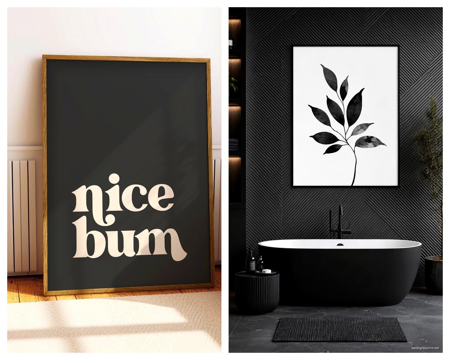
Line drawings are probably my favorite for bathrooms. Simple black line art on white—like abstract faces, botanical sketches, architectural drawings. There’s something about the minimalism that feels clean but not boring. I did this whole gallery wall in my half bath with six different line drawings of women’s profiles and people always comment on it.
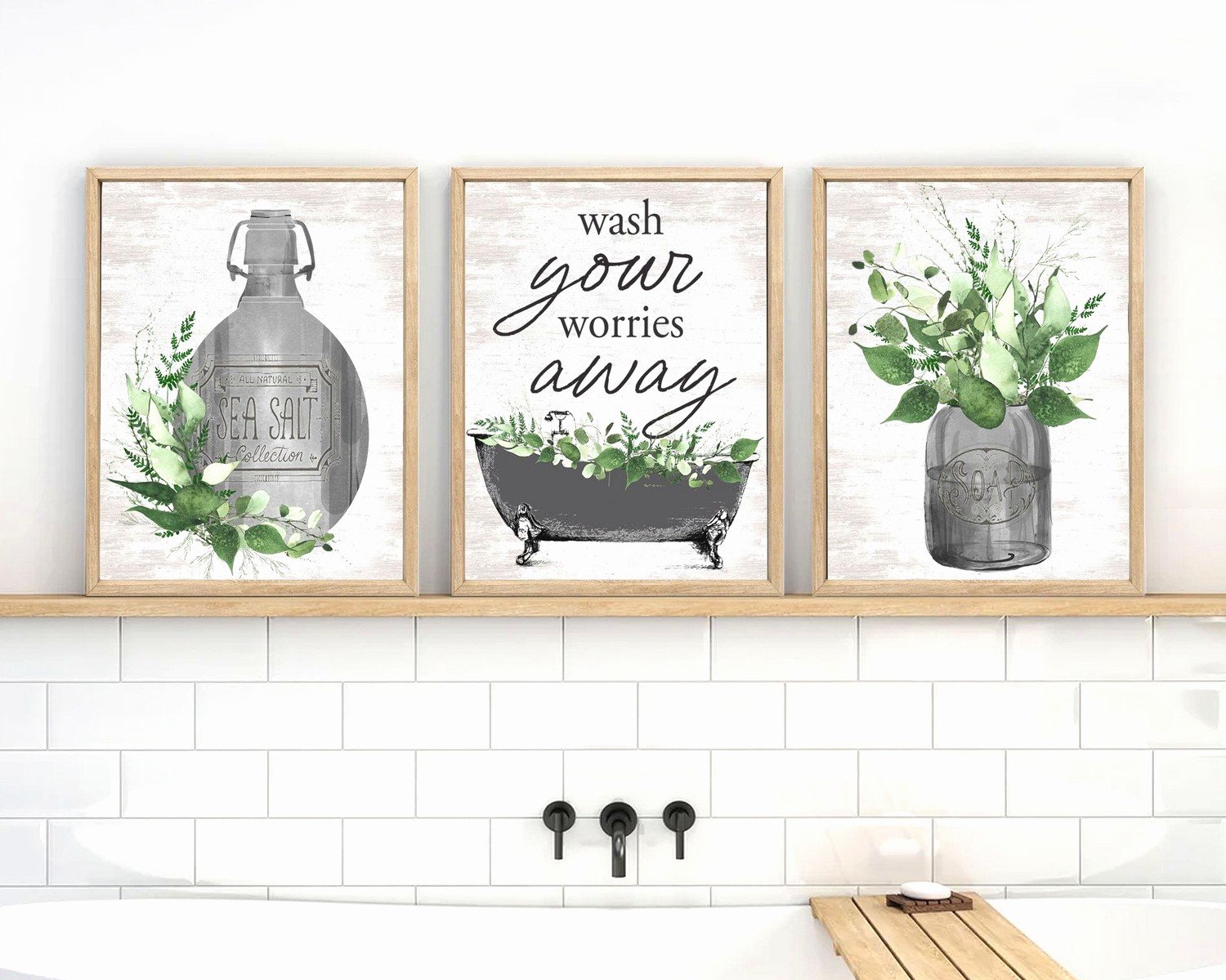
Typography prints can go either way. I’m not huge on the “wash your hands” type stuff because it feels a bit obvious? But I did this French typography print about water or bathing or something, and because it’s in another language it just reads as texture and looks really sophisticated.
Black and white photography is the safe bet that actually works. Landscapes, architecture, abstract close-ups. I have this series of three black and white wave photos above my bathtub and the movement in them makes the space feel bigger somehow. Just avoid anything too busy or detailed because from across a small bathroom it’ll just read as visual noise.
Abstract black paintings are hit or miss. The really gestural ones with visible brushstrokes can feel too heavy, but geometric abstracts or watercolor-style pieces with lots of white space work great. There’s this artist on Etsy who does these minimal black ink washes and I’ve probably bought five of her pieces for different projects.
Sizes That Don’t Overwhelm
So here’s where people mess up constantly—they either go way too small or they panic and fill every wall. In a standard bathroom, which is like what, 5×8 feet or something ridiculous, you want pieces that feel substantial but not suffocating.
My general rule: one large piece (like 24×36 inches) OR a set of 3-4 smaller pieces (around 11×14 or 8×10). I did a client’s bathroom last month where we hung one massive 30×40 inch abstract piece and it completely made the space. But her bathroom was pretty big with high ceilings, so.
For powder rooms you can actually go bigger because people aren’t spending as much time in there. It’s more of an impact moment. I have an oversized black and white palm leaf print in mine that takes up basically the whole wall behind the toilet and it’s dramatic in the best way.
Wait I forgot to mention—measure your actual wall space before you buy anything. Sounds obvious but I cannot tell you how many times I’ve ordered something that looked perfect online and then it arrives and it’s either comically small or doesn’t fit between the towel bar and the ceiling. Take actual measurements, then mock it up with painter’s tape on the wall. Saved me so many return shipping fees.
Framing Matters More Than You Think
Okay this is where I get kind of annoying about details but it really does matter. Black art needs the right frame or it can look cheap really fast.
Thin black frames are your best friend. Like 1/2 inch to 3/4 inch width max. Anything chunkier starts competing with the art itself. I buy most of my frames from this one place online that does custom sizes for reasonable prices, because standard sizes never fit what I actually want to hang.
Natural wood frames in light oak or whitewash also work surprisingly well with black art. It softens the whole look and adds warmth. I did this in my own bathroom with black botanical prints in light wood frames and it keeps it from feeling too cold or modern.
No frame at all can work if you’re doing canvas or metal prints. Just make sure the edges are finished properly. There’s nothing worse than seeing the staples and raw canvas edge in a “frameless” piece.
Gallery frames with white mats are classic but remember what I said about moisture. If you’re gonna do mats, make sure that frame is properly sealed. I use that framers tape around the back edges to keep humidity out.
Placement Without Making It Weird
So standard rule is hang art at eye level, which is like 57-60 inches to the center of the piece. But in bathrooms you gotta adjust for the actual sightlines. Like, where are you actually looking when you’re in there?
Above the toilet is the obvious spot and honestly it works. Just make sure whatever you hang is high enough that it’s not gonna get knocked by anyone’s head. I usually do 6-8 inches above the tank.
Behind the sink above the mirror gets tricky because you need to work around the mirror size and shape. I actually prefer art on the side walls flanking the mirror if there’s space. Creates this nice symmetry without competing with your reflection.
In the shower is possible but you need to be really careful about materials. I’ve done small metal prints or sealed canvas in shower niches and it’s held up fine. Just keep it away from direct water spray.
Oh and this is gonna sound random but my cat knocked over a plant last night and I was cleaning it up while thinking about this—you probably don’t want art directly over radiators or heat vents if your bathroom has them. The heat can damage prints over time.
The Gallery Wall Approach
Gallery walls in bathrooms can look amazing but they’re harder to pull off than in other rooms because the space is usually tight and there’s plumbing fixtures interrupting everything.
What’s worked for me: stick to symmetrical arrangements. Like four prints in a perfect grid, or three in a horizontal row. The structured layout feels intentional in a small space versus that salon-style asymmetrical thing that needs more wall space to work.
All the same size frames makes it easier. You can mix up the art inside but having uniform frames creates cohesion. I did six 8×10 black frames with different abstract prints and it looks way more pulled together than when I tried mixing sizes.
Keep the spacing tight—like 2 inches between frames. In a big living room you can do 3-4 inches but in a bathroom the tighter spacing makes it feel like one installation instead of random pieces.
Where I Actually Source This Stuff
I’m always testing new places because clients ask me this constantly. Here’s what’s actually worked:
Etsy has been surprisingly good for downloadable prints. You can buy the digital file, print it at whatever size you need, and frame it yourself. Way cheaper than buying pre-made pieces and you have more control over the final size. Just make sure you’re downloading at high enough resolution—at least 300 dpi.
There are a few online print shops that do really affordable framed art and the quality is decent. I’ve ordered from like three different ones and they’re hit or miss on shipping protection but the actual prints are good.
Thrift stores and estate sales for vintage black and white photography. I found this incredible set of architectural photos from the 1960s for twelve dollars total and they’re in my guest bathroom now. Just needed new frames.
Local art fairs if you want something actually original. I got a small black ink painting from an artist at a street fair and it’s probably my favorite piece. Cost more than a print obviously but it’s a real conversation starter.
The Lighting Question
Ugh okay so this matters but it’s annoying to figure out. Black art needs good lighting or it just disappears into a dark void on your wall. Most bathrooms have overhead lighting which creates shadows, and that’s not ideal.
If you can add picture lights or small sconces near your art, do it. Makes such a difference. I installed these battery-operated LED picture lights in my powder room because I didn’t wanna deal with electrical work and they’ve been great.
Natural light actually shows black art really well but obviously most bathrooms don’t have great windows. If yours does, consider how the light changes throughout the day. That gorgeous print might look perfect at noon and completely washed out at 7am.
Common Mistakes I See All The Time
Going too matchy-matchy with the rest of the decor. Your black art doesn’t need to match your black faucets and black towel bar perfectly. Actually looks better if there’s some variation in the blacks—matte versus glossy, warm black versus cool black.
Hanging stuff too high. I know I mentioned eye level but I see people hang things way too close to the ceiling all the time. It makes the room feel bottom-heavy and weird.
Choosing art that’s too literal. Like a print of a bathtub in your bathroom, or rubber ducks or whatever. It’s too on the nose. Abstract or unexpected subjects work better.
Not considering the humidity factor and then getting mad when things warp. Just gonna repeat this because it’s so important—seal everything, use glass, choose moisture-resistant materials.
Forgetting about the toilet paper holder and towel bars when planning placement. Measure where all your fixtures are before committing to a spot. Nothing worse than hanging something perfectly and then realizing the hand towel covers half of it.
Okay I think that’s everything I’ve learned through way too much trial and error. The main thing is just commit to it—black art in a bathroom can completely change the vibe from boring to actually interesting, but you gotta go for it instead of second-guessing every choice. Start with one piece, see how it feels, then build from there.