Wall Art Guide, Wall Art Tutoriels
Banksy Wall Art: Street Art Graffiti Reproductions
Jun
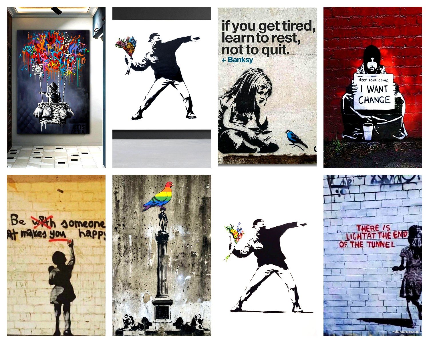
So I’ve been deep in the Banksy reproduction rabbit hole lately and honestly it started because a client wanted that balloon girl piece but had no idea what they were actually buying, and now I’m like weirdly obsessed with helping people not waste money on terrible prints.
The Quality Spectrum Is Wild
Okay so first thing – not all Banksy reproductions are created equal and this is gonna sound obvious but I’ve seen people drop $300 on what’s basically a poster. The quality ranges from “I printed this at Staples” to actual gallery-worthy canvas pieces that make you do a double-take.
Canvas prints are usually your best bet if you want that street art vibe. The texture matters SO much more than I thought it would. I ordered three different “Girl with Balloon” pieces last month to compare (my partner thought I’d lost it) and the difference was insane. The cheap one looked flat and dead, like someone just slapped ink on fabric. The mid-range one had decent texture but the colors were off – too bright, too digital. The expensive one actually had visible brushstroke texture printed into it which sounds fake but completely changes how it reads in a room.
Canvas vs Metal vs Paper Prints
Canvas is the most forgiving honestly. It hides imperfections better and gives you that urban gallery feel without trying too hard. I’ve used canvas reproductions in like six different client spaces now and they always photograph well which matters if you’re doing this for social media or whatever.
Metal prints are having a moment and I get why – they’re super modern and the colors pop like crazy. But here’s the thing nobody tells you: they work better with Banksy’s simpler stencil pieces. The “Flower Thrower” looks incredible on metal. But something with subtle spray paint effects? Loses all its grit on that glossy surface. My friend got “Pulp Fiction” on metal and it just looked too clean, too polished for what’s supposed to be street art.
Paper prints or posters – look I’m not gonna lie and say they’re terrible because sometimes that’s your budget and that’s totally fine. Just frame them properly or they’ll look like dorm room decorations. A really good frame with proper matting can elevate a $40 print to look like a $200 piece. I learned this the hard way in my early blogging days when I posted room photos with unframed posters and someone commented that it looked “unfinished” and they weren’t wrong.
Size Actually Matters Here
This is where people mess up constantly. Banksy’s work was meant to be seen on walls, buildings, underpasses – it’s LARGE scale art. When you shrink “Rage, Flower Thrower” down to like 16×20 inches it loses all its impact and just looks decorative.
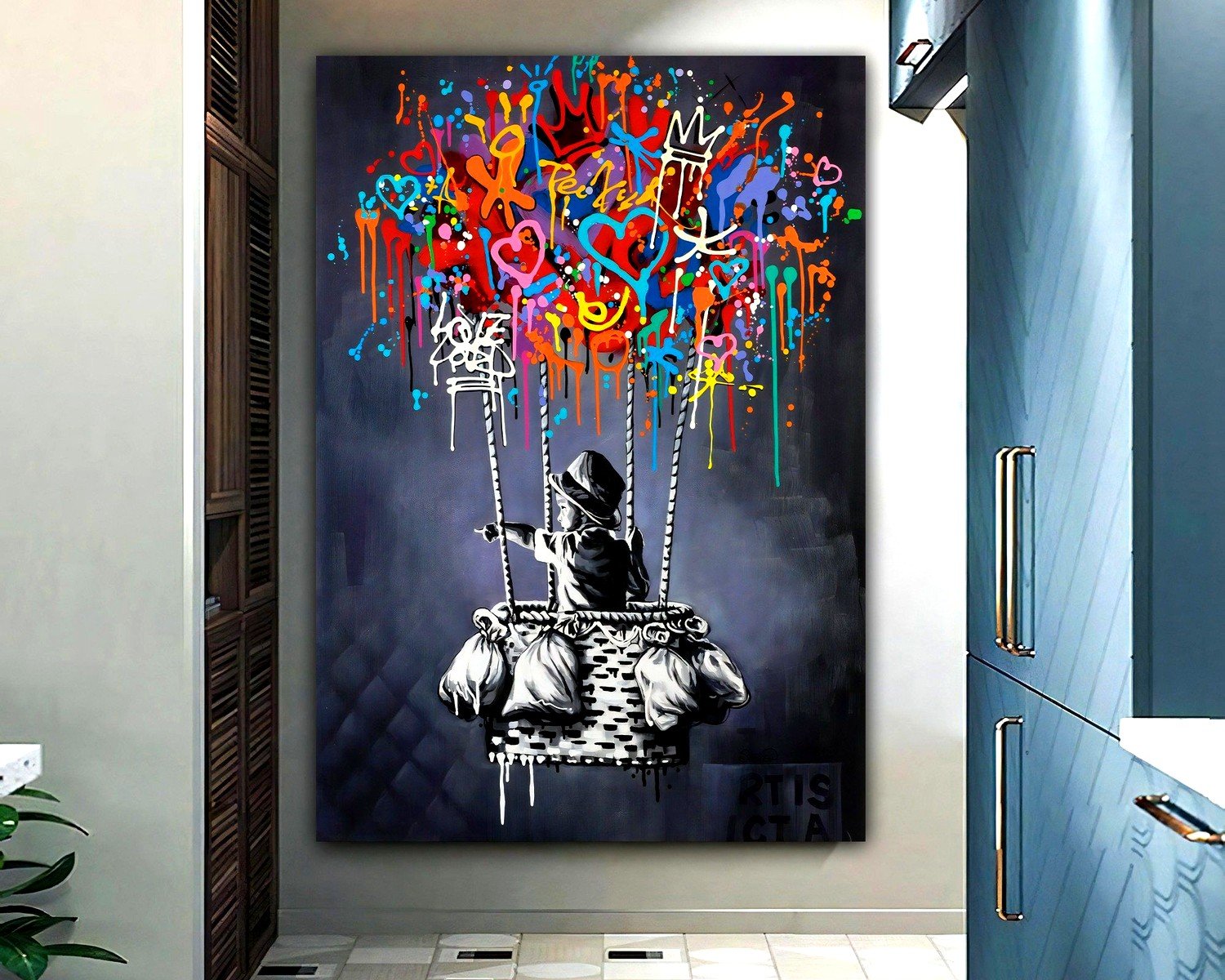
I usually tell people go bigger than you think you need. That voice in your head saying “maybe this is too big”? Ignore it. Street art needs to command attention. I put a 40×60 inch “Love is in the Air” in a client’s loft and she was nervous it would overwhelm the space but once it was up she literally texted me “why didn’t we go BIGGER” which made me laugh.
The sweet spot for most living rooms is 30×40 to 40×60 inches depending on your wall space. Smaller pieces work better in hallways or as part of a gallery wall situation but even then you want them at least 24×36.
Where Different Pieces Work Best
“Girl with Balloon” – everyone wants this one and I get it, it’s iconic. Works literally anywhere but I’ve had the most success in bedrooms and home offices. There’s something about the simplicity that doesn’t compete with other design elements. Just make sure you’re not getting the version where the red is too orange because I’ve seen that happen and it’s tragic.
“Flower Thrower” or “Rage, Flower Thrower” whatever you wanna call it – this is my go-to for dining rooms or entryways. It’s got movement and energy but isn’t aggressive. Makes a statement without being too political if that matters to your space.
The monkey pieces (“Laugh Now” or the various chimp art) – okay these are trickier. They can read as juvenile if you’re not careful with the surrounding decor. I use them in more industrial or eclectic spaces, offices, creative studios. They need context basically.
“Pulp Fiction Bananas” – this one’s polarizing but I love it for kitchens or casual dining areas. It’s playful without being cutesy which is a hard balance to strike.
Wait I forgot to mention the rat pieces – Banksy’s rats are everywhere and they’re actually super versatile. The scale works smaller so you can do a 20×24 and it still has impact. I’ve used rat prints in bathrooms (weird but it works), laundry rooms, even a mudroom once.
The Framing Situation
So if you get a canvas print you might think you don’t need a frame and sometimes that’s true. Gallery wrapped canvas where the image continues around the edges can hang as-is. But here’s what I’ve learned – a simple float frame makes even a good canvas look more intentional and finished.
For Banksy stuff specifically I usually go with black frames, natural wood, or industrial metal frames. White frames can work but they make the piece feel more “art gallery” and less “street art” if that makes sense. You want the frame to ground the piece not make it precious.
Oh and another thing – don’t do ornate frames with Banksy. I saw someone put “There is Always Hope” in this baroque gold frame once and it was like… a crime against art. The whole point of street art is that it’s anti-establishment and accessible so your framing should reflect that aesthetic.
Actually Hanging the Thing
Canvas prints are lighter than you think so don’t go overboard with your hanging hardware. Most come with sawtooth hangers or wire on the back. Eye level is typically 57-60 inches to the center of the artwork which is the museum standard but honestly I cheat this all the time depending on furniture placement and ceiling height.
For heavier pieces or metal prints you’re gonna want proper anchors. I use those heavy duty picture hangers rated for like 50 pounds even if the piece is lighter because better safe than having it crash down at 3am and scaring the hell out of your cat (yes this happened, yes it was traumatic for everyone involved).
If you’re hanging multiple Banksy pieces as a gallery wall keep at least 2-3 inches between frames. Too close and they compete with each other, too far and it doesn’t read as a cohesive collection.
Color Variations and What to Watch For
This is gonna sound weird but you need to obsess over the colors before you buy. Banksy’s original work has very specific color palettes – usually black stencil work with one or two accent colors. Red, pink, sometimes yellow or blue.
Bad reproductions mess up the blacks first – they’ll print them as dark gray or they’ll have a weird blue or brown undertone. The blacks should be CRISP and truly black. If you’re shopping online zoom way in on the product photos and look at the black areas.
The reds are the second thing that gets butchered. Balloon Girl’s balloon should be like a true red, maybe slightly warm but not orange, not pink. I’ve seen versions that look basically magenta and it’s just wrong.
Some sellers will “enhance” colors thinking it looks better and it doesn’t. Street art is meant to be slightly raw, slightly imperfect. If the colors look super saturated and digital you’re probably looking at a lower quality reproduction.
Limited Edition vs Open Edition Prints
Okay so there are “limited edition” Banksy reproductions which is kind of hilarious because they’re reproductions of street art which was literally free and accessible to everyone. But whatever, the art market is weird.
Limited editions will be numbered and sometimes signed by the printer or publisher (not Banksy obviously since he’s not involved in most reproductions). These cost more and theoretically hold value better but honestly unless you’re buying from a really reputable source this doesn’t mean much.
Open edition prints are unlimited runs and they’re totally fine for decorating your actual home. Unless you’re collecting for investment purposes (and if you are maybe don’t start with reproductions?) the limited vs open distinction doesn’t matter that much.
Where to Actually Buy These
I’ve ordered from probably fifteen different sources at this point and here’s what I’ve learned. Etsy has a massive selection but quality is all over the place. Read reviews obsessively and look for shops that show detailed photos of the actual print not just mockups.
Society6 and Redbubble are consistent quality – not the highest end but reliable and affordable. Good for testing out a piece before you commit to a pricier version.
For higher quality stuff I’ve had good experiences with specialized street art print shops online. There’s a few UK-based ones that ship internationally and actually understand Banksy’s aesthetic. They’re pricier but the prints have proper texture and color accuracy.
Amazon is a gamble honestly. I’ve gotten decent stuff there and absolute garbage. If you go this route make sure the seller has tons of reviews specific to the Banksy print you’re looking at.
Licensing and Authenticity Notes
Here’s the thing – Banksy doesn’t authorize most reproductions and has actively fought against copyrighting his work because it goes against his whole philosophy. So almost everything you’re buying is technically unauthorized which feels weird but is also very on-brand for street art.
There is no “official” Banksy reproduction in most cases. Pest Control (Banksy’s authentication service) only deals with original works. So don’t pay extra for something claiming to be “officially licensed” because that’s probably nonsense.
Some pieces have been reproduced with proceeds going to charity which Banksy supports and those are cool if you can find them but they’re rare.
Styling Around Banksy Prints
The surrounding decor matters so much with street art. You can’t just slap a Banksy print in a traditional or overly feminine space and expect it to work. I mean you can try but it’ll look confused.
Industrial elements work great – exposed brick, metal accents, concrete or wood textures. Mid-century modern furniture surprisingly pairs well because both aesthetics are about clean lines and making statements.
I did a client’s home office with “Think Tank” on the main wall and we surrounded it with minimalist black furniture, some vintage skate decks, Edison bulb lighting. The whole thing felt cohesive because we leaned into the urban vibe instead of fighting it.
Color palette in the rest of the room should be mostly neutral so the Banksy piece can pop. If you’ve got the red balloon you can pull red accents into throw pillows or books or whatever but don’t go overboard. Let the art be the statement.
What Not to Do
Don’t mix Banksy with like… Thomas Kinkade or traditional landscape art. I know that sounds obvious but I’ve seen it attempted and it’s jarring.
Don’t put Banksy in a space that’s trying to be overly polished or formal. It won’t work in your traditional dining room with the china cabinet and formal table settings.
Don’t cluster too many pieces together unless you’re doing a dedicated gallery wall. Street art needs breathing room.
And please don’t put a Banksy print in your kid’s nursery unless it’s like the balloon girl and even then think about whether you want your baby’s room to have that slightly melancholy vibe. Just because it has a child in it doesn’t make it nursery art.
Taking Care of Your Print
Canvas prints are pretty low maintenance. Dust them occasionally with a soft cloth or duster. Don’t use any cleaning products or water directly on the canvas.
Keep them out of direct sunlight because colors will fade over time. I learned this when a client’s “Love Rat” faded to basically pink and gray after a year in a south-facing window.
If you’ve got a paper print behind glass you can use regular glass cleaner just spray it on the cloth not directly on the glass.
Metal prints are the easiest – just wipe them down with a damp cloth when they get dusty.
The biggest thing is just being thoughtful about placement initially. Avoid anywhere with high humidity (so maybe not the main bathroom wall), avoid direct sun, avoid anywhere that gets bumped constantly.
Look I could keep going because there’s so much more about specific pieces and framing options and whatever but honestly you’re probably good with this info to make a solid choice. Just remember bigger is better, quality matters more than you think, and don’t overthink the “authenticity” thing because street art was never meant to be precious anyway.