Wall Art Guide, Wall Art Tutoriels
Flower Wall Art: Floral Botanical Prints & Paintings
Jun
So I’ve been rotating through flower art in my apartment and various client spaces for like three years now and honestly it’s one of those things where you think “how hard can it be, it’s just flowers” but then you end up with something that looks like a hotel lobby from 2009.
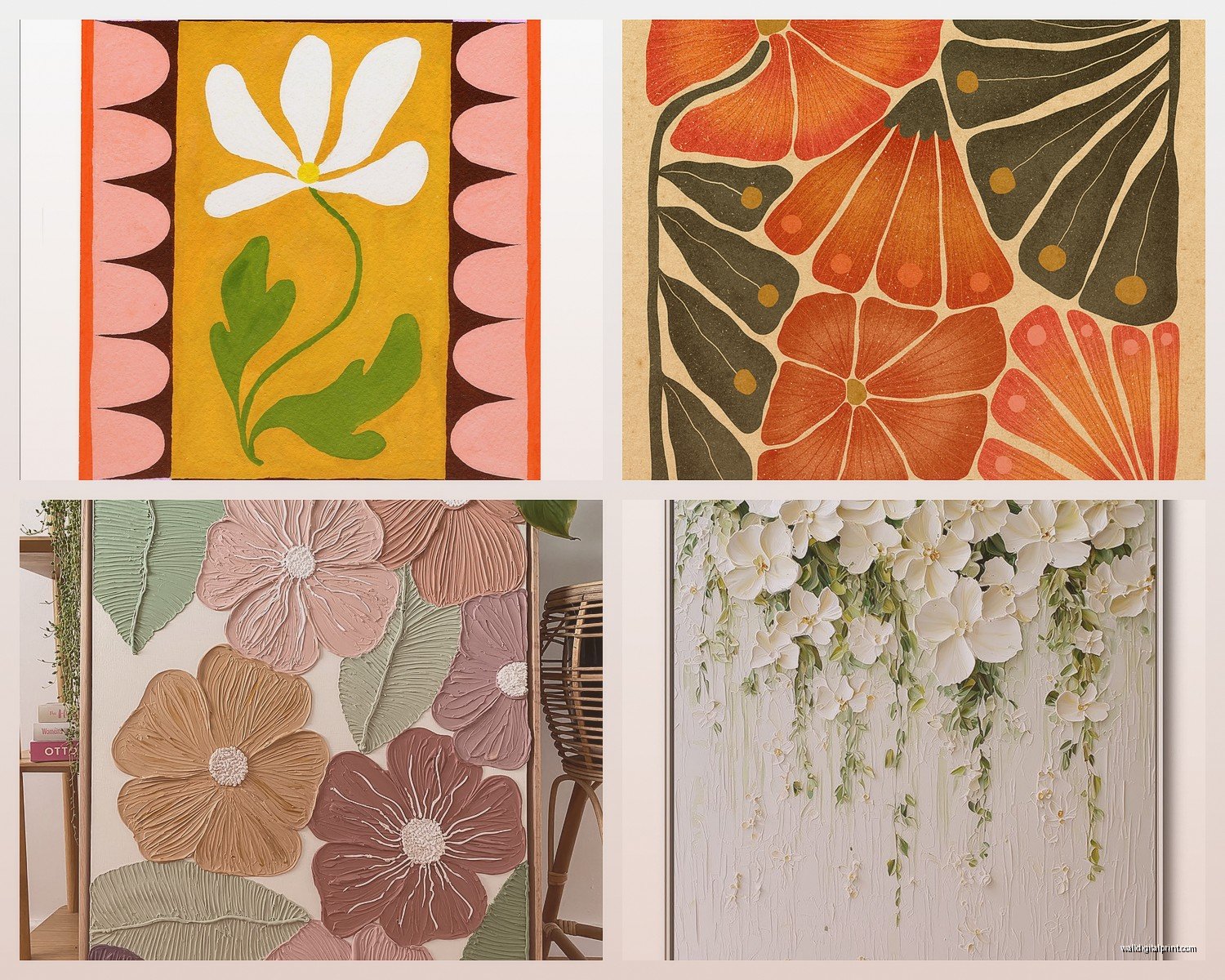
The biggest thing I learned the hard way is that botanical prints and paintings hit completely different depending on whether they’re vintage-style or modern. Like, I bought this “vintage botanical” print from one of those mass market sites and it just sat there looking sad because everything else in my space was contemporary. My dog literally knocked it off the console table and I didn’t rehang it for two weeks because… it just wasn’t working.
Figure Out Your Actual Style First
Okay so before you buy anything, pull up your phone and look at your space. Not how you want it to look, how it actually looks right now. Because I’ve watched so many people (including myself) buy art for the Pinterest version of their home.
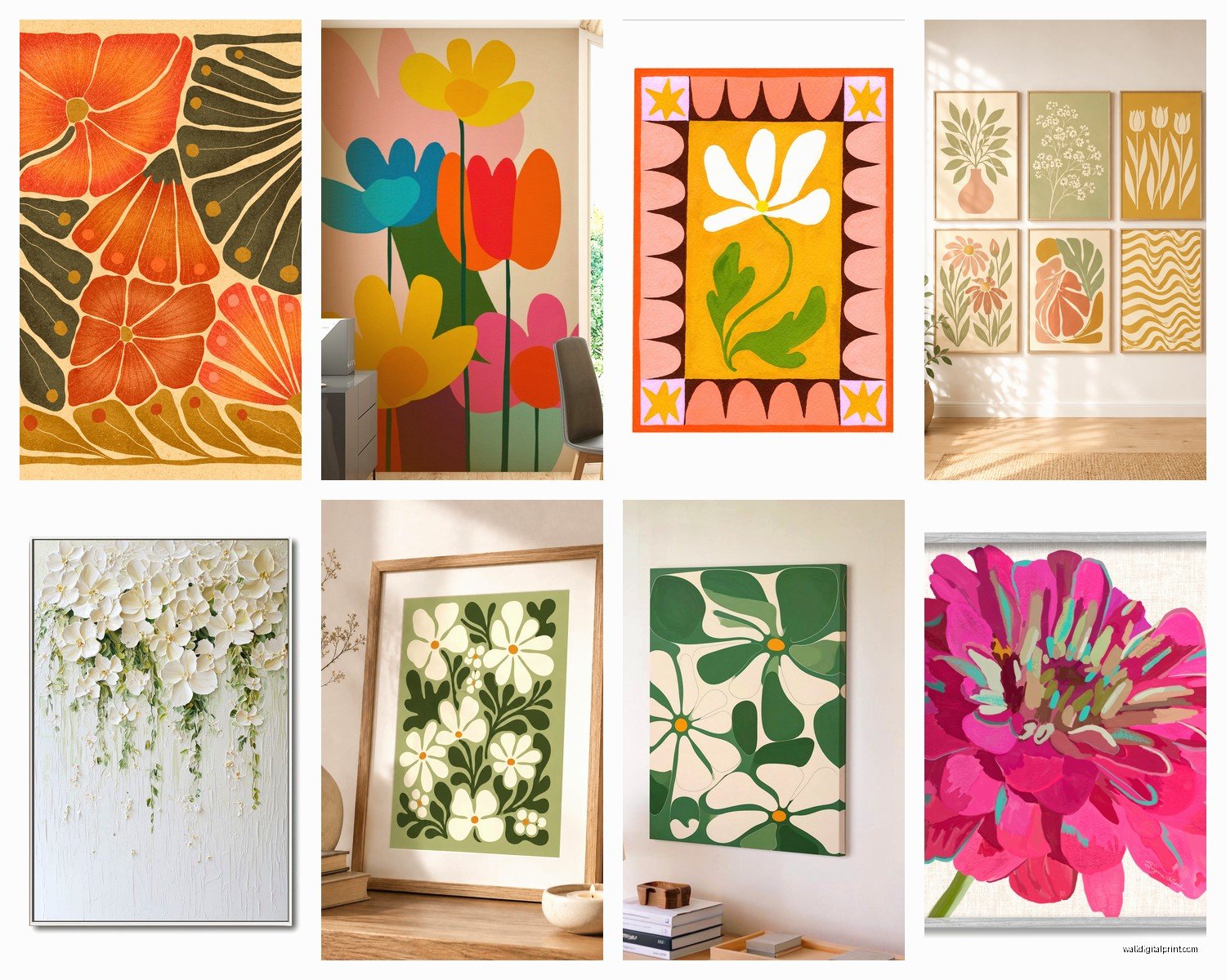
Traditional botanical prints are those ones that look like they came from old scientific journals. Very detailed, usually on cream or aged paper, Latin names sometimes. These work amazing in spaces that already have some traditional elements – wood furniture, classic frames, maybe some brass accents. I used a set of three in a client’s dining room last month and they were perfect because she had this gorgeous oak table and wanted something that felt collected over time.
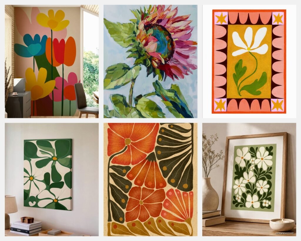
Modern floral paintings are bolder, more abstract, bigger color moments. Think less “pressed flower specimen” and more “I interpret flowers through color and movement.” These need space to breathe and they work better in rooms with simpler furniture lines. I have this massive abstract peony piece above my bed that’s basically hot pink and coral and it only works because my bed frame is super minimal.
The In-Between Category Nobody Talks About
There’s this whole middle ground of contemporary botanical art that’s realistic but not vintage – clean white backgrounds, modern photography of flowers, watercolor florals that are pretty but not grandma-precious. This is actually the easiest to work with if you’re not sure because it plays nice with most styles. I’m gonna be honest, I use these as transition pieces when I’m helping someone move from one aesthetic to another.
Size and Scale Will Make or Break This
The number one mistake is going too small. I see it constantly. Someone has a big blank wall and they put up like a 16×20 flower print and then six months later they’re texting me asking why their room feels off.
For over a sofa or bed, you want your art to be roughly 2/3 to 3/4 the width of the furniture. So if your couch is 84 inches wide, you’re looking at art that’s 56-63 inches across. That can be one large piece or a gallery wall situation.
Single large pieces (like 40×60 or bigger) work best with abstract florals or oversized blooms. There’s something about seeing a flower at that scale that feels intentional and dramatic. Small delicate botanical prints at huge sizes can look weirdly empty? Like there’s not enough visual weight.
Gallery walls with botanical prints are their own beast. I spent last Sunday arranging and rearranging frames in my hallway because – wait I should back up. For gallery walls with florals, you want an odd number of pieces, and they should share either a color palette OR a style but not necessarily both. I did five vintage botanical prints in different frame styles but they all had that aged paper look and similar muted greens. Worked great.
Color Matching Without Losing Your Mind
This is gonna sound weird but don’t try to match your flower art exactly to your throw pillows or whatever. I did this in my first apartment and it looked SO staged. Instead, pull one accent color from your art and let it echo somewhere else in the room.
Like I have this botanical print with dusty blue thistles and instead of getting blue everything, I just have blue in my curtains and one small vase. The rest of the room is neutrals and wood tones. The blue becomes this thread that connects things without screaming “I MATCHED EVERYTHING.”
If your space is really neutral – grays, whites, beige – you can go wild with colorful flower art. This is actually the best scenario because the art becomes your color moment. I just finished a client’s bedroom that was all linen and white oak and we did these massive coral and terracotta poppy paintings. Looked expensive and intentional.
If you already have color happening, pick flower art that either matches your existing palette OR go monochrome. Black and white floral photography is stupidly versatile. I keep a few black and white pieces that I rotate through because they literally work everywhere.
The Beige Flower Problem
Okay so there’s been this trend of really muted, almost colorless floral art. Pampas grass, dried flowers, everything in cream and tan. It’s pretty in photos but in real life it can read as just… flat. Unless your space has tons of texture – like chunky knits, varied wood tones, interesting fabrics – these pieces disappear. I learned this when a client bought a $400 dried flower print and called me panicking because it “wasn’t showing up” in her room. We added texture through other elements and it helped, but honestly that piece needed either more color or a space that was more layered to begin with.
Framing Matters More Than the Print Sometimes
I’ve seen a $30 botanical print look amazing in a $100 frame and a $200 painting look cheap in the wrong frame. It’s frustrating but true.
For traditional botanicals, go with simple wood frames or classic black. Gold can work but it’s tricky – too ornate and you’re in country club territory, too modern and it clashes with the vintage vibe. I default to oak or walnut for most botanical prints.
Modern floral paintings usually look best in thin black frames, natural wood, or no frame at all if they’re on canvas. I have strong feelings about floating frames but that’s probably its own topic.
White frames are safe and they work with almost everything but they can feel a little basic? I use them when I want the art to feel light and airy or when I’m doing a gallery wall and need frames to disappear.
Oh and another thing – mat borders. For smaller botanical prints (like 8×10 or 11×14), a wide mat in a large frame makes them feel more important. I do this trick all the time. Take a small vintage botanical print, put it in a 16×20 frame with a big cream mat, suddenly it’s a statement piece.
Where to Actually Buy This Stuff
I’m gonna be honest about where I source flower art because I’ve wasted money in enough places to know what works.
Etsy is great for vintage botanical prints and downloadable files you can print yourself. The quality varies wildly so read reviews and check if they show the actual print or just the artwork. I’ve downloaded files that looked pixelated when printed large. For Etsy, I stick to shops that have hundreds of sales and recent reviews.
Society6 and similar print-on-demand sites are fine for trendy modern florals but the quality is hit or miss. I’ve had good experiences with their framed prints but their canvases can look cheap in person. The nice thing is you can get matching pieces easily.
Local artists and art fairs are honestly my favorite because you get original work and the quality is usually better. Plus you can see it in person. I found this amazing artist at a farmers market last summer who does watercolor botanicals and I’ve used her work for three different clients now.
Anthropologie and West Elm have surprisingly good floral art if you catch sales. Full price is kinda ridiculous but at 40% off you’re getting decent quality. Their botanical prints especially are nice because they’re already framed well.
For really high-end stuff, Minted has beautiful florals and their framing quality is solid. Pricey but worth it if you want something that’ll last. My cat knocked over one of their framed pieces and the glass didn’t even break, so there’s that.
The Download and Print Route
If you’re on a budget, downloading botanical prints and getting them printed at a local print shop is legit the way to go. I do this constantly. You can get a high-res vintage botanical for like $5-8, print it for $15-30 depending on size, frame it yourself, and you’re looking at a total cost of maybe $50-80 for something that looks way more expensive.
The trick is making sure the file resolution is high enough. You want at least 300 DPI at the size you’re printing. A 3000×4000 pixel file will print well at 10×13 but might look fuzzy at 24×36.
Mixing Different Floral Styles
People ask me about this all the time – can you mix vintage botanicals with modern flower paintings? And the answer is yes but you need a buffer.
I did my living room with one large modern floral canvas and two smaller vintage botanical prints on an adjacent wall. They work together because the color palette is similar (lots of greens and muted pinks) and they’re not competing for attention – they’re on different walls doing different jobs.
What doesn’t work is putting a super detailed vintage botanical right next to an abstract splashy floral painting in the same gallery wall. Too much contrast, too close together. Your eye doesn’t know where to land.
If you’re mixing styles, separate them by at least a few feet OR use a neutral piece between them. Like vintage botanical, then a landscape or abstract, then modern floral. The neutral piece acts as a palate cleanser.
Seasonal Rotation Is a Thing You Can Do
This might sound extra but I swap out some of my flower art seasonally and it’s such an easy way to refresh a space. I keep lighter florals with cherry blossoms and tulips for spring, big bold sunflowers and dahlias for summer, muted dried flowers for fall, and white amaryllis or winter botanicals for cold months.
You don’t need a ton of pieces to do this. I have maybe three sets that I rotate through my entryway and living room. The rest of my art stays permanent but those few seasonal swaps make everything feel current.
Common Mistakes I See Literally All the Time
Hanging art too high. The center of your art should be at eye level, which is usually around 57-60 inches from the floor. I’ve walked into so many homes where flower prints are floating near the ceiling and it’s just… why.
Buying a set of three identical flower prints and hanging them in a row. It’s not wrong exactly but it’s very 2015 HomeGoods energy. If you’re doing multiples, try to vary them slightly – different flowers, different compositions, or at least different frame sizes.
Putting floral art in rooms that already have floral everything. Like floral wallpaper AND floral curtains AND flower paintings is a lot. Pick one or two places for florals and keep the rest more neutral.
Forgetting about lighting. Flower art needs decent lighting to look good. I added picture lights to my botanical prints and it made such a difference. If you can’t do picture lights, at least make sure there’s ambient light hitting your art.
Not committing to a size. Going medium when you should go large just makes everything feel tentative. If you have the wall space, go bigger than feels comfortable. I promise it’ll look better than you think.
Anyway I gotta run because I’m supposed to meet someone about a commission piece but hopefully this helps you figure out what you actually need versus what just looks good on Instagram.