Wall Art Guide, Wall Art Tutoriels
Bird Wall Art: Avian Nature & Birdwatching Decor
Jun
So I’ve been totally obsessed with bird wall art lately and honestly it started because a client asked me to find something that wasn’t the usual beach-themed stuff for their coastal house and I fell down this whole rabbit hole of bird prints and now half my Pinterest is just avian art.
Why Bird Art Actually Works in Modern Spaces
Okay so here’s the thing about bird wall art that took me forever to figure out—it’s not just for your grandma’s cottage anymore. The key is choosing pieces that match your actual aesthetic instead of defaulting to those super traditional Audubon prints (though we’ll get to those because they can be amazing in the right context).
I tested this theory in my own dining room last month. Swapped out this abstract geometric piece for a large-scale hummingbird print in jewel tones and the whole room felt more alive? Like it gave the space this energy without being loud about it. My cat Charlie kept staring at it for the first week which was hilarious but also kinda proved the point that birds just draw the eye naturally.
Choosing Your Bird Based on Room Vibe
This is gonna sound weird but different birds give off completely different energy and you gotta match that to where you’re hanging them.
Hummingbirds
These work best in spaces where you want movement and lightness. I use hummingbird art in:
- Breakfast nooks or kitchen dining areas
- Home offices where you need creative energy
- Bathrooms (seriously, the small scale works perfectly with powder room dimensions)
The trick with hummingbirds is going for either super detailed scientific illustration style OR really loose watercolor. The middle ground tends to look like craft fair art and that’s not what we want.
Owls
Okay owls are having a moment again but you gotta be careful. They can skew too whimsical-woodland-nursery real quick. I’ve had success with owl prints in:
- Libraries or reading nooks (obvious but it works)
- Masculine bedrooms when you choose stark black and white photography
- Entryways for that “wise guardian” vibe without being too literal about it
Peacocks and Pheasants
These are my secret weapon for adding luxury without actual luxury prices. A good peacock print in emerald and gold tones can make a basic bedroom look like you hired a designer. They’re dramatic enough to stand alone as a statement piece.
I hung a massive peacock feather close-up in a client’s powder room last spring and people literally ask about it every time. Cost like $60 framed from this Etsy seller I found at 2am one night.
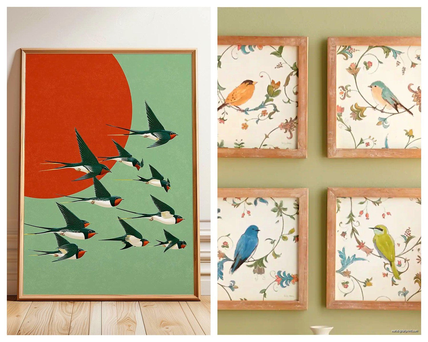
Songbirds and Sparrows
Best for creating that effortless collected-over-time look. I group smaller songbird prints in different frame styles and it looks like you’ve been curating them for years even if you bought everything last weekend.
These work in literally any room but especially:
- Stairway gallery walls
- Above console tables
- Bedroom clusters opposite the bed
The Style Breakdown Nobody Tells You
Vintage Audubon Style
So these are those classic ornithological prints and yes they can be gorgeous but here’s what I learned the hard way—you need decent size for them to work. Those tiny 5×7 prints look like you raided a museum gift shop. Go for at least 11×14, preferably larger.
I found this amazing set of vintage reproductions at an estate sale (was actually there looking for mid-century lamps but whatever) and the seller told me they look best when you embrace the aged paper look. Don’t try to make them modern. Lean into the antiqued vibe with dark wood or gold frames.
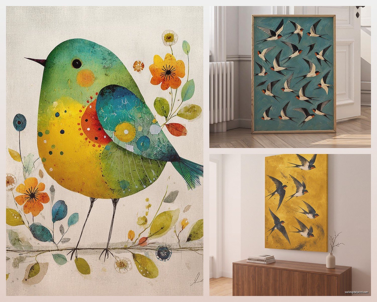
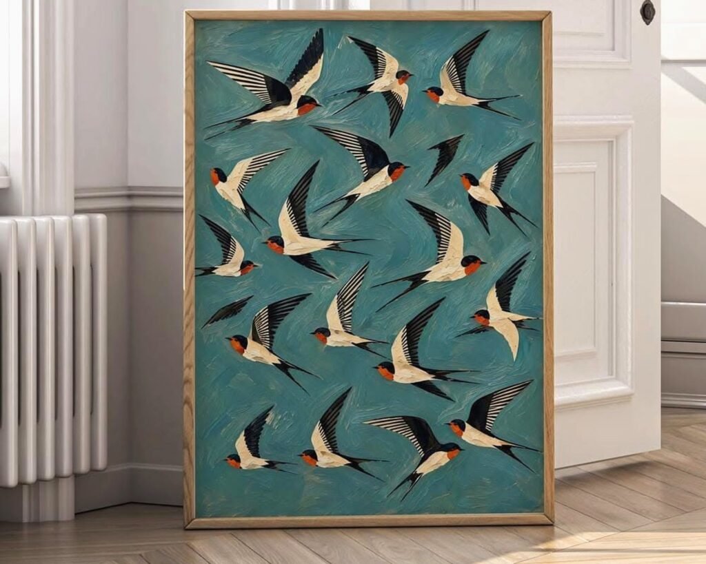
Modern Minimalist Line Drawings
This is my current favorite style honestly. Single continuous line birds or really simple silhouettes. They work in basically any modern or contemporary space and you can mix them with other art styles without everything clashing.
The best ones I’ve found are on Etsy from independent artists. Search “single line bird art” or “minimalist bird illustration” and you’ll find hundreds. I keep a folder of sellers I like because my client canceled last Tuesday so I spent an hour comparing line weights and styles.
Photography Prints
Real bird photography can be stunning but it’s easy to make it look too National Geographic. What works better is:
- Black and white photography with high contrast
- Close-up details rather than full bird-in-environment shots
- Matte finish prints instead of glossy
- Large scale so you can see feather texture
I have this black and white crow photograph above my bed that’s like 30×40 and everyone thinks it’s gonna be creepy but it’s actually really serene? The detail in the feathers creates this unexpected texture.
Color Strategy That Actually Matters
This is where most people mess up. They choose bird art based on whether they like birds instead of thinking about color flow in the room.
If your room is mostly neutrals, you can go wild with colorful bird art—think tropical parrots or those jewel-toned hummingbirds I mentioned. But if you’ve already got color happening in your textiles and furniture, choose bird art in muted tones or black and white.
I broke this rule once with a client who insisted on colorful macaw prints in an already-colorful boho living room and it looked like a Pier 1 exploded. We switched to sepia-toned crane prints and suddenly the whole room calmed down.
Metallic Accents
Oh and another thing—bird art with gold or copper metallic accents is having a huge moment. I’m seeing it everywhere from high-end galleries to Target. It works because birds naturally have this delicate quality and the metallic adds just enough luxury.
Best application I’ve done: three panels of white egrets with gold leaf details in a master bathroom. Feels spa-like but also slightly glamorous.
Framing Choices Nobody Talks About
Okay so you found perfect bird prints but the framing can totally make or break it. Here’s what I’ve learned through way too many framing mistakes:
Thin black frames work for modern minimalist bird art. Like those simple line drawings I mentioned—put them in a thin black metal frame and they look expensive even if they cost $12.
Natural wood frames are your friend for vintage Audubon styles or watercolor birds. I usually go for light oak or walnut depending on the other wood tones in the room.
No frame at all can work for canvas prints of bird photography. I did a series of three frameless canvas prints of different shore birds in a beach house and the casual vibe was perfect for that space.
Wait I forgot to mention—floating frames (where you can see the paper edges) are really good for vintage botanical-style bird prints. It highlights that antique paper quality and makes $20 reproductions look like actual vintage finds.
Size and Placement Rules I Actually Follow
Everyone says “hang art at eye level” but that’s not super helpful so here’s what I actually do:
For above a sofa or bed, your bird art should be roughly 2/3 the width of the furniture. So if your sofa is 90 inches, you want art that’s about 60 inches wide. This can be one large piece or a grouping.
In dining rooms, I hang bird art slightly lower than you’d think because people are sitting. Center of the art should be around 54-56 inches from the floor instead of the usual 60.
For gallery walls with multiple bird prints, I lay everything out on the floor first (groundbreaking advice I know but seriously do it). I use painter’s tape on the wall to mark where frames will go. Did this last weekend and avoided so many extra nail holes.
The Cluster Method
This is my favorite way to display smaller bird prints. Take 6-9 prints of different birds, all roughly the same size (like 8×10 or 11×14), frame them identically, and hang them in a grid pattern. Super clean, super collected-looking.
I did this in a client’s home office with different British garden birds and it became the whole personality of the room. Cost maybe $200 total including frames from IKEA.
Where to Actually Buy Bird Wall Art
Okay so you need sources and I’m gonna be honest about what works at different price points.
Etsy is where I find like 70% of my bird art. Search specifically for “bird print download” if you want to save money and print yourself at a local print shop. The quality is usually identical to buying pre-printed and you save on shipping.
Desenio has really good minimalist bird line drawings. Ships from Europe but arrives pretty quick and the quality is solid for the price.
Local Audubon societies sometimes sell prints and the money goes to bird conservation which feels good. Plus you might find regional birds that have meaning for your specific location.
Estate sales and antique markets for actual vintage bird prints. I found an incredible set of four pheasant prints for $30 total last month. They needed new frames but still.
Society6 and similar print-on-demand sites work fine for trendy styles. Just watch the reviews because quality can be inconsistent between different artists.
Mixing Bird Art with Other Decor
This is gonna sound random but I learned this while watching The Great British Baking Show and rearranging my gallery wall—bird art mixes really well with botanical prints. Like they’re natural companions (literally) and create this natural history cabinet vibe.
I also mix bird art with abstract pieces that pull colors from the bird prints. So if you have a blue heron print, pair it with an abstract in similar blues and grays. Creates cohesion without being too matchy.
What doesn’t work as well: mixing bird art with beach scenes or landscape photography. Too literal. You want enough variety that it’s interesting but not so much that there’s no through-line.
The Unexpected Pairing
Okay this might be controversial but bird art works surprisingly well in industrial or modern spaces. I put a large-scale black and white bird photograph in a loft with exposed brick and metal fixtures and the contrast between organic and industrial was perfect.
The trick is choosing stark, graphic bird images rather than soft watercolors. Think bold silhouettes or high-contrast photography.
Seasonal Switching Strategy
I know people who swap out their bird art seasonally and honestly it’s extra but also kind of genius? Store winter birds like cardinals and snow owls for November through February, then switch to spring songbirds and summer hummingbirds.
I don’t personally do this because I’m lazy but a client does and her house always feels really connected to the season. She uses those Command picture hanging strips so it’s not damaging walls with new holes constantly.
The Bird Watching Connection
If you’re actually into birdwatching this is where you can get really specific and personal with your choices. Display prints of birds you’ve actually spotted or birds native to your region. Makes the art more meaningful than just decorative.
I worked with a client who was obsessed with birdwatching and we created this whole wall of birds she’d personally photographed on her trips. Mixed her photos with vintage field guide illustrations of the same species. It was like her birdwatching journal on the wall and way more interesting than generic art.
You can also do this with birds that have symbolic meaning—like if you grew up somewhere specific and certain birds remind you of home. I have a California quail print in my bedroom because I grew up in Northern California and they were everywhere. Makes me happy every morning which is the whole point of art anyway.
Field Guide Aesthetic
Speaking of field guides, that vintage naturalist look is really popular right now. You can buy actual old field guide pages on eBay pretty cheap and frame them. Or get high-quality reproductions from museum shops.
The National Audubon Society has a whole collection of prints from their historic archives and they’re surprisingly affordable. I bought like five last month during a sale for a client project.
Just make sure if you’re using actual vintage pages that you frame them with UV-protective glass because they’ll fade otherwise. Learned that the hard way with some botanical prints that turned basically white after two years in direct sunlight.
Common Mistakes to Avoid
Okay so things I’ve seen go wrong or done wrong myself:
Don’t hang bird art too high. I see this constantly and it makes rooms feel disconnected. If you can’t see details clearly from where you normally sit or stand, it’s too high.
Don’t choose bird art based solely on whether you like that bird species. I love crows but crow art doesn’t work in every room I design. Think about the overall aesthetic first.
Avoid super matchy sets of bird art unless you’re going for that intentional collected vintage look. Like those sets of four identical frames with different birds can look catalog-y. Mix up the frame styles or sizes to make it feel more curated.
Don’t put tropical bird art in every room. I see people fall in love with flamingo or parrot prints and suddenly their whole house is tropical. One room, maybe two if they’re not adjacent. Otherwise it’s theme park territory.
And honestly the biggest mistake is overthinking it. If you love a bird print and it makes you happy when you look at it, that’s like 80% of what matters. The technical stuff helps but joy should be the main criteria.