Wall Art Guide, Wall Art Tutoriels
Blue Wall Art for Bedroom: Calming Ocean Sky Sleep Space
Apr
So I’ve been working with blue wall art in bedrooms for like three years now and honestly it’s one of those things that seems simple until you actually start hanging stuff and realize your “calming ocean vibes” look more like a doctor’s office waiting room.
The biggest mistake I see is people buying one piece of dark navy abstract art and calling it done. That’s not gonna give you the sleep sanctuary feeling you want. You need layers, different shades of blue, and this is key – you gotta mix your blues with neutrals or it gets overwhelming fast.
Understanding Your Blues Before You Buy Anything
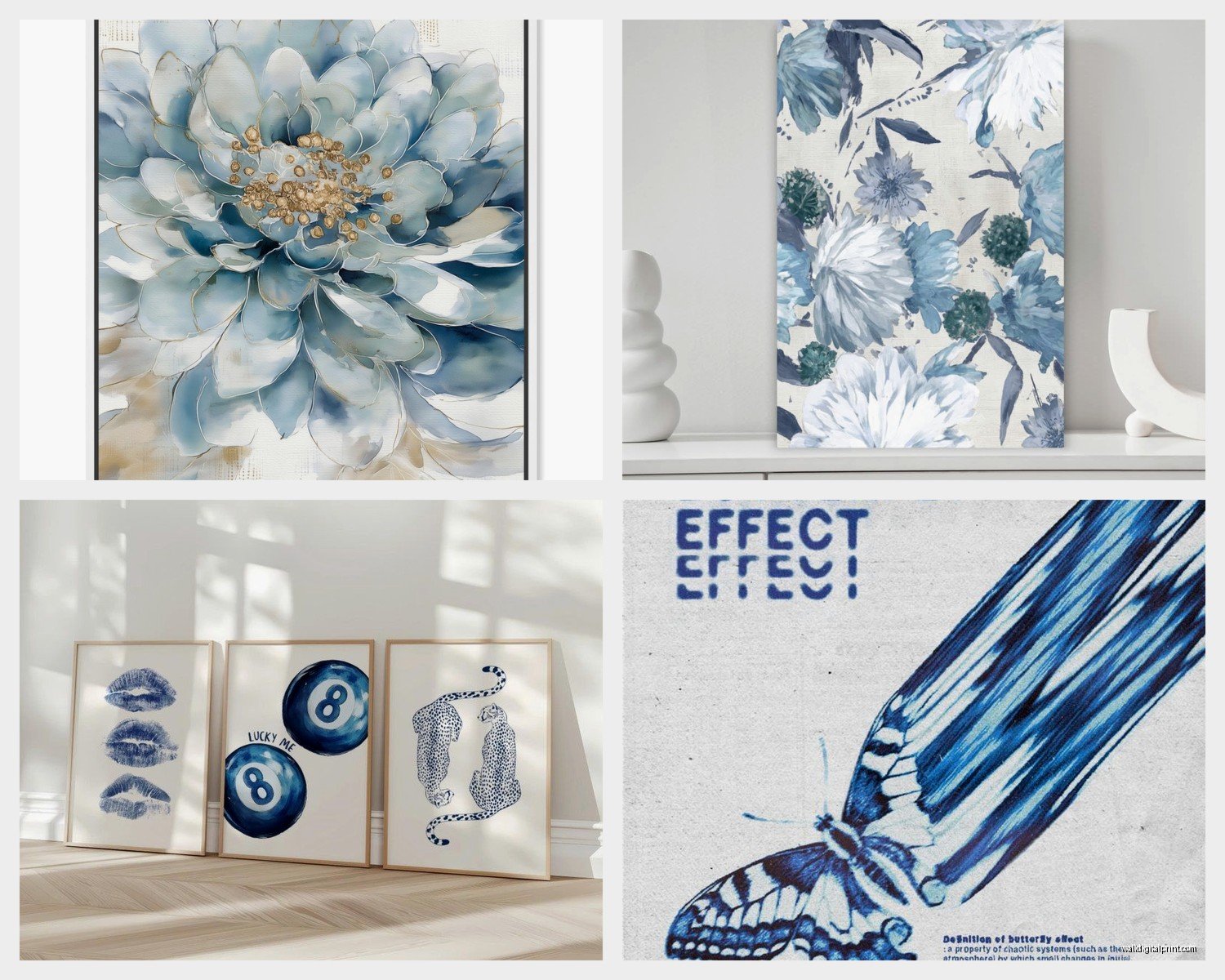
Okay so there are basically three blue families you’re working with. Light sky blues and aquas (these are your airy, fresh morning feels), medium ocean blues and teals (more sophisticated, still calming), and deep navy or indigo (dramatic but can be heavy if you overdo it). I learned this the hard way when I put three navy pieces in a client’s bedroom and she texted me at midnight saying she felt like she was sleeping in a cave.
What actually works is picking one dominant blue tone and then pulling in one or two accent blues. Like if you go with a large piece that’s got those gorgeous turquoise ocean tones, maybe add a smaller navy piece and something with pale blue. The variation keeps it interesting but the color family keeps it cohesive.
Testing Before Committing
Here’s what I do and what you should totally do too – order samples or use those paint sample cards. I know it sounds extra but hang them on your wall for a few days. Look at them in morning light, afternoon light, and especially at night with your bedroom lighting. Blues shift like crazy depending on light. That peaceful sky blue can look straight up gray in low light, or that navy can turn black and depressing.
My bedroom faces north so it gets cool light anyway, which makes blues read even cooler. If your room gets warm afternoon sun, you can go more saturated with your blues. If it’s like mine, you might wanna lean toward blues with slight green undertones (the teals and aquas) because they feel warmer.
Size and Placement That Actually Makes Sense
The rule I break constantly but you should probably follow – your main piece should be about 2/3 to 3/4 the width of your bed or furniture it’s above. But honestly I’ve done massive oversized pieces that go almost wall to wall and they look incredible if the image itself is calming enough.
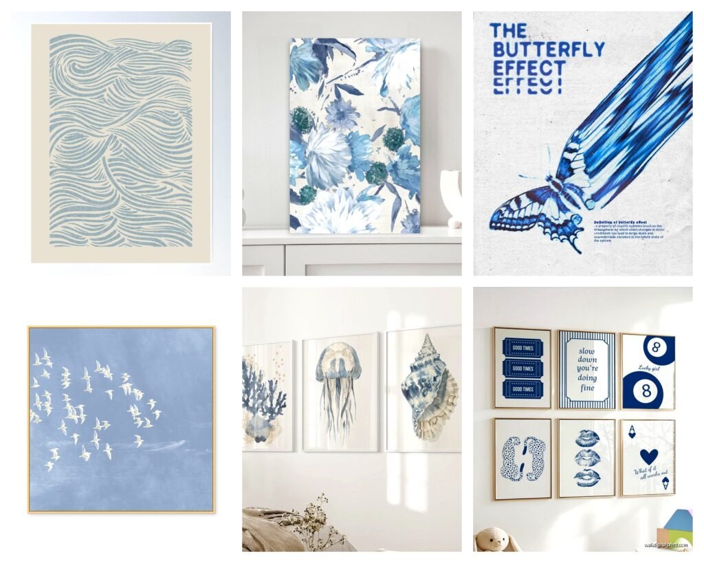
For blue ocean or sky art specifically, horizontal pieces work better than vertical. Something about the horizontal lines mimics the horizon and feels more restful. I’ve got this one piece in my own bedroom that’s like 60 inches wide and only 24 inches tall, and it’s just this gradient from deep ocean blue at the bottom to pale sky at the top, and it’s genuinely the most calming thing I own.
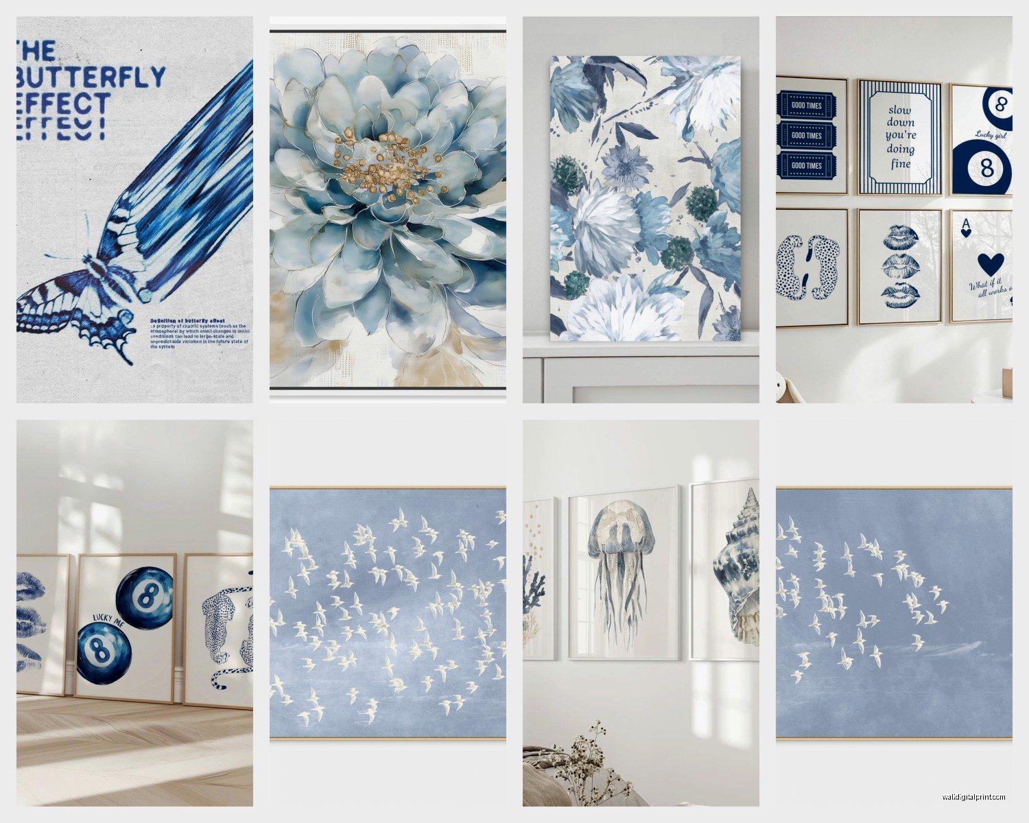
The Three-Piece Situation
If you’re doing a triptych or three-piece set – which looks really good with ocean themes btw – hang them with about 2 to 3 inches between each panel. Not more. I see people space them out like 6 inches and it just looks disconnected. You want them to read as one image that’s been split, not three separate things.
And please use a level. I spent 45 minutes once fixing a three-panel set that was hung “by eye” and every single panel was at a different angle. My cat was literally judging me from the doorway.
Mixing Mediums and Textures
This is where it gets fun and where you can really customize the vibe. Don’t just do canvas prints. Mix in some textured pieces.
I’m obsessed with those woven fiber art pieces right now – you can find ocean-inspired ones with blue gradient threads that add this tactile element. Pair that with a smooth acrylic or resin piece (resin ocean art is HUGE right now and some of it is actually stunning) and maybe a watercolor print. The different textures make the blues feel more dynamic.
Also consider adding some white or cream pieces into your gallery wall if you’re doing one. Like a white coral print or a cream-colored abstract that just has hints of blue. It gives your eyes a place to rest and keeps the blue from feeling monotonous.
Frame Colors Matter More Than You Think
Natural wood frames – especially light oak or maple – look incredible with blues. They warm everything up and give it that coastal bedroom feel without being too beach house themed. White frames work too but they can feel stark, so if you go white, make sure you have other white elements in the room (white bedding, white curtains, whatever).
Black frames with blue art can look really sophisticated and modern, but it’s a specific vibe. More gallery-like than calming sleep space. I use black frames when the room already has black accents and a more contemporary style.
Oh and another thing – frameless canvas wraps are fine but they’re starting to look dated. Just my opinion but I think a simple frame elevates everything.
Specific Pieces That Actually Work
I’m not gonna link specific products because that feels weird but I’ll tell you what to look for.
For above the bed, those large-scale abstract ocean pieces with lots of white space mixed into the blue are your best bet. Not the ones that are super detailed realistic ocean photography – those can be too busy for a sleep space. You want something your eyes can glaze over, you know? Soft gradients, gentle waves, abstract interpretations of water.
I have this one client who bought this massive piece that’s essentially just paint poured to look like ocean waves from above – lots of white foam, turquoise water, deep blue depths – and it’s mesmerizing but in a calm way. That’s the sweet spot.
Gallery Wall Configuration
If you’re doing a gallery wall situation, start with your largest piece first. Hang that at eye level (about 57 inches to the center of the piece from the floor – this is the standard gallery height). Then build around it.
For a calming bedroom vibe, I usually do asymmetrical but balanced layouts. Like the visual weight is distributed but it’s not matchy-matchy. Maybe three pieces on one side, two on the other, different sizes. The key with blue art is keeping the color intensity balanced too. Don’t put all your dark navy pieces on one side and all your light blues on the other or it’ll feel lopsided.
Lighting Your Blue Art
This is gonna sound weird but the lighting matters almost more than the art itself. Blues can look completely different depending on how they’re lit.
If you have overhead lighting, make sure it’s warm white bulbs (around 2700K to 3000K). Cool white bulbs will make your blues look harsh and cold. I switched all my bedroom bulbs to warm white and it completely transformed how my blue art looked – suddenly everything felt cozier.
Picture lights are actually great for bedroom art if you have the setup for it. Those little lights that mount above the frame create this subtle glow that makes the art feel intentional and also provides nice ambient lighting for the room. Just make sure you can turn them off separately because you don’t want them on while you’re trying to sleep.
Natural Light Considerations
If your art is across from a window, be careful with direct sunlight. Blues fade faster than you’d think, especially watercolors and prints. I learned this when a beautiful indigo print I had faded to like pale gray-blue after two summers. UV-protective glass or acrylic is worth it if you’re investing in original art or quality prints.
Also think about what the art looks like with natural light streaming in during the day versus at night with lamps on. That’s your reality – you’ll see it in both conditions every day. Sometimes I’ll take a photo of the art in different lighting just to make sure I’m not gonna hate it at night.
Avoiding the Obvious Coastal Clichés
Look, if you love seahorses and anchors and “Life is Better at the Beach” signs, you do you. But if you want sophisticated blue bedroom art that happens to evoke ocean and sky without screaming BEACH HOUSE, here’s what to avoid.
Skip the obvious nautical symbols. No anchors, no ship wheels, no literal sailboats. Instead go for abstract water movements, aerial ocean photography, sky gradients, or even just geometric art in ocean colors.
I did a bedroom last month where we used this stunning piece that was just rectangles in different shades of blue – from pale sky to deep ocean – arranged in this gradient pattern. Totally abstract, zero beach imagery, but it absolutely gave that water/sky calming effect. Way more sophisticated than a surfboard print.
Bringing in Other Elements
The art shouldn’t exist in isolation. Pull the blues into your bedding, throw pillows, maybe a rug. But – and this is important – don’t go full blue overload. Use the blues as accents alongside a neutral base.
Like my bedroom has white bedding, natural wood furniture, and then I’ve got those blue art pieces, blue and white pillows, and a cream-colored rug with subtle blue undertones. If everything was blue I’d feel like I was underwater in a bad way.
Budget Real Talk
You don’t need to spend thousands on original art. Some of the best blue abstract pieces I’ve sourced for clients came from online print shops where you can get large-scale prints for under $200. The trick is getting them properly framed – don’t cheap out on framing because a great print in a cheap frame still looks cheap.
If you are gonna invest in original art, local artists often do ocean and sky pieces and you can commission something in the exact shades you want. I’ve done this a few times and it’s usually between $500-$1500 depending on size, which honestly isn’t that much more than buying a large framed print once you factor in framing costs.
Etsy is actually solid for finding unique blue art prints. Just read the reviews and make sure you’re getting good print quality. I’ve had hit or miss experiences – some prints show up gorgeous, others look washed out. Digital download options let you print at your local print shop which sometimes gives you better quality control.
DIY Option If You’re Crafty
Okay so funny story, I tried making my own ocean resin art last year and it was a disaster. Resin is harder than it looks and I ended up with bubbles and uneven coating and just… no. But if you’re actually crafty, blue watercolor abstracts are pretty forgiving for beginners. Get some good watercolor paper, decent paints in your blue palette, and just play with water-to-paint ratios. The organic flow of watercolor naturally creates those calming gradients.
Even if it’s not technically perfect, original art has character that prints don’t. Just get it professionally framed and people will think you’re fancy.
The Weird Stuff That Works
Sometimes the most calming blue art isn’t obviously ocean or sky themed. I’ve used aerial landscape photos that show blue waterways snaking through terrain. Microscopic photography of blue crystals or minerals. Even fashion photography with lots of blue tones and negative space.
The point is creating a feeling, not a theme. If a piece is predominantly blue and makes you feel calm when you look at it, it works. I’ve got this one piece that’s actually a photograph of blue fabric billowing in wind, and it reads as both sky and water somehow. Cost like $80 for the print and I get compliments on it constantly.
Wait I forgot to mention – consider the seasons too. Some blues feel perfect in summer but too cold in winter. If you live somewhere with real winters, you might wanna have warmer accent pieces you can swap in during colder months. I change out one or two smaller pieces seasonally just to keep things fresh, though my main large piece stays year-round because it’s got enough teal in it to feel okay even in January.
Just make sure whatever you choose, you’re not sick of looking at it after a month because bedroom art is what you see first thing in the morning and last thing at night, and that’s gotta be something that genuinely makes you feel peaceful or at least neutral, not something you start resenting because you rushed the decision.