Wall Art Guide, Wall Art Tutoriels
Farmhouse Wall Art for Living Room: Rustic Main Space Decor
Apr
So I’ve been styling farmhouse living rooms for the past three years and honestly the wall art is where most people totally overthink it or go way too matchy-matchy. Let me just tell you what actually works because I literally just finished a client’s space last week and we nailed it.
Start With Your Biggest Wall First
Okay so here’s the thing everyone gets backwards. They buy a bunch of small pieces thinking they’ll figure out the arrangement later, and then nothing looks right. Start with your main wall, usually the one behind your sofa or opposite your entryway. You need an anchor piece that’s either really large or a gallery wall arrangement, but we’ll get to that.
For a standard sofa that’s like 84-90 inches, you want your art to take up about two-thirds to three-quarters of that width. So we’re talking 50-65 inches of visual space. You can do this with one massive piece or a grouping, but that’s your target zone.
I usually start clients with either a large wood sign (the kind with the carved or painted lettering), a big vintage-style metal piece, or an oversized framed print. The wood signs are super farmhouse obviously, but they work because they add texture. I got one from this Etsy shop last year that was reclaimed barn wood with “Gather” carved into it and my client was obsessed. Cost like $180 but it was 48 inches wide so it made a statement.
Wood Signs That Don’t Look Basic
You gotta be careful with the word signs though because some of them are just… generic. “Live Laugh Love” energy, you know? Look for ones that either have really beautiful typography or say something a bit more specific. I like family name signs, coordinates of a meaningful place, or even just single impactful words like “Home” or “Farmhouse” if the lettering is interesting enough.
The carved ones where the letters are routed into the wood are way better than the painted ones in my opinion. They catch light differently throughout the day and just feel more substantial. Painted ones can look flat and crafty if you’re not careful.
Gallery Walls Are Your Friend But Follow The Formula
Okay so funny story, I used to freestyle gallery walls and they’d take me like four hours of rearranging. Now I use a formula and it takes maybe 45 minutes including hanging time.
Here’s what you need for a farmhouse gallery wall that doesn’t look chaotic:
- One large anchor piece, usually 16×20 or bigger
- Three to four medium pieces around 11×14 or 8×10
- Two to three small accent pieces like 5x7s
- At least one dimensional element, not flat art
That dimensional piece is key. It’s what makes it feel farmhouse instead of just like a regular gallery wall. I use things like small wire baskets mounted on the wall, a vintage window frame, wooden arrow, or even a small wreath. My cat knocked over my coffee while I was arranging one last month and honestly the break made me rethink the whole layout and it ended up better.
The Actual Layout Process
Trace all your frames on kraft paper or newspaper. Cut them out. Tape them to the wall with painter’s tape. This is the only way to do it without making a million holes in your wall, trust me.
Start with your anchor piece slightly off-center or dead center, depending on your wall width. Then build around it, keeping 2-3 inches between each piece. The spacing matters more than you think, too tight looks cluttered, too far apart looks disconnected.
I always do one row that’s roughly level as a visual baseline. Not everything needs to line up, but having some pieces that share a top edge or bottom edge creates order within the casual arrangement.
Color Palette For Farmhouse Wall Art
This is where people get it wrong all the time. True farmhouse isn’t just all white and beige, there’s actually a pretty specific color story that works.
Your base is neutrals obviously, lots of white, cream, warm grays, and natural wood tones. But then you need to pick ONE accent color and stick with it throughout the room. I see navy blue a lot, it’s very farmhouse modern. Sage green is having a moment. Muted terracotta or rust if you want warmer vibes. Or go classic with black for contrast.
Whatever you pick, it should show up in your wall art, your throw pillows, maybe a blanket. The repetition is what makes a space feel pulled together instead of random.
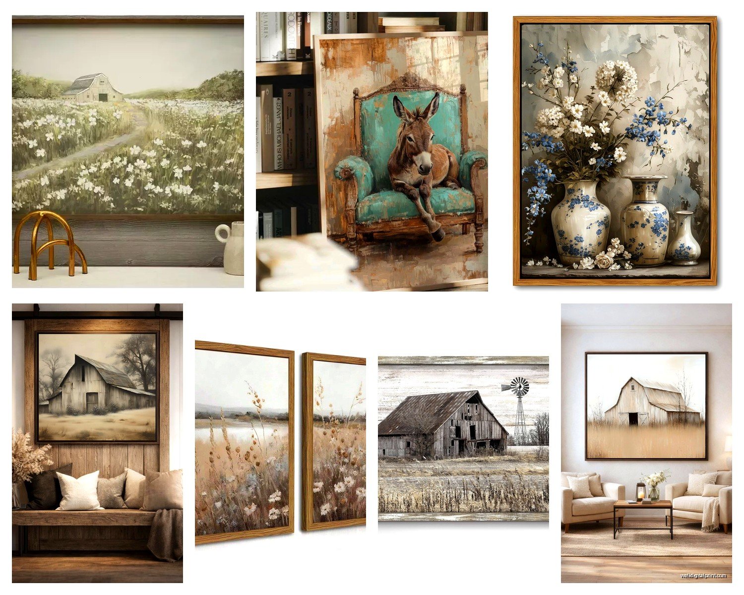
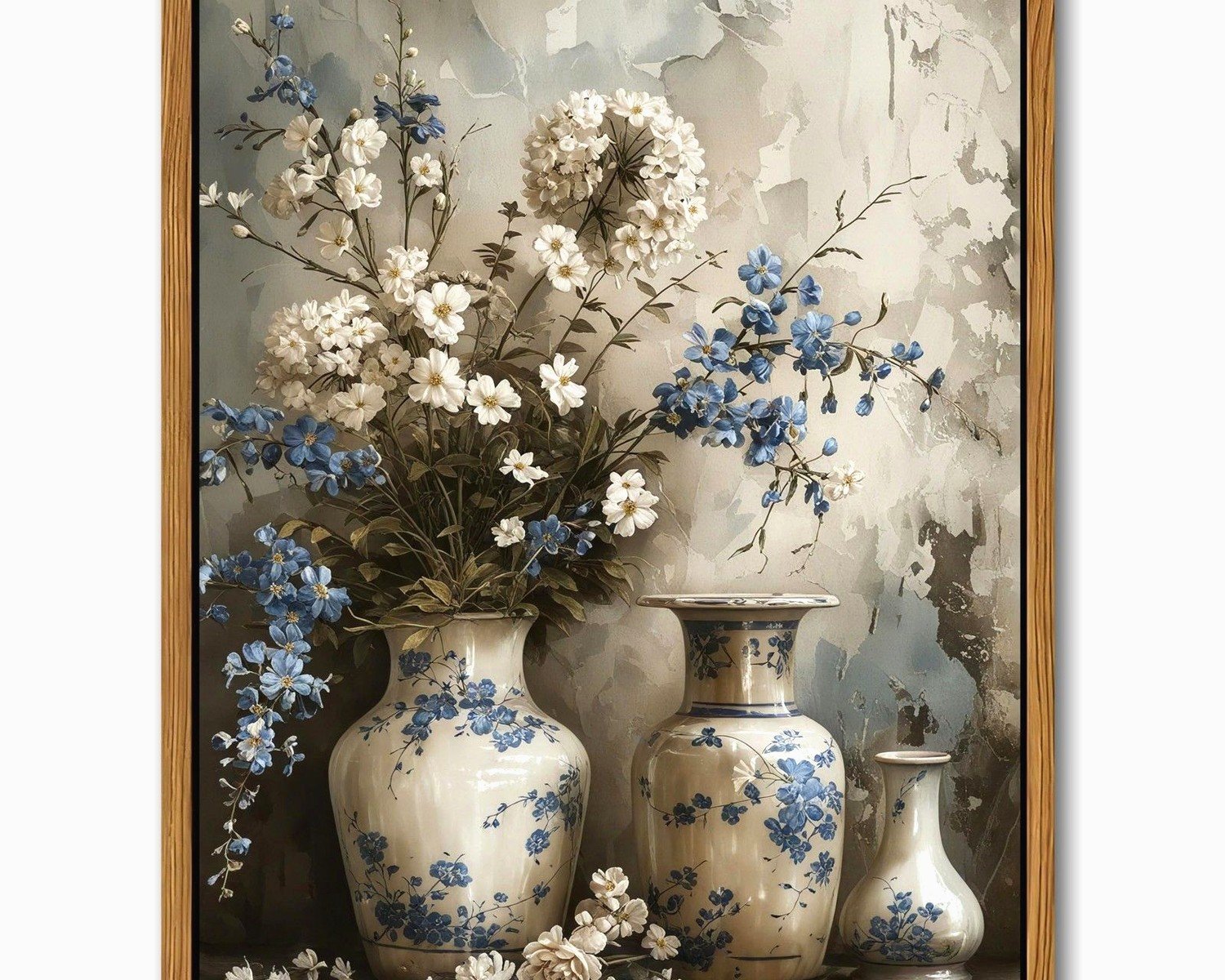
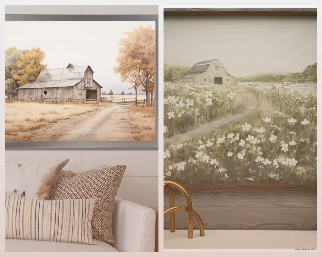
For prints and paintings, look for stuff that’s not too saturated. Farmhouse aesthetic is more muted and vintage-feeling. Those really bright, modern graphic prints don’t fit the vibe. Think watercolor landscapes, botanical prints, vintage farm animal illustrations, or black and white photography.
Where To Actually Buy This Stuff
Okay so I’m gonna be honest about where I source things because I’ve wasted money in all the wrong places.
Etsy is genuinely great for custom wood signs and printable art. The printables are clutch because you can get a high-res file for like $5-8, then print it at FedEx or Costco for cheap, and frame it yourself. I do this constantly. Just make sure the listing clearly states the DPI is 300 for quality printing.
Hobby Lobby has decent farmhouse wall decor when it’s on sale, which is like every other week. Their metal wall art and wooden pieces are pretty good quality for the price. Don’t pay full price there ever, just wait for the 50% off.
Target’s Threshold line has some good framed prints that are already matted and ready to hang. Not the most unique but they’re affordable and they work. I use them as filler pieces in gallery walls.
Facebook Marketplace and estate sales for vintage stuff. Old windows, architectural salvage, vintage botanical prints, wooden crates you can mount as shelves. This is where you find the pieces with actual character. I found this amazing set of three vintage feed sack prints at an estate sale for $15 total and they’re worth like $200 framed.
Framing Situation
Frames matter more than the art sometimes, I’m not even kidding. For farmhouse you want simple wood frames in natural finishes or painted white or black. Nothing ornate or gold-toned unless it’s genuinely vintage.
I buy a lot of frames from Michael’s when they’re running their frame sales. The Studio Décor basics line is fine, nothing special but they get the job done. For larger pieces, check Amazon’s basics frames, they’re shockingly decent.
If you’re doing a gallery wall, you don’t need to match all the frames exactly. Actually it looks better if you don’t. But keep them in the same color family, like all natural wood tones or all painted frames. Mixing natural wood with painted white frames works too if you balance them out across the arrangement.
Specific Pieces That Always Work
Let me just give you my go-to list because these never fail:
Cotton stem prints or art – So overdone but people love them and they really do look good. The key is finding one that’s not the exact same image everyone has. There are variations with different arrangements and styles.
Vintage botanical prints – Especially herbs or vegetables. There’s something about those old-school scientific illustration styles that just fits the farmhouse aesthetic perfectly.
Black and white family photos in a grid – Four to nine frames arranged in a perfect grid, all the same size. Super clean, personal, and it anchors a space.
Oversized clock – The big metal ones with Roman numerals. They’re dramatic and functional. Just make sure it’s proportional to your wall, I’ve seen too many tiny clocks on massive walls.
Wooden bead garland – Okay this isn’t art exactly but draping one of those chunky wooden bead garlands around a frame or hanging it on a nail adds that farmhouse texture everyone wants.
Shiplap or barn door wall hanging – Yeah it’s trendy but if your walls aren’t actually shiplap, a piece of decorative shiplap as art gives you that texture. Just don’t overdo it.
The Dimensional Texture Thing
This is what separates okay farmhouse decor from really good farmhouse decor. You can’t have everything flat against the wall. You need varying depths and textures.
Mix in things like metal wall baskets with faux greenery, wooden shelves with small decor items, or those metal wire wall pockets. I’m obsing over these vintage-style wire baskets that are like 6 inches deep, you can stick some eucalyptus stems in them or just leave them empty for the shape.
Woven baskets mounted on the wall are huge right now too. The flat ones that are basically decorative plates but made of woven material. They add warmth and texture without being too busy.
Wait I forgot to mention mirrors, mirrors are technically wall art and they’re super useful in farmhouses. Look for ones with wooden frames or metal frames with a distressed finish. The windowpane-style mirrors are very farmhouse, they look like old windows with mirror panels instead of glass.
Scale Mistakes To Avoid
Too many small pieces makes your wall look cluttered and your room feel smaller. If you’re working with a big wall, you need big art or a substantial gallery wall. Don’t put three 8×10 frames on a wall that’s like 10 feet wide, it’ll look lost.
On the flip side, don’t put a massive 60-inch piece on a tiny wall just because you love it. It needs breathing room. You want at least 6-8 inches of wall showing around your art on all sides ideally.
Above the sofa, leave like 6-10 inches between the top of the sofa back and the bottom of your art. Not more, not less. Too high and it looks disconnected, too low and it feels cramped.
The Actual Hanging Part
Get a level, use it, don’t eyeball it. I eyeballed stuff for years and wondered why it looked off. Took me way too long to figure out I’m just bad at estimating level.
For lightweight stuff under 10 pounds, regular picture hanging strips work fine and don’t damage walls. For heavier pieces, use proper picture hanging hardware with anchors if you’re not hitting studs.
Gallery walls are easier if you hang the center piece first, then work outward. Some people say start at one edge but I’ve never gotten that to work right.
If you’re hanging something above a piece of furniture, the general rule is 4-8 inches above it. Closer to 4-6 for most situations. This creates a visual connection between the furniture and the art.
Pulling It All Together
The thing about farmhouse wall art is it should feel collected over time, not like you bought everything in one shopping trip from the same store. Even if you did buy it all at once, try to source from different places so there’s variety in style and finish.
Layer different elements – wood, metal, canvas, paper prints, dimensional objects. Vary the sizes. Include at least one or two pieces that feel personal or vintage even if they’re reproduction vintage style.
And honestly don’t stress too much about making it perfect. Farmhouse style is supposed to feel a little lived-in and relaxed. If something’s slightly off-level or the spacing isn’t mathematically perfect, it’s probably fine. I spent three years trying to make everything perfect and my clients’ favorite rooms are always the ones where we were a bit looser with the “rules.”
The biggest thing is just starting with that anchor piece and building from there. Don’t buy random stuff hoping it’ll all work together later because it probably won’t and you’ll end up with a closet full of art you never hang like half my clients had before I helped them.