Wall Art Guide, Wall Art Tutoriels
Cool Wall Art for Living Room: Trendy Hip Main Space Decor
Apr
So I’ve been diving deep into wall art lately because honestly, the living room is where everyone judges your taste and I needed to figure out what actually looks good versus what just seems trendy on Instagram. And like, there’s a massive difference.
The Stuff That Actually Works (Not Just Looks Good in Photos)
Okay so first thing – abstract prints are still huge but you gotta be strategic about it. I made the mistake last year of buying this “cool” geometric print from one of those dropship sites and it looked so flat in person. The colors were off, the canvas was basically cardboard. Now I only go for prints that have texture or at least decent paper quality. Giclée prints are worth it if you’re spending over like $150 on a piece because the color depth is just… chef’s kiss.
What I’ve been recommending to literally everyone is mixing your mediums. Don’t do all canvas prints or all framed posters. My living room has this combo of a large canvas abstract (blues and terracotta, very 2024), two smaller framed vintage concert posters, and then – this is gonna sound weird but – a woven wall hanging I got from this artist on Etsy. The texture thing is key because it makes your wall look curated instead of “I went to HomeGoods on a Saturday.”
Gallery Walls That Don’t Look Like a Pinterest Fail
I spent THREE HOURS last month installing a gallery wall and then took it all down because the spacing was off. Here’s what I learned the hard way:
- Start with your largest piece first – center it where you want the focal point
- Work outward from there instead of trying to plan the whole thing at once
- Keep spacing consistent – I use 2-3 inches between frames always
- Mix frame colors but keep the style similar (all modern, all vintage, etc.)
- Odd numbers look better than even, no idea why but it’s true
The paper template method is legit. I traced all my frames on kraft paper, taped them to the wall, and could move stuff around without making a million holes. My cat kept attacking the paper though so maybe lock your pets out first.
Size Matters Way More Than You Think
This is where people mess up constantly. You walk into a room and there’s this tiny 16×20 print on a massive wall and it’s just… sad. The rule I follow is that your art should take up about two-thirds to three-quarters of the furniture width below it. So if your sofa is 84 inches, you want your art or gallery wall to span roughly 56-63 inches.
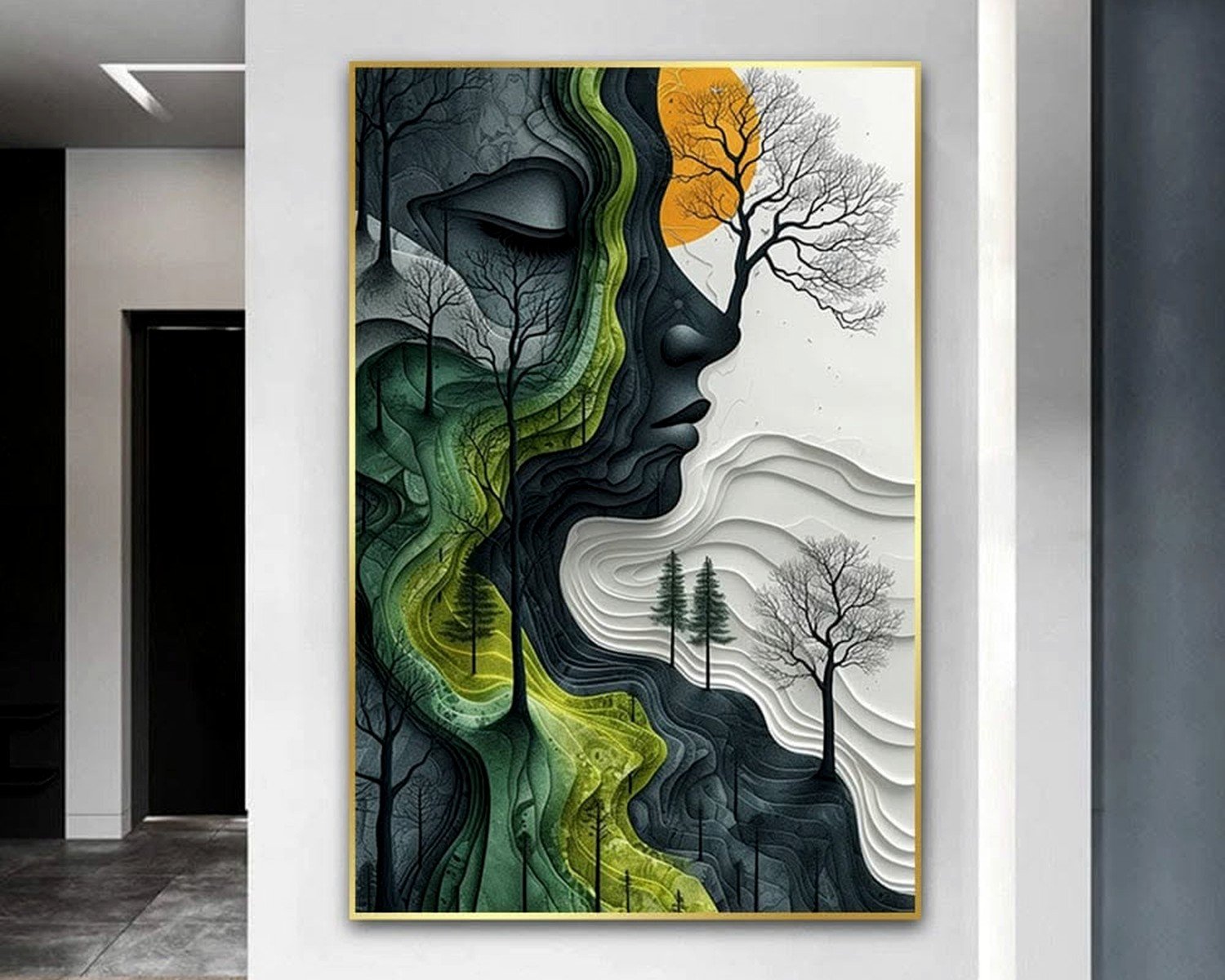
For a single statement piece above the couch, I’m talking LARGE. Like 40×60 minimum for a standard living room. I know it feels scary to go that big but trust me, it anchors the whole space. I just installed a 48×72 abstract for a client and she was nervous about the size but now she’s obsessed.
The Styles That Are Actually Cool Right Now
Okay so here’s where trends come in but also like, your personal taste matters more than what’s “in.” That said, if you want your living room to feel current:
Line art is still around but it’s evolved. The minimalist one-line faces? Kinda over. But abstract line work with bold colors or architectural line drawings are still really strong.
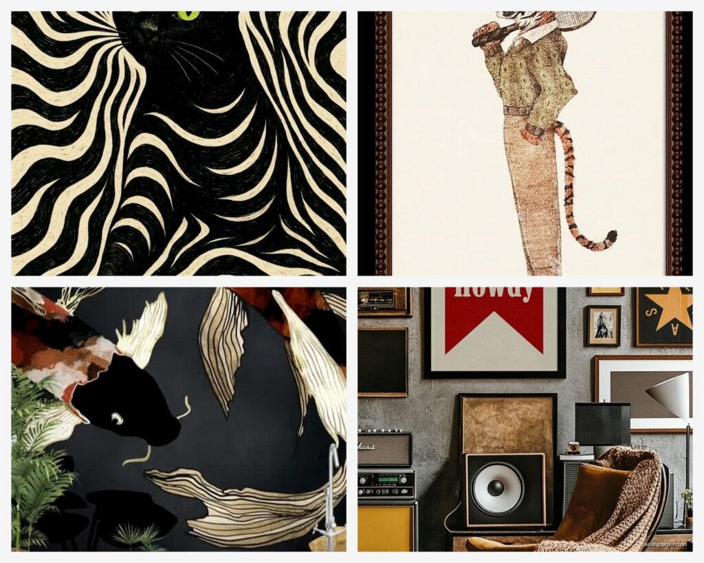
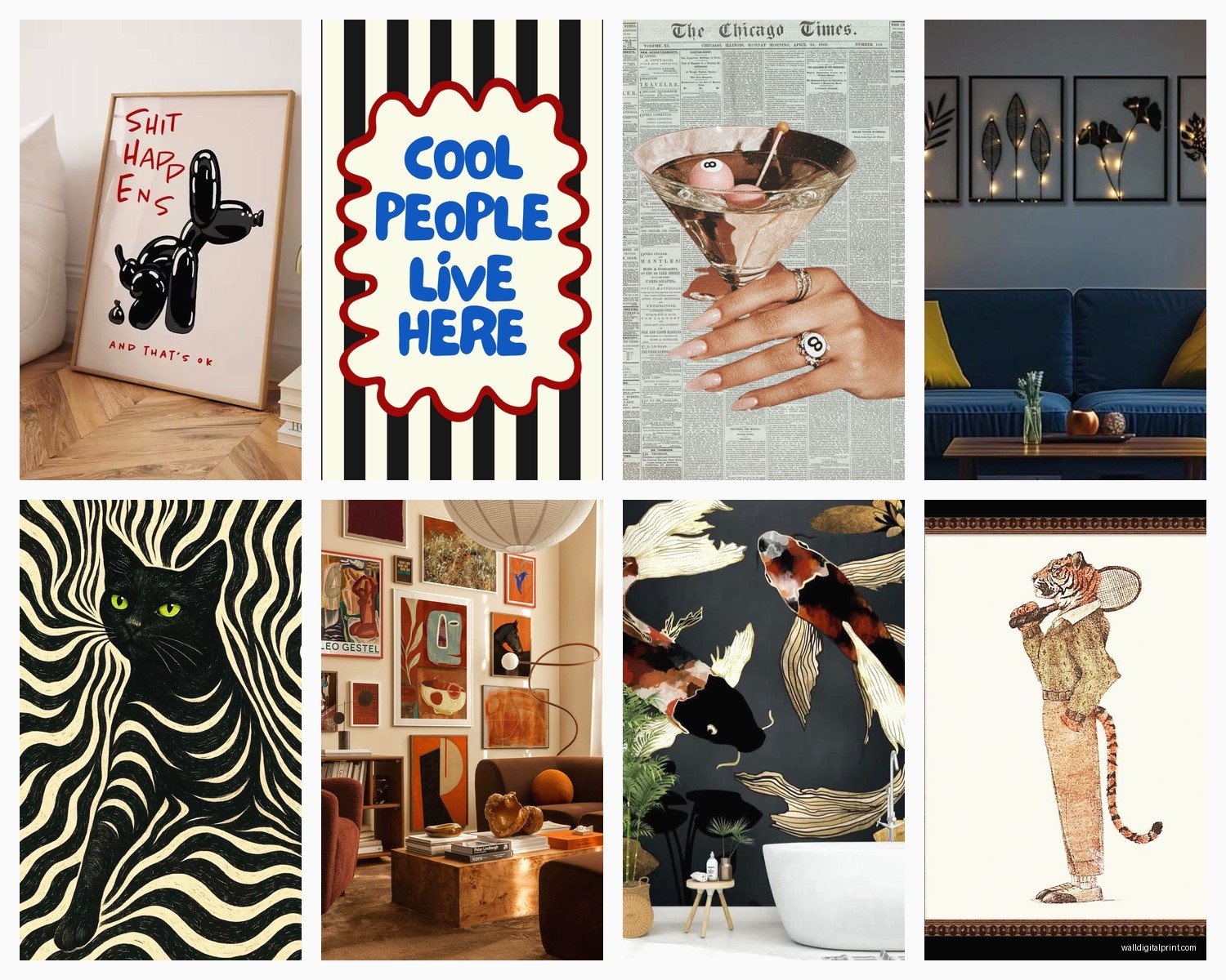
Vintage photography – especially black and white or that faded color film look. I’m obsessed with old architecture photos, vintage cars, retro travel posters. There’s something about the grain and the nostalgia that feels warm without being cheesy.
Bold color abstracts – we’re talking rich jewel tones, burnt oranges, deep teals. Not the millennial pink and gray combo anymore. The art should have depth and movement.
Maximalist gallery walls – like I mentioned before, but I’m seeing people go FULL maximalist with mismatched frames, different art styles, even incorporating objects like small shelves or mirrors into the gallery wall.
Where to Actually Buy This Stuff
Real talk, I’ve wasted so much money on bad art. Here’s my current rotation of sources:
Minted – their quality is consistent and they have tons of independent artists. Pricier but the framing options are solid and it actually arrives looking like the website photos.
Etsy – but you gotta dig. Search for specific styles like “abstract printable art” or “vintage botanical prints” and filter by reviews. I’ve found amazing downloadable prints for like $8 that I print at a local print shop on nice paper.
Society6 – hit or miss on quality but good for trendy stuff. Their canvas prints are decent, framed prints are fine, but don’t expect museum quality.
Saatchi Art – if you want to invest in original work. I bought one piece from here and it’s the first thing everyone comments on. You’re paying real money but it’s actual art.
Facebook Marketplace and estate sales – okay this requires effort but I’ve scored INSANE vintage art for nothing. Found a set of three botanical prints in original frames for $40 total. They’re probably from the 70s and they’re perfect.
Oh and another thing, if you find a print you love but it’s digital, don’t just print it at Staples. Go to a proper print shop that does fine art printing. The difference in color and paper quality is massive and usually only costs like $20-40 more.
DIY Options That Don’t Look DIY
I’m gonna be honest, some DIY art looks… crafty. But there are ways to do it that look legit:
Large-scale abstract painting – get a big canvas from Michael’s with a coupon, watch one YouTube tutorial, and just go for it with acrylics. The key is using a limited color palette (3-4 colors max) and not overthinking it. My friend did this and everyone thinks she spent $500 on it.
Blown-up personal photography – if you have any decent photos you’ve taken, get them printed LARGE at a professional print shop. I took a photo of a building facade in Chicago on my iPhone, printed it 30×40, and it looks like deliberate architectural art.
Framed fabric or wallpaper samples – sounds weird but works. Get interesting fabric or wallpaper samples, frame them in simple black or wood frames, and suddenly you have textile art. I did this with some vintage-looking botanical wallpaper samples and people always ask where I got them.
Hanging This Stuff Without Destroying Your Walls
I’ve used every hanging method and here’s my hierarchy:
For heavy pieces (over 20 lbs), you need actual wall anchors or to hit a stud. Don’t risk it with those adhesive strips – I watched a $300 framed print crash down at 2am once and almost had a heart attack.
Command strips work great for lighter frames (under 15 lbs) and renters. Follow the weight limits exactly and let them sit for an hour after applying before hanging anything.
Picture hanging wire is annoying but gives you flexibility to adjust level without making new holes. Use two hooks instead of one for anything over 24 inches wide so it doesn’t tilt.
French cleats for really large pieces – worth learning if you’re hanging anything massive. It distributes weight evenly and feels super secure.
The laser level I bought on Amazon for $25 changed my life. No more eyeballing it and ending up with crooked art.
Lighting Makes or Breaks It
This is what separates okay art from art that actually impacts the room. If you have overhead lighting only, your wall art is gonna fall flat (literally and figuratively).
Picture lights are the obvious choice but they’re expensive and require installation. I use those battery-operated LED picture lights from Amazon – they’re like $30, stick on with adhesive, and you’d never know they’re not hardwired.
Track lighting or adjustable can lights aimed at the wall work great too. You want to avoid glare on glass-covered pieces though, so angle matters.
Even just adding a floor lamp near your gallery wall with the light bouncing off creates dimension. My living room has a tall arching floor lamp that highlights the art corner and it makes such a difference at night.
Colors and Coordination Without Being Matchy-Matchy
Your art doesn’t need to match your throw pillows exactly – actually please don’t do that, it looks too staged. But there should be some color conversation happening.
I pull 1-2 colors from my main art piece and echo them in other parts of the room through smaller items. So my big abstract has terracotta and navy, and I have navy in my rug and terracotta in some decorative objects. The art ties it together without being obvious about it.
If your furniture is neutral (grays, beiges, whites), you have total freedom to go bold with art. If your furniture is already colorful, maybe lean toward black and white or more subdued art so the room doesn’t feel chaotic.
Also textures – if your room is all smooth surfaces (leather couch, glass coffee table), textured art adds necessary contrast. If you have a chunky knit throw and velvet pillows, sleek modern art balances it out.
The Weird Stuff That Actually Works
Okay so I’m gonna throw out some unconventional ideas that I’ve seen work really well:
Vintage mirrors mixed into a gallery wall – not as art exactly but they add dimension and light
3D wall sculptures – there are these metal abstract ones that cast cool shadows and add literal depth
Large-scale maps or blueprints – especially vintage ones, they’re conversation starters
Woven baskets hung as a cluster – I know it sounds very 2018 boho but arranged right it’s texture art
Floating shelves with art leaning against the wall instead of hanging – gives you flexibility to switch things out and looks casual-cool
wait I forgot to mention – the height you hang stuff matters SO much. The center of your art should be at eye level, which is roughly 57-60 inches from the floor. Above furniture, leave 6-8 inches between the furniture top and the bottom of the frame. I see people hang art way too high all the time and it disconnects from the space.
Mistakes I Made So You Don’t Have To
Bought art before I had a color scheme figured out – ended up with pieces I loved but didn’t work in the room
Went too small on my first statement piece, looked like a postage stamp on my wall
Tried to DIY frame matting and it looked terrible, just pay the $40 at a frame shop
Hung everything with nails and now my wall looks like Swiss cheese after rearranging
Bought “inspirational quote” art that felt cringey after a month
Got sucked into buying matching sets of three – they look catalogue-y and boring
Mixed too many art styles without a unifying element and the wall looked confused
Okay I think that covers most of what I’ve learned through trial and error and working with clients. The main thing is to actually put stuff on your walls – blank walls are worse than imperfect art choices. You can always switch things out later. My living room art has evolved like five times in the past two years and that’s totally normal.
Just start with one piece you genuinely love, build from there, and don’t overthink the “rules” too much. Your living room should feel like you actually live there, not like a showroom.