Wall Art Guide, Wall Art Tutoriels
2 Piece Wall Art for Living Room: Diptych Main Space Sets
Apr
So I’ve been installing diptych sets in living rooms for like three years now and honestly they’re way trickier than people think. My friend Sarah just texted me last week asking which ones to buy and I basically sent her a novel, so let me break this down properly.
Why Two Pieces Actually Works Better Than You’d Think
Okay so the thing about diptych art is that your brain automatically reads it as one complete image even though it’s split. I learned this when I was curating a show in Portland and the artist explained how negative space between panels creates this visual tension that… anyway, it makes your wall look bigger. That’s the main thing. A single large canvas can feel heavy and kinda imposing, but two pieces with that gap in between? Your eye travels across the space and suddenly your living room feels wider.
I tested this in my own apartment first because I’m not gonna recommend something I haven’t lived with. Hung a 60-inch single canvas above my sofa, lived with it for two months, then switched to a diptych with the same total dimensions. The room legitimately felt 15% larger. My sister thought I’d repainted or moved furniture.
Sizing This Thing Without Losing Your Mind
The formula everyone uses is wrong, just so you know. They tell you the art should be 60-75% of your sofa width but that’s for single pieces. With diptychs you gotta think differently.
Here’s what actually works:
- Measure your sofa width
- Multiply by 0.65 for the TOTAL width including the gap between panels
- Each panel should be roughly 45% of that total measurement
- Leave 2-4 inches between the two pieces depending on your ceiling height
So if you have a standard 84-inch sofa, you want about 55 inches total art width. That means each panel is around 24-25 inches wide with a 3-inch gap. I know that sounds weirdly specific but I’ve hung probably 40 of these and this ratio just works.
Oh and another thing – vertical vs horizontal orientation matters way more with diptychs than single pieces. Vertical panels make your ceiling feel higher which is great if you have standard 8-foot ceilings. Horizontal panels emphasize width, so they’re better if you have a long narrow room or if your sofa sits on a really wide wall.
The Gap Situation That Nobody Talks About
Wait I forgot to mention the most important part. The space between your two panels? That’s where people mess up constantly. Too close and it looks like you couldn’t afford one big piece. Too far and they read as completely separate artworks that just happen to be next to each other.
I use this rule: 2 inches minimum, 6 inches maximum. Usually I land around 3-4 inches. Anything beyond 6 inches and your brain stops connecting them as a diptych.
Also the gap should stay consistent with your ceiling height. Low ceilings need tighter gaps (2-3 inches). High ceilings can handle wider spacing (4-6 inches). This is gonna sound weird but I actually measure the negative space in the room first now before I even think about the art dimensions.
What Actually Looks Good in Living Rooms
Okay so funny story, I once spent an entire weekend photographing different diptych styles in client homes because I was trying to figure out why some worked and others felt off. My cat knocked over my tripod twice and I had to restart but whatever.
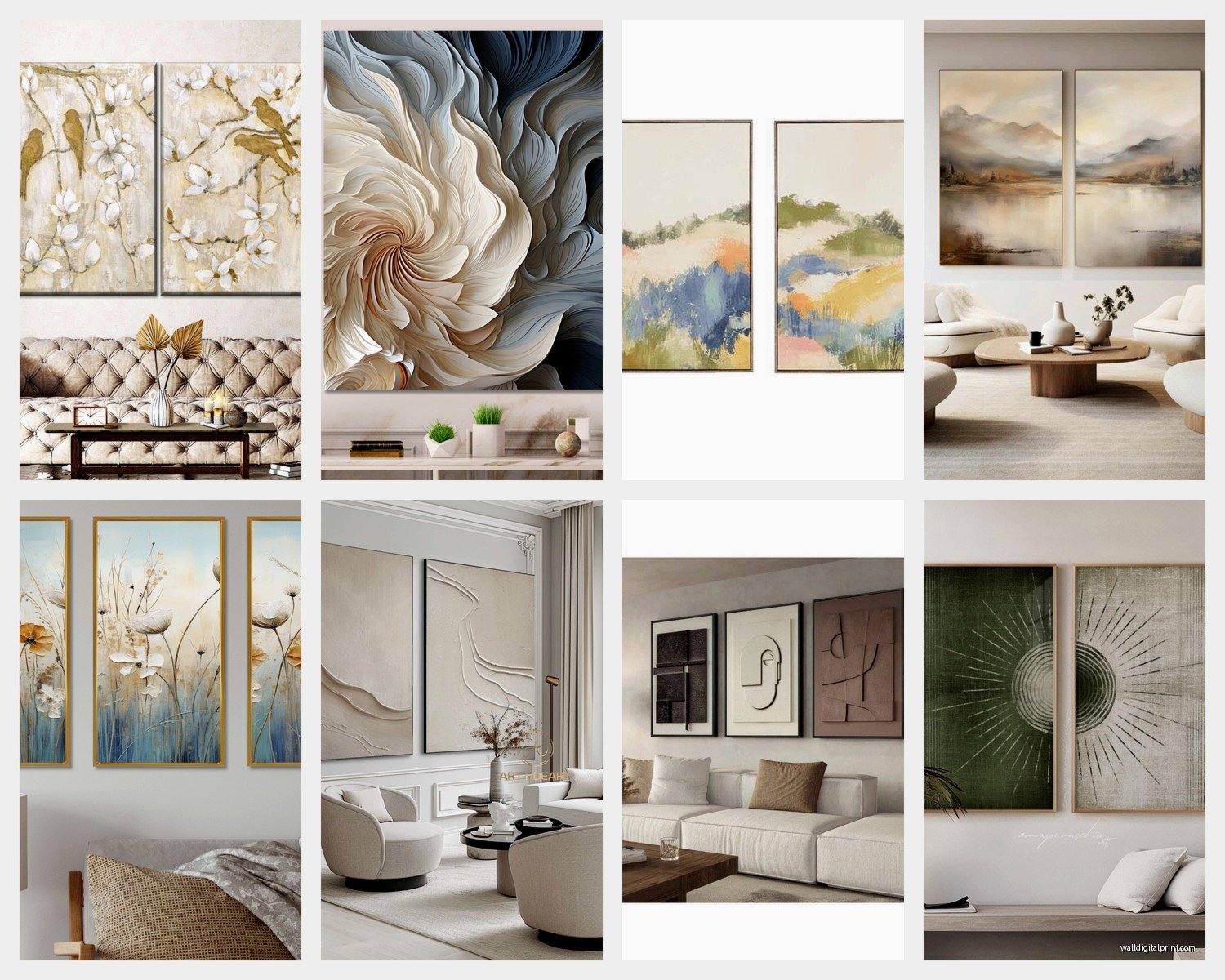
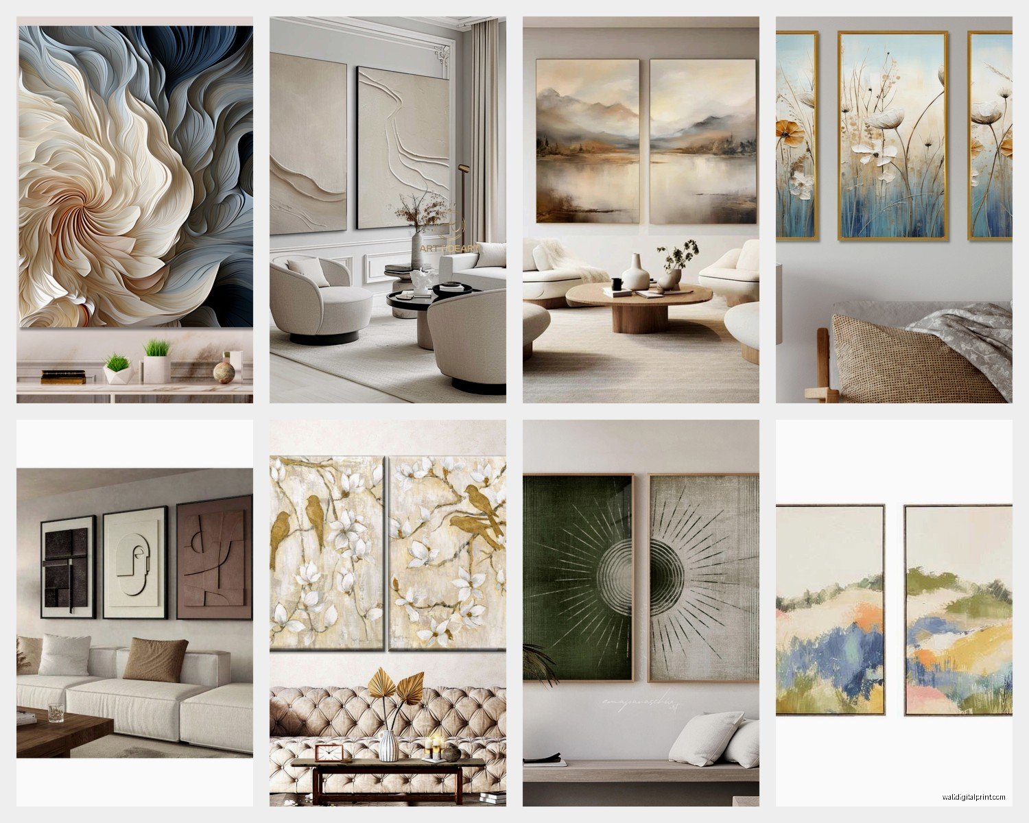
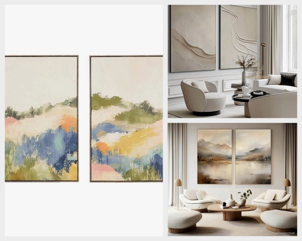
Abstract geometric diptychs are the safest bet for most living rooms. They add visual interest without demanding attention, which sounds contradictory but like… you want art that enhances conversations, not interrupts them. I’m obsessed with these split geometric patterns where one panel has sharp angles and the other has the same pattern slightly shifted or inverted.
Nature scenes split across two panels work really well if your living room has lots of natural light. Ocean horizons, forest paths, mountain ranges – anything with a clear horizontal line that can span both pieces. Just make sure the horizon line is actually continuous across the gap or it’ll drive you insane. Trust me on that one.
Photography diptychs are having a moment right now. Black and white architectural photos, urban landscapes, that kind of thing. They feel more sophisticated than canvas prints somehow? I’ve been using a lot of minimalist photography sets for clients who want that modern gallery vibe without going full stark white walls.
Color Matching Without Making It Boring
People always ask me if the diptych needs to match their existing decor and honestly… kinda but not really? You want one dominant color in the artwork to echo something in your room. Could be your throw pillows, your rug, even your coffee table books.
But here’s the thing – don’t match too perfectly. If your sofa is navy blue, don’t get navy blue art. Get art with navy as an accent color alongside rust orange or cream or whatever. The slight mismatch creates depth.
I usually go with:
- One color that ties to existing room elements
- One neutral that works with your walls
- One surprise accent that adds energy
My client last month had this beige minimalist living room and was terrified of color. We went with a diptych that was mostly cream and taupe with these small pops of terracotta. Completely transformed the space without feeling like she’d suddenly developed a different personality.
Installation Tips That Actually Matter
So mounting these properly is where most people give up and just eyeball it, which… please don’t. I’ve fixed so many wonky diptych installations and it’s always because someone thought they could just estimate.
You’re gonna need:
- A level obviously
- Painter’s tape for marking
- Two people unless you enjoy struggling alone
- Picture hanging strips if you’re renting OR proper wall anchors if you own
The center point between your two panels should align with the center of your sofa. Not the center of each individual panel – the center of the SPACE between them. I cannot stress this enough because I see it done wrong constantly.
Height-wise, hang so the center of the overall diptych (imagining it as one piece) is 57-60 inches from the floor. This is standard gallery height and it works for most ceiling heights. If you have weirdly tall ceilings like 10+ feet, you can go up to 65 inches.
The Template Method I Swear By
Okay this is my secret technique that makes installation so much easier. Cut out paper templates the exact size of your panels. Tape them to the wall in different configurations. Live with it for like two days. Seriously, just leave the paper up there and see how it feels when you’re watching TV, having coffee, whatever.
I started doing this after I permanently installed a diptych for a client, she hated it, and I had to patch four anchor holes. Now I always template first.
While the templates are up, photograph them with your phone from different angles. Sitting on the sofa, standing in the doorway, from the dining area if you have an open floor plan. Sometimes what looks perfect straight-on looks completely off-center from where you actually spend your time.
Frame vs Frameless and Why It’s Complicated
Frameless canvas diptychs are cheaper and they have this contemporary gallery-wrapped edge thing going on. The image continues around the sides which looks clean and modern. But they show damage easily and they feel less substantial.
Framed diptychs cost more but they last longer and you can switch out the art later if you want. The frame also adds like half an inch to an inch around each piece so factor that into your measurements.
I’m personally team frame for living rooms because it elevates everything. Even inexpensive prints look intentional and curated in simple black or natural wood frames. But if you’re going for that ultra-modern minimalist vibe or you’re hanging abstract art, frameless totally works.
Wait I forgot to mention floating frames – these are frames that have a small gap between the art and the frame edge. They’re perfect for diptychs because they emphasize each panel as an individual piece while still reading as a set. Little pricier but they look expensive even when they’re not.
Where to Actually Buy These Without Getting Scammed
Okay so I’ve ordered from basically everywhere at this point. Society6 and Minted have good affordable options and you can usually find diptych sets designed to work together. Quality is decent, not amazing, but fine for most living rooms.
Etsy is a goldmine if you search specifically for “diptych set” or “two piece wall art.” You’re buying from actual artists usually and you can often get custom sizes. Just read the reviews carefully because quality varies wildly. I found this amazing abstract artist in Australia on Etsy who does custom diptychs based on your color palette and I’ve ordered from her like five times now for different clients.
West Elm and CB2 have curated diptych collections that are pretty safe bets. They’re more expensive but everything is designed to actually work together and the quality is consistent. Good option if you don’t wanna think too hard about it.
This is gonna sound weird but HomeGoods sometimes has incredible diptych sets for like $80 total. It’s completely random and you gotta go in person, but I’ve found some genuinely good pieces there. My own living room diptych is from HomeGoods and people always ask where I got it.
Custom Printing Your Own
If you have specific photos or artwork you want to use, Mpix and Nations Photo Lab do great canvas prints. You can upload two images designed to work as a diptych or split one large image across two canvases.
For splitting one image, you gotta account for the gap. So if you want a 3-inch gap, you need to crop your image so that 3 inches worth of content will be lost in the middle. Most print places have templates for this but honestly I just use Canva now because it’s easier.
I did this for my sister with photos from her wedding – split this beautiful sunset shot across two 20×30 canvases with a 4-inch gap. Looked incredible and cost maybe $120 total.
Style Combinations That Work
Minimalist modern rooms need bold graphic diptychs. Think large-scale abstracts, black and white photography, geometric patterns. The contrast between the simple room and the striking art creates balance.
Traditional or transitional living rooms do better with landscape diptychs or classical art reproductions split across two panels. Botanical prints work really well too – I just did a set of vintage fern illustrations for a client with a traditional sofa and antique side tables.
Bohemian eclectic spaces can handle more experimental diptychs. Mixed media, textured pieces, even mismatched frames if you’re brave. The key is making sure the two panels still relate to each other through color or theme even if they’re not perfectly matched.
Industrial loft-style rooms look amazing with urban photography diptychs or abstract metal wall sculptures split into two pieces. I’m working on a project right now with exposed brick and we’re doing a black and white architectural photography set that’s gonna be perfect.
Common Mistakes I See Constantly
Hanging them too high. Everyone does this. Remember the 57-60 inch center point measurement.
Buying panels that are different sizes thinking it’ll look artistic. It won’t, it’ll look like a mistake. Both panels need to be identical dimensions for a proper diptych.
Ignoring the furniture below. Your diptych needs to relate to what’s underneath it, usually a sofa or console table. If there’s nothing below it, it’ll feel like it’s floating in a weird way.
Choosing busy patterns for small rooms. If your living room is under 150 square feet, go with simpler compositions. Too much visual complexity in a small space feels chaotic.
Not considering lighting. If your diptych is in a dark corner, you need lighter tones or you need to add a picture light. Dark moody art in a dark space just disappears.
Oh and another thing – people buy diptychs that are way too small for their wall. Go bigger than you think you need. Undersized art is one of those things that always looks off even if you can’t pinpoint why.
Making It Feel Cohesive With Everything Else
Your diptych shouldn’t be the only art in your living room unless it’s really large and statement-making. I usually add 1-2 smaller pieces on adjacent walls or a shelf with objects that echo the diptych colors.
Layer in textiles that pull colors from the artwork. This is the easiest way to make everything feel intentional. If your diptych has sage green, add a sage throw blanket or pillows.
The coffee table is your friend here. Style it with books or objects that relate to the diptych theme. Abstract geometric art? Add a sculptural bowl or angular objects. Nature photography? Bring in organic elements like driftwood or plants.
Lighting matters more than people realize. I always suggest adding a floor lamp or table lamp near the diptych to create visual weight on that side of the room. It balances everything out.
Anyway that’s basically everything I’ve learned from installing these in probably 50+ living rooms at this point. The main thing is just measuring carefully and not being afraid to go bigger than feels comfortable. Oh and living with paper templates before you commit to drilling holes – that trick has saved me so many times.