Wall Art Guide, Wall Art Tutoriels
Black Wall Art for Living Room: Dark Bold Main Space
Apr
So I’ve been obsessing over black wall art lately and honestly it’s completely changed how I think about living rooms. Like, everyone’s so scared of going dark but when you actually commit to it? Game changer.
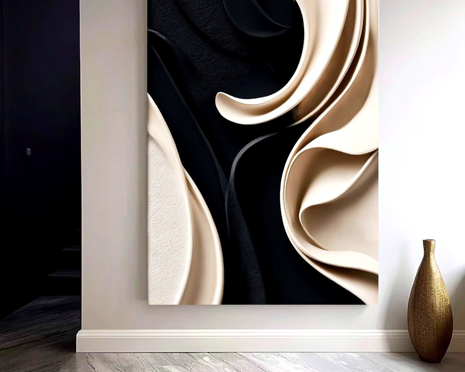
First thing – and I cannot stress this enough – size matters way more than you think. I see people buying these tiny 16×20 pieces for their main wall and it just looks lost. You need to go big or create a substantial gallery wall. I’m talking at least 40×60 inches for a single statement piece above your couch, or if you’re doing a gallery wall, plan for the entire arrangement to take up about two-thirds of your wall width. I made this mistake in my own place three years ago with this gorgeous abstract black piece that cost way too much, and it looked like a postage stamp floating on my wall until I surrounded it with complementary pieces.
The thing about black art is it actually needs MORE negative space around it than colorful art, which sounds backwards but trust me. The darkness creates its own visual weight, so if you cram it too close to furniture or corners, it feels oppressive instead of bold. Leave at least 8-10 inches of wall space visible on all sides.
Now for actual pieces – I’ve been testing different styles in client spaces and my own living room (my cat Miso knocked over one of them last week and I almost cried but that’s another story). Here’s what actually works:
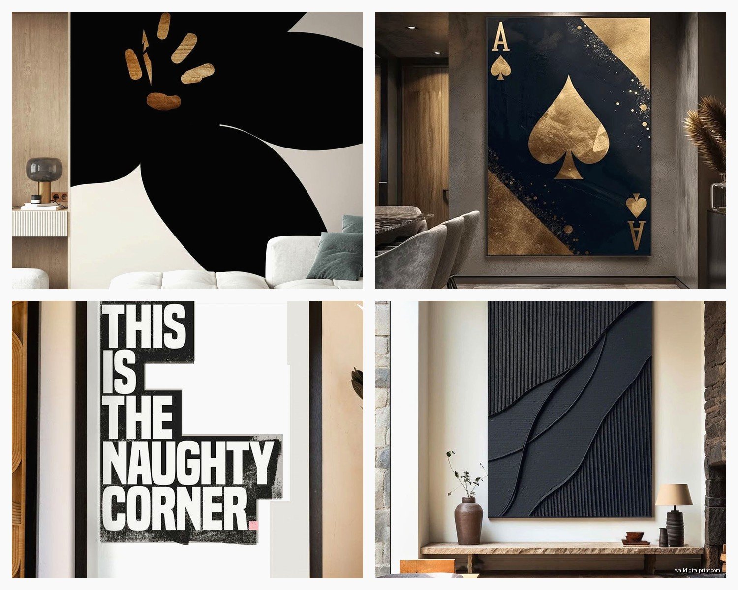
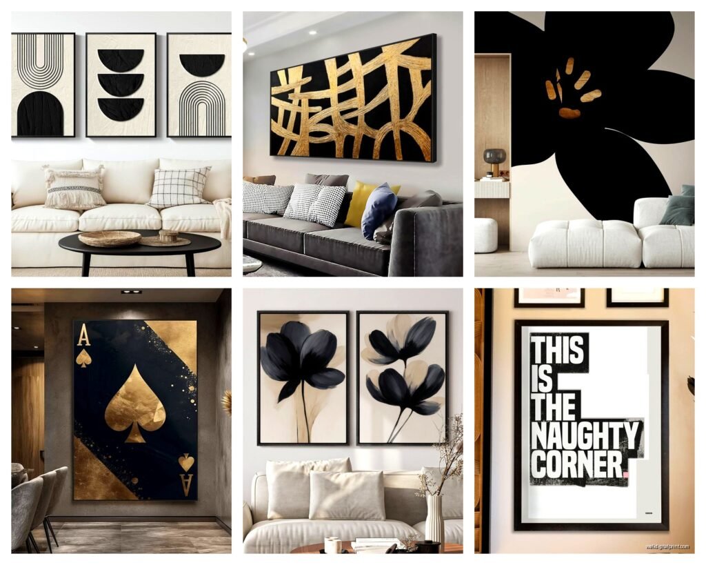
Abstract Black and White Pieces
These are your safest bet if you’re nervous about going full dark. Look for pieces with bold brushstrokes or geometric shapes. The white elements give your eye somewhere to rest. I found this amazing oversized canvas on Etsy from a seller called MinimalModernArt – it’s like black ink swirls with white negative space and it photographs SO well for my blog. Cost around $280 for a 48×36 which isn’t cheap but also not insane.
The key with black and white abstracts is making sure there’s enough contrast. I’ve seen pieces that are like 90% black with tiny white accents and they just read as solid black from across the room, which might be what you want but probably isn’t? You want movement and depth.
Textured Black Art
Okay so funny story, I discovered textured black pieces by accident when a shipment got delayed for a client and I had to scramble. Ended up finding these 3D sculptural pieces that are entirely black but the texture catches light differently throughout the day. Total game changer because they’re never boring.
You can find these in a few formats:
- Carved wood panels painted black – West Elm has some decent ones but they’re pricey
- Layered canvas with actual dimension – easier to DIY if you’re crafty
- Metal wall sculptures in matte black – CB2 had a collection last season that was *chef’s kiss*
- Woven fiber art in black – this is having a moment right now
The textured route works especially well if your living room has good natural light. The shadows create this constantly changing piece throughout the day. I have one above my credenza that looks completely different at 7am versus 4pm.
Black Framed Photography
This is where I spend way too much time honestly. Black and white photography in black frames creates this moody gallery vibe that feels really sophisticated without trying too hard.
For living rooms specifically, I go for larger scale prints – think architectural shots, dramatic landscapes, or striking portraits. There’s this photographer on Minted, their username is escaping me right now but they do these incredible black and white shots of European architecture, all sharp lines and dramatic shadows.
Pro tip that took me forever to figure out: matte finish over glossy for living rooms. The glare from windows or lamps on glossy prints is SO annoying when you’re trying to watch TV or just hang out. Matte absorbs light instead of reflecting it.
Frame-wise, you want black frames with white or cream matting if the print itself has lighter elements, or go frameless with a gallery wrap if it’s darker. I’m currently using simple black metal frames from Framebridge for a gallery wall project and they’re holding up really well.
Gallery Wall Configurations That Actually Work
Wait I forgot to mention – if you’re doing a gallery wall with black art, there are basically three approaches that don’t look chaotic:
The grid method is your most foolproof option. Same size frames (I usually do 16×20), same spacing between them (2-3 inches), arranged in perfect rows and columns. It’s very organized and lets the art itself be the bold element. I did this in a client’s living room with nine black and white prints and it looks like a magazine spread.
The salon style is trickier but more interesting. Different sized frames, but you still need a plan. What I do is cut out paper templates of each frame size and tape them to the wall first. Move them around until it feels balanced – and balanced doesn’t mean symmetrical, it means the visual weight is distributed. Heavier/darker pieces on the bottom generally, smaller pieces filling in gaps. This takes forever but saves you from a million nail holes.
The linear approach is just hanging pieces in a straight horizontal line at the same height, but varying the widths. Super clean, very modern, works great above a long sofa.
Mixing Black Art with Your Existing Decor
So here’s where people get nervous and honestly, I get it. Black art feels like a commitment. But it’s actually more versatile than you think?
If your living room is mostly light and neutral – whites, beiges, light grays – black art creates instant drama and grounds the space. It’s like adding punctuation to a sentence. Just make sure you have at least 2-3 other black elements in the room so the art doesn’t feel random. Black throw pillows, a black lamp, black picture frames on the bookshelf, whatever.
If you’ve got colorful furniture or accent walls, black art is basically a neutral that makes everything else pop more. I had a client with this gorgeous emerald green velvet sofa and we hung a large black abstract piece behind it – the green looks SO much richer now because the black creates contrast without competing.
For rooms with wood tones, black art adds modern edge. This works especially well with lighter woods like oak or maple. Darker woods like walnut can handle black art too but you need to be more careful about lighting or it gets cave-like.
Lighting Is Not Optional
This is gonna sound obvious but you NEED good lighting with black art or it just becomes a dark hole on your wall. I’ve made this mistake and had to fix it and it’s annoying.
Picture lights are the gold standard – those little brass or black fixtures that mount above the frame and aim down. They’re not cheap (anywhere from $80-300 depending on size and quality) but they’re worth it for statement pieces. I use the LED ones from House of Troy because they don’t get hot and the light is clean.
If picture lights aren’t your thing or your budget, track lighting or adjustable can lights work too. Just aim them at an angle so you’re not creating glare. The goal is to make the art visible and create depth, not spotlight it like you’re in a museum (unless that’s your vibe, then go for it).
Wall sconces on either side of the art also work and they add ambient lighting for the whole room. I did this in my living room actually – two simple black sconces flanking a large abstract piece and it’s both functional and looks intentional.
What Doesn’t Work (Learned This the Hard Way)
Okay so things I’ve tried that were failures:
Glossy black frames with glossy black art – it’s just too much shine and looks cheap even when it’s not. Pick one or the other.
Tiny black pieces scattered around – they look like holes in your wall instead of intentional decor. Go big or go gallery wall.
Black art in a room with no natural light and bad artificial light – it’s just depressing, full stop. You need light to make dark art work, otherwise why bother.
Mixing too many different black tones – matte black, glossy black, blue-black, warm black – they all look slightly different and when you mix them randomly it looks uncoordinated. Stick to one or two finishes max.
Where to Actually Buy This Stuff
Since you’re probably wondering where to find pieces that don’t look like they came from a hotel lobby…
Etsy is my go-to for original art and prints. Search for “black abstract art” or “minimalist black wall art” and filter by size. Read reviews because shipping large pieces can be a disaster. I’ve had good luck with printable downloads too – you just take the file to a local print shop and get it printed on quality paper or canvas, then frame it yourself. Way cheaper and you can get exactly the size you need.
Minted and Artfully Walls for curated prints and photography. They’re pricier but the quality is consistent and they often have sales. I wait for their 20% off promotions and stock up.
Society6 if you want something more affordable and trendy. The quality is hit or miss depending on what you order – stretched canvases are fine, framed prints are decent, but some of the other products are meh.
Saatchi Art for original pieces if you’ve got budget. I’ve bought two pieces from emerging artists there and both have been excellent quality. You’re paying real money though – expect $500+ for anything substantial.
West Elm and CB2 for textured pieces and sculptural art. Wait for sales because their stuff is overpriced at full retail.
Local art fairs and studio tours are underrated. I’ve found some of my favorite black pieces directly from artists for less than online prices, plus you can see them in person before buying which is huge.
Making It Work in Different Living Room Styles
Modern/Contemporary – this is the easiest match. Go for clean-lined abstract pieces, geometric designs, or stark black and white photography. Keep frames simple and minimal.
Traditional spaces can absolutely handle black art but you need to choose pieces with more classical subjects or softer compositions. Black and white botanical prints, architectural drawings, or landscape photography work better than harsh abstracts. Ornate black frames can bridge the gap between traditional furniture and modern art.
Scandinavian/Minimalist – black art is basically made for this style. Large scale simple pieces, lots of negative space, matte finishes. Don’t overthink it.
Bohemian – this is trickier but doable. Mix black art with natural textures and warm tones. Woven black fiber art or black line drawings work better than heavy abstract pieces. Keep it light-handed.
Industrial – black art is a natural fit. Metal wall sculptures, photography of urban landscapes, abstract pieces with hard edges. Black metal frames are your friend here.
Oh and another thing – I was watching this design show last night while working on client mood boards and they had someone trying to make black art work in an all-white room with zero other dark elements and it looked SO bad. Don’t do that. You need supporting elements or it’s just floating in space looking awkward.
The Practical Stuff Nobody Talks About
Hanging heavy black art requires proper hardware. Those little sawtooth hangers that come with cheaper frames are garbage for anything over 10 pounds. Use D-rings and picture wire, and anchors in your wall if you’re not hitting studs. I learned this when a piece crashed down at 2am and scared the hell out of me.
Dusting black art shows EVERYTHING. Get a microfiber cloth and dust regularly or get glass/plexiglass over it if possible. Matte black surfaces especially show dust and fingerprints.
If you rent, consider leaning large pieces instead of hanging them. I have a massive black abstract piece leaning against the wall on my credenza and it looks intentional plus I don’t have to patch holes when I move.
Switching out black art seasonally or when you get bored is harder than colorful art because it’s usually a bigger investment and commitment. Make sure you really like it before spending serious money.
The room temperature matters for where you hang it – don’t put valuable black art above radiators or in direct harsh sunlight. The heat and UV exposure will damage it over time.
Anyway that’s basically everything I’ve figured out through trial and error and working with clients and my own space. Black art isn’t as scary as people think, you just gotta commit to it and make sure the rest of your room supports it instead of fighting against it.