Wall Art Guide, Wall Art Tutoriels
Cactus Wall Art: Desert Botanical Prints & Southwest Decor
Jun
So I’ve been absolutely obsessed with cactus wall art lately and honestly it started because my client wanted to do this whole desert vibe thing in her living room but didn’t want it to look like a roadside motel in Arizona, you know? And I ended up going down this massive rabbit hole testing different prints and arrangements and now I have like three saguaro prints in my own apartment so here we are.
Finding Prints That Don’t Look Cheap
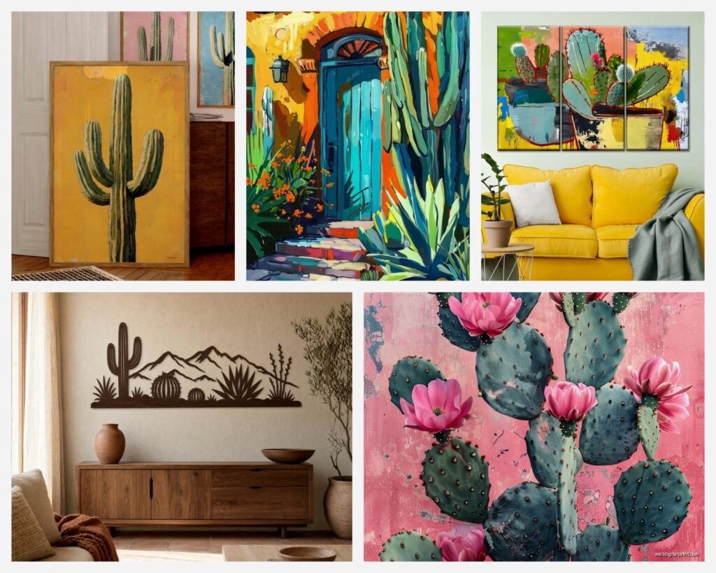
Okay so the biggest problem with cactus art is that like 90% of it looks either super touristy or weirdly clinical, like a biology textbook. What you want are prints that have some actual depth to them. I’ve found the best ones are either vintage botanical illustrations or really high-quality photography prints where you can see the texture of the cactus needles.
Etsy is honestly your best friend here but you gotta be picky. Search for “vintage cactus botanical” or “desert botanical print” instead of just “cactus wall art” because that second search is gonna give you a million generic results. I spent like two hours one night while watching that baking show (the British one, obviously) just scrolling through options and saving the good shops.
The sweet spot price-wise is around $15-30 for a digital download that you can print yourself at like Staples or FedEx. I know everyone says print quality doesn’t matter but it absolutely does. Always go with the heavyweight matte paper, minimum 80lb. The glossy stuff makes everything look like a poster from a college dorm.
Color Palettes That Actually Work
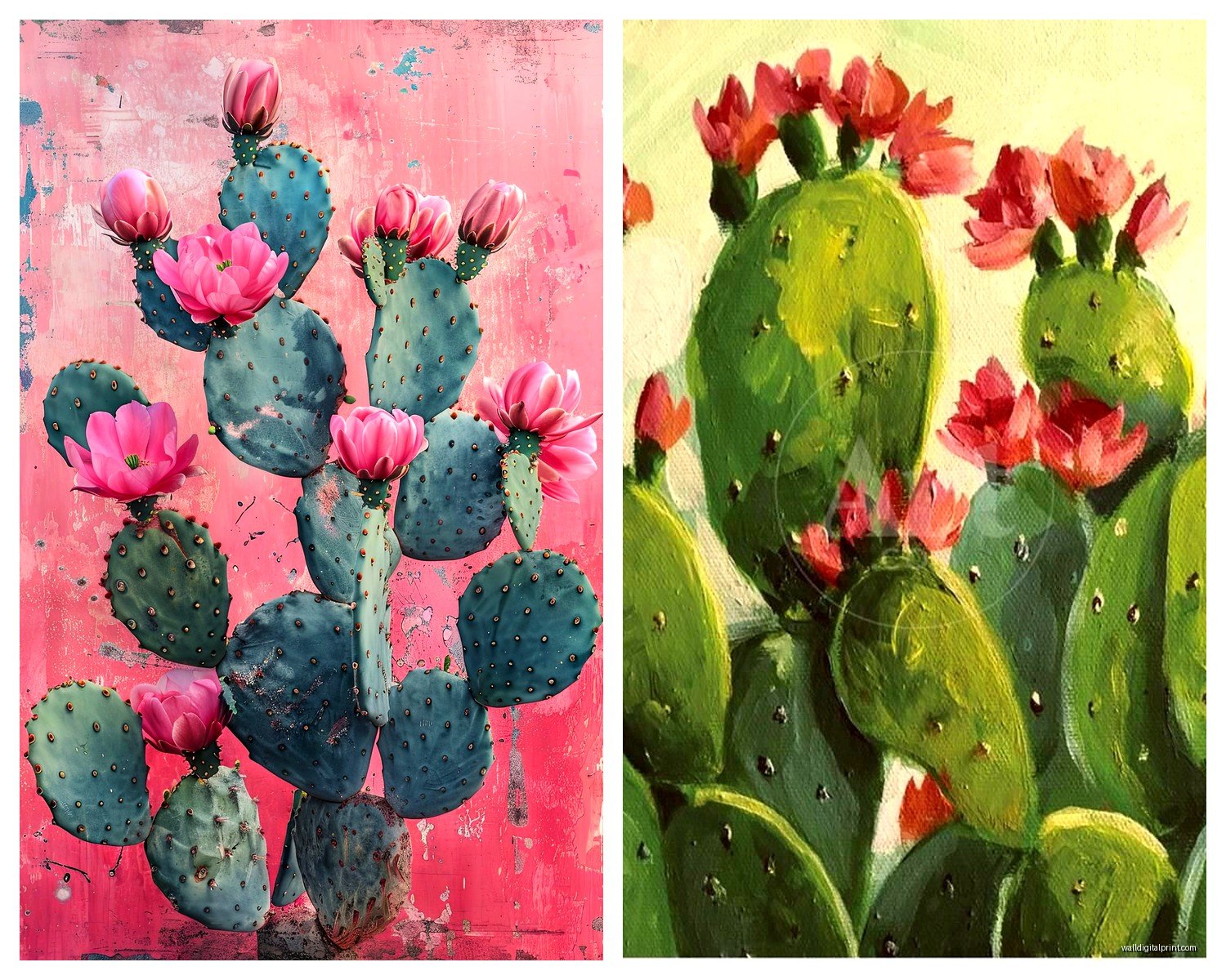
Here’s where people mess up constantly. They think desert = beige and terra cotta and that’s it, but then the whole room ends up looking flat and boring. The cactus prints you choose should have some variation in tone.
My go-to combo is:
- One or two prints with deep greens (like a close-up of prickly pear pads)
- Something with that dusty sage green color
- Maybe one print with flowering cactus for a pop of coral or magenta
- Black and white botanical illustrations as anchors
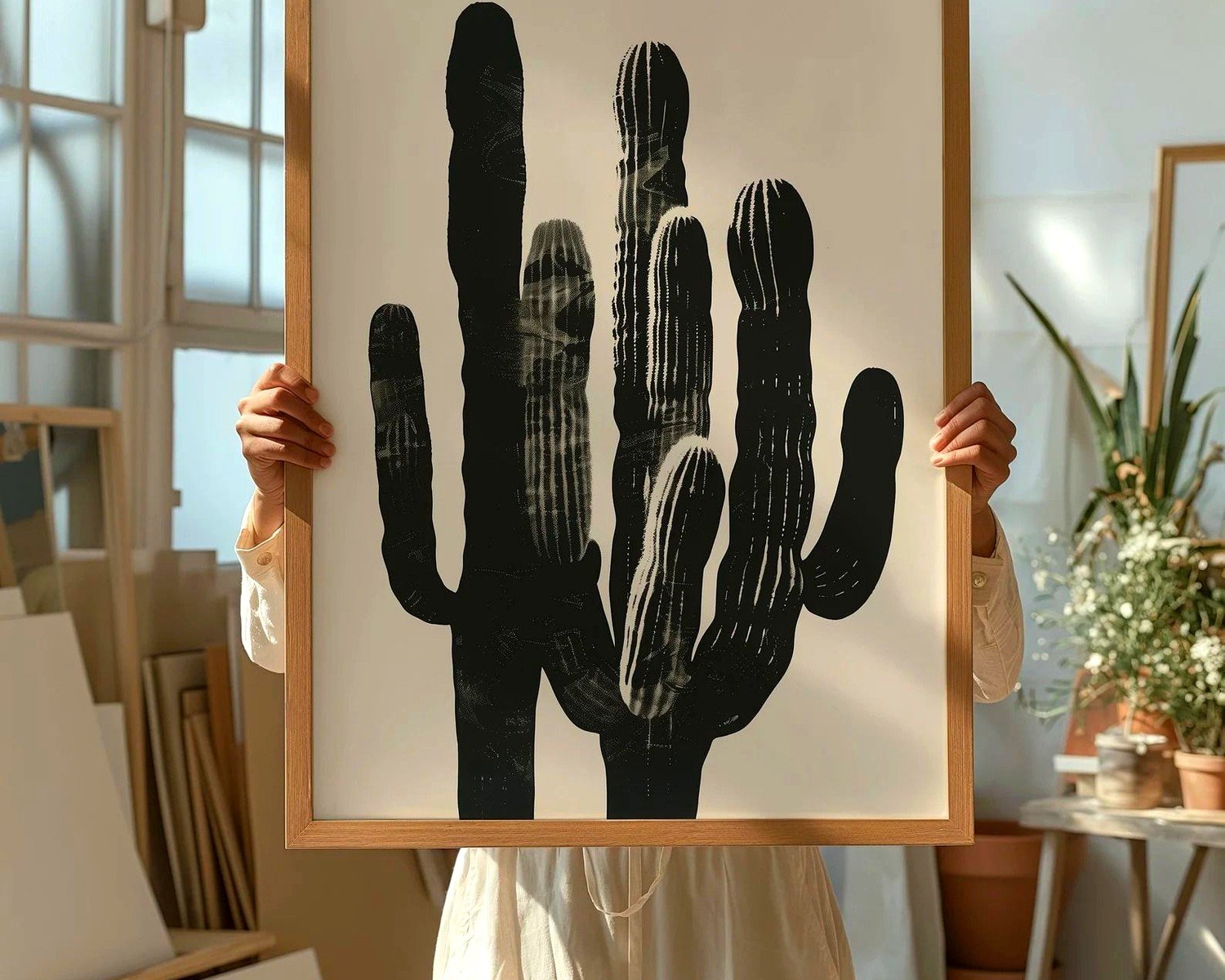
The black and white ones are key because they ground everything. I use them as the largest prints in a gallery wall and then the colored ones as accents. Otherwise it can start looking too busy or like you’re trying too hard with the theme.
Oh and another thing, if your walls are already that trendy terracotta or warm beige color, go heavier on the black and white prints. I made the mistake once of putting all green-toned cactus prints on a peachy wall and it just looked muddy. Learned that lesson the hard way.
Frames That Don’t Ruin Everything
So this is gonna sound weird but the frame matters way more than the actual print sometimes. I’ve seen gorgeous cactus photography completely destroyed by the wrong frame choice.
For Southwest/desert vibes, you want:
- Light natural wood frames (white oak or ash, not that orange-y pine)
- Thin black metal frames for a more modern desert aesthetic
- No frame at all with just a canvas print, but only if it’s really high quality
Skip the ornate frames, skip anything with a rustic distressed finish (it’s too literal), and definitely skip those chunky dark brown frames unless you’re specifically going for like a 1970s ranch house vibe, which actually can work but that’s a whole different thing.
I get most of my frames from Michaels when they’re doing their 50% off sale, which is basically always. The Studio Décor brand is surprisingly decent. Or if you’re doing a bunch of same-size prints, just get the multi-packs from Amazon. I’ve used the Americanflat ones and they’re fine, nothing special but they don’t fall apart.
Gallery Wall Layouts Without Losing Your Mind
Okay so I’m gonna save you so much time here. Forget about trying to make it look “effortlessly eclectic” or whatever design blogs say. That look takes forever to achieve and usually ends up with a ton of holes in your wall.
The easiest layout that always works is a grid. I’m serious. Three rows of three, or two rows of three, all the same size frames. It looks intentional and collected without being stuffy. I did this in my own bedroom with 8×10 cactus botanicals and it took me like 20 minutes to hang once I measured it out.
If you wanna do the asymmetrical gallery wall thing (which I do love, don’t get me wrong), here’s my method:
- Get one large statement piece, like 16×20 or 18×24
- Arrange 4-6 smaller pieces around it, varying between 5×7 and 8×10
- Keep everything within an invisible rectangle shape, even if the arrangement is asymmetrical
- Use painter’s tape on the floor to map it out first, I know it sounds extra but trust me
The painter’s tape trick is something I learned from another stylist and it’s honestly life-changing. You arrange all your frames on the floor in the exact configuration, tape around the whole thing to mark the boundaries, then you can just transfer those measurements to your wall. Way better than the paper template method which never works for me.
Mixing Cactus Art With Other Stuff
So you probably don’t want ONLY cactus prints unless you’re really committing to the theme hard, which is fine but can feel limiting later. I like mixing in other desert elements and textures.
Things that look good with cactus prints:
- Vintage desert landscape photography
- Abstract art in rust, terracotta, or sand colors
- Woven wall hangings or macramé (but like, just one, not ten)
- Black and white architectural photos of adobe buildings
- Simple line drawings of desert animals
My living room has three cactus botanicals, one vintage Joshua Tree print, and this abstract piece that’s basically just rust and cream colored shapes, and they all work together because the color palette is cohesive. That’s the secret honestly, you can mix different subjects if the colors talk to each other.
Wait I forgot to mention, if you’ve got a really modern space, those single-line cactus drawings can look amazing. There’s a ton on Etsy, they’re literally just one continuous line forming a cactus shape. Super minimalist, works great in bedrooms or offices where you want the desert vibe but subtle.
Where to Actually Hang This Stuff
Not every room needs cactus art, obviously, but I’ve found they work particularly well in certain spots. Living rooms are the obvious choice, but I’ve also done really successful cactus galleries in:
Dining rooms – especially if you’ve got a Southwestern or Spanish colonial style table. The botanical vibe feels appropriate with food and entertaining somehow.
Bathrooms – okay hear me out on this. A small cactus print or two in a bathroom adds this spa-like desert retreat feeling. Just make sure they’re properly sealed if it’s a steamy bathroom, or use frames with plexiglass instead of regular glass.
Home offices – the clean lines of cactus botanical prints don’t compete with your workspace but still add personality. I’ve got a simple black and white barrel cactus print above my desk and my dog is currently asleep under it so clearly it creates a calming environment.
Bedrooms – this is where I’d go more subtle with the color palette. Stick to greens, whites, and blacks rather than the coral and terracotta tones. Creates a more restful vibe.
The one place I’d avoid is kitchens, unless you’re really going for it. Something about cactus art in a kitchen feels off to me, like the themes don’t mesh. Better to do herb prints or food-related art there.
Size Guidelines Nobody Tells You
This is gonna sound basic but I see people mess this up constantly. Your art should take up roughly 2/3 to 3/4 of the width of your furniture below it. So if you’ve got a 6-foot sofa, your art arrangement should be about 4 to 4.5 feet wide.
For a gallery wall situation, think of all the frames together as one unit when measuring. And hang the center of your arrangement at eye level, which is usually around 57-60 inches from the floor. I always do 58 inches because I’m average height and it seems to work for most spaces.
Single large prints should be bigger than you think. I used to go too small all the time. Now my rule is if you’re doing one statement piece over a sofa or bed, minimum 24×36. Otherwise it just looks dinky and awkward floating on the wall.
The Digital Download vs Ready-Made Print Debate
So I’ve gone both routes and here’s my honest take. Digital downloads are cheaper and give you more control, but you gotta actually go print them which is another errand and sometimes the colors don’t turn out exactly how they looked on screen.
Ready-made prints from places like Juniper Print Shop or Minted cost more but they’re already color-calibrated and printed on good paper. If you’re only getting like one or two prints, just buy them ready-made. The convenience is worth it.
But if you’re doing a whole gallery wall of 6+ prints, definitely go the digital download route. I just did this for a client’s hallway, bought eight different botanical downloads for like $120 total, had them all printed at FedEx on their premium matte paper for another $80, and we were still way under what buying eight ready-made prints would’ve cost.
The quality difference isn’t as huge as you’d think either. The key is making sure you download the highest resolution file, minimum 300 DPI. Most Etsy sellers offer multiple sizes, just make sure you’re getting the right resolution for your print size.
Styling Around Your Cactus Art
Okay so you’ve got your prints up, now what? The rest of the room needs to support the vibe without being too matchy-matchy. I’m not a fan of like, cactus throw pillows AND cactus art AND a cactus-shaped vase. Pick one or two things and let them shine.
What works well:
- Natural materials like jute, rattan, light wood
- Leather furniture in tan or cognac tones
- Linen textiles in neutral colors
- Terracotta pots with actual plants (doesn’t have to be cacti)
- Woven baskets for storage
- Concrete or stone accents
I styled a reading nook last month with two large cactus prints, a tan leather chair, a chunky knit throw in cream, and a snake plant in a concrete planter. Very desert-modern without being too themed. The client sends me photos of it constantly because she’s obsessed.
One thing I’ve learned is that real plants make a huge difference. Even if they’re not desert plants, having living greenery in the room makes the botanical prints feel more intentional and less decorative. I’ve got a fiddle leaf fig in my living room with all my cactus art and it somehow just works.
Lighting Considerations Nobody Thinks About
This is gonna sound boring but lighting can make or break your cactus art. If you’ve got prints with subtle coloring or detailed botanical illustrations, you need decent lighting on them or they’ll just look dark and muddy.
I’m a huge fan of picture lights for larger pieces. Those little LED strips that mount above the frame make such a difference, especially in rooms without a lot of natural light. You can get battery-operated ones now so you don’t need an electrician.
For gallery walls, make sure you’ve got good ambient lighting in the room. Track lighting or adjustable can lights aimed at the wall work great. Or even just a well-placed floor lamp that casts light upward.
Avoid hanging valuable prints in direct sunlight because they’ll fade over time. I learned this the hard way with a vintage botanical I had in my old apartment, the colors totally washed out after like a year near a west-facing window. If you’ve got a sunny spot, either use UV-protective glass or choose prints that are less precious.
Oh and another thing, this is totally random but I always take photos of my gallery walls during different times of day before finalizing them. Sometimes arrangements that look great in morning light look completely different in evening light, and you wanna make sure it works in both situations.
The whole cactus art thing is really forgiving once you get the basics down. It’s hard to mess up too badly because the subject matter is so clean and graphic. Just keep your color palette consistent, don’t go overboard with the theme, and make sure your frames don’t suck. That’s like 80% of it right there.