Wall Art Guide, Wall Art Tutoriels
Fall Wall Art: Autumn Seasonal Decor & Harvest Themes
Jun
So I’ve been switching out wall art for fall in my own place and like three client spaces this month and honestly the whole autumn decor thing can go really wrong really fast if you’re not careful. Let me just dump everything I’ve learned because I literally just finished hanging stuff yesterday.
The Actually Good Color Palettes Nobody Talks About
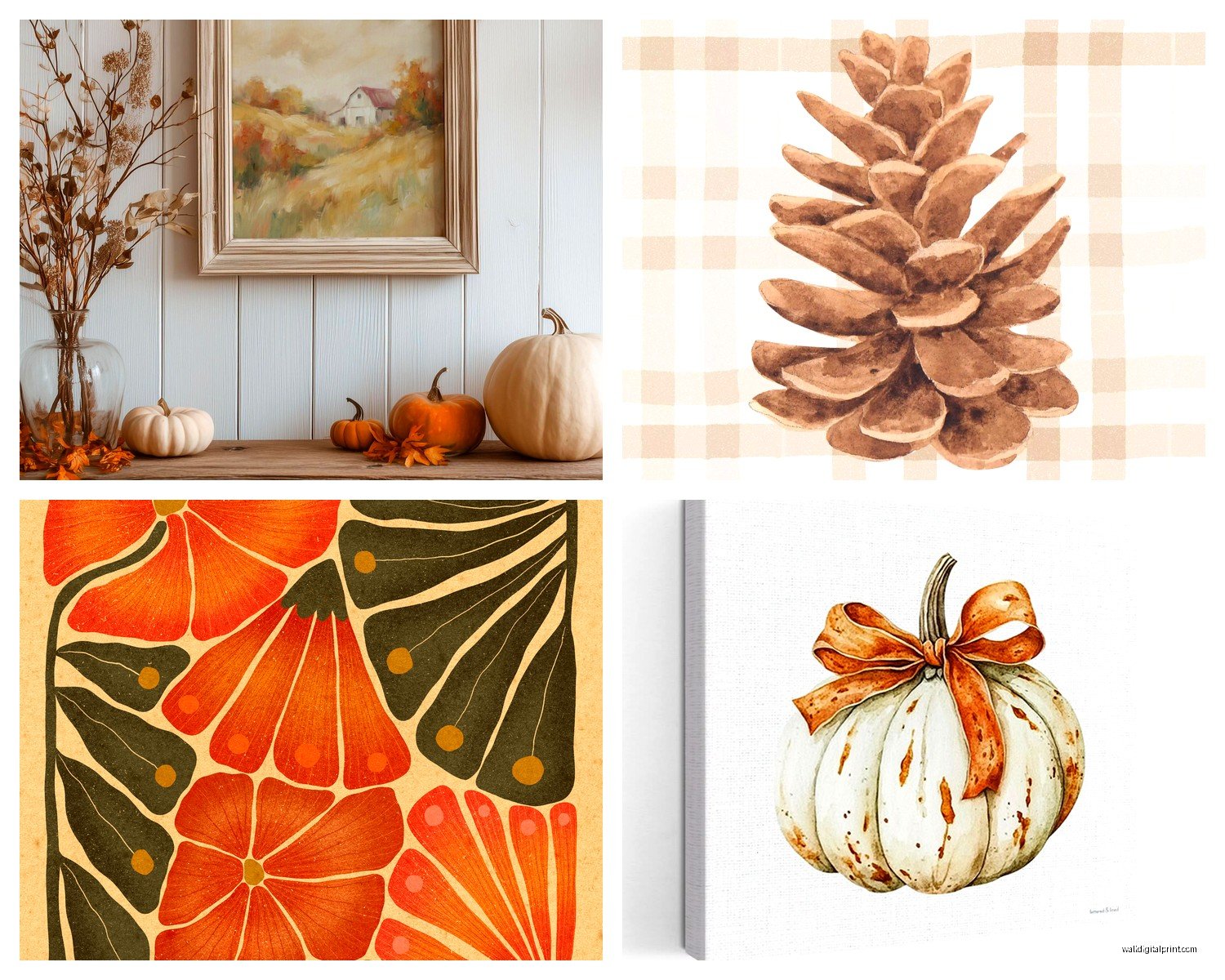
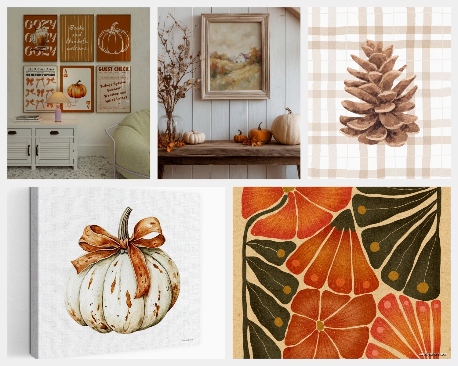
Okay so everyone thinks fall means orange and brown everything but that’s gonna make your space look like a Halloween store threw up. What actually works – and I tested this in my dining room last week – is picking ONE warm tone and pairing it with neutrals. Like burnt sienna with cream and maybe one pop of deep teal or forest green. My cat knocked over my coffee while I was planning this out and the stain actually showed me a better color combo than what I was going for, so thanks Luna I guess.
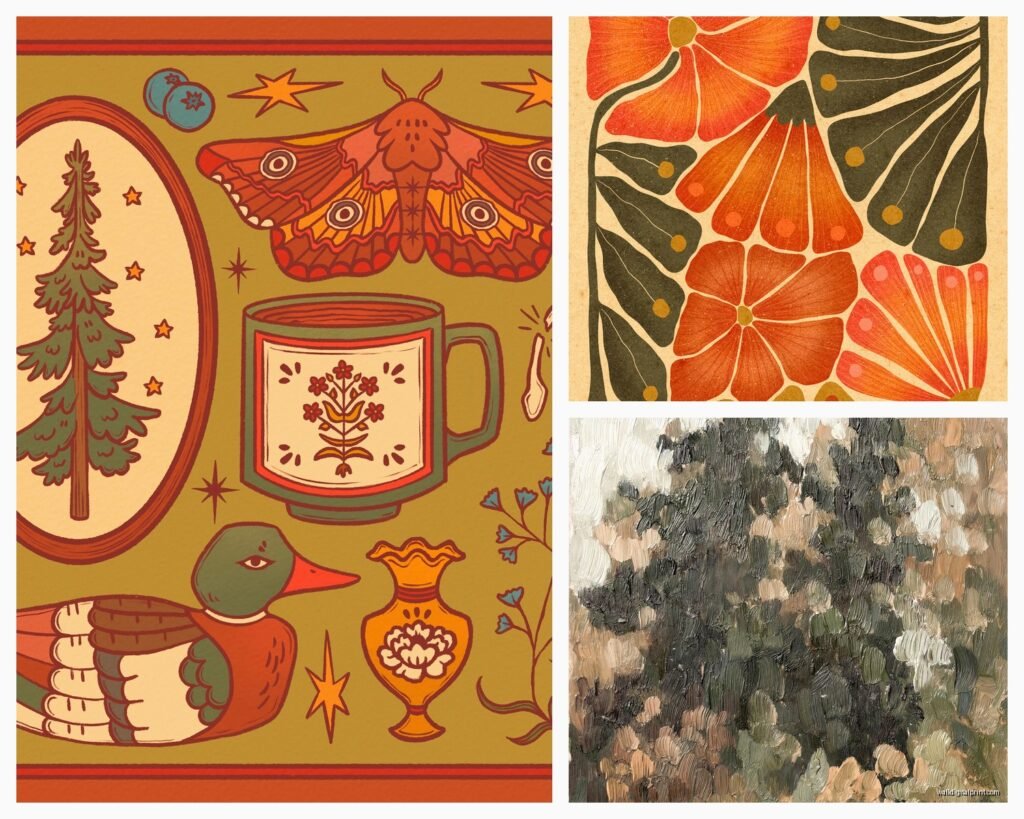
The rust and sage combination is having a moment and it’s actually deserved. I hung three pieces in varying sizes with this palette and it doesn’t scream FALL IN YOUR FACE but it definitely shifts the mood. You want people to feel autumn not be assaulted by it.
Deep plum is criminally underused for fall. Pair it with gold accents and suddenly you’ve got something that works from September through November without looking dated. I found this out accidentally when a client rejected my orange-heavy mockup and I had to scramble.
What Actually Works Size-Wise
Here’s where people mess up constantly – they buy art that’s too small. If you’re doing a fall gallery wall, your anchor piece needs to be AT LEAST 24×36 inches. I spent like two hours last weekend rearranging my client’s pieces because she bought everything in 8×10 and it just looked sad and choppy against her beige wall.
For over a couch or console table, you want your art to take up about two-thirds to three-quarters of the furniture width. I know that sounds like a lot but trust me. I’ve rehung so many pieces because clients go too small and then the whole room feels unbalanced.
If you’re doing a single statement piece, go big or go home. Like 40×60 inches kind of big. Fall imagery has a lot of visual detail – leaves, harvest scenes, landscapes – and when you shrink it down too much it loses impact and just becomes muddy looking.
The Three-Piece Formula That Never Fails
This is gonna sound weird but I have a formula I use for literally every fall arrangement. One landscape or nature scene (this is your anchor), one abstract piece in complementary colors, and one text-based or minimal piece. The variety keeps it from feeling too themed or costume-y.
I did this in my hallway with a misty autumn forest photo, an abstract with rust and cream brushstrokes, and a simple line drawing of wheat stalks. Takes like five minutes to arrange and looks way more curated than matching pumpkin prints.
Harvest Themes Without Looking Like a Farmhouse Exploded
Oh and another thing – harvest imagery can be really sophisticated if you avoid certain traps. Skip anything with words like “blessed” or “gather” unless you’re specifically going for that farmhouse vibe. Which is fine if you are but most people want something a bit more subtle.
Wheat, barley, and dried grass prints are chef’s kiss for fall. They’re recognizably autumnal but not cutesy. I found this incredible botanical-style print of wheat stems with the scientific names labeled and it’s been my most complimented piece. Looks expensive, was like forty bucks.
Pomegranates and figs make gorgeous subjects and read as harvest season without being obvious. There’s this Turkish artist I follow who does these deep moody still lifes with fall fruits and they’re stunning. Way more interesting than another pumpkin patch scene.
What To Avoid Completely
Anything with cartoon pumpkins unless you have kids and that’s the vibe. Live laugh pumpkin spice type stuff – just no. Those felt letter boards with fall sayings – they’re gonna date your space so fast.
Also skip the super orangey orange. Like traffic cone orange. It doesn’t exist in nature during fall anyway and it’s harsh on the eyes. If you want orange go for terracotta or burnt orange or even a peachy situation.
Where To Actually Buy This Stuff
Okay so I’ve tested a bunch of sources because my client canceled yesterday so I spent an hour comparing options instead of billing anyone which was definitely a good use of time.
Society6 has independent artists and you can get prints, canvases, or framed pieces. Quality is solid for the price point. I’ve ordered probably fifteen pieces from there over the years. The autumn photography section is really strong right now.
Etsy is obvious but you gotta be careful with print quality. Always read reviews and check if they’re actually printing in-house or dropshipping. I got burned once with a grainy mess that looked nothing like the listing photo. But when you find a good seller it’s gold. Search for “modern fall art” or “contemporary autumn print” to avoid the crafty stuff.
Minted has gorgeous stuff but pricier. Their fall landscape collection is beautiful though and the framing options are actually good quality. I use them for clients with bigger budgets.
Target’s Threshold line does seasonal art that’s surprisingly decent. I bought two pieces last fall and they’re still hanging in my guest room. They won’t wow anyone but they’re not embarrassing either and they’re like twenty bucks.
Wait I forgot to mention – check local artists and craft markets. I found this woman at a farmers market who does pressed leaf compositions under glass and they’re incredible. Way more unique than anything mass produced.
DIY Options That Don’t Look DIY
If you’re crafty at all, pressing and framing actual fall leaves is stunning when done right. Use heavy books, give them like two weeks to fully dry, then frame them in simple black or wood frames with white matting. Looks expensive and collected.
Print your own photos if you’ve got decent ones. I took pictures at this orchard last October and printed three of them in black and white at 16×20. Framed them identically and hung them as a triptych. Everyone thinks I bought them from a gallery.
Abstract fall art is stupid easy to make. Get a canvas, some acrylic paint in fall colors, and literally just layer and blend. It doesn’t have to be perfect – abstract means there’s no wrong way. I made one while watching that new true crime series and it turned out way better than the fifty dollar print I was considering.
Hanging and Arrangement Strategies
This is where people really struggle and honestly it’s more about the hanging than the actual art sometimes. Eye level is 57-60 inches from the floor to the center of your artwork. This is like a universal gallery standard and it works.
For gallery walls, lay everything out on the floor first. Take a picture. Move stuff around. Take another picture. I literally do this every single time because once you put holes in the wall you’re committed. Keep pieces 2-3 inches apart for a cohesive look.
Use a level. I know it seems obvious but I’ve seen so many crooked pieces in client homes and it ruins everything. Even slightly off is noticeable. I keep a small level in my bag specifically for this.
The Ledge Hack
Picture ledges are your friend for seasonal decor because you can swap things out without making new holes. I put one up in my living room and just rotate different prints throughout fall. Takes five minutes and no commitment.
You can layer pieces on ledges too which adds dimension. Put a larger piece in back and a smaller one leaning in front. Add a small pumpkin or some dried flowers and suddenly it’s a whole vignette situation.
Making It Work With Your Existing Stuff
This is crucial – your fall art needs to work with what you already have. If your space is modern and minimal, go for simple line drawings or abstract pieces in fall colors. If you’re more traditional, landscape paintings or vintage botanical prints fit better.
I had a client with a really contemporary gray and white living room who wanted fall decor. We did a massive black and white photograph of birch trees with just a hint of golden leaves. It added warmth without clashing with her aesthetic.
Your frames matter as much as the art. Black frames are safe and modern. Wood frames add warmth. Gold or brass frames make things feel more formal and traditional. I usually stick with one frame color per room unless I’m doing a really eclectic gallery wall.
Lighting Makes a Huge Difference
Nobody talks about this enough but lighting can make or break your fall art. If you’ve got a piece with warm tones, warm white bulbs (2700-3000K) will make it glow. Cool white lighting can make fall colors look muddy and weird.
Picture lights are extra but they’re not that expensive and they make art look intentional. I installed one over my big autumn landscape piece and now it’s like a focal point instead of just wall decoration.
Natural light considerations too – if your art is in direct sunlight, it’s gonna fade. Use UV-protective glass if the piece is important or expensive. I learned this the hard way with a print that turned basically sepia within a year.
Rotating Through the Season
You don’t have to put everything up at once. I actually swap things out as fall progresses. Early September I go lighter – maybe some subtle wheat prints and soft landscapes. October I add richer colors and more obvious harvest imagery. November I shift toward more muted, cozy stuff.
This keeps your space from feeling stale and gives you something to do when you’re bored. Plus you can store pieces more easily if you’re not trying to display everything simultaneously.
Quick Fixes for Common Problems
If your fall art feels too dark, add white matting. It instantly brightens and modernizes the look. I did this with three vintage autumn prints that were feeling heavy and it totally transformed them.
If everything feels too matchy, throw in something unexpected. I added a piece with just a hint of coral to my rust and cream arrangement and it made everything more interesting. Rules are meant to be broken and whatever.
When pieces feel disconnected, repeat one element across all of them. Could be the frame color, could be one accent color that appears in each piece, could be the subject matter. I used gold frames for all my fall pieces even though the art itself is different styles and it tied everything together.
If your arrangement feels boring, go asymmetrical. Instead of centering everything, offset your main piece and balance it with smaller pieces on one side. Creates more visual interest and feels less formulaic.
The whole point is making your space feel intentional for the season without looking like you bought out the entire autumn section at HomeGoods. Less is honestly more here and you want people to notice your good taste not just notice that it’s fall.