Wall Art Guide, Wall Art Tutoriels
Quote Wall Art: Inspirational Typography & Sayings
Jun
So I’ve been setting up quote wall art for clients for like three years now and honestly it’s one of those things that looks super easy until you actually try to hang something that says “Live Laugh Love” and realize you’ve created a Pinterest fail in your own home.
The Typography Thing Everyone Gets Wrong
Okay first thing – font weight matters SO much more than you’d think. I had this whole situation last month where I bought what I thought was this gorgeous minimalist print that said “Begin” and when it arrived the letters were so thin they literally disappeared against my client’s textured wall. You need to think about your wall color and texture before you even click buy. Dark walls need either white or really bold colored text with thick fonts. Light walls can handle those delicate script fonts everyone loves but honestly even then I usually go for medium weight at minimum.
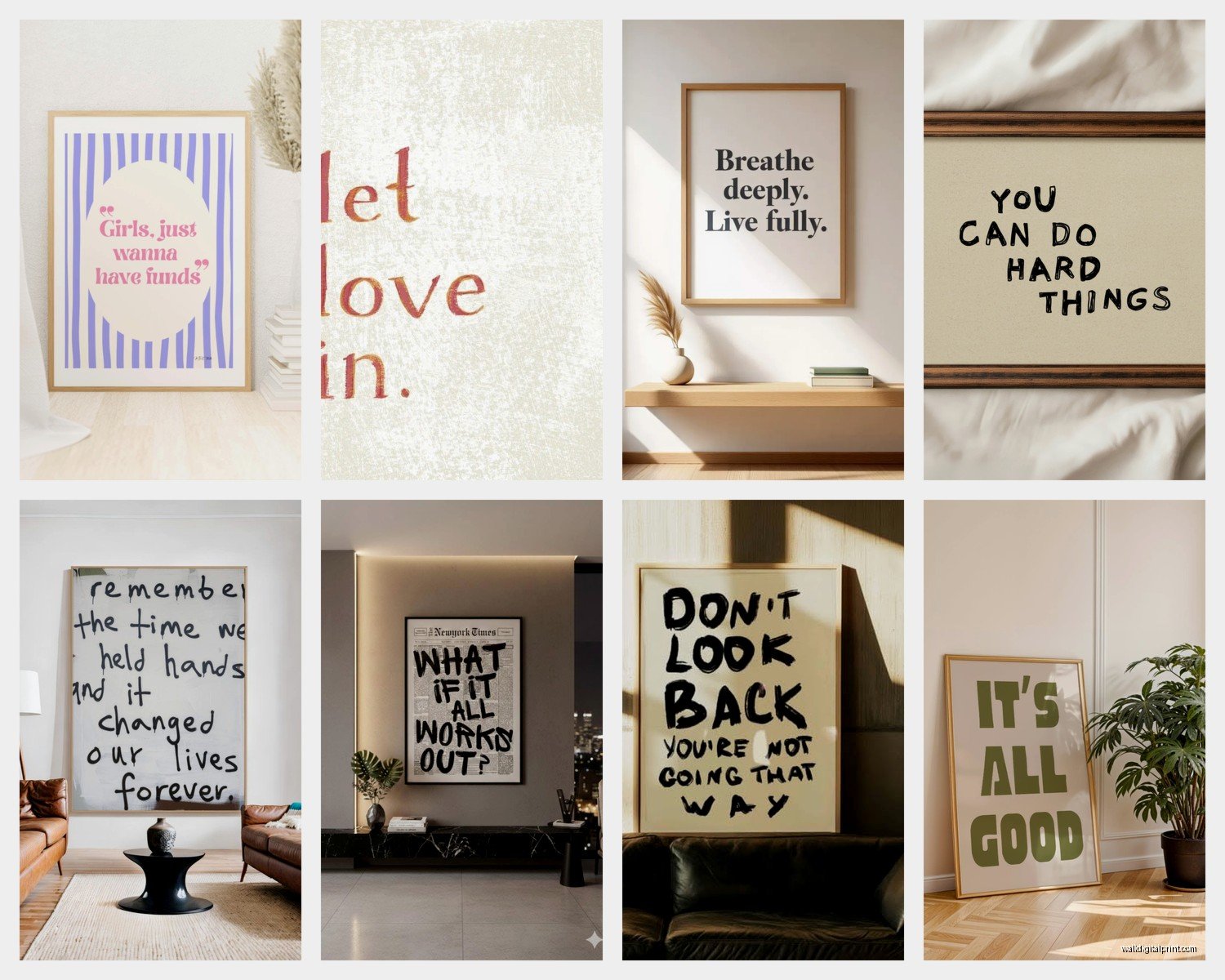
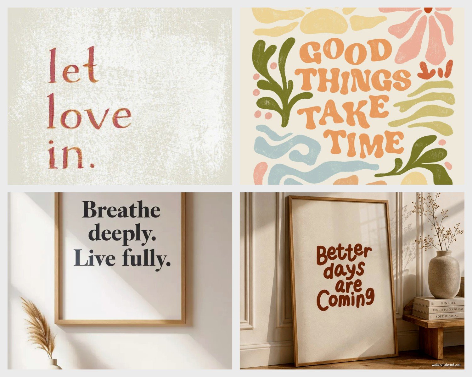
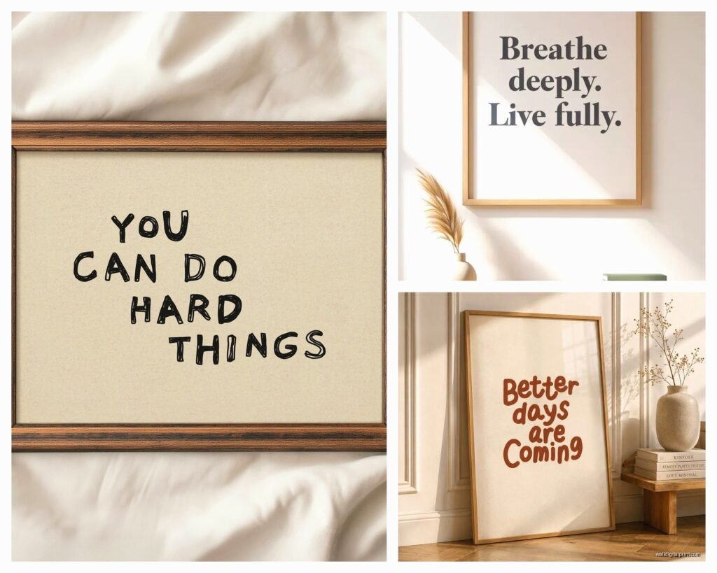
And script fonts… look they’re beautiful but if you can’t read it from across the room it’s just squiggly lines. I keep a rule now that if the quote is more than three words, no script. Just don’t do it. Block letters, sans serif, maybe a nice clean serif font. Save the fancy calligraphy for single words like “Breathe” or “Home” where people’s brains can fill in the gaps.
Size Is Literally Everything
This is gonna sound weird but I measure everything with painter’s tape now before buying. Cut out the exact dimensions on the wall with tape and live with it for like two days. Because what looks massive in the product photo is usually way smaller in real life and vice versa.
For over a couch or bed you want something that’s at least two-thirds the width of the furniture. I learned this the hard way when I hung an 11×14 print above my friend’s king bed and it looked like a postage stamp. Now I tell people to go 40-60 inches wide for those spaces minimum. Either one large piece or a gallery wall situation that fills that visual space.
Single walls or narrow spaces you have more flexibility but honestly anything under 16×20 tends to look a bit lost unless you’re doing a tight gallery wall with multiple pieces.
The Gallery Wall Math Nobody Tells You
Oh and another thing about gallery walls with quotes – odd numbers always look better. Three pieces, five pieces, seven if you have a really big wall. And they don’t all have to be quotes? Like I mix in abstract prints or simple line drawings because all text gets overwhelming and kinda preachy honestly.
Space them 2-3 inches apart. I use this trick where I trace all the frames on kraft paper, cut them out, and tape the paper to the wall first. Rearrange until it looks right THEN measure and mark for the actual nails. Saved me so many extra holes in the wall.
What Quotes Actually Work vs What’s Cringe
Okay real talk – some quotes are just done. “Live Laugh Love” had its moment and that moment was 2012. Same with “Gather” and honestly most one-word commands are getting tired unless they’re really specific to your situation.
What actually works now:
- Full sentences that sound like something a real person would say – not generic inspiration
- Literary quotes from actual books or poems with the author attribution
- Song lyrics that mean something specific to you
- Inside jokes or phrases specific to your family
- Foreign language phrases if you have an actual connection to that language
I’m working with this couple right now who has a print in their kitchen that just says “We’re gonna need a bigger boat” from Jaws because they’re both obsessed with that movie and cook together constantly and it makes me smile every time I see it because it’s THEM not just generic home decor.
Versus I had another client who wanted Chinese characters for “peace” in her bathroom and she doesn’t speak Chinese and has never been to China and I was like… maybe let’s find something else? It just feels weird.
Material Choices That Actually Matter
Canvas prints are having a moment but they collect dust like crazy and you can’t really clean them easily. I prefer framed prints with glass or acrylic because you can actually wipe them down. My dog sheds everywhere so this is non-negotiable for me.
Metal prints are actually really cool for modern spaces – the quote gets printed directly on aluminum and it’s this crisp industrial look. They work great in kitchens or bathrooms because moisture doesn’t affect them. Had one in my own kitchen for two years now and it still looks brand new.
Wood prints give you that rustic farmhouse vibe which is still popular in certain areas. The text gets printed or burned into real wood. They’re heavy though so make sure you have proper wall anchors. I watched one fall off a client’s wall during installation because we used regular nails… it was not great.
Acrylic prints are like the fancy option – super modern, the text appears to float, really glossy. But they show fingerprints like CRAZY and they’re expensive. Only recommend if you’re committed to the look and won’t have kids touching them constantly.
Color Psychology That’s Not Total BS
Wait I forgot to mention – the color of your text matters for the vibe of the room and this is where I see people mess up constantly.
Black text feels formal and classic. Works everywhere but can feel heavy in small spaces or rooms without much natural light. White or cream text feels airy and modern but needs a darker background obviously.
Colored text is tricky. I usually stick to:
- Navy or dark gray instead of black for something softer
- Warm metallics like gold or copper in bedrooms and living rooms
- Cool metallics like silver in bathrooms and kitchens
- Muted earth tones like terracotta or sage in boho or natural style spaces
Bright colors are hard to pull off unless your whole room is designed around them. I had this phase where I thought hot pink quotes would be fun and quirky… they just looked like they were yelling at me.
Where to Actually Buy This Stuff
Etsy is still my go-to because you can find custom options and support actual artists. Search for “digital download” if you want to print it yourself at a local print shop which is usually cheaper for larger sizes. Just make sure the file is high resolution – at least 300 DPI for printing.
Society6 and Redbubble have tons of options from independent designers. The quality is pretty consistent and they do sales constantly so never pay full price. Sign up for emails and wait.
For custom quotes with your own text I’ve used Minted and Artifact Uprising. Both have good quality but Minted is pricier. Artifact Uprising has this thing where you can create quote prints from Instagram captions which is actually kinda cool if you have meaningful captions.
Target and HomeGoods are hit or miss. You’ll find stuff but it’s usually pretty generic. Good for filler pieces in a gallery wall but probably not your statement piece.
Amazon is… fine? The quality varies wildly. Read reviews carefully and check if you can return it. I’ve gotten some surprisingly good prints and some absolute garbage all from the same platform.
The Custom Route
If you want something totally unique find a local calligrapher or graphic designer. It costs more upfront – usually $150-400 depending on complexity – but you get exactly what you want in your colors, your size, your font. I did this for my entryway with a quote from my grandmother and I literally tear up sometimes when I see it which sounds dramatic but whatever it’s meaningful.
Placement Rules I Actually Follow
Eye level is around 57-60 inches from the floor to the center of the artwork. This is museum standard and it actually works in homes too. Exception is if you’re hanging above furniture then you want 6-8 inches above the furniture piece.
In hallways I go a bit higher especially if it’s a narrow hallway where you’re not stopping to look at the art you’re just walking past it.
Bathrooms are tricky because of moisture – keep prints away from direct shower spray. I like putting quotes on the wall opposite the mirror or on a small wall next to the toilet (sounds weird but you’re literally sitting there with nothing to look at so why not).
Mixing Quotes with Other Art
This is where it gets fun – you don’t need a wall that’s ALL quotes. Actually please don’t do that because it feels like you’re being lectured by your walls.
I mix quotes with:
- Abstract art in complementary colors
- Photography especially black and white
- Botanical prints
- Simple line drawings
- Maps if the quote relates to travel
The quote becomes like an anchor piece and everything else supports it visually. In my living room I have one large quote print about adventure surrounded by photos from trips and some abstract pieces in blues and greens. It tells a whole story instead of just shouting words at people.
Frames Make or Break the Whole Thing
Cheap frames look cheap – this is just true and I wish it wasn’t. You don’t need to spend hundreds but those $8 plastic frames from the drugstore will make even expensive art look bad.
My goto frame sources are IKEA for basic black and white options, Target’s Threshold line for mid-range, and Framebridge for custom if budget allows. Michael’s and Hobby Lobby always have 50% off coupons so use those.
Match your frame finish to other metals in the room – if you have brushed nickel light fixtures don’t get shiny silver frames. If you have black iron curtain rods go with matte black frames. It’s a small detail but it makes everything feel intentional instead of random.
For a cohesive gallery wall stick to one frame color even if you vary the sizes and styles. All black, all white, all natural wood – it ties everything together.
Lighting That Makes Text Actually Readable
Natural light is obviously ideal but you gotta think about glare. Glass covered prints will reflect light at certain angles and suddenly your inspirational quote is just a glare blob. Matte finishes or non-reflective glass help with this.
If you’re hanging quotes in a dim hallway or room without windows consider adding a picture light above it or positioning it where a lamp highlights it. Text needs good light to be readable and if people can’t read it what’s even the point.
I’m watching this show right now about home renovations and they always forget about lighting art and it drives me crazy but anyway – yeah lighting matters more than people think.
The Maintenance Nobody Talks About
Dust your quote art regularly especially canvas and wood prints. I use a microfiber cloth for glass covered prints and a soft brush for textured surfaces. Once a month is usually enough unless you live somewhere really dusty.
Sun fading is real – if your quote art is in direct sunlight it will fade over time. UV protective glass helps but it’s expensive. Easier to just rotate art seasonally or accept that it might need replacing every few years.
Check that your hanging hardware is secure every six months or so. Especially in humid climates things can loosen up. Takes two seconds and prevents that horrible moment when art crashes off the wall at 3am.
Trends I’m Seeing Right Now
Minimalist single words or very short phrases are big right now. Like just “Rest” in a bedroom or “Savor” in a kitchen. Clean sans serif fonts, usually black on white or vice versa.
Neon signs with quotes are having a moment but they’re pricey and trendy so I’d only invest if you really love the look. LED signs are cheaper and give similar vibes.
Vintage-style typography with that letterpress look is still popular especially in farmhouse or industrial spaces. Think old advertising aesthetics.
Custom family name prints or coordinates of meaningful places – these feel more personal than generic inspiration and they’re not going out of style because they’re specific to you.
Foreign language quotes are still around but like I said earlier make sure you have an actual connection to the language otherwise it’s kinda appropriation-y and weird.
The anti-inspiration movement is also happening where people are putting up funny or sarcastic quotes instead of earnest ones. Saw one recently that said “I hope this email doesn’t find me” and honestly that’s more relatable than “Choose Joy” sometimes.
Anyway that’s basically everything I know about quote wall art from actually doing this a million times. Start with one piece that really speaks to you, get the size right, frame it properly, and go from there. Don’t overthink it but also don’t just buy whatever’s on sale if it doesn’t actually mean something to you because you’ll get sick of looking at it real fast.