Wall Art Guide, Wall Art Tutoriels
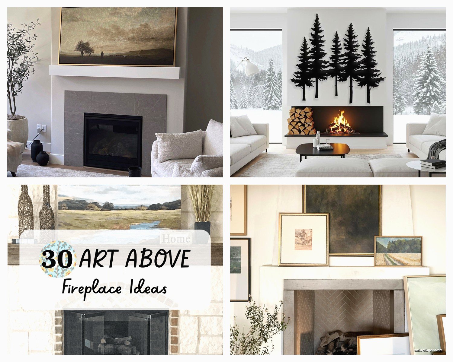
Fireplace Wall Art: Mantel & Hearth Focal Point Decor
Jun
So I’ve been styling fireplace mantels for like seven years now and honestly it’s one of those things that looks way harder than it actually is. The main thing people get wrong is they either go too matchy-matchy or they throw random stuff up there and wonder why it looks like a yard sale.
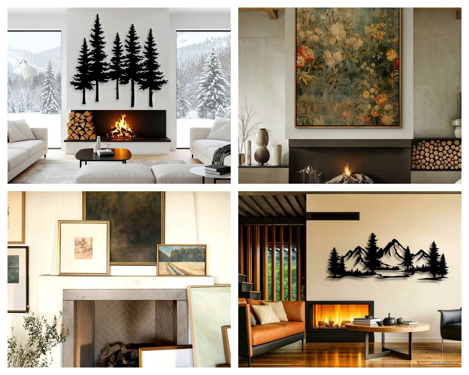
Let me just start with the actual wall above the fireplace because that’s usually where everyone panics first. The golden rule I always tell people is that whatever you hang there needs to be proportionate to the mantel width. Like, if your mantel is 60 inches wide, your art or mirror or whatever should be somewhere between 40-50 inches wide. Not a tiny 16×20 print that looks like it’s floating in space, you know?
I had this client last month who bought this gorgeous abstract piece but it was like 24 inches wide on a 72-inch mantel and we had to… it just didn’t work. We ended up doing a gallery wall instead which actually leads me to something important – you don’t HAVE to do one single piece. A gallery wall above a fireplace can be amazing if you follow some basic rules.
For gallery walls over mantels, keep everything within an imaginary rectangle. Don’t let pieces drift too far out to the sides or it looks chaotic. I usually map it out on the floor first (my cat loves to sit right in the middle of these layouts, it’s super helpful). Start with your largest piece slightly off-center, then build around it with smaller pieces. Keep about 2-3 inches between frames.
Oh and another thing – the bottom of your art should sit about 4-6 inches above the mantel. Not right on top of it, not floating a foot above it. That 4-6 inch sweet spot just works visually. I don’t make the rules, it’s just one of those design things that’s been proven over and over.
Now for the actual mantel styling, this is where it gets fun. I use the triangle method which sounds complicated but it’s really not. Basically you want to create visual triangles with your objects so your eye moves around naturally. Like if you have a tall candlestick on the left, maybe a medium-height vase in the middle, and some stacked books on the right. Your sight line bounces around instead of just going flat across.
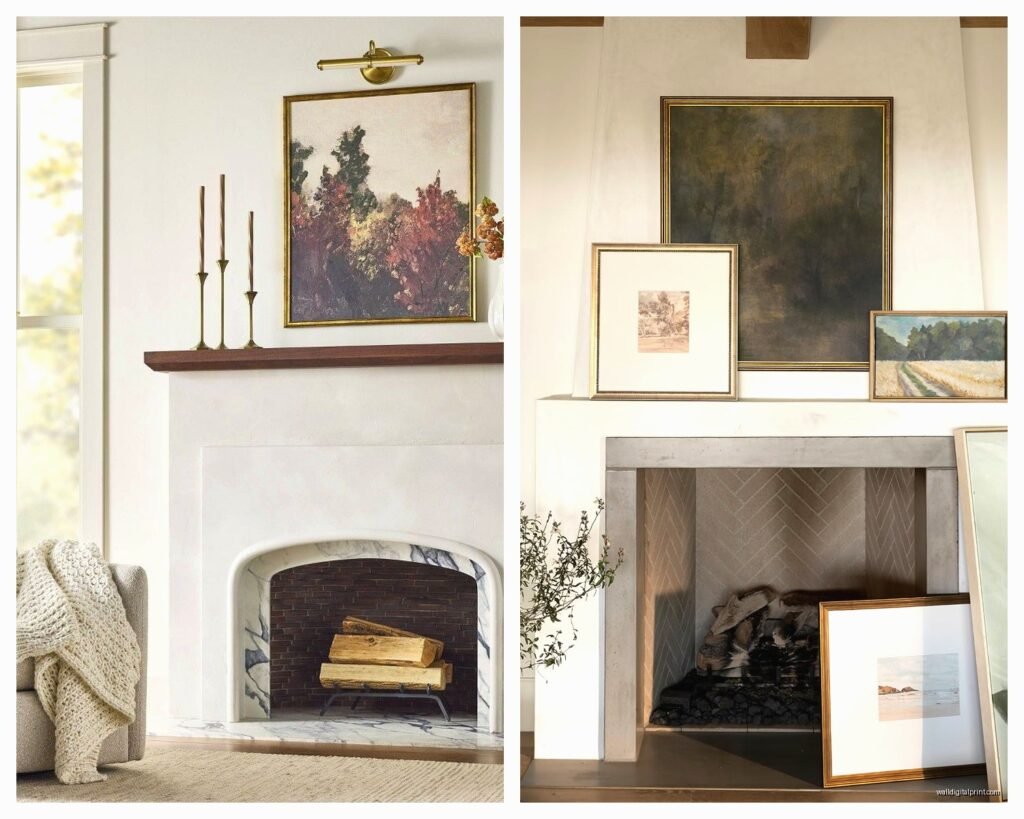
Layering is everything. I always start with something leaning against the wall – could be a piece of art, a mirror, even a cool cutting board or vintage window frame. Then you build forward from there. So like, lean a medium-sized framed print, put a small plant or candlestick in front of it, maybe stack 2-3 books next to that. It creates depth instead of everything being in a straight line.
Wait I forgot to mention – odd numbers are your friend. Three candlesticks look better than two or four. A group of five small objects is more interesting than six. It’s weird but it works and I stopped questioning it years ago.
For color palette, pick like 2-3 main colors and stick with them. My go-to combo lately has been warm whites, natural wood tones, and one accent color (usually terracotta or deep green depending on the season). You can swap out that accent color without redoing the whole mantel. I literally just did this in my own living room last week and it took maybe ten minutes.
Texture is super important too and people forget about this. If everything is smooth ceramic or glass it feels cold. Mix in some wood, maybe a woven basket, plants (real or fake, I’m not gonna judge), linen-wrapped books, a chunky knit throw draped over one end. The variety makes it feel collected and intentional instead of like you bought everything in one trip to HomeGoods.
Speaking of plants, they’re honestly the easiest way to make a mantel look expensive and curated. Eucalyptus stems in a simple vase, a trailing pothos, even just some branches from outside in a tall vessel. I buy fake eucalyptus from nearly natural and it’s looked the same for three years now which is… actually kind of amazing.
Okay so funny story, I was watching this restoration show the other night and they had this gorgeous stone fireplace but they hung the TV above it and I just… anyway, if you’re gonna do a TV above the fireplace (which I know people have opinions about), you gotta work with it not against it. Frame it with sconces on either side, or do floating shelves flanking the fireplace with symmetrical styling. Make the TV part of the design instead of this black rectangle everyone’s trying to ignore.
For non-TV situations, mirrors above fireplaces are classic for a reason. They reflect light, make the room feel bigger, and they’re neutral enough that you can change your mantel styling without worrying about clashing. I love an oversized leaning mirror, like 40×60 inches, just propped against the wall. It feels more relaxed than hanging it perfectly centered.
Seasonal styling is where you can have fun without committing to anything permanent. I keep my base layer the same year-round – that’s usually the art/mirror, maybe two candlesticks, a permanent vase or sculptural object. Then I swap in seasonal stuff. Fall gets mini pumpkins and dried grasses, winter gets greenery and pine cones, spring gets fresh flowers and lighter colors, summer gets… honestly I usually just add more plants in summer.
The height thing trips people up constantly. You want varying heights but not like, crazy varying. If your tallest object is 18 inches, your shortest shouldn’t be 3 inches. Keep it within a reasonable range. I usually work in a 6-14 inch range for most mantels, with maybe one taller piece (like 20 inches) as an anchor.
Books are your secret weapon. You can use them to add height under objects, you can stack them horizontally, you can stand them vertically between bookends. I hit up thrift stores for hardcovers in neutral colors and just remove the dust jackets. Instant mantel styling for like two bucks a book.
One thing I gotta mention because I see this mistake ALL the time – don’t push everything to the back edge of the mantel. Bring some pieces forward. It creates that layered look I was talking about and it doesn’t feel so… lined up? Like you’re not creating a police lineup of decorative objects, you’re creating a vignette.
For really wide mantels (like over 6 feet), you might want to do symmetrical groupings on each end with something in the middle. So like, matching candlesticks and a small plant on each side, then a larger centerpiece – could be a big vase with branches, a lantern, stacked books with something on top. This works especially well in more traditional spaces.
Modern mantels can be super minimal which honestly makes them easier in some ways. Like, one amazing sculptural piece, two candlesticks, done. You don’t need to fill every inch of space. Sometimes less is actually… yeah, less is fine.
Oh wait, lighting is something I should probably mention. If you have sconces flanking your fireplace, use them. They add ambiance and also create that triangle composition I talked about earlier. If you don’t have built-in lighting, battery-operated LED candles are actually really good now. I was skeptical but the ones with timers and realistic flicker are kinda perfect for mantels, especially if you have kids or pets and don’t want open flames.
The hearth itself is usually forgotten but you can style that too. A big basket with blankets, a set of modern fireplace tools, a couple of oversized floor candles if you don’t actually use the fireplace. Just don’t clutter it because it’s also a functional space and you need to be able to access the fireplace if you use it.
For art specifically, abstract works really well above fireplaces because they don’t compete with the architectural element. Landscapes can work too, but portraits can feel weird – like someone’s watching you which is… anyway. Black and white photography is always a safe choice and works with basically any decor style.
If you’re renting or don’t want to put holes in the wall, there are these really good picture ledges you can mount to the wall (okay yes that’s still holes but way fewer). Then you can lean multiple pieces of art and swap them out whenever. It’s more flexible than committing to hanging something permanently.
Size-wise for leaning art on the mantel itself, I usually go with something that’s about 2/3 the width of the mantel and 18-30 inches tall. Big enough to make a statement but not so big it’s gonna fall forward and break.
The whole fireplace area should feel balanced with the rest of the room. If your mantel is super ornate and busy, keep your furniture and other decor simpler. If you have a really minimal modern fireplace, you can go bolder with your mantel styling and art choices.
I think the biggest mistake people make is overthinking it. Start with a few key pieces you actually love, arrange them, step back, adjust. Take a photo because sometimes you can see issues in a photo that you miss in person. Move stuff around until it feels right. There’s no perfect formula and what works in my house might not work in yours.
Also don’t be afraid to shop your house. That vase in the guest room might be perfect on the mantel. The cutting boards in your kitchen could be cool propped up there. The art in your hallway might actually work better above the fireplace. I restyle my own mantel probably every six weeks just because I get bored and start moving stuff around while I’m on phone calls.
One last thing – scale matters more than you think. Tiny objects on a big mantel look lost. Huge objects on a small mantel look overwhelming. When in doubt, go slightly bigger than you think you need. A piece that’s a bit too large reads as intentional and bold. A piece that’s too small just looks like a mistake.