Wall Art Guide, Wall Art Tutoriels
Gallery Wall Art Prints: Curated Multi-Frame Collections
Jun
So I just spent like three hours hanging frames in a client’s hallway and honestly my arms are still sore but I learned SO much about gallery walls that actually work versus the Pinterest disasters we’ve all seen.
The Layout Thing Everyone Gets Wrong
Okay first thing – you gotta plan this on the floor. I know, I know, everyone says that but seriously last month I tried to wing it and ended up with like 47 nail holes in my office wall. My cat Oscar kept sitting on the frames while I was arranging them which was annoying but also kinda helpful because it forced me to slow down.
Start with your biggest piece as the anchor. This is usually gonna be around 16×20 or 18×24 depending on what you bought. Put it slightly off-center, not dead center – that’s the trick literally nobody tells you. Then build around it with smaller pieces. I usually do a mix of 8x10s and 5x7s with maybe one or two 11x14s thrown in.
The spacing between frames should be consistent – I use 2-3 inches between each frame. Got a level app on your phone? Use it. The cheap bubble levels from the hardware store are… not great. Found that out the hard way when everything looked perfect until I stepped back and realized the whole thing tilted left like a sinking ship.
Frame Colors That Don’t Make You Look Like You Tried Too Hard
Here’s where people get weird – they think everything needs to match perfectly. It doesn’t. Actually it looks better when it doesn’t? I usually stick to two frame colors max though. Black and natural wood is like the safest combo and works in literally any room. All black is dramatic and modern. All white can work but it needs colorful art or it just disappears into the wall.
Mixed metals are tricky. Gold and silver together can look amazing or completely chaotic depending on your art choices. I did a gallery wall last year with brass frames and it was gorgeous but the client had really warm lighting which helped. In a cool-toned room it would’ve looked off.
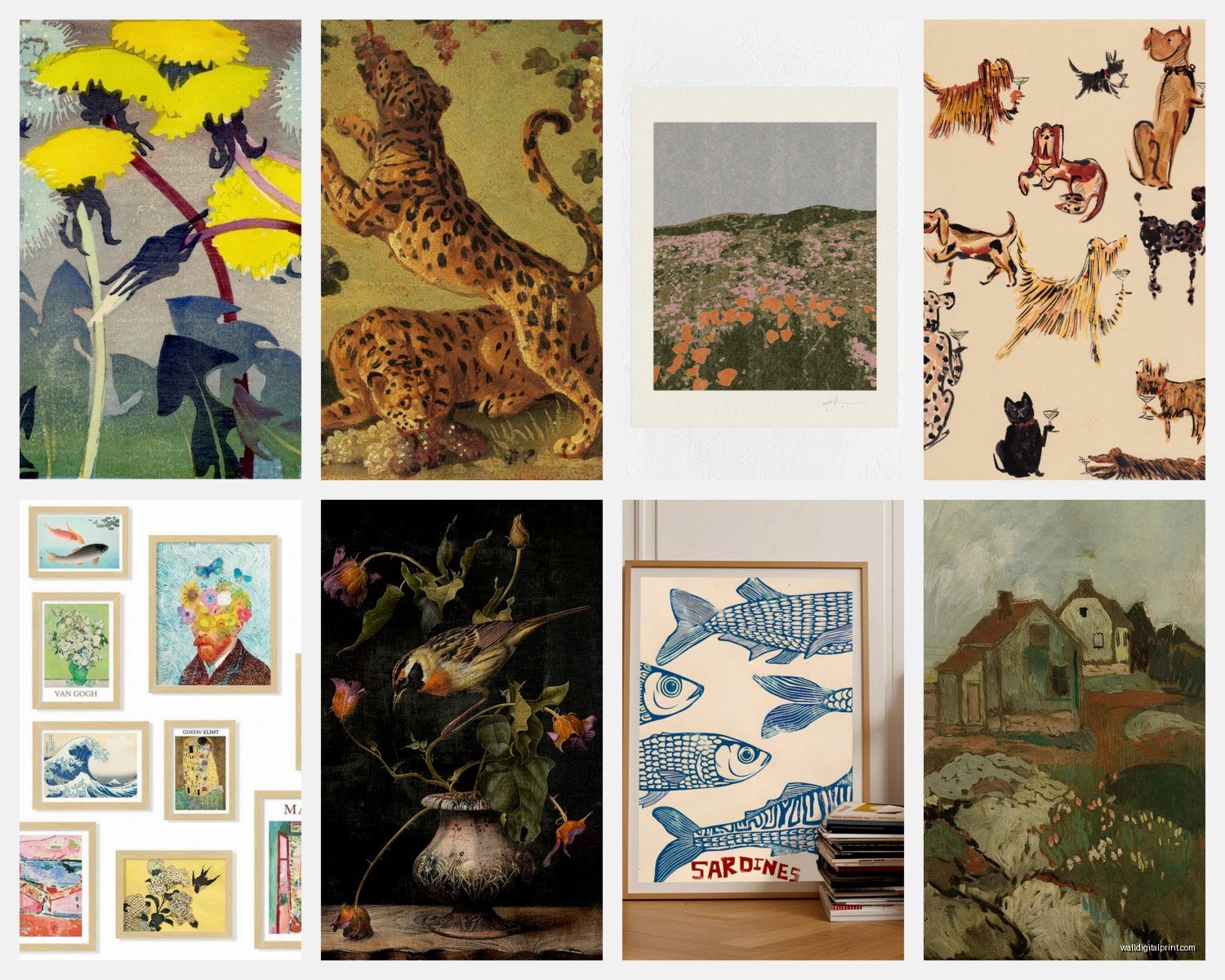
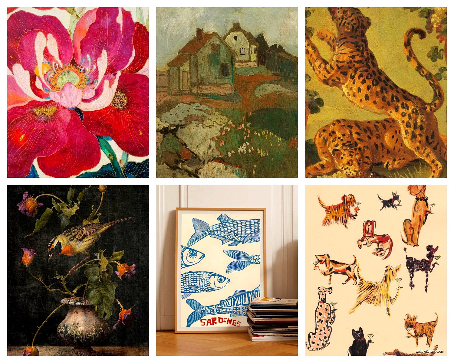
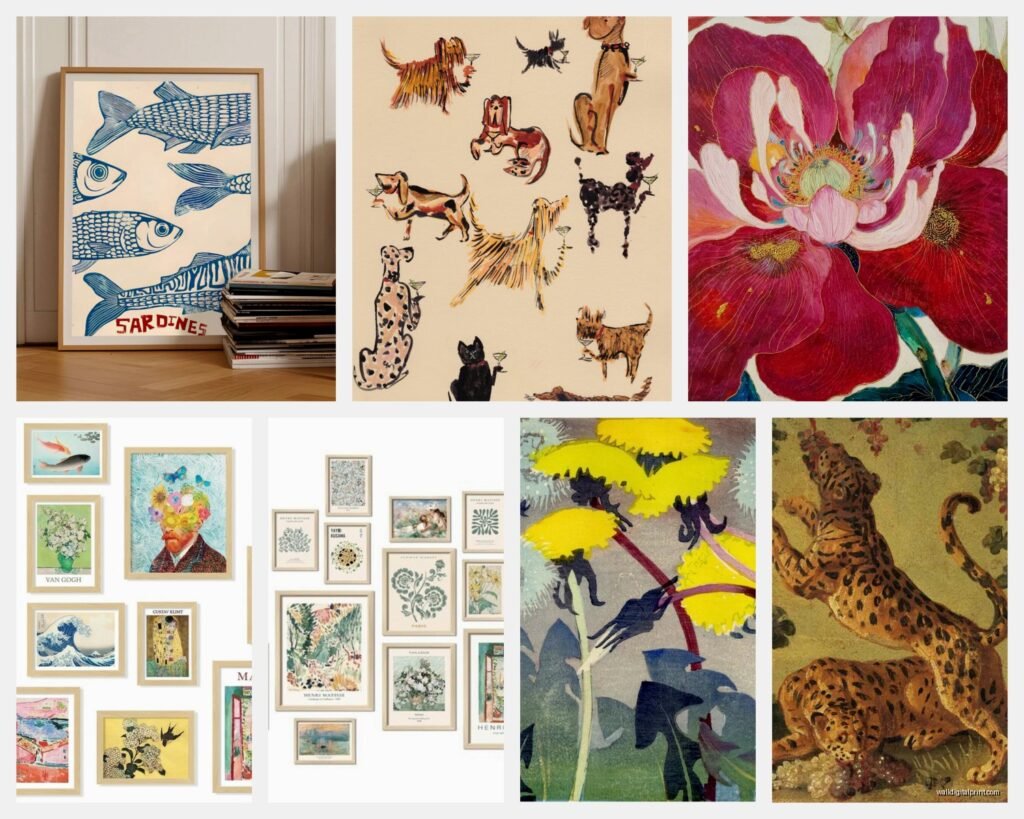
Art Print Choices When You’re Not an Art Expert
Okay so this is gonna sound weird but I have a whole system for this now. You want variety but not chaos. I aim for:
- Two or three prints with similar colors that tie everything together
- Mix of photography and illustration or abstract pieces
- At least one piece with negative space so your eye has somewhere to rest
- Maybe one text-based print if that’s your vibe but honestly those can date quickly
I’ve been buying a lot from independent artists on Etsy lately and the quality is actually better than some of the mass-market stuff. Print quality matters more than people think – if you’re printing at home, use at least 80lb cardstock. Regular printer paper looks cheap up close and you’ll notice it every single day.
Abstract art is the easiest to work with because it doesn’t compete for attention. Landscapes can be beautiful but sometimes they feel too literal? Like if you have five different landscape photos it can feel like a travel agency waiting room. Mix it up with some abstract shapes or botanical prints.
The Actual Hanging Part That Makes People Cry
Wait I forgot to mention – get yourself some proper picture hanging strips if you’re renting. The Command ones that hold up to 16 pounds actually work. I was skeptical but I’ve had frames up for two years with zero issues.
For owned walls, use proper picture hangers rated for the weight. Those tiny nails that come with frames? Trash. Absolute trash. Use actual picture hooks with the angled nail that goes into the wall.
Here’s my process and I promise this saves so much time:
- Trace all your frames on kraft paper or newspaper
- Cut out the paper templates
- Tape them to the wall in your arrangement
- Step back like fifteen times and take photos with your phone
- Look at the photos because somehow things look different in photos than real life
- Adjust until it feels right
- Mark where the hangers go right through the paper
- Hang your actual hooks
- Remove paper and hang frames
The paper template thing changed my life. I used to just eyeball it and ended up in a rage spiral every time.
Gallery Wall Styles That Actually Look Good
The grid layout is the easiest if you’re not confident. Same size frames, equal spacing, arranged in a perfect grid. It’s clean and modern and very hard to mess up. I did one in my own bedroom with nine 8×10 frames and it took like 30 minutes to hang once I had the spacing figured out.
Salon style is what everyone pins on Pinterest – the organic looking arrangement with different sizes all clustered together. This is harder than it looks. The trick is to keep the outside edges somewhat aligned even if the inside is chaotic. Like imagine drawing a rectangle around the whole thing – that rectangle should be intentional even if what’s inside feels random.
The horizontal row thing works great above a couch or bed. Three to five frames in a single row, usually with the largest in the middle. Super simple, still makes an impact.
Asymmetrical but balanced is my personal favorite – you’re not doing a grid but you’re also being thoughtful about visual weight. If you have a large frame on the left side, you need multiple smaller frames on the right to balance it out. Think of it like a scale.
Color Coordination Without Looking Matchy Matchy
Pick three colors that appear in your room and make sure those colors show up in your art prints. Not in every print, but scattered throughout. So if you have navy blue pillows, rust colored throw, and brass accents, get some prints with those tones.
Black and white photography is the cheat code honestly. It goes with everything and adds sophistication without trying too hard. I usually include at least two black and white pieces in any gallery wall.
Monochromatic can be stunning – all prints in shades of blue, or all warm tones, or all earthy greens and browns. This works especially well in bedrooms where you want it calm.
Sizing and Spacing Math That Doesn’t Require a Degree
Your gallery wall should take up about two-thirds to three-quarters of the wall space you’re filling. So if you’re hanging above a couch that’s 84 inches wide, your gallery wall should be roughly 56-63 inches wide.
Hang the center of your gallery wall at 57-60 inches from the floor. This is standard eye level in museums and it works in homes too. I measure up from the floor and put a tiny piece of tape to mark the centerline, then arrange frames so the visual center hits that mark.
The lowest frame should be 8-10 inches above furniture. Any lower and it feels crowded, any higher and it looks disconnected from the furniture piece.
Mistakes I Made So You Don’t Have To
Going too small – a gallery wall that’s too small for the space looks timid and sad. I did this in a client’s dining room and we had to add four more frames to make it work. Better to go bigger than you think.
Not having enough contrast – I once did all similar prints in similar colors and it just blended into visual noise. You need some pieces that pop.
Forgetting about the furniture below – your gallery wall needs to relate to what’s underneath it. I hung a really contemporary abstract collection above a traditional antique dresser and it looked like two different rooms fighting each other.
Using too many fonts if you include text prints. One typography print max, maybe two if they’re really different styles.
Buying all the frames from different places and then realizing the blacks don’t match. There’s like fifty shades of black frames apparently. Stick to one retailer for your frame order.
Practical Stuff About Actually Buying This
Frame sets on Amazon are honestly pretty decent if you’re on a budget. I’ve used the ones from MCS and they’re solid. Not heirloom quality but they look good and don’t fall apart.
For art prints, you can mix downloaded Etsy prints with some nicer pieces. Nobody needs to know which is which. Print the digital downloads at a local print shop or through an online service – the quality is way better than home printing unless you have a really good printer.
Matting makes cheaper frames look expensive. A print in a mat looks more intentional and curated. You can buy pre-cut mats or cut your own with a mat cutter which is weirdly satisfying actually.
oh and another thing – leave room to add more frames later. Gallery walls can grow over time and that actually looks more collected and personal than something that’s perfectly complete from day one.
The Room-by-Room Strategy
Living rooms can handle bigger, bolder gallery walls. This is where you can do the full salon style situation with tons of frames.
Bedrooms should be calmer – I usually do fewer frames, more cohesive color story, nothing too visually chaotic since you’re trying to sleep there.
Hallways are perfect for symmetrical arrangements or a single horizontal row. The narrow space actually makes gallery walls easier because you have clear boundaries.
Bathrooms – yes you can do gallery walls in bathrooms but maybe avoid valuable prints because humidity. Also keep it simple, like three to five frames max.
My own stairway has a gallery wall that follows the angle of the stairs and honestly it was the most annoying thing I’ve ever hung but it looks amazing. You have to account for the slope which means the arrangement needs to flow with the diagonal line. Would I do it again? Ask me when my arms don’t hurt.
The whole process takes longer than you think – budget like three hours for a medium-sized gallery wall if you’re doing it properly. But once it’s up, it’s up, and you get to enjoy it every day which is the whole point right?
Just start with your paper templates and take your time with the arrangement. That’s literally the whole secret. The rest is just hanging stuff on walls which you can definitely do.