Wall Art Guide, Wall Art Tutoriels
Living Room Free Printable Wall Art: Main Space Downloads
Sep
So I’ve been downloading free printable wall art for my living room for like three years now and honestly it’s gotten a little out of control but in the best way. My cat knocked over my coffee this morning while I was sorting through my latest finds and I just… anyway, let me tell you what actually works because there’s SO much garbage out there.
Where to Actually Find Good Stuff
Okay so the first place everyone goes is Pinterest and yeah, it’s useful but you gotta be careful. Half those links are dead or they want your email for their newsletter and then the file is like 72dpi which is absolutely useless for printing. I learned this the hard way when I printed what I thought was gonna be this gorgeous abstract piece and it came out pixelated like a 2004 digital camera photo.
The sites I actually use: Unsplash has incredible high-res photos that you can just… use. For free. I’ve pulled so many minimalist landscape shots from there. There’s this photographer who does these moody coastal scenes and I’ve used probably five of his images in client spaces. You want at least 300dpi for printing, anything less looks fuzzy once it’s on your wall.
Oh and another thing, The Graphics Fairy is weirdly good for vintage botanical prints. Like if you want that grandmillennial vibe without spending $80 at Anthropologie. The site looks like it was designed in 2009 but the content is solid.
File Formats That Won’t Make You Want to Scream
This is gonna sound boring but you need to understand file types or you’ll waste so much paper and ink. PDF is your friend for printing, especially if it’s vector-based. JPEGs work fine if they’re high resolution but they can get weird when you scale them up.
I made the mistake once of trying to print a PNG that was only 800 pixels wide to fit an 11×14 frame and it was… not good. My printer literally paused like it was judging me. You want your file dimensions to match your frame size or larger. So if you’re printing for a 16×20 frame, your image should be at least 16×20 inches at 300dpi.
Wait I forgot to mention, some sites offer different sizes in the download. Chicfetti does this really well, they’ll give you like five different size options in one ZIP file which is super helpful when you’re not sure what frame you’re using yet.
The Printing Part Nobody Talks About
Your home printer is probably gonna disappoint you for anything larger than 8×10. I have an HP that’s fine for documents but for wall art? The colors come out flat and weird. I use Staples or FedEx for most prints now and it’s honestly not that expensive. Like $3-8 per print depending on size.
Here’s the thing though, you gotta tell them what paper to use. Cardstock is okay for smaller prints but for anything you’re actually framing, ask for their premium matte or satin photo paper. The difference is huge. I did a side-by-side comparison once when a client canceled so I spent an hour comparing the same abstract print on different papers and the regular paper just looked… cheap.
Matte is better for line drawings and typography. Glossy works for photographs but can have glare issues depending on your lighting. I usually go matte because most living rooms have windows and you don’t want that reflection situation happening.
Color Settings You Can’t Ignore
This is where it gets technical but stick with me. When you’re downloading, check if the file is RGB or CMYK. RGB is for screens, CMYK is for printing. If you send an RGB file to print, the colors might shift and suddenly your perfect terracotta turns orange.
Some print shops will convert it for you but not always accurately. There’s free online converters but honestly I just… if I really love an image I’ll pay the $5 on Etsy for a print-ready version rather than deal with color correction myself.
Frame Situations Because That’s Half the Battle
Ikea frames are fine, actually. I know everyone wants to hate on them but their RIBBA frames are like $7 and they look clean and modern. I’ve used them in probably twenty living rooms. The key is buying multiples in the same color so you get that gallery wall cohesion.
Target’s Threshold line has good frames too, slightly better quality than Ikea, usually around $15-20. Amazon has cheaper options but the glass is often really thin and the backing is flimsy.
Oh and this is gonna sound weird but, measure your wall space BEFORE you download and print. I cannot tell you how many times I’ve printed something beautiful and then realized I have nowhere to put it that’s the right size. I have a whole folder on my desktop labeled “someday prints” that are just waiting for the right spot.
What Actually Looks Good in Living Rooms
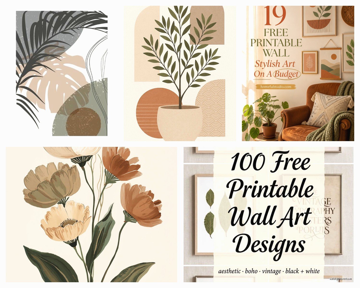
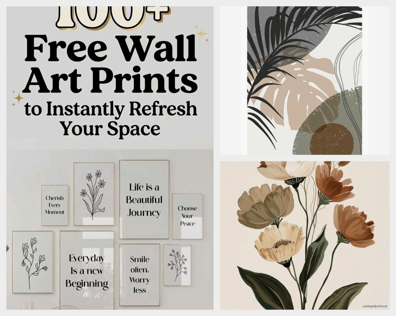
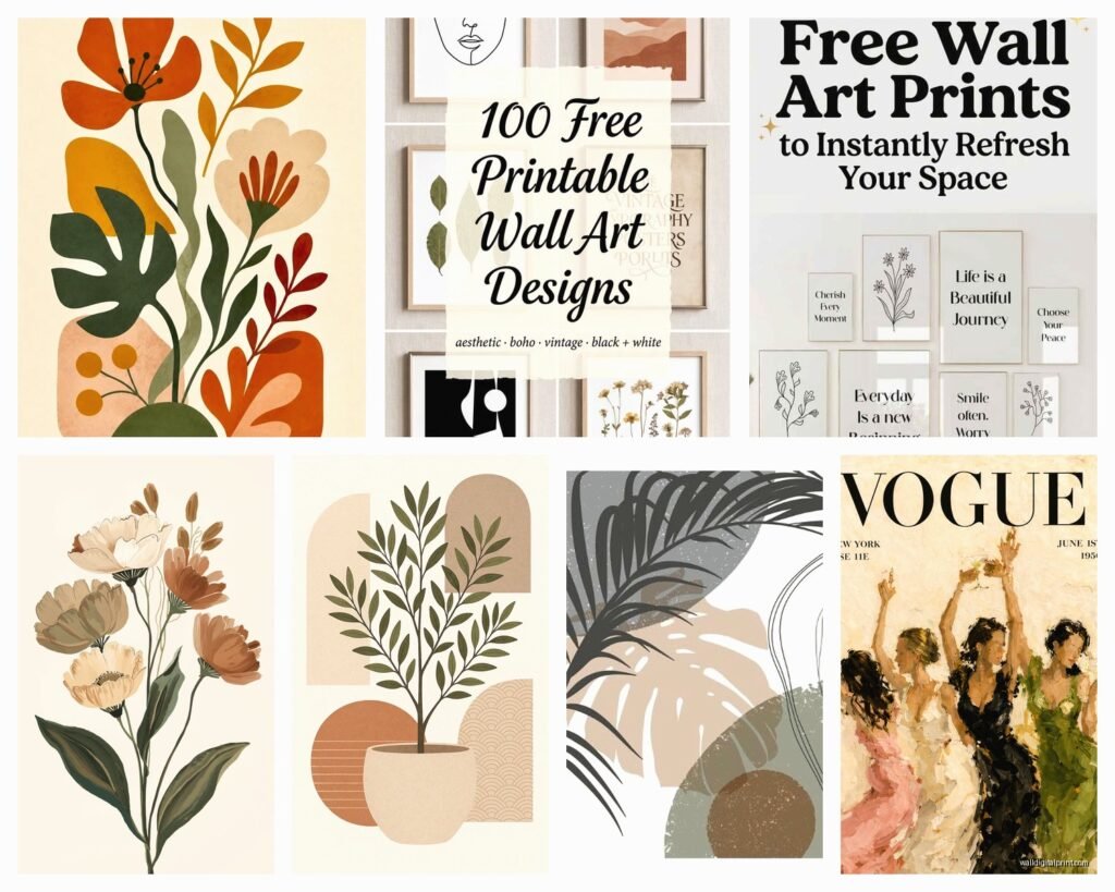
Okay so trends come and go but here’s what I’ve noticed works consistently. Abstract shapes in neutral colors, always. Terracotta and sage green line drawings, very popular right now but also kinda timeless? Vintage botanical prints if your space leans traditional.
Typography prints are tricky because they can look really Hobby Lobby really fast. If you’re gonna do words, make sure the font is interesting and the message isn’t something you’d see on a coffee mug at TJ Maxx. I saw one that said “inhale exhale” and I just… no.
Black and white photography is foolproof honestly. Architecture shots, nature, even abstract shadows. Hard to mess up and it goes with everything.
The Gallery Wall Strategy
If you’re doing a gallery wall, download everything first and lay it out on the floor before printing anything. I use painter’s tape to mark where frames will go on the wall but the floor layout helps you see the composition. You want varied sizes but a cohesive color palette.
Rule I follow: pick 2-3 main colors max. So maybe black and white prints with one or two that have a pop of rust or navy. More than that starts looking chaotic unless you really know what you’re doing.
Space them about 2-3 inches apart. Closer than that feels cramped, further apart and it doesn’t read as a cohesive installation.
Sites I Actually Return To
Let me just give you my actual bookmarks because this is what matters. Unsplash like I said, for photography. The Everyday Co has beautiful abstract minimalist stuff, some free some paid but the free ones are good quality. Just Something I Made has quirky line drawings that work well in modern spaces.
Printable Crush sends out a free print monthly if you’re on their email list and I actually don’t hate their emails so I’ve stayed subscribed. The prints are hit or miss but I’ve gotten maybe four that I’ve actually used.
Etsy has free stuff if you search specifically for “free printable wall art” but you gotta wade through a lot of meh to find the good stuff. I found this shop that does minimalist face line drawings that I’ve used in three different client living rooms and nobody knows they were free.
What Doesn’t Work (Learned This the Hard Way)
Super trendy stuff dates quickly. I downloaded a bunch of those “one line woman face” prints in 2020 and they already feel kinda played out. Not saying don’t use them but just know you might want to switch them out in a year or two.
Anything with too much white space can look unfinished in a frame. You need some visual weight or it just looks like you forgot to print the rest of it.
Low contrast images disappear on the wall. What looks subtle on your screen can basically vanish from six feet away. I printed this gorgeous pale pink and cream abstract once and on the wall it was just… barely there.
Seasonal Rotation Because Why Not
This might be extra but I have a folder system on my computer organized by season and I swap out a few prints throughout the year. Fall gets warmer tones, winter gets more black and white or deep blues, spring gets botanicals, summer gets brighter stuff.
It’s an easy way to refresh your space without buying anything new. Takes like fifteen minutes to swap out three frames and suddenly your living room feels different.
The Matting Question
Mats make everything look more expensive, that’s just facts. You can buy pre-cut mats at craft stores or online. An 8×10 print in an 11×14 frame with a mat looks way better than an 8×10 print in an 8×10 frame.
White mats are classic and safe. Black mats are dramatic and modern. Cream or off-white feels softer and works well with warmer color schemes.
You can also just… not use mats. Borderless prints in frames work fine especially for photography or abstracts. I actually prefer no mat for black and white photos, gives them more impact.
Lighting Makes or Breaks It
Even the best free printable looks bad in terrible lighting. If your living room is dark, either add picture lights or choose brighter, higher-contrast prints. Subtle pastels in a dim room just look muddy.
Natural light is great but watch for fading. UV-protective glass exists but it’s pricey. I usually just accept that prints might fade over time and hey, they were free so I can reprint them.
Okay I think that’s everything I’ve learned from way too many hours doing this. The main thing is just start downloading and printing and seeing what you actually like on your walls because what looks good on Pinterest might not work in your actual space with your actual lighting and furniture and that’s totally fine. Also gonna grab another coffee since my cat destroyed the first one.