Wall Art Guide, Wall Art Tutoriels
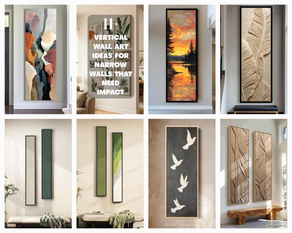
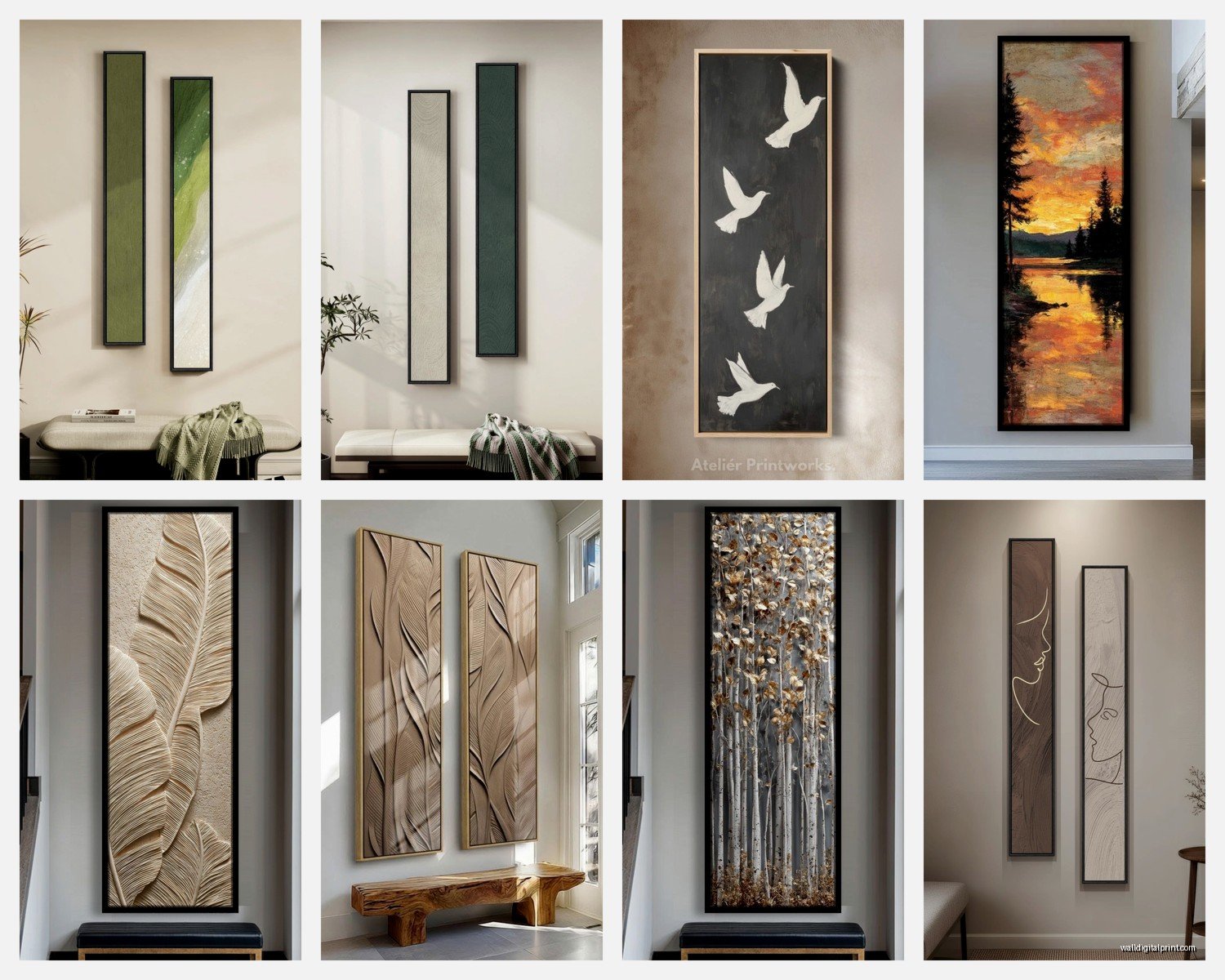
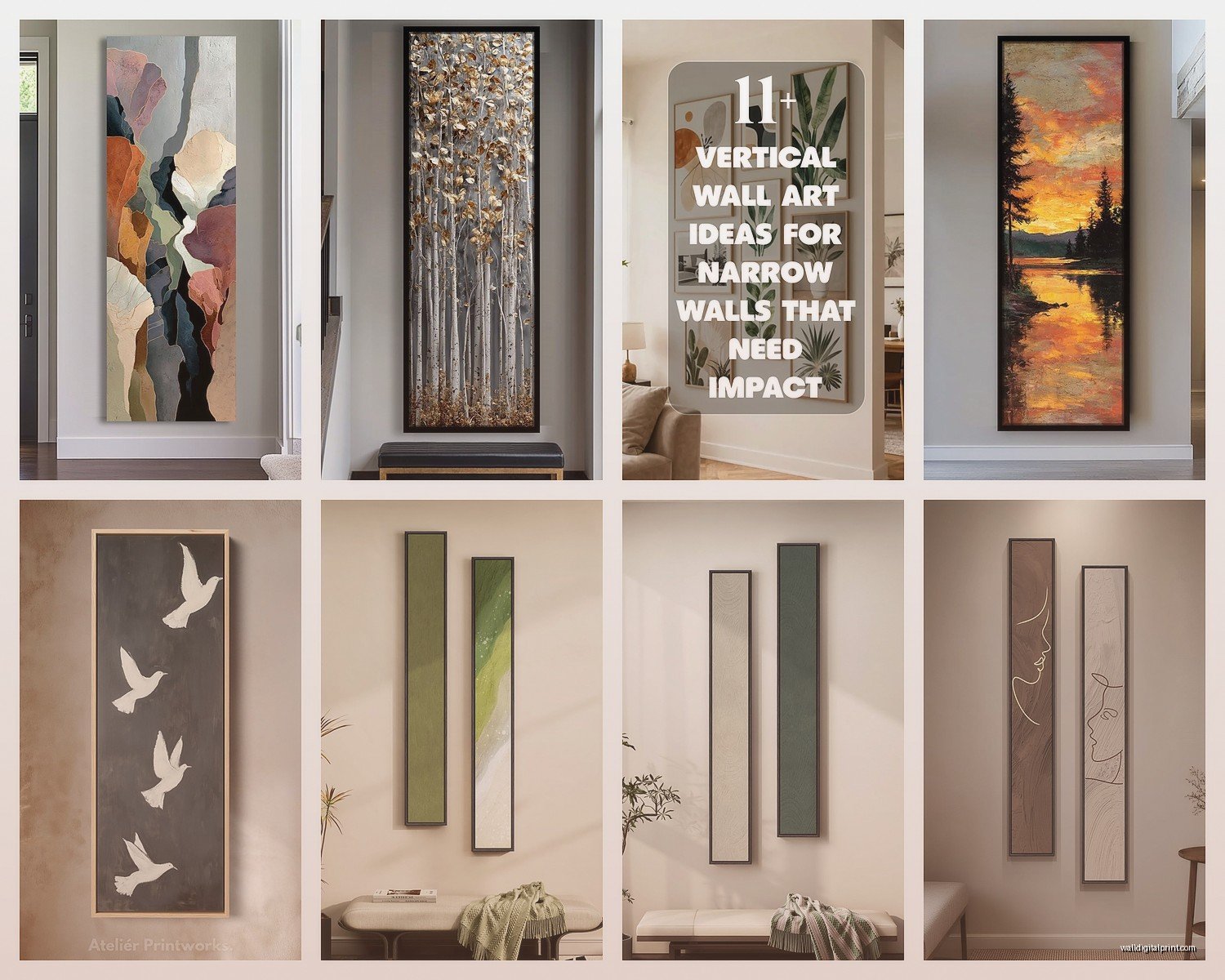
Long Narrow Vertical Wall Art: Tall Slim Portrait Pieces
May
So I’ve been kinda obsessed with these long narrow vertical pieces lately and honestly they solve SO many wall problems that regular art just can’t handle. Like, you know that weird space next to your doorframe or between two windows? That’s where these tall slim pieces actually shine.
Where These Actually Work (I’ve Tested This)
Okay so the obvious spot is next to doorways but hear me out because there’s more to it. You want at least 6-8 inches of space between the door trim and your artwork, otherwise it looks cramped and people’s shoulders will bump it when they’re walking through. I learned this the hard way in my own hallway and had to move a piece three times before I got it right.
Narrow hallways are honestly the BEST spot for vertical art. I’m talking those corridors that are like 36-40 inches wide where you can’t really do anything else. A series of three or four tall narrow pieces down one wall creates this gallery moment without making the space feel cluttered. My neighbor did this with botanical prints and every time I walk past their place I’m lowkey jealous.
Between windows is another winner, especially if you’ve got those double windows with like 12-18 inches between them. A vertical piece fills that gap without blocking light or making the windows feel disconnected from each other.
Bathroom walls next to the shower or beside the vanity – this is gonna sound weird but it’s actually perfect because most bathrooms have these tall narrow wall sections that are too small for regular art but too prominent to leave bare.
What Size Actually Means in Real Life
The dimensions get confusing fast. When people say “narrow vertical” they usually mean pieces that are at least 2:1 ratio, so like twice as tall as they are wide. But I’ve worked with everything from 12×36 inches up to 18×72 inches.
For standard 8-foot ceilings, I usually stick with 36-48 inch heights. Anything taller starts feeling overwhelming unless you’ve got the ceiling height to support it. My client last month insisted on a 60-inch piece in a room with 8-foot ceilings and it just… it looked like the art was trying to escape through the roof.
The width thing is trickier. Under 10 inches wide starts looking like a fancy bookmark honestly. The sweet spot for me is 12-16 inches wide – narrow enough to fit tight spaces but substantial enough to register as actual art and not just a decorative accent.
My Go-To Dimensions
- 10×30 inches – good for really tight spots, powder rooms, narrow sections between furniture
- 12×36 inches – the workhorse size, fits most situations
- 16×48 inches – when you want more presence, works in living rooms and bedrooms
- 18×54 inches or bigger – statement pieces, need high ceilings and breathing room
What to Actually Put Up There
Okay so content matters more with vertical pieces than regular art because the format is so specific. Some subjects just look weird when they’re stretched tall and thin.
Botanical prints are like the easiest win. Tall flowers, branches, stems, palm leaves – they’re naturally vertical so they don’t look forced. I’ve got this eucalyptus branch print in my entryway that’s 14×42 and people always ask where it’s from. Got it from an Etsy shop that doesn’t exist anymore which is super helpful, sorry.
Abstract vertical stripes or geometric patterns work really well because they emphasize the height. Color field paintings in portrait orientation can be stunning if you find the right one. Rothko-style pieces especially, though good luck affording an actual Rothko haha.
Cityscape verticals showing tall buildings are kinda obvious but they work. Architecture photography in general translates well – think doorways, staircases, cathedral interiors, that sort of thing.
Figure studies and portraits in full-length format are gorgeous but you gotta be careful with proportion. A 12-inch wide portrait can look squashed if the figure is too compressed.
What Doesn’t Work (Usually)
Landscapes are tough unless they’re specifically composed for vertical format. That panoramic beach scene you love? Gonna look cropped and weird when it’s tall and skinny.
Horizontal compositions that someone just rotated 90 degrees – you can always tell and it looks wrong. Your brain knows something’s off even if you can’t articulate why.
Really busy, detailed scenes with lots going on. The narrow format creates this tunnel vision effect that makes complex compositions feel overwhelming rather than interesting.
Hanging Height Because Everyone Messes This Up
The standard “center at 57 inches” rule kinda breaks down with really tall pieces. What I actually do is measure 60-62 inches from the floor to where I want roughly the middle-third of the piece to land. So not the exact center, but slightly above center.
Wait I forgot to mention – this assumes you’ve got standard ceiling height. If you’ve got 10-foot ceilings or higher, you can go up to 65 inches for your reference point.
For really tall pieces like 60+ inches, sometimes I’ll go even higher because if you center them at eye level, they extend too far down and start feeling bottom-heavy. There’s this visual weight thing happening that I can’t totally explain but you know it when you see it.
The Furniture Relationship
If your vertical piece is going above furniture, leave 6-8 inches between the furniture top and the bottom of the frame. Less than that and it looks like the furniture is pushing the art off the wall. More than 10 inches and they start feeling disconnected.
My cat just knocked over my coffee while I’m writing this so if there are typos that’s why… anyway where was I
Grouping Them (Or Not)
Single vertical pieces make strong statements. Sometimes that’s all you need and adding more would dilute the impact. I see people overthink this constantly – not everything needs to be a gallery wall.
But if you ARE grouping them, odd numbers work better. Three vertical pieces in a row creates rhythm without being too matchy-matchy. Keep 3-4 inches of space between frames, maybe 5-6 if they’re really large pieces.
You can also do the thing where you have one tall vertical piece flanked by two shorter ones, creating like a stepped effect. The center piece should be noticeably taller – at least 12 inches taller than the side pieces or it just looks like you couldn’t decide on a size.
Mixing vertical and horizontal pieces gets complicated fast. I usually don’t recommend it unless you really know what you’re doing or you’re working with a professional. The proportions have to relate to each other mathematically or it looks random in a bad way.
Framing Options That Actually Matter
Thin frames work better on narrow pieces. A chunky 3-inch frame on a 12-inch wide piece means the frame is taking up like 50% of the visual width which is just… no.
I usually stick with frames that are 0.75 to 1.5 inches wide max. Simple profiles, nothing ornate. Let the format be the interesting thing, not the frame.
Float mounting can look really cool with vertical pieces – where the art appears to float inside the frame with space around it. This works especially well with watercolors or pieces that have deckled edges.
Metal frames in brass or black are my default. Wood frames can work but they need to be slim and simple. White or natural wood, nothing with heavy grain or distressing.
Matting Considerations
If you’re matting, keep the mat narrow too – like 2 inches on the sides, maybe 3 inches on top and bottom. Wide mats on narrow art make the whole thing look like it’s drowning in matboard.
Sometimes I skip mats entirely on vertical pieces, especially with photography or digital prints. The clean edge-to-edge look emphasizes the sleek vertical line.
Where to Actually Buy These
This is tricky because most art is created in standard sizes and vertical formats are less common. Etsy has a decent selection if you search specifically for “vertical wall art” or “portrait orientation prints.” Filter by size to find what actually fits your space.
Society6 and Minted let you order prints in custom sizes sometimes, though the quality can be inconsistent. I’ve had good luck with both but also some disasters where the colors were completely off.
Local artists are honestly your best bet if you want something unique. Commission work in the exact size you need. It costs more upfront but you get exactly what you want and it’s not mass-produced.
Oh and another thing – check out architectural salvage shops or antique stores for vintage pieces that are already in narrow vertical formats. Old botanical prints, fashion illustrations, that sort of thing. They often come in unusual sizes that are perfect for tight spaces.
The Lighting Thing Nobody Talks About
Vertical pieces catch light differently than horizontal ones. If you’ve got a window to one side, the whole piece will be lit unevenly and it’s really noticeable because of the format.
Picture lights work great on vertical art – those little lights that mount above the frame. Get one that’s about half the width of your piece. So for a 12-inch wide piece, use a 6-inch picture light.
Track lighting or directional ceiling spots should hit the piece from about 30 degrees off-center, not straight on. This creates some dimension and prevents glare if you’ve got glass in the frame.
Common Mistakes I See Constantly
Hanging them too low. People default to the standard height rules and end up with tall pieces that feel bottom-heavy and awkward.
Choosing pieces that are too narrow for the space. A 6-inch wide piece on a 24-inch wide wall section looks lost and tentative. Go wider than you think you need.
Not considering what’s across from the piece. If your vertical art is facing a mirror or reflective surface, you’re gonna see it reflected and it needs to look good from that angle too.
Mixing too many different widths in a grouping. If you’re doing multiple vertical pieces, keep them the same width even if the heights vary. It creates cohesion.
Real Talk About Budget
You can find decent digital prints on Etsy for like $20-40 for a 12×36 size, then framing is gonna run you another $80-150 depending on whether you go custom or find something at Target or IKEA that fits.
Custom framing for vertical pieces is often cheaper than for large horizontal pieces because there’s less material involved. I had a 16×48 piece custom framed last month for $140 which isn’t terrible.
The DIY route with downloaded art and cheap frames can work but honestly the quality difference is noticeable. I’d rather have one really good piece than three mediocre ones.
Okay so funny story, I was watching that restoration show on Netflix while trying to figure out framing for a client and realized that antique frames can sometimes be modified to fit vertical art. It’s not always possible but worth asking a framer if you find a gorgeous old frame.
Specific Room Applications
In bedrooms, vertical pieces work on either side of the bed instead of one large horizontal piece above the headboard. Creates symmetry without being boring. I did this in my guest room with two 14×42 abstract pieces and it completely changed the feel of the space.
Living rooms – that awkward wall space next to built-ins or bookcases is perfect for a tall vertical. It balances the horizontal lines of the shelving.
Dining rooms can handle really tall pieces, like 54+ inches, because you’re usually sitting down so the scale works differently. Plus high ceilings are more common in dining spaces.
Entryways and foyers basically demand vertical art. It’s the first thing people see and a tall narrow piece creates this welcoming vertical line that draws the eye up and makes the space feel more spacious.
Home offices behind your desk or on the wall you face – vertical pieces take up less desk wall real space while still providing visual interest during those endless video calls.
The thing about vertical art is it forces you to think differently about your walls and that’s actually kinda refreshing after everyone’s been doing the same gallery wall layouts for years. Once you start noticing spots where vertical pieces would work, you’ll see them everywhere in your house.