Wall Art Guide, Wall Art Tutoriels
Metal Compass Wall Art: Navigation Nautical Directional
Jul
So I’ve been obsessing over metal compass wall art lately because my client wanted this whole navigation theme for their beach house and honestly, it sent me down a rabbit hole I wasn’t expecting. Like, I thought it’d be simple – grab a compass, hang it up, done. But there’s actually so much to consider with these things.
Size Matters Way More Than You’d Think
Okay first thing – and I cannot stress this enough – measure your wall space before you fall in love with something online. I made this mistake with a 36-inch compass rose that looked perfect in the product photos but absolutely swallowed my client’s entryway. It was like this massive metal monster that made everything else look tiny. Now I always tell people: for a standard living room wall (like 10-12 feet), you want something in the 24-30 inch range. Smaller spaces like hallways or bathrooms? Go 18 inches or under. Above a console table or behind a headboard, you can push it to 36-40 inches if the furniture is substantial enough to balance it out.
The visual weight thing is real. Metal reads heavier than wood or canvas art, so even a 24-inch metal compass is gonna have more presence than a 30-inch painting. Keep that in mind.
Materials and Finishes That Actually Work
Most of these compass pieces come in a few standard finishes and honestly some work way better than others depending on your space. The distressed bronze or copper ones are super forgiving – they hide imperfections, they don’t show fingerprints, and they work with basically any color scheme. I’ve used them in spaces with navy blues, whites, greens, even some warmer terracotta situations.
The polished silver or chrome finishes look amazing but oh my god they show every single smudge. My cat knocked one off the wall during installation (long story, she gets weird around new things) and just picking it up left marks all over it. If you go this route, keep microfiber cloths handy.
Matte black is having a moment and I actually love it for modern nautical themes. It’s less “I went to a seafood restaurant” and more “I appreciate navigation as an art form.” Works great with brass accents, white shiplap, natural wood tones.
The Directional Accuracy Question Nobody Asks
Wait I forgot to mention – some people get really hung up on whether their compass should point true north. Like, actually magnetically accurate. And look, unless you’re a hardcore sailor or geography teacher, it literally doesn’t matter. Most decorative compasses have north pointing up just because that’s what looks right to our brains. I’ve hung them with north pointing wherever made the design work best for the space.
That said, if you DO want it accurate, you’ll need to use a real compass or your phone’s compass app during installation. Mark where true north is before you start drilling. But honestly? I’ve done maybe 200 installations and exactly two people cared about this.
Installation Tips That’ll Save Your Walls
Okay so the installation part trips people up. These metal pieces are heavier than they look. A 30-inch compass can easily weigh 8-15 pounds, sometimes more if it’s got thick gauge metal or multiple layers.
You absolutely need to hit studs or use proper drywall anchors. I use the toggle bolt style anchors rated for at least 50 pounds when I can’t hit a stud. The plastic expansion anchors that come with most hardware? Trash. Don’t use them. I watched a beautiful $300 compass crash down at 2am once because the client used the included anchors and it’s just… it still haunts me.
Most compass designs have a keyhole hanger on the back or sometimes D-rings. For anything over 20 inches, I prefer installing two hooks even if there’s only one hanger – it keeps the piece from tilting over time. Oh and another thing, use a level. I know that sounds obvious but metal compasses are unforgiving. If it’s off by even a degree or two, your eye will catch it every single time because of all the symmetrical elements.
Style Variations and What They Actually Communicate
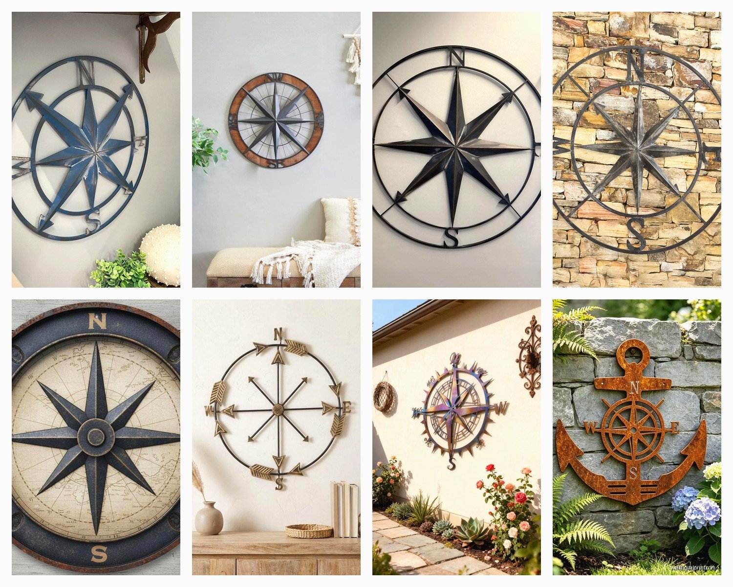
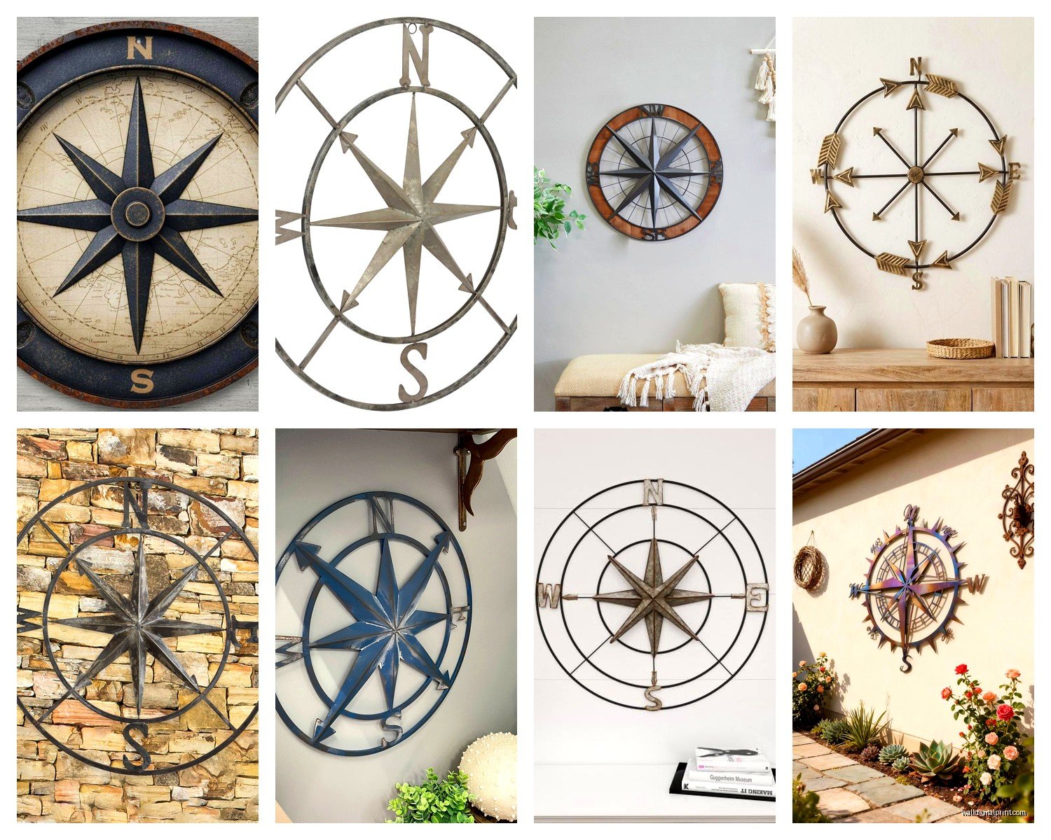
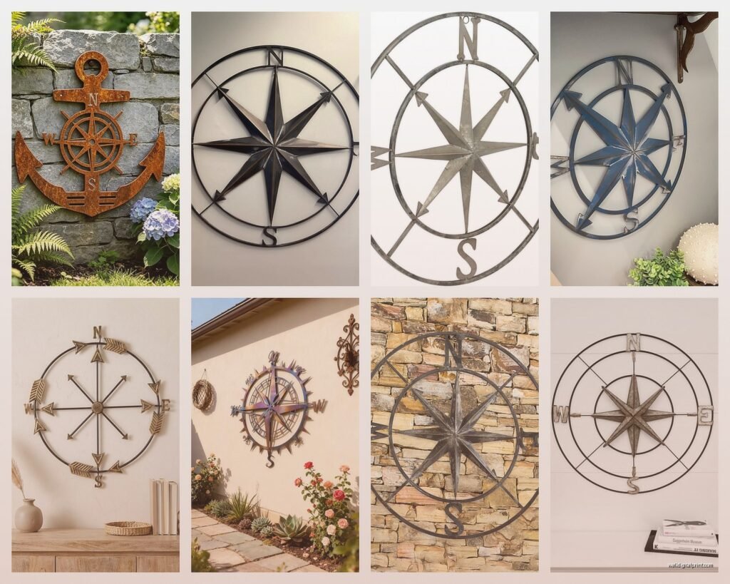
There’s like this whole language to compass designs that I didn’t appreciate until I really started working with them. The super ornate ones with all the flourishes and degree markings and multiple rings – those read very traditional, classic nautical. Think yacht club, maritime museum, New England coastal vibes. They work great in spaces with other traditional elements like oriental rugs, brass fixtures, dark wood furniture.
The minimalist geometric ones with clean lines and maybe just the cardinal directions? Those are your modern coastal pieces. They work in Scandinavian-inspired spaces, modern farmhouses, contemporary beach houses. I used one in a loft apartment that was nowhere near water and it just read as geometric art with a subtle nautical nod.
Then there’s the vintage distressed category which is its own thing. These usually have faded paint, intentional rust spots, maybe some “aged” patina. They’re perfect for that collected-over-time look. I mix these with other vintage finds and they blend right in.
The Color Coordination Thing
This is gonna sound weird but I actually don’t try to match compass art to existing colors too precisely. Like, if you’ve got a navy and white room and you get a navy compass, it can disappear into the wall. Instead, I look for pieces that have accent colors or metallic finishes that complement without matching exactly.
Bronze and copper tones work beautifully with navy, gray, white, and even soft greens. They add warmth without competing. Silver and chrome look crisp against darker walls – charcoal, navy, deep green. Black compasses are surprisingly versatile but they need good contrast to pop. Don’t put black on dark gray walls unless you want it to vanish.
Layering and Styling Around It
Okay so funny story – I was watching this home renovation show while styling a nautical office and realized the designer was doing this thing where they never let themed decor stand completely alone. The compass wall art was there but it was balanced with non-nautical elements so it didn’t feel costume-y.
That’s the secret honestly. Your metal compass shouldn’t be surrounded by anchors and ship wheels and “Life is Better at the Beach” signs. That’s when it crosses into theme park territory. Instead, pair it with:
- Abstract art in complementary colors
- Natural fiber textures like jute or seagrass
- Plants (real or fake, I’m not judging)
- Simple shelving with books and objects
- Photography that’s not necessarily nautical
The compass becomes an anchor point (pun intended I guess) for the design without overwhelming it. In my beach house project, we put a 28-inch bronze compass above a console table, but then styled the table with modern ceramic vases, a stack of design books, and a single piece of coral. The mix kept it interesting.
Where to Actually Hang These Things
Not every room works for compass art and I learned this the hard way. My client insisted on putting one in their kitchen and it just felt… off. Too busy competing with cabinet hardware and appliances. But here’s where they absolutely shine:
Entryways: Perfect spot. It’s literally about navigation and wayfinding. Makes conceptual sense and creates a focal point right when you walk in.
Home Offices: Especially if you do any travel-related work or just want that explorer/adventure energy while you’re answering emails.
Living Rooms: Above the sofa or on a large empty wall. This is the most common placement and works great if the room has some coastal or travel elements.
Bedrooms: Above the headboard or on a wall opposite the bed. Creates a nice focal point without being too busy for a sleep space.
Outdoor Spaces: If you get one specifically rated for outdoor use (look for powder-coated or weatherproof finishes), they’re amazing on covered patios or three-season porches.
Sizing for Specific Spaces
I keep notes on this because I got tired of second-guessing myself. For above a queen bed, 24-30 inches works well. King bed, you can go 30-36 inches. Above a sofa, you want the art to be roughly two-thirds the width of the sofa, so for a standard 84-inch couch, you’re looking at 48-56 inches total. A single compass might not fill that, which is where you gotta either go bigger or create a grouping.
Oh wait, groupings – that’s a whole thing. You can do multiple smaller compasses in a cluster. I did three 12-inch compasses in a triangle formation once and it looked way more interesting than one medium piece. Just keep the spacing consistent, like 4-6 inches between each piece.
Price Ranges and What You Actually Get
So prices are all over the place with these. You can find basic metal compass art for $30-50 at places like HomeGoods or Target. These are usually thin gauge metal, simpler designs, mass-produced. They’re fine for rental spaces or if you’re just testing out the look. The finishes won’t be super durable and they might arrive slightly bent, but for the price, they work.
Mid-range is $80-200 and this is where you get better craftsmanship. Thicker metal, more detailed designs, better finishes that’ll last. Most of my projects fall into this range. Brands like Uttermost and Stratton Home Decor make solid pieces here.
High-end is $250+ and you’re getting artisan-made pieces, often custom or limited production. Hand-forged details, premium finishes, sometimes incorporating other materials like wood or glass. These are statement pieces and the quality difference is noticeable.
Online vs In-Person Shopping
I usually browse online to get ideas but try to see at least a similar piece in person before committing to anything over $150. The scale is just so hard to judge from photos. That said, Wayfair and Amazon have gotten better with their room visualization tools. Just take those with a grain of salt.
West Elm and Pottery Barn are safe bets if you want to see things in person – they usually have a few compass options in their nautical sections. Anthropologie has interesting artisan pieces but they’re pricey. For budget options, Target’s Threshold line sometimes has decent ones, and HomeGoods is hit or miss but worth checking.
Etsy is great for custom or unique pieces but read reviews carefully. I’ve gotten some amazing handmade compasses there and also some that arrived looking nothing like the photos. Check shop ratings and look for detailed shots, not just styled room photos.
Maintenance and Longevity
These things are pretty low maintenance honestly. Dust them every few weeks with a microfiber cloth or duster. For fingerprints or smudges on polished finishes, slightly damp cloth works fine. Don’t use harsh cleaners – they can strip protective coatings or discolor the metal.
The biggest issue I’ve seen is oxidation on copper and bronze pieces, especially in humid climates. Some people love the developing patina, others hate it. If you want to prevent it, there are metal sealers you can apply annually. If you like the aged look, just let it do its thing.
Check the mounting hardware every six months or so, especially if you’re in an area with temperature fluctuations. Metal expands and contracts and screws can loosen over time. Just give them a quick tighten if needed.
Honestly the hardest part about these pieces is committing to the style. Once you’ve got the right size, finish, and placement figured out, they’re pretty foolproof. And they add this instant sense of adventure and direction to a space without being overly literal about it. Just don’t go overboard with the nautical theme and you’ll be fine.