Wall Art Guide, Wall Art Tutoriels
Om Wall Art: Sacred Symbol & Meditation Room Decor
Jun
So I’ve been setting up meditation spaces for clients for like three years now and the Om symbol thing – it’s way more nuanced than just slapping a metal cutout on your wall and calling it spiritual, you know?
Why Om Symbols Actually Work in Meditation Spaces
Okay so here’s the thing about Om wall art that nobody really talks about. It’s not just decorative (though yeah, it looks pretty). The symbol itself has this weird focusing quality – like when you’re trying to meditate and your brain is doing that thing where it’s making grocery lists and replaying conversations from 2015, having a visual anchor actually helps. I noticed this in my own practice before I started recommending it to clients.
The best placements I’ve found are either directly across from where you sit to meditate OR slightly above eye level when seated. You want it in your natural sight line when your eyes drift open during meditation, not so high you’re craning your neck like you’re at a museum.
Material Choices That Actually Matter
This is gonna sound weirdly specific but the material makes a huge difference in how the piece affects the room energy. I’ve tested probably 15 different types at this point because my client Lisa kept returning stuff saying it “felt wrong” and I was like okay let’s figure this out.
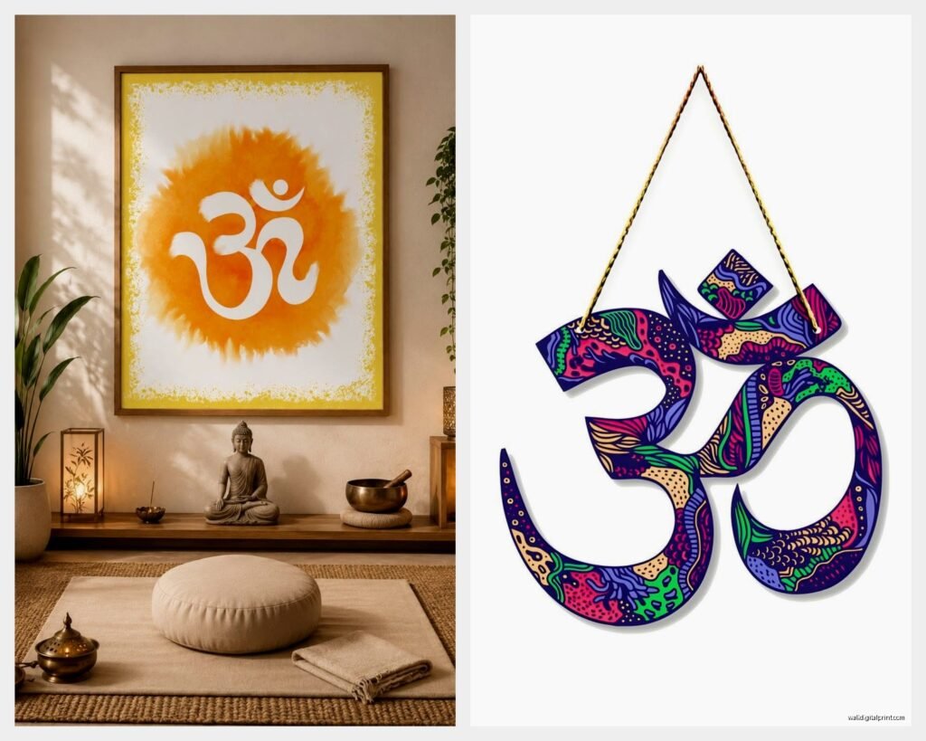
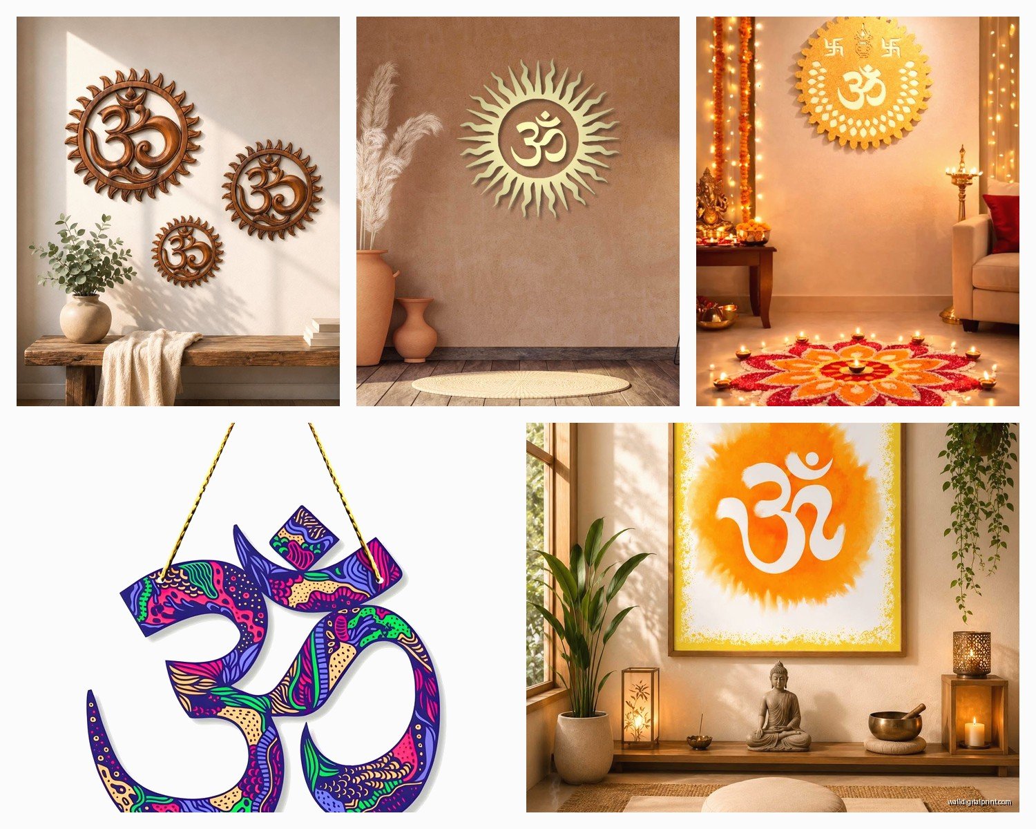
Metal Om Wall Art
The brushed brass or copper ones are my go-to recommendation. They catch light differently throughout the day which is actually really beautiful when you’re sitting there at sunrise versus evening meditation. I have this one client who does both and she sent me photos showing how it literally glows different colors.
Things to watch for with metal:
- Weight – anything under 2 pounds is probably too flimsy and will look cheap
- Finish quality – run your finger along the edges, sharp=bad craftsmanship
- Mounting hardware – needs to be sturdy, not those sticky strips
- Size proportion – 12-18 inches works for most spaces, bigger isn’t always better
I learned the size thing the hard way when I ordered a 30-inch one for what I thought was a large wall and it completely overwhelmed the meditation corner. Had to return it, my husband was like “that’s not spiritual that’s just loud.”
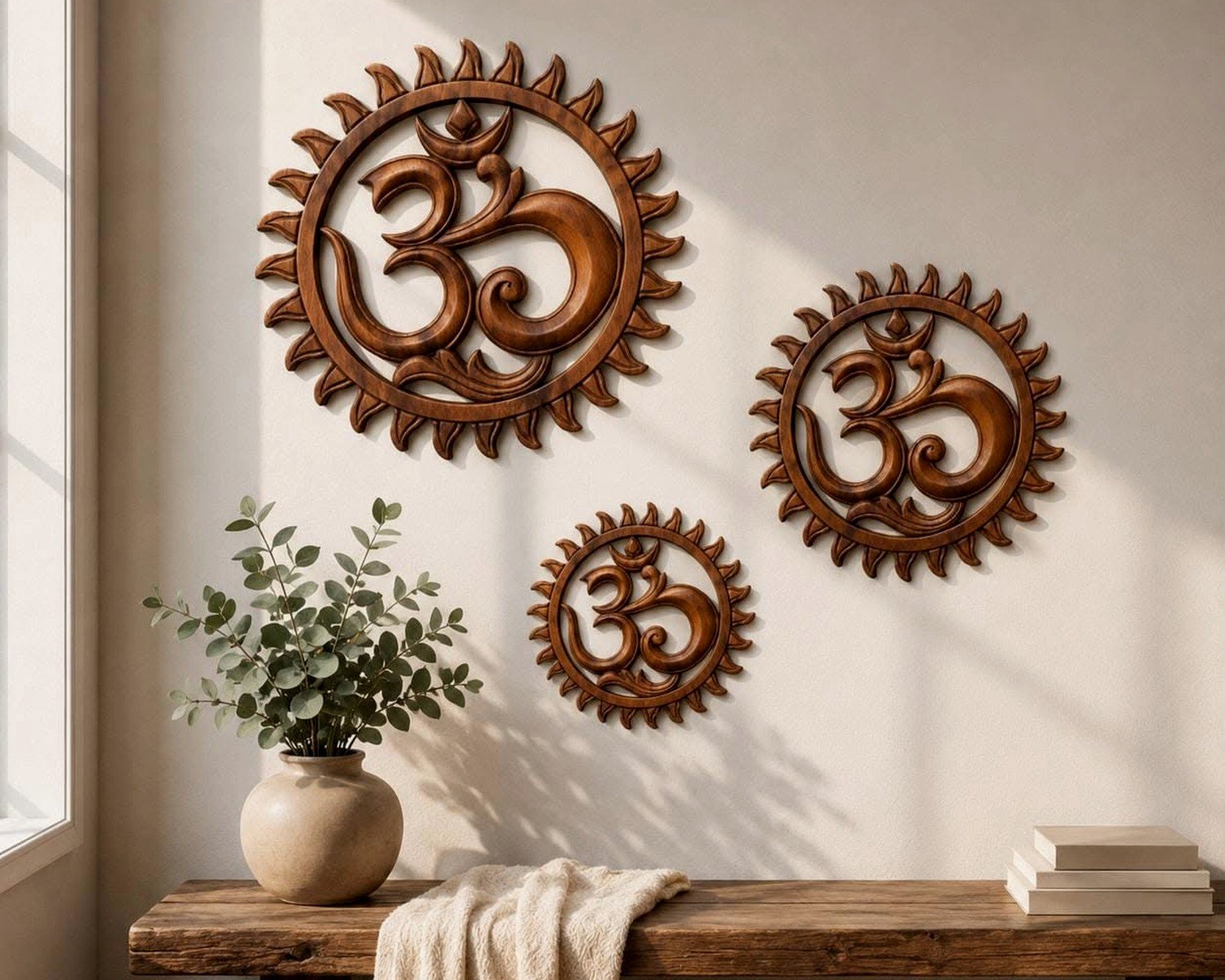
Wood Carved Options
Wooden Om symbols have this warmth that metal doesn’t, especially if you’re going for an earthy vibe. Mango wood and teak are the most common. The hand-carved ones from India are gorgeous but honestly the laser-cut versions have gotten really good and they’re like half the price.
Watch out for the stain color though – I’ve seen too many that are so dark they just become a black blob on the wall and you lose all the detail of the symbol. Medium walnut tones work best.
Placement Strategies Nobody Tells You
So placement is where people mess up constantly. They think meditation corner = random unused space but it’s actually gotta be intentional.
Best spots I’ve found:
- Facing east if you can swing it (traditional direction for meditation)
- Away from doors where people might randomly walk in
- Not directly under air vents because papers/incense will blow around
- Natural light is good but not harsh afternoon sun that’ll be in your eyes
The Om symbol should be centered on whatever wall you’re facing. I use painter’s tape to mark the spot before drilling because I’ve absolutely eyeballed it before and ended up with crooked installations that drove me crazy every time I looked at them.
Height Measurements
Okay this is specific but helpful – if you’re sitting on a meditation cushion that’s about 6 inches high, mount the center of your Om symbol about 48-52 inches from the floor. If you’re using a meditation bench or chair, go higher, like 55-60 inches. Test it by sitting in position and having someone hold it up at different heights while you actually look at it.
Combining Om Art with Other Elements
Oh and another thing – the Om symbol works way better when it’s not alone doing all the heavy lifting. I usually create a small constellation of elements around it.
What works together:
- Small shelf underneath for candles or crystals (if you’re into that)
- Soft uplighting from below – creates this nice glow effect
- Minimalist surrounding space – don’t crowd it with other wall art
- Maybe one small plant to the side, nothing too distracting
I had this whole thing last month where a client wanted to put the Om symbol on a gallery wall with family photos and travel art and I was like…no. That’s not gonna create the focused energy you want. It needs breathing room. We compromised by giving it its own wall in the corner and she actually thanked me later because it completely changed her practice.
Color Considerations for Different Room Vibes
The wall color behind your Om symbol matters more than you’d think. I’ve photographed the same brass Om piece against like six different wall colors for my blog and the difference is wild.
Best backgrounds:
- Soft sage green – creates calm, doesn’t compete
- Warm white or cream – classic, makes metal pop
- Light gray-blue – modern but still peaceful
- Natural clay/terracotta – earthy vibe, warm
Worst backgrounds I’ve seen: bright yellow (too energizing), dark navy (symbol gets lost), pure white (too clinical), accent walls with patterns (just no).
Sizing for Your Actual Space
This is gonna sound obvious but I see people get this wrong constantly. The size of your Om wall art needs to match not just your wall but your seating distance from it.
Quick formula I use: measure the distance from your meditation seat to the wall in feet, divide by 2, that’s roughly the diameter in inches your Om symbol should be. So if you sit 6 feet away, you want something around 12-15 inches.
Smaller than that and it’s like squinting at it, larger and it’s overwhelming. There’s this sweet spot where it’s present without being demanding.
Lighting Your Om Symbol
Wait I forgot to mention lighting which is actually super important. The way you light your Om wall art completely changes how it functions in the space.
Options that work:
- Small picture light mounted above – creates gentle downward glow
- LED strip behind the symbol – modern look, creates floating effect
- Candlelight from below – traditional, moving shadows are meditative
- Natural window light from the side – free and beautiful
I’m not a fan of overhead lighting hitting it directly because it creates harsh shadows and flattens the dimensional quality. Indirect or angled light shows off the depth better, especially with carved or raised symbols.
My Setup at Home
In my own meditation room I’ve got a 14-inch brushed copper Om with a small battery-operated picture light above it on a dimmer. Game changer. I can adjust the brightness based on time of day or mood. Morning meditation I keep it brighter, evening I dim it way down. Cost like $30 on Amazon for the light.
Styles Beyond the Basic Symbol
Okay so not all Om wall art is created equal style-wise. You’ve got options depending on your overall aesthetic.
Traditional Sanskrit – This is the classic devanagari script version, looks the most authentic if you’re going for traditional spiritual vibes. Usually more ornate.
Minimalist Line Art – Simple outline of the symbol, very modern, works in contemporary spaces. My younger clients usually prefer this.
Mandala Integration – Om symbol incorporated into a larger mandala design. Beautiful but busy – only works if your space is otherwise very minimal.
Geometric Modern – Angular, clean-lined versions that read more as art than religious symbol. Good if you’re worried about it being too overtly spiritual.
Textured Relief – Raised or carved with dimensional texture. My personal favorite because of how light plays across it.
What to Avoid
Things I’ve seen that just don’t work and you should skip:
- Glittery or shiny finishes – looks like clearance section decor
- Om symbols with inspirational quotes around them – too cluttered
- Really thin metal that warps or bends – feels cheap
- Printed canvas versions – lose the dimensional quality that makes them work
- Neon or LED light-up versions – this isn’t a dorm room
- Combining multiple Om symbols on one wall – one is a focal point, five is visual chaos
I had a client who bought one of those printed canvas ones from a big box store and texted me a photo asking why it felt “off” and like…yeah, it’s because it’s flat and mass-produced and has no soul. We replaced it with a hand-carved wooden version and she was like oh THAT’S the difference.
Installation Tips
Real talk about actually hanging these things because I’ve watched people struggle. Most Om wall art comes with basic hanging hardware but it’s often not great.
What you actually need:
- Level – seriously use one, your eye will lie to you
- Stud finder if it’s heavy (over 3 pounds)
- Appropriate anchors for your wall type
- Pencil for marking (not pen, trust me)
- Measuring tape
For drywall with no stud, I use those toggle bolt anchors rated for like 50 pounds even if the piece only weighs 2 pounds. Overkill is better than coming home to your Om symbol on the floor.
Pro tip: take a photo with your phone once it’s hung and check if it looks level in the photo. Sometimes what looks straight in person photographs crooked and that’s usually the accurate view.
Maintaining Your Om Wall Art
This is boring but practical – different materials need different care and nobody thinks about this until there’s dust buildup or tarnishing.
Metal symbols: Dust weekly with microfiber cloth, polish monthly if it’s brass or copper to prevent oxidation. Some people like the aged patina look though so that’s personal preference.
Wood symbols: Dust gently, occasionally treat with wood conditioner if it’s in a dry climate. Don’t use harsh cleaners.
Stone or resin: Damp cloth is fine, avoid abrasive cleaners that’ll scratch the surface.
Budget Ranges and What You Get
Okay so pricing is all over the place with these. Here’s what I’ve found at different price points:
Under $30: Probably printed, lightweight, mass-produced. Fine if you’re just testing out the concept but won’t have longevity.
$30-$80: Sweet spot for most people. Good quality metal or wood, decent craftsmanship, will last years.
$80-$200: Hand-carved, unique pieces, often imported, substantial presence. Worth it if meditation is a serious practice for you.
Over $200: Art pieces, often custom, museum-quality. I’ve specified these for high-end clients but honestly unnecessary for most people.
I usually recommend the $50-$80 range because that’s where you get quality without overpaying for brand markup.
Creating the Whole Meditation Corner
Since we’re talking about Om wall art, might as well mention the whole setup because the symbol alone isn’t gonna create a meditation space.
Essential elements I include:
- Comfortable meditation cushion or bench (not decorative pillows, actual meditation seating)
- Small side table or shelf for timer, water, whatever
- Sound dampening if your space is noisy – even just a small rug helps
- Window treatment for light control
- Storage for meditation accessories tucked away
The Om symbol anchors all of this visually. It’s the focal point that tells your brain “this is the meditation zone” which sounds woo-woo but actually works.
My cat keeps trying to sleep in my meditation corner which is super annoying but also kinda validates that it’s a calm space I guess?
When Om Symbols Don’t Work
This is gonna sound weird but Om symbols aren’t for everyone and that’s okay. If you’re not connected to Hindu/Buddhist traditions and it feels like cultural appropriation to you, there are alternatives.
Other focal symbols that work:
- Ensō (Zen circle) – minimalist, less culturally specific
- Sacred geometry patterns – universal
- Natural elements like tree of life – accessible to anyone
- Abstract art that speaks to you personally
The point is having a visual anchor for your practice, not specifically the Om symbol. Use what resonates.
Seasonal Adjustments
One thing I’ve noticed in my own space – the way I interact with my Om wall art changes seasonally. In winter when it’s dark earlier, I light it more. Summer mornings with natural light it needs nothing. Some people swap out the surrounding elements (candles, plants, etc.) with the seasons while keeping the Om symbol constant. That anchoring consistency is actually really grounding when everything else shifts.
Anyway that’s most of what I’ve learned through trial and error with these. The main thing is don’t overthink it – get something that feels right to you, hang it at the proper height, give it space to breathe, and actually use your meditation corner regularly. The Om symbol is just a tool, the practice is what matters.